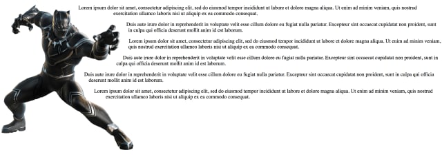
Today we’re going to learn how to wrap text around a non-traditional image outline instead of a square, rectangular, or circular image. In honor of Chadwick Boseman (R.I.P.), we’re going to use Black Panther.
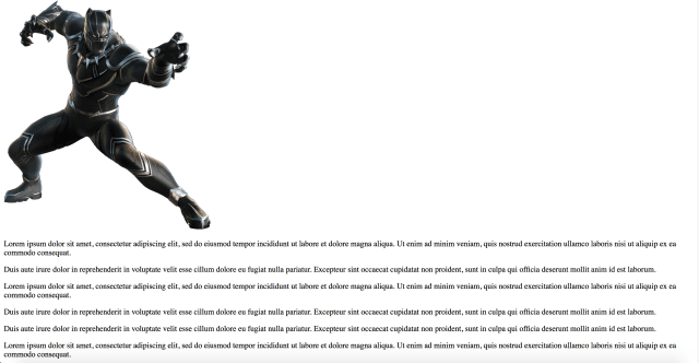
Let’s start with an image and some text. Make sure the image is a png.
/*The image can be a link or a file*/
<img class="photo" src="https://image-link.png"/>
<div>
  <!-- Add as many paragraphs as you want -->
  <p>Lorem ipsum dolor sit amet, consectetur adipiscing elit, sed do eiusmod tempor incididunt ut labore et dolore magna aliqua. Ut enim ad minim veniam, quis nostrud exercitation ullamco laboris nisi ut aliquip ex ea commodo consequat.</p>
</div>
It should look like this so far.
Next let’s move the words next to the image. In the css, we’re going to add a float. Note the class name for the image is “photo”.
.photo{
  float: left;
}

Now we’re going to add some css styles you may not have heard of yet.
The first is called shape-outside. Shape-outside provides a way to customize the usual text-wrap wrapping, making it possible to wrap text around complex objects rather than simple boxes or circles. Note that this property will only work on floated elements.
The possible values for shape-outside are :
-
circle(): for making circular shapes. -
ellipse(): for making elliptical shapes. -
inset(): for making rectangular shapes. -
polygon(): for creating any shape with 3 or more vertices. -
url(): identifies which image should be used to wrap text around. -
initial: the float area is unaffected. -
inherit: inheritsshape-outsidevalue from parent.
We’re going to use url. So under your float style, add this.
.photo{
  float: left;
  shape-outside: url("https://image-link.png");
}
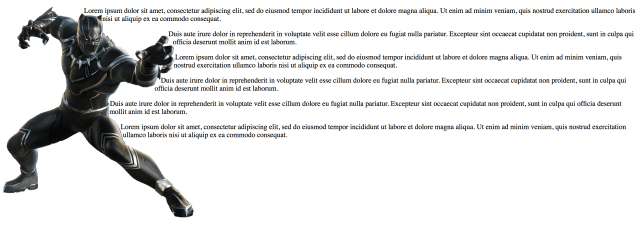
Now I’m not saying css is magic… but css can certainly be magical. It’s looking better already! 😉
Next we’re going to add something called the shape-image-threshold. It may not always be needed (and in my image’s case it’s not needed), but it’s good to be aware of. So I’m going to show you!
It’s mainly used with gradient images or images with a shadow and says, “This is how much of the gradient I want the words to cover.” Since my image doesn’t need it, here is an example.
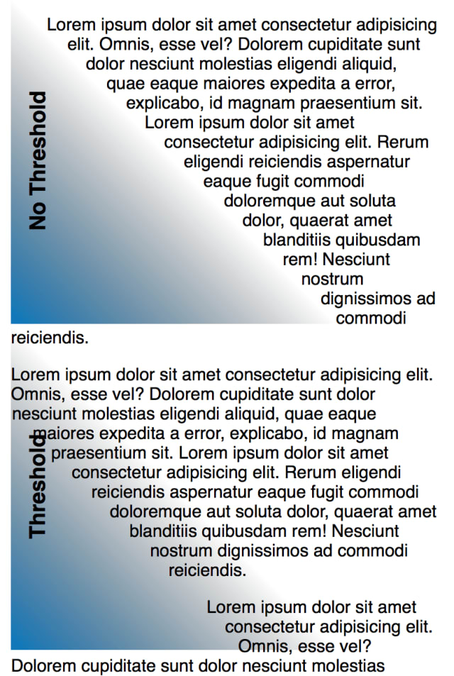
The top image has a threshold of 0 while the second has a threshold of 0.3.
The possible range is from 0 to 1, same as opacity measurements.
In my image’s case, it will only slightly hug the edges of the image more or fully cover it if I input 1. It’s looking for shadows or gradient which my image doesn’t have. So let’s give Black Panther a nice little hug and add some shape-threshold. Adjust yours as needed.
.photo{
  float: left;
  shape-outside: url("https://image-link.png");
  shape-image-threshold: 0.9;
}
As you can see, nothing has really changed at all for my non-gradient image.
Now let’s give Black Panther some room to breathe by adding margin. But because we’re using shape-whatever, we can’t just use margin. We have to use shape-margin.
.photo{
  float: left;
  shape-outside: url("https://image-link.png");
  shape-image-threshold: 0.9;
  shape-margin: 2%;
}
That’s so much better!
Well there you have it, we’ve created a custom text wrap around an image.
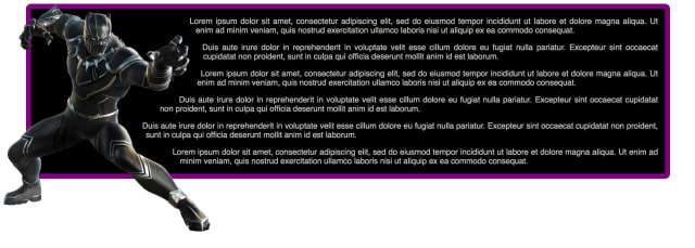
Just to make it pretty, we can add some styles on the div.
div{
  width: 90%;
  margin: 0 auto;
  padding: 0 1%;
  font-family: Arial;
  text-align: justify;
  color: silver;
  background-color: black;
  border: 10px purple solid;
  border-radius: 10px;
}
.photo{
  float: left;
  shape-outside: url("https://image-link.png");
  shape-image-threshold: 0.9;
  shape-margin: 2%;
}
Today we learned about shape-outside, shape-image-threshold, and shape-margin to make a text wrap around a non-traditional image shape.
Hopefully this has helped someone to become 1 step closer to becoming a better developer.


Latest comments (1)
Nice, didn't know about the
shaperules in CSS 👍