Story by Dylan Opet.
You want people to enjoy using your app (if not, you wouldn’t bother with UX design at all). However, creating a flawless UX is nearly impossible. You can’t make every single moment exciting. But if you play your cards right, you don’t have to. Your UX doesn’t have to be perfect to be enjoyable–if you design with the peak-end rule in mind.
This post is part of a 9-part series on UX psychology.
What Is It?
The peak-end rule is simple: the most memorable parts of any experience are the peak–the most emotionally-intense part–and the end. If the peak and the end are good, people will conclude that the entire experience was good. But if the most emotionally-intense part was negative and the end was unsatisfying, people will conclude that the entire experience was bad.
Movies are a great example. If a movie has a great end and a really enjoyable scene, you will most likely enjoy the movie. But what if the enjoyable scene is overshadowed by an extremely boring scene? Or what if the end of the movie was bad? In either instance, your opinion may entirely change.
So What
Movies seem completely out-of-context, but your UX isn’t too different. Both a director and a UX designer need to instill emotions over a period of time. As a result, the peak-end rule is very applicable to design. Let’s say users need to register to use your app. If the peak of the registration process is a frustrating bug, they won’t like the app no matter how good it is. But if the process ends with fun micro animations, users will be much more forgiving. You see how prioritizing the peak and the end of the experience can make it better?
But applying the rule is the hard part. Here’s how to get started.
Improve UX With A Good Peak
Sending out mass emails can get boring very quickly. It’s not a great experience. However, MailChimp makes the entire experience much better by adding a fun peak. Right before you send an email, you are greeted by a sweaty monkey finger hovering over a big, red button.
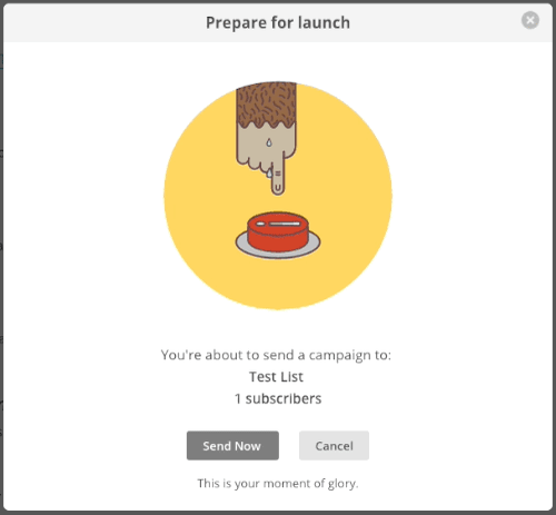
This animation is pure UX genius. Not only does it encourage you to go back and double-check for errors, but it also captures the intensity of the peak and makes it into a more fun experience. By turning the most emotionally intense part of the experience into a fun moment, the entire experience seems more fun.
Improve UX With A Good End
An eCommerce platform that dwells on the price will make the user feel bad about spending that cash. After all, losing money isn’t just a bad experience; it’s a horrible experience. So instead of ending the purchase with a big ol’ bill, why not end it by reminding the customer what they’re getting?
That’s what Amazon does. After you finish spending money, it reminds you why you spent that money in the first place.
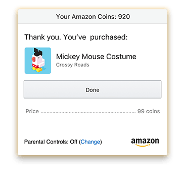
This window isn’t much, but it makes all the difference. Imagine if you clicked the “purchase” button and nothing happened. How would you know that the order went through? The UX is only functional with a proper end.
Want to go above and beyond? Make the end a little more fun. Let’s look at MailChimp again. After you send an email, you can give the same monkey hand a high-five.

Similarly, DuoLingo gives you awards when you finish a lesson.

But the Peak-End rule can also work against you.
Don’t Ruin UX With A Bad Peak
Be warry when building an app’s UX. A well-made peak and end will improve any experience. But just as easily, a bad peak can ruin the entire UX.
For instance, the Disney+ app was full of bugs when it was initially released.

Many users complained that the app repeatedly crashed. As a result, they didn’t want to continue using the app. These bugs may not seem like an issue with the UX, but they certainly impact how people perceive the app. When the most emotionally intense part of the UX is a major error, users will overlook any positive peaks you include. It’s up to your team to build a robust application from the start.
Don’t Ruin UX With A Bad End
However, even if your UX is on point and your app is error-free, your app may not be perfect. Thanks to the peak-end rule, an unsatisfying end is enough to ruin the entire experience.
For instance, have you ever filled out a digital form without receiving any feedback? You may have filled out all the necessary information and poured your heart and soul into the form, but after clicking “submit,” you didn’t receive as much as a “thank you” message. That absence of feedback can rob the UX of any and all satisfaction. To fix that problem, explore using micro animations. We talk about the best way to use micro animations in our article about how to make micro animations more engaging.
Overall, the peak and end of your UX are the most important parts. Don’t forget the rule. If you want help getting the UX right, contact our design team or call us at 844.526.2253.
Like this article? See the original post on https://www.fyresite.com/peak-end-rule-the-second-principle-of-ux-design/


Top comments (0)