
A “Flying Footer” is a footer that is not always placed at the bottom of the page. This article presents different solutions on how to place the footer at the bottom of a layout.
Footers that are not placed at the very bottom of the page, is one of my pet peeves when it comes to web design and layout.
”Flying Footers” occurs in layouts that lacks enough CSS rules for placing the footer at the bottom at all times. For example, when there is not enough content on the page to take up 100% of the screen’s height, the footer might end before the page ends. This is typically occurring on larger screens when displaying pages that contain a smaller amount of content.
Examples
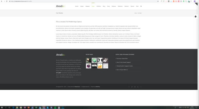
An example of a short page displayed on a large screen using the top-selling WordPress theme Avada.
Another example is this view from Sweden’s largest public service news and media company SVT.

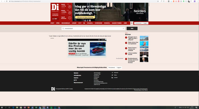
And yet another example, this time from one of Sweden’s largest business news sites, di.se.
Is This Really Important?
Fixing details like this is in my opinion comparable to wearing an ironed shirt to an important meeting when you want to look your best. The world will not end if you show up in a wrinkled shirt, but you will probably make a better impression wearing an ironed one.
In the same way, caring about details, coherent design and making a solid impression can make a website appear to be of higher quality.
Dynamic Content
Most websites have dynamic content. It is preferable that the expected look of a website’s design is not relying on whether or not the content is long or short.
Larger Screens
There has been a lot of focus on mobile and smaller screens, but there has been a shift upwards in screen sizes as well. Screens used for accessing websites are getting larger; some users even browse the Internet on their TV screens. It is therefore needed to provide layouts that scale and stay in place on larger screens as well.
Join the Fight
Depending on which browser support is needed, as well as on the content of the footer itself, different techniques can be used to make the footer stay at the bottom of the page regardless of the page’s previous content.
Negative Margin
Applicable when: the footer height is known and will not change, and you need to support old browsers.
Browser support: supported in all browsers.
Note about CSS Computed Properties: Although it might be possible to combine CSS Computed Properties with a calc() statement to use this in a scenario with a changing footer height, those techniques require more modern browsers. And if you are building mainly for more modern browsers, you have the opportunity to use Flexbox or CSS Grid as well.
vh Units
Applicable when: the minimum footer height is decided, and you need support down to IE9.
Browser support: supported in old browsers back to IE9.
Adding content to the footer so that it exceeds the set minimum height will trigger y-axis scrolling on the webpage (instead of adjusting for and making use of any extra space left above the footer). However, the footer will stay at the bottom of the page.
Flexbox
Applicable when: The footer content is dynamic, since the footer height can vary without breaking the layout.
Browser support: fully supported in Edge12 and upwards. Partial support (due to "a large amount of bugs") and older syntax version make IE 10-11 support less reliable.
CSS Grid
Applicable when: The footer content is dynamic, since the footer height can vary without breaking the layout.
Browser support: full support in Edge16 and up. Partial support with older version of the specification and -ms- prefix in IE10-11 and Edge12-15.
Note about Position Sticky
It is possible to place the footer at the bottom using position sticky, which is supported from Edge 16 and up. Even if the footer is placed at the bottom of the page, the drawback with using position sticky for footer positioning is that the footer will overlap previous content when y-axis scrolling is needed.
In this case, this might not be the desired behavior and hence position sticky might not be the best tool for the job.
In Summary
The main constraints that decide which technique is best for each use-case are:
- Which browsers need to be supported?
- Is the footer height known?
- Will the footer height change (for example as a consequence of dynamic footer content)?
- If you know you don’t need to support Internet Explorer, the technique with the best support is flexbox, which also allows for changing the footer height.
Originally published at redonion.se.


Latest comments (3)
informative post! here is also an extensive post about the footer, its importance in website design and its main components gapsystudio.com/blog/website-foote....
Really helpful
Nice,
I'm using the flex version "stollen" from MaterializeCSS: materializecss.com/footer.html#sti...
It's similar to the one defined here.