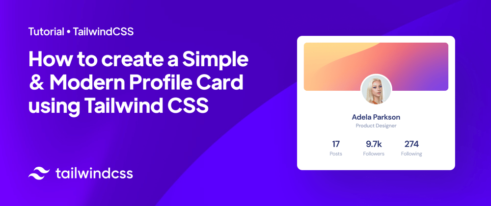
As we all know, Tailwind CSS is a utility-first CSS framework for rapidly building custom user interfaces. It provides a wide range of low-level utility classes that make it easy to build complex designs by composing simple CSS classes. Also, now is one of the most popular CSS frameworks in the whole web development industry! ⚡️
Some of the benefits of using Tailwind CSS include:
Speed: Because Tailwind provides a wide variety of pre-defined CSS classes, it can help developers quickly build and prototype user interfaces without having to write custom CSS.
Consistency: By using the same set of classes throughout a project, developers can ensure that the design is consistent across different pages and components.
Customizability: Tailwind CSS is highly customizable, allowing developers to easily adjust the design to match their project's specific needs.
Accessibility: Tailwind CSS provides a set of classes that make it easy to implement accessibility best practices, such as providing sufficient contrast between text and background colors.
A profile card is a great way to showcase important information about an individual or organization on a website. In this article, we’ll show you how to create a modern profile card using the popular CSS framework, Tailwind CSS.
So, let’s get started!
Step 1: Setting up the Tailwind CSS config file
Let’s set up our project by creating the Tailwind CSS config file and adding base css. Here we will use some colors, shadows, and more from the Horizon UI template for Tailwind.
tailwind.config.js
module.exports = {
  darkMode: 'class',
  content: ['./src/**/*.{js,jsx,ts,tsx}'],
  theme: {
    extend: {
      fontFamily: {
        dm: ['DM Sans', 'sans-serif'],
      },
      boxShadow: {
        '3xl': '14px 17px 40px 4px',
      },
      borderRadius: {
        primary: '20px',
      },
    },
    colors: ({ colors }) => ({
      white: '#ffffff',
      lightSecondary: '#A3AED0',
      bluePrimary: '#2B3674',
      gray: {
        DEFAULT: colors.gray,
        50: '#f8f9fa',
        100: '#edf2f7',
        200: '#e9ecef',
        300: '#cbd5e0',
        400: '#a0aec0',
        500: '#adb5bd',
        600: '#a3aed0',
        700: '#707eae',
        800: '#252f40',
        900: '#1b2559',
      },
      navy: {
        50: '#d0dcfb',
        100: '#aac0fe',
        200: '#a3b9f8',
        300: '#728fea',
        400: '#3652ba',
        500: '#1b3bbb',
        600: '#24388a',
        700: '#1B254B',
        800: '#111c44',
        900: '#0b1437',
      },
      shadow: {
        500: 'rgba(112, 144, 176, 0.08)',
      },
    }),
  },
}
index.css
@import url('https://fonts.googleapis.com/css2?family=Poppins:wght@100;200;300;400;500;600;700;800&display=swap');
@import url('https://fonts.googleapis.com/css2?family=DM+Sans:wght@400;500;700&display=swap');
@tailwind base;
@tailwind components;
@tailwind utilities;

@layer base {
    html {
      font-family: 'DM Sans', sans-serif;
      font-feature-settings: 'kern';
      -webkit-font-smoothing: antialiased;
      letter-spacing: -0.5px;
    }
}
Step 2: Create the HTML structure
First, we’ll create the HTML structure for our profile card. We’ll use a div container to hold the card, and within that, we’ll add several divs to hold the different elements of our card, such as the background image, profile picture, name, and its statistics.
index.html
<div>

//Banner image

  <div style='background-image: url("https://i.ibb.co/FWggPq1/banner.png");'>

//Profile picture (separate div for future positioning)

   <div>
    <img src="https://i.ibb.co/6YbS9ff/avatar11.png" alt="" />
   </div>
  </div>

//General info

  <div>
    <h4>Adela Parkson</h4>
    <p>Product Manager</p>
  </div>
  <div>
    <div>
      <h3>17</h3>
      <p>Posts</p>
    </div>
    <div>
      <h3>9.7K</h3>
      <p>Followers</p>
    </div>
    <div>
      <h3>434</h3>
      <p>Following</p>
    </div>
  </div>
</div>
Step 3: Styling
Add Tailwind CSS classes so the card has its own identity.
<div class="dark:!bg-navy-800 shadow-shadow-500 shadow-3xl rounded-primary relative mx-auto flex h-full w-full max-w-[550px] flex-col items-center bg-white bg-cover bg-clip-border p-[16px] dark:text-white dark:shadow-none">
  <div class="relative mt-1 flex h-32 w-full justify-center rounded-xl bg-cover" style='background-image: url("https://i.ibb.co/FWggPq1/banner.png");'>
    <div class="absolute -bottom-12 flex h-[88px] w-[88px] items-center justify-center rounded-full border-[4px] border-white bg-pink-400">
        <img class="h-full w-full rounded-full" src="https://i.ibb.co/6YbS9ff/avatar11.png" alt="" />
    </div>
  </div>
  <div class="mt-16 flex flex-col items-center">
    <h4 class="text-bluePrimary text-xl font-bold">Adela Parkson</h4>
    <p class="text-lightSecondary text-base font-normal">Product Manager</p>
  </div>
  <div class="mt-6 mb-3 flex gap-4 md:!gap-14">
    <div class="flex flex-col items-center justify-center">
      <h3 class="text-bluePrimary text-2xl font-bold">17</h3>
      <p class="text-lightSecondary text-sm font-normal">Posts</p>
    </div>
    <div class="flex flex-col items-center justify-center">
      <h3 class="text-bluePrimary text-2xl font-bold">9.7K</h3>
      <p class="text-lightSecondary text-sm font-normal">Followers</p>
    </div>
    <div class="flex flex-col items-center justify-center">
      <h3 class="text-bluePrimary text-2xl font-bold">434</h3>
      <p class="text-lightSecondary text-sm font-normal">Following</p>
    </div>
  </div>
</div>
Step 4: Hooray! You’re done! 🎉
All you have to do is integrate the card in your project. The final result should look like this:
If it helps you, here is a link with the full component today’s card 👉 Horizon UI Tailwind
In conclusion, creating a modern profile card with Tailwind CSS is a simple and efficient way to add a visually appealing element to your website or application. By utilizing the pre-designed classes and responsive design capabilities of Tailwind CSS, you can easily customize the layout and style of your profile card to fit the look and feel of your project.
More cards like the one we made, components like navbars, dropdowns, and so on, are available in Horizon UI Tailwind!


Latest comments (5)
Stunning design guys! 😍
Thanks a lot! Hope it helps! 😁
🙌🏼🙌🏼🙌🏼
😍