
Photo by Stefan Cosma on Unsplash
Over the last years web components have matured quite a bit. Still, there are areas where web components are unfortunately not yet easy to fit in. Surprisingly, micro frontends are one of the areas that actually do not only benefit from web components, but will also face real issues if used directly.
In this article we go into one of these troublesome use cases for web components arising with micro frontends. We'll cover how a web component-based component library can be used by multiple micro frontends in independent versions. But first, let's have a look at the problem in depth.
Web Components and Versioning
Let's say you have two micro frontends - red and blue. Both want to use a component library. Let's just share it (green):
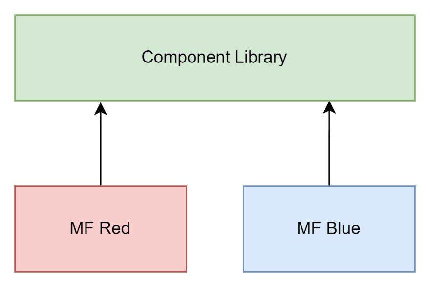
Since the component library is based on web components the shared part is actually trivial - they need to be shared. After all, to register a web component the following global call is made:
customElements.define('my-component', MyComponent);
Both micro frontends can then access the my-component element. So far, this does not present any problem. But now, let's say the team behind the component library releases a new version.
While the red micro frontend actually wants to use this new version (purple), there is bug in a core component used by the blue micro frontend. So, at least for the time being, this team wants to remain on the old version.
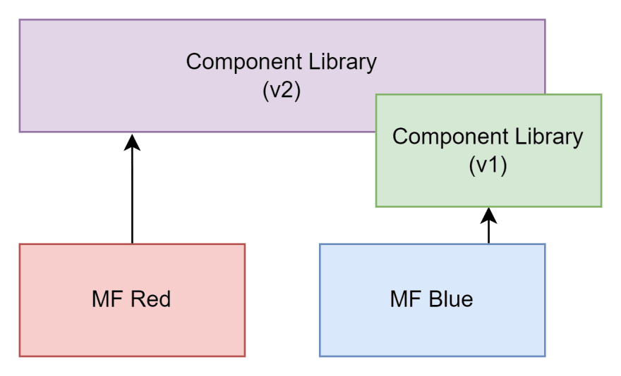
This is a new version, yes, but the team wanted to keep breaking changes minimal. As such, both libraries want to register a different component to the same element name. Unfortunately, this is not supported and will throw:
// called from v2
customElements.define('my-component', MyComponentV2);

// called from v1
customElements.define('my-component', MyComponentV1); //this will throw!
Even if the library has been developed defensively, it would not yield the right result:
// called from v2
if (!customElements.get('my-component')) {
  customElements.define('my-component', MyComponentV2);
  // registered
}

// called from v1
if (!customElements.get('my-component')) {
  customElements.define('my-component', MyComponentV1);
  // never called, nothing registered
}
Now, both teams would unknowingly use the same component - but the blue micro frontend explicitly wanted to use the old v1 version.
Consequently, there must be a way to properly version and roll out the component library to support this use case.
Challenges and Solutions
Alright, let's start with the most striking issue. What if we would just release with a certain version-dependent name?
customElements.define('my-component-v2', MyComponentV2);
The granularity of this is debatable. Yes, the suffix could be used for API breaking changes, but what if there is some internal bug that was resolved in one version, but is included in another?
For instance, for a daily build we could define:
customElements.define('my-component-2022-09-01', MyComponent);
Even though this might be as granular as possible, it would be pretty much unusable. Any update to the library would require changing all the references. Unless... we can make an alias. Can we?
// original definition - very granular
customElements.define('my-component-2022-09-01', MyComponent);
// alias definition
customElements.define('my-component', MyComponent);
This has two problems:
- By giving the alias a predefined name we run into the same problem that we want to avoid
- A web component reference (the class behind it, i.e.,
MyComponentin the example above) can only be used once
The latter can be fixed by using an anonymous class extending the original class:
// original definition - very granular
customElements.define('my-component-2022-09-01', MyComponent);
// alias definition
customElements.define('my-component', class extends MyComponent {});
Now we are left with the first issue. This one could be solved by making the alias registration configurable:
// original definition - very granular
customElements.define('my-component-2022-09-01', MyComponent);

export function registerComponent(name = 'my-component') {
  // alias definition
  customElements.define(name, class extends MyComponent {});
}
This way, the default version of the component library will be auto-registered (e.g., using registerComponent() implicitly), while the blue micro frontend will use the custom registration, explicitly calling registerComponent with a new name for the component.

From the perspective of the blue micro frontend the code could look like:
import { registerComponent } from 'component-lib/custom';

registerComponent('other-component');
Great! So we can define aliases, but does that fully help us?
It turns out there are a couple of issues with this approach:
- If we do not isolate the styling (e.g., instead of using shadow DOM we use
innerHTMLor similar) we have trouble identifying the element by a fixed tag name - If within the component library we reference some component by its tag name then we have an issue
To solve the first problem we can either introduce class names, inline styling, or CSS-in-JS. The former two have the issue that their specifity is quite high, i.e., in order to override the styling (which presumably is wanted in such cases, otherwise using shadow DOM would be preferred I guess) the use of !important would be necessary.
Using a CSS-in-JS solution, however, makes sense for web components. They should anyway be styled by some mechanism (e.g., lit styles) that is close / defined within JS.
So we could just do the following:
function getSheet() {
  const element = document.createElement('style');
  document.head.prepend(element);
  return element.sheet;
}

function defineComponent(name, BaseClass) {
  // wrapper to always succeed here
  if (!customElements.get(name)) {
    const sheet = getSheet();
    customElements.define(name, class extends BaseClass {});
    sheet.insertRule(`${name} { ${BaseClass.styles || ''} }`, 0);
  }
}

// default definition
defineComponent('my-component-2022-09-01', MyComponent);

export function registerComponent(name = 'my-component') {
  // alias definition
  defineComponent(name, MyComponent);
}
where we expect the given component class (e.g., MyComponent) to have a static styles property like this:
export class MyComponent extends HTMLElement {
  static styles = `
    color: green;
    font-weight: bold;
  `;
}
This way, we can apply some default styling exactly to the registered tag name. Even better, if we register the element multiple times then each gets the default styling applied - independently of each other. Hence, overriding the styles of one tag does not impact the others.
That only leaves us with the reference problem. Here, we need to stay consistent. The following diagram illustrates this:

Using a x-button-group component from both, the red and the blue, micro frontends is only possible if we follow the steps we derived so far. We require a dedicated name for the embedded version used in the blue micro frotend. But that is not everything: Inside the x-button-group we also need to reference whatever tags have been defined outside (in our case: the blue micro frontend). Well, this is a challenge.
One way out of this is to keep book of the context. Inside the component we always know our tag:
export class MyComponent extends HTMLElement {
  constructor() {
    super();
    // this will log the currently used name, e.g., `x-button-group` or `x-button-group-v1`
    console.log(this.localName); // "x-button-group"
  }
}
Now we can use this information if we perform a joint registration like so:
const contexts = [];
const components = {
  'x-button': Button,
  'x-button-group': ButtonGroup,
};

export function registerComponents(getName = (name) => name) {
  const tagNames = [];
  const aliases = {};

  Object.entries(components).forEach(([name, cls]) => {
    const tag = getName(name);
    aliases[name] = tag;
    tagNames.push(tag);
    defineComponent(tag, cls);
  });

  contexts.push({ tagNames, aliases });
}
We get aliases and tags.

By using the localName from the current component instance to match the provided tags (we guarantee that it appears once and only once) we find the right context, giving us the aliases. So, for the ButtonGroup to find the correct name of a Button we can use:
export function findTagName(localName, defaultName) {
  // get the right context - we are only interested in its aliases
  const { aliases } = contexts.find(c => c.tagNames.includes(localName));
  // resolve the current tag name from the provided alias mapping
  return aliases[defaultName];
}
This is pretty much all that's necessary to cover the most important use cases. Let's see this in action.
Demo Project
I've prepared a demo project on the basis of Piral. The running demo can be found at the Piral samples organization on GitHub. Running the demo locally does not look very spectacular.

In the end, we have two micro frontends contained in one application. One micro frontend is using the embedded / centrally provided version of a web component library (lib-v1), while the other one is using its own version (lib-v2).
The setup of the first micro frontend is:
import "./style";
import * as React from "react";

export function setup(app) {
  app.registerTile(
    () => (
      <div className="teaser">
        Welcome to Piral 1 using the shared version of the component lib!
        <lib-container>
          <lib-button-group></lib-button-group>
        </lib-container>
      </div>
    ),
    {
      initialColumns: 4,
      initialRows: 4,
    }
  );
}
Here, lib-container and lib-button-group are used. These are components from the web component library. While the lib-container uses a shadow DOM for styling and a <slot> for its children, the lib-button-group redefines its content by setting the innerHTML property. The latter has therefore to be styleable from the outside. Also, it directly references lib-button internally.
The setup of the second micro frontend is:
import "./style";
import { registerAll } from "lib-v2/register";
import * as React from "react";

registerAll((name) => `new-${name}`);

export function setup(app) {
  app.registerTile(
    () => (
      <div className="teaser">
        Welcome to Piral 2 using its own version of the component lib!
        <new-lib-container>
          <new-lib-button-group></new-lib-button-group>
        </new-lib-container>
      </div>
    ),
    {
      initialColumns: 4,
      initialRows: 4,
    }
  );
}
Pretty much the same, except that we use the lib-v2/register module instead of just importing lib-v2. Then, this micro frontend uses the imported registerAll function to actually alias all these components.
The result is that both library versions co-exist, and can even be styled independently, e.g.:
/* mf-one */
lib-button:nth-child(1) {
  color: blue;
}

/* mf-two */
new-lib-button:nth-child(2) {
  color: red;
}
The demo also includes components written using Lit. For Lit a couple of things need to be respected:
- Components should not be registered right away (i.e., drop the decorator)
- The dynamically resolved tag names need to be included via unsafe constructs
The unsafe constructs can be done in Lit like this:
import { LitElement, html, css } from "lit";
import { unsafeHTML } from "lit/directives/unsafe-html.js";
import { getAlias } from "./aliases";
import { buttonTag } from "./Button";

export class ButtonGroup extends LitElement {
  render() {
    const button = getAlias(this.localName, buttonTag);
    const code = unsafeHTML(
      `<div><${button}>A</${button}><${button}>B</${button}><${button}>C</${button}></div>`
    );
    return html`${code}`;
  }
}

export const buttonGroupTag = "lib-button-group";
There could be even more convenient wrappers on top of this, like
function renderFragment(localName, defaultTag, content) {
  const tag = getAlias(localName, defaultTag);
  const code = unsafeHtml(`<${tag}>${content}</${tag}>`);
  return html`${code}`;
}
The result is a DOM as we want it:

Conclusion
With the right utility functions and architectural decisions you can create a library consisting of web components that can be used in quite flexible ways. The key question is if you want or need to support that use case.
My personal preference is to always stay agile. Allowing different teams to make their own decisions what usage of your library fits best to their use case is always a good goal to have in mind.


Oldest comments (3)
Another possibility is to treat each new component as if it were in beta testing before allowing others to use it. So the first beta version that other teams are given a peek at might be called
<beta1-fancy-button>. Any breaking changes that you want to share would be published as<beta2-fancy-button>. Eventually, everyone moves on to the next problem and forgets about fancy buttons, so you silently publish the canonical version as<fancy-button>. Later, the teams using the beta versions discover that things have settled down, so they grep their code base, remove the beta prefix, test for breakage, and are good to go.The canonical answer on how to run the same set of web components is scoped elements:
Still this requires, that your set of web components are not self-registering and thus forces you to modify the web components. This might not always be possible, if you are not in control of the web component library.
There are other non-invasive approaches available by modifying the CustomElement registry, that I outlined 3 years ago, by modifying
CustomElement.define()to allow registering CustomElements with the same name over and over again, by having a host component that delegates to the actual CustomElement that will get a scoped name. This allows you do all kind of magic:If your web components are self-contained concerning the styling, this allows you to run different versions of the same application, without modifying the application code at all. This is very important, because that way you won't have to modify the complete application, if you want to migrate to another version.
While I only build a rough-rough prototype, this should work perfectly for micro-frontend composition. You only need to come up with some kind of wrapper for the micro-frontend, telling the custom element loader to determine the version from. This can be as simple as a
<div version="2.2.1"><mf-one></mf-one></div>For a small overview:
Of course all of the proposed techniques will only work, as long as your web components of a shared library do not rely on any global state, that they are syncing across the document, because this is still globally and shared. Let's see what's up in the making for ShadowRealms next week at TC39!
PS: Sorry, but somehow the markdown table is not working...
Not sure why you think this is Piral specific or somewhat related to Piral. I made the MF demo with Piral, but the technique and the article have nothing to do with Piral and the sharing / demo could have been done in the same way using whatever other thing you have in mind.