For the final part of the Zelda series we're going to add a lot of little details, more animations and sounds !
Checkpoint
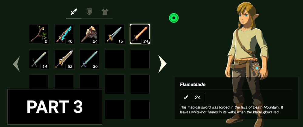
After the second part our interface should look like this.

Items actions
Creating the modal

We are going to start by creating a Modal component in order to interact with the item selected. The modal will provide the equip and drop actions. For this step we will display the modal when either a click or the enter key is pressed on a selected item. The actions will be handled later on, we can close the modal instead when they are selected. We will also handle keyboard navigation inside the modal actions and create a useClickOutside hook to close the modal when we click elsewhere.
Notes
We also must not forget to reset the focus when the modal is closed to keep the interface navigable with the keyboard.
Solutions
In the first commit below, only the keyboard is handled to open the modal. The onClick handle is done in the second commit.
Handling modal actions
We are now going to handle the equip and drop actions inside the modal.
For the equip feature we have some requirements. Link can have equip at the same time the following items:
- 1 Weapon
- 1 Shield
- 3 Armors:
- 1 Helm
- 1 Armor
- 1 Greaves

We can also add some visual indicators to show that an item is equipped like a radial background in the item cell and a blue bar inside the ItemInformation component. The blue color should be defined in our Tailwind config file.

For the data structure of our new state we can use for instance an object with the item.category string as key and the item data as value.
{
  [key: string]: ItemType
}
The drop feature should be simpler, we just want to remove the item selected and add an empty item at the end instead.
Solutions
Handling items with special bonus

We are now going to handle the bonus for armor's items. To do so we have to:
1) Display the bonus icon of an item inside its cell
2) Compute all the active bonus based on what items are equipped
3) Display the active bonus, with a new component, inside the right column
For the first step we need to create a BonusIcon component which takes for example a bonusType as props and returns the appropriate bonus icon (fire, swimming or climbing). Then we can use this component inside the Item component.
For the second step we need to create a state to store the active bonus. These bonuses will be updated whenever the items equipped change. We can use a useEffect hook for that. For the data structure of our new bonus state it could look like that (if you are using TS, otherwise define key as usual):
{
   [ItemsBonusType.FIRE]: 0,
   [ItemsBonusType.SWIMMING]: 0,
   [ItemsBonusType.CLIMBING]: 0,
}
For the final step we are going to create two new components BonusBox and BonusList.
-
BonusBoxwill display aBonusIconand little bars, up to a max of 3, to show how many items which have this bonus type are equipped. -
BonusListwill receive the data we've created on step 2 and display a bonus for each of the bonus types.
Solutions
Adding little details
Sounds
To add sounds to our interface we are going to use the handy use-sound hook from Joshua Comeau.
The sounds has been added in the repository. There is one for selection (arrow keys, click) and other one for actions (equip, drop). The sounds should be playable from anywhere inside the app so we should create a new context for that. We might need to create a wrapper for our main App component for the new sound context.
Then we should use the sounds wherever it feels necessary.
Solutions
Endurance gauge

This is going to be a small step but details matter. We are going to display an endurance gauge with css only.
We are going to need two divs, one for the outer circle and one for the inner circle. To create the circle effect we just just have to apply a border-radius: 50% to them.
Notes
It might be easier to create a custom css file for this rather than add all missing values to Tailwind, since we're not going to need them elsewhere.
Solutions
Full durability star

For the final touch we are going to add a sparkle animation for items with full durability (items with the isNew property in the dataset).
Like we've done before we need to convert the sparkle SVG from the asset folder with SVGR.
After that we need to create an animation, still with framer-motion, to rotate and scale the sparkle at the same time and infinitely.
Ressources
- Joshua Comeau has written a great article on the subject.
Solutions
Wrapping up
Wow we're finally done with the ZeldaUI, congrats for completing it !
I hope that you learned new things and that you had fun at the same time.
If you're interested, I'll be sending updates on the new GameUI I'll be working on here: GameUIonWeb newsletter. I look forward to it, it will be a ton of fun I think.
If you have any ideas or feedback you can send them here gameui.on.web@gmail.com, I will gladly try to address them.
See you then !


Top comments (2)
Thank you very much for this tutorial! I discovered a lot of things and it was fun to do. Keep going!
Glad you like it :)