In this article series we'll learn how to replicate the menu inventory interface of Zelda: Breath Of The Wild on the web !
Click on the image below to check the final demo:
Articles structure
This will be a series of 3 articles:
- PART1: Setup the Item Grid + Adding navigation + Selection Animation
- PART2: Adding pagination + page transition animation + display additional items data
- PART3: Handling actions with a modal + Handling items with bonus + new item animation + add sound
Target audience:
Intermediate Front-end developer.
If you are more experienced you might not learn much (at least for part 1) but it might still be an interesting exercise to do.
Why doing that ?
I find GameUI very inspiring, they share different problems than web interfaces and also similar ones. They are usually designed to not get in the way of a player's experience of a game (Zelda BOTW is a perfect example of that). Web is not much different in that regard. When we design a website we're actually building an experience, the interface is just the way to interact with the experience.
Also GameUI are often filled with a lot of little details, these details are not always meant to be noticed at first glance yet they amount for a significant part of an enjoyable interface.
About this interface
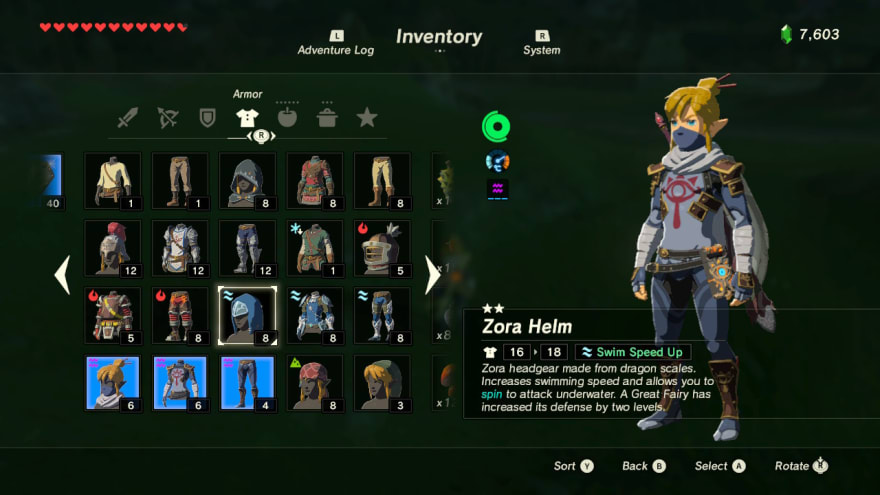
screenshot from interfaceingame.com
The interface is basically a two layout column.
- The first column contains a grid of items grouped by categories.
- The second column is used to display information about the item selected.
There are a lot of animations on the interface that all serve a purpose:
- arrows moving in and out the edge of the selected items
- arrows at the horizontal edge of the grid to indicate that you can navigate between categories
- when you change the selected item, the item description is typed progressively to catch your eye on the fact that these data have changed
- items that are new (max durability) have a little shiny star. This animation is really subtle compare to the other, because it concerns a detail about the item
The first 3 animations, which are the most visible, act as signifiers (This a UX term that comes from Donald Norman, the author of The design of everyday thing), and helps the player understand the actions he can do on the interface.
About the format
At first I thought of just providing some code samples with explanations but I don't think it would have provided much value.
You might have come to realize that we, as developper, learn best by actively doing something. That's why this series will actively encourage you to code your own version of the Zelda BOTW interface.
I'll give you a goal to reach at each step and provide leads for realizing it.
If you're stuck or if you just want to keep reading, the solutions will be provided at each step in separate gists.
I have setup a based repository with all the ressources to get you started immediately:
 flagrede
/
zelda-botw-starter
flagrede
/
zelda-botw-starter
Template for reproducing the Zelda BOTW inventory interface
Zelda BOTW starter

Complete demo
https://www.gameuionweb.com/zelda-botw
Articles links:
Stack
- React
- Tailwind
- Framer-motion (beta)
Useful links for Tailwind:
Credits
- Items Data: Zelda Gamepedia
- Font: Reddit user /75thTrombone
The repository is set up with Typescript but no obligation here, you can use either ts or js as you prefer.
Prior requirements and notes about technologies used
This articles series is based on the following stack:
- ReactJS and leverage some libraries of its ecosystem
- Some prior knowledge is expected but nothing advanced
- TailwindCSS
- No prior knowledge expected, we'll introduce it briefly if you are not familiar with it.
- Framer-motion:
- This is the main library used for animation, no prior knowledge expected
Tailwind quick introduction
You can skip this part if you're already familiar with Tailwind

Tailwind is a CSS utility framework, it provides a set of css classes with low responsability like w-full for width: 100% or flex for display: flex.
These classes are generated based on a JS configuration file. In this file you define design tokens like color, spacing, ... and then tailwind will generate all the css classes based on the design constraints you defined.
You can find the structure of this file here: Default configuration
I choose Tailwind for the article series because it allows me to prepare the design configuration upfront so you can focus on the most interesting part.
Also I will be able to put tailwind classes needed directly on schemas provided in the article to make implementation even easier.
If this is your first time with tailwind you could use this cheat sheet to help you find class at the beginning: https://nerdcave.com/tailwind-cheat-sheet
I also strongly recommend installing a plugin to get autocompletion on tailwind classes (see starter readme for the links).
Starting with the layout
We're going to start by creating the base layout of our interface.
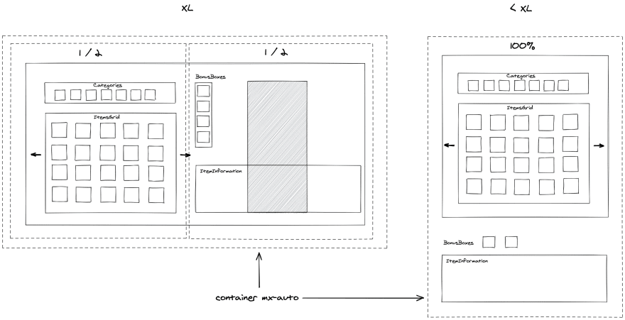
What we want here is a responsive layout with the following constraints:
- Extra large screen (XL): a two columns layout column, with each column taking 1/2 of the screen.
- below extra large screen (<XL): there should only be one column taking full width.
- The layout should be contained inside a centered responsive container.
Once your layout is done you can add the bg-zelda-darkGreen class to your main div and we're good for that part.
Ressources:
Solution:
https://gist.github.com/flagrede/e440ac5c56f21ef9b9db37d1c780ad20
Adding the items grid
We'll now create our ItemsGrid and Item components.
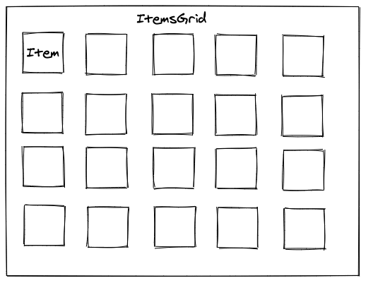
We want to create a 5 columns Grid, with css-grid, which reduces to 3 columns on mobile, that displays an Item component in each cell.
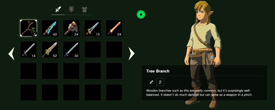
To create the Item component we will need to take a look at the data available in src/data/items.js. An item data looks like this:
    {
      name: "Tree Branch",
      category: "weapon",
      icon: "/zelda-botw/items/weapons/BotW_Tree_Branch_Icon.png",
      value: "2",
      isNew: true,
      description:
        "Wooden branches such as this are pretty common, but it's surprisingly well-balanced. It doesn't do much damage but can serve as a weapon in a pinch.",
    }
For now our component will just have to display its icon and value and also his name for the image title.
Our item should look like this:

There are 3 main categories of items in the dataset weapons, shields and armors. We need to display only one category for now so we can start by taking the weapons items for example. We can create a getItems function to retrieve that group and fill the rest of the array, with an empty item object, to reach the number of cells wanted.
Ressources:
Solution:
Item: https://gist.github.com/flagrede/dc21859cc3020454cd1dc3c6f5afabdb
ItemsGrid: https://gist.github.com/flagrede/f752e3e2de8cbb6a7edf1609dc42f9b7
getItems: https://gist.github.com/flagrede/4471044563611d572707c96546d64635
Items selections
Now we want to be able to select an item by clicking on it by applying the following classes.

Our app structure should look like this at this point:
<App>
  <ItemsGrid>
    <Item>
We will need to:
- store the index position of the selected item using React.useSate in App component
- create a context with React.createContext to store the selectedItem position and the setSelectedItem from the previous useState
- Retrieve the context value inside the Item component using useContext hook.
- Activate the selected classes from above using classnames utils and the value from the context.
Ressources:
Solution:
https://gist.github.com/flagrede/d0627032cb459166dd454110337a1ab1
Keyboard navigation
For this part we will have to convert the index position of an item to a 5x4 matrix position and another one to revert it.
The grid position should be like this:

So we will need a method that convert for instance 6 to {x:1 ,y:1}
And another method that convert {x:1 ,y:1} to 6
The first method signature should be:
-
(index: number) => {x:number, y:number}
The second method signature should be:
({x:number, y:number}) => number
We will then need four methods to compute the new position base on the direction goUp, goRight, goLeft, goBottom
I strongly recommend doing tests for these methods, but no obligation here.
Test example:
it("should convert 6 to x:1, y:1 position", () => {
  // Given
  const index = 6;

  // When
  const result = convertIndexToPosition(index);

  // Then
  expect(result).toEqual({ x: 1, y: 1 });
});
Finally a handleKeyPressed function inside the App component to handle the behaviour to execute based on the key pressed.
Note: the keyboard navigation is expected to work only for the 5 columns grid (since we have 3 columns for the mobile layout).
Ressources:
Solution:
- keyboardNavigation: https://gist.github.com/flagrede/dbce8e6be44e39f37a9f8e459a39f28c
- App: https://gist.github.com/flagrede/58c2bd6dfceda4861be0da90cf099c50
- Tests: https://gist.github.com/flagrede/72d64e3db9634d5b4cc10f37a9f220ee
Animation

To close this first part we'll add some animation with framer-motion.
We will now add triangles at the edge of the selected item and animate them.
The triangles will be done using css. The css classes to create the triangles are already available, you have zelda-botw-triangle-up and zelda-botw-triangle-bottom.
We will need to create two components:
A Triangle component with the following props:
type Props {
  animateParams: {
    rotate: string,
    x: [number, number, number],
    y: [number, number, number]
  },
  className: string
}
-
rotateshould be something like"-10deg" -
xshould be something like[8, 2, 4], it will animate the triangle on the x axis through the values provided in the array. The values given here are random, I let you find the right ones. -
ysame axbut for theyaxis -
classNamewill be used to apply a list of css classes
A TrianglesBox component that has no props but display 4 Triangle components.
- To position the triangles we can apply a position
absoluteon them and positionrelativeon parentItem. To animate thetrianglecomponent we will have to use themotionapi from framer-motion
import { motion } from "framer-motion";

const DummyComponent ({ animateParams }) => (
  <motion.div
    animate={animateParams}
  />
);
We will also need to apply a transition parameter to motion.div to obtain the desired effect.
Ressources:
Solution:
- Triangle component:
https://gist.github.com/flagrede/8143023838936fb4b7cf81eae1c52d54
- TrianglesBox component:
https://gist.github.com/flagrede/9587f518c4cf7f8ca991c63a8144b75b
What's next
Congratulations for completing the first part, I hope you enjoyed it !
On part 2 we will implement the pagination between the items categories, the page transition animation and display additional data about the items.
If you encountered any issues or if you have feedback let me know here or on twitter, I will gladly try to address them !
Notes
All the schemas were done using Excalidraw. Thanks to the team for providing such a great tool for free.


Top comments (14)
Such a fun idea for a tutorial, I love it ✨
This is great!
This is so excellent, Florent. Great concept and execution.
This tutorial and the whole idea of Game UI on web is fire!!!!!
I really like how you built requirements style tutorial that aren't code along but more like: Here is requirements and here are tips how you should try to implement it. Great job, waiting for more ;-)
😮👌🔥
Love it!!!! :D Massive Kudos ^^
Awesome idea! Do you have the complete source code somewhere? I find it a bit difficult to follow with only the gists.
Thanks ! I will provide "checkpoints" branch on the starter repository in the next two articles. The full code source will available at the end of the article series.
I manage to finish the checkpoint branch for part 1 today, it is here if needed: github.com/Flow11/zelda-botw-start...
Big thanks for the warm feedbacks !
I have already started to work on part 2, hoping to release it in the coming weeks.
It great.
Really good!
This can be done with react-native too?
Yes but probably not with the same stack. I'm not sure that framer-motion is supported on RN.