
For this post we will be working with information about the bike stations that TFL (London's public transport system) makes available throguh an API; I have already downloaded this information and it looks like this:
| id | name | lat | lon | bikes | empty_docks | docks | query_time | proportion |
|---|---|---|---|---|---|---|---|---|
| BikePoints_489 | Christian Street,... | 51.5131 | -0.064094 | 8 | 26 | 34 | 2022-01-30 07:39:00 | 0.235294 |
| BikePoints_591 | Westfield Library... | 51.5061 | -0.224223 | 26 | 0 | 27 | 2022-01-30 07:39:00 | 1 |
| BikePoints_437 | Vauxhall Walk, Va... | 51.4881 | -0.120903 | 22 | 3 | 27 | 2022-01-30 07:39:00 | 0.888889 |
| BikePoints_165 | Orsett Terrace, B... | 51.5179 | -0.183716 | 13 | 2 | 15 | 2022-01-30 07:39:00 | 0.866667 |
| BikePoints_317 | Dickens Square, B... | 51.4968 | -0.093913 | 32 | 0 | 32 | 2022-01-30 07:39:00 | 1 |
From this dataframe, which I am going to name in the code cycles_info, what interests me are only the columns: lat and lon, which is the location of each of the stations and the column proportion that has a range [0, 1], where 0 indicates that the station has all its docks available and 1 means the station is full of cycles
In addition to having a geographical reference of the location of each of these points, I will use a map (in vector a format called Shapefile) of London; I found this file on the London Datastore website.
A bit about the format of this post, this time I will gradually transform the graph until I reach the final result, which looks more or less like this:

If you are in a hurry and want to see the final code, you can just scroll to the bottom of the post. If you want to know how I got to that code, read on.
The object oriented API
I have always liked to use the matplotlib object-oriented API as much as possible, in addition to being familiar with this programming paradigm, using this API allows you to customize the plots to the maximum.
For our purposes we will start by creating an instance of Figure and an instance of Axes:
fig = plt.Figure(figsize=(6, 4), dpi=200, frameon=False)
ax = plt.Axes(fig, [0., 0., 1., 1.])
fig.add_axes(ax)
This will create an empty plot:

Geopandas y shapefiles
Now let's ipen our .shp file, it can be ploted on the ax we recently created:
london_map = gpd.read_file("shapefiles/London_Borough_Excluding_MHW.shp").to_crs(epsg=4326)
london_map.plot(ax=ax)
The to_crs methods re-maps the geospatial info to a different coordinate reference system, in this case epsg=4326 is the coordinate system we know as latitude and longitude.
The result of plotting the map in this way looks like this:

London begins to take shape.
Placing the stations
Now that we have our map, the next step is to place the bike stations, for this I will use the seaborn library, and a scatter plot:
sns.scatterplot(y="lat", x="lon", hue="proportion", data=cycles_info, ax=ax)
For the scatterplot we specify which column of the data frame to use for the x and y axes, we are also telling it where to take the color for each of the points, we do this through the argument hue, remember that the column proportion goes from 0 to 1 . To finish, we tell it from which data frame it should get the information and in which axes it should graph:
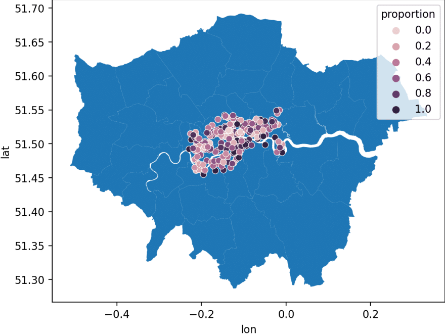
Still not looking great, let's move on.
Zooming in
Do you realize the inequality in London? bicycles only cover the central area of the city... but hey, that's another topic.
To make sure that our information is a little easier to consume, we are going to center the graph in the area where all the information is concentrated, we will use the methods set_ylim and set_xlim (since we are at it, we are going to remove the axes from our graph):
ax.set_ylim((min_y, max_y))
ax.set_xlim((min_x, max_x))
ax.set_axis_off()
The min_y and min_x correspond to the minimum and maximum latitude, and min_x and max_x correspond to the same values, but for longitude. The result is this:

We are approaching someting neater.
Coloring the map
The original map colors are not so nice, it even seems that what is land is water and that the Thames is empty.
To color the river blue I will use the method fill_between and the coordinates obtained previously. For the map we have to change the arguments of plot in our geodata frame:
ax.fill_between([min_x, min_y], min_y, max_y, color="#9CC0F9")
london_map.plot(ax=ax, linewidth=0.5, color='#F4F6F7', edgecolor='black')
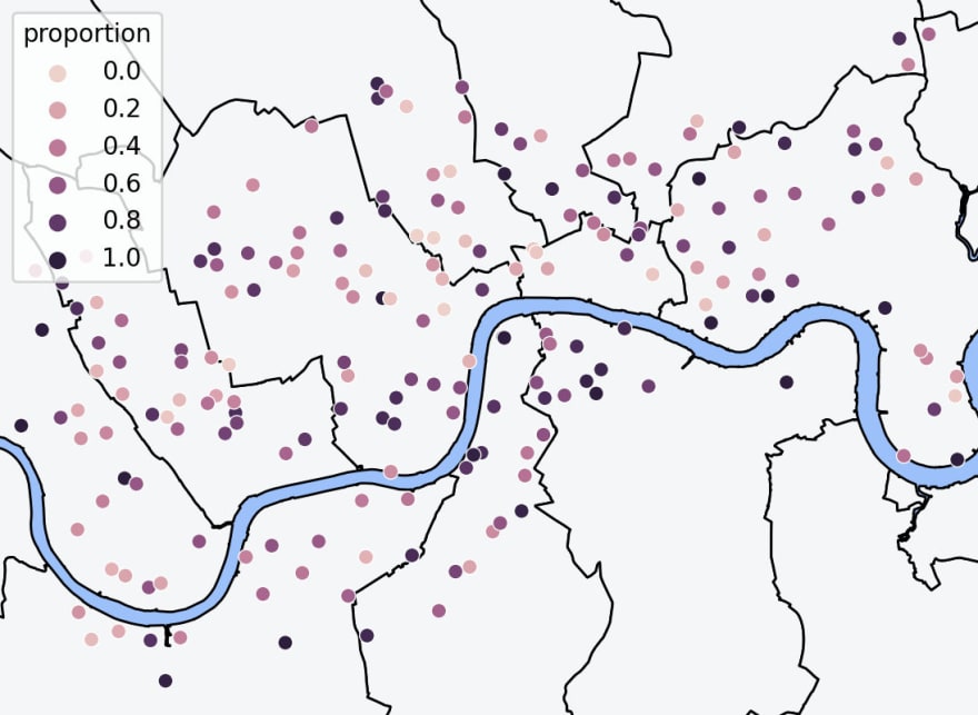
Changing the stations coloring
Now that we changed the color of the map, I feel that the color of the stations does not stand out, right? – we are going to change those purple colors for some red tones. For this we will use a matplotlib color map known as OrRd , this palette will become an argument to the seaborn scatterplot method:
cmap = matplotlib.cm.get_cmap("OrRd")
sns.scatterplot(
        y="lat", x="lon", hue="proportion", edgecolor="k", linewidth=0.1, palette=cmap, data=cycles_info, s=20, ax=ax
)
The only change we made to the scatterplot method was the palette argument, the end result is:
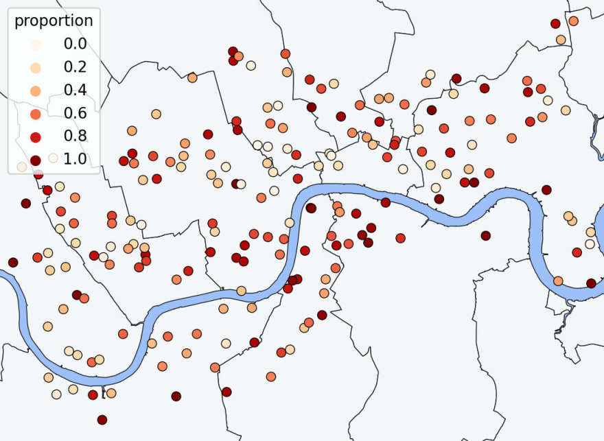
We still have that huge (and invasive) legend...
Custom legend
Instead of the default legend, I want to use something more "sophisticated", something that is more easy on the eyes. If you remember the values go from 0 to 1, the lighter the color is, the closer to 0, imagine a scale like this:
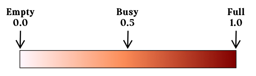
Those three levels are exactly what I want to show. To get the correct color values we are going to create an array of (value, label); then we can use the cmap we created in the previous step to get the right color. Finally, we create as many instances of Line2D as many elements we want within the legend.
values = [(0.0, "Empty"), (0.5, "Busy"), (1.0, "Full")]
legend_elements = []
for gradient, label in values:
        color = cmap(gradient)
    legend_elements.append(
        Line2D(
            [0],
            [0],
            marker="o",
            color="w",
            label=label,
            markerfacecolor=color,
            markeredgewidth=0.5,
            markeredgecolor="k",
        )
    )

ax.legend(handles=legend_elements, loc="lower right", prop={"size": 6}, ncol=len(values))
The final line replaces our old-fashioned legend with the one we just created; with loc we specify that we want it to appear at the bottom right, with prop={"size": 6} we indicate the size of the labels and ncol tells matplotlib that the legend is made up of 3 columns, I do this so that the legend presents its values horizontally:
Ultimate code
from typing import Tuple

import geopandas as gpd
import matplotlib.pyplot as plt
import pandas as pd
import seaborn as sns
from matplotlib.colors import Colormap
from matplotlib.lines import Line2D

PADDING = 0.005

def prepare_axes(ax: plt.Axes, cycles_info: pd.DataFrame) -> Tuple[float, float, float, float]:
    min_y = cycles_info["lat"].min() - PADDING
    max_y = cycles_info["lat"].max() + PADDING
    min_x = cycles_info["lon"].min() - PADDING
    max_x = cycles_info["lon"].max() + PADDING
    ax.set_ylim((min_y, max_y))
    ax.set_xlim((min_x, max_x))
    ax.set_axis_off()
    return min_x, max_x, min_y, max_y

def save_fig(fig: plt.Figure) -> str:
    fig.patch.set_facecolor("white")
    map_file = "/tmp/map.png"
    fig.savefig(map_file)
    return map_file

def set_custom_legend(ax: plt.Axes, cmap: Colormap) -> None:
    values = [(0.0, "Empty"), (0.5, "Busy"), (1.0, "Full")]
    legend_elements = []
    for gradient, label in values:
        color = cmap(gradient)
        legend_elements.append(
            Line2D(
                [0],
                [0],
                marker="o",
                color="w",
                label=label,
                markerfacecolor=color,
                markeredgewidth=0.5,
                markeredgecolor="k",
            )
        )
    ax.legend(handles=legend_elements, loc="lower right", prop={"size": 6}, ncol=len(values))

def plot_map(cycles_info: pd.DataFrame) -> str:
    fig = plt.Figure(figsize=(6, 4), dpi=200, frameon=False)
    ax = plt.Axes(fig, [0.0, 0.0, 1.0, 1.0])
    fig.add_axes(ax)

    # Calculate & set map boundaries
    min_x, max_x, min_y, max_y = prepare_axes(ax, cycles_info)

    # Get external resources
    cmap = plt.get_cmap("OrRd")
    london_map = gpd.read_file("shapefiles/London_Borough_Excluding_MHW.shp").to_crs(epsg=4326)

    # Plot elements
    ax.fill_between([min_x, max_x], min_y, max_y, color="#9CC0F9")
    london_map.plot(ax=ax, linewidth=0.5, color="#F4F6F7", edgecolor="black")
    sns.scatterplot(
        y="lat", x="lon", hue="proportion", edgecolor="k", linewidth=0.1, palette=cmap, data=cycles_info, s=25, ax=ax
    )

    set_custom_legend(ax, cmap)

    map_file = save_fig(fig)

    return map_file
And that is it.
This is how the repo looks like by the end of this repo.
Remember that you can find me on Twitter at @feregri_no to ask me about this post – if something is not so clear or you found a typo. The final code for this series is on GitHub and the account tweeting the status of the bike network is @CyclesLondon.


Top comments (0)