A 100% Stacked Column Chart is one of the basic chart types. This chart will show the relative percentage of multiple data series in stacked columns. It can display the percentage-of-the-whole of each group and are plotted by the percentage of each value to the total amount in each group. In this guide, we will see how to create a 100% Stacked Column Chart in Excel Office 365.
Create 100% Stacked Column Chart:
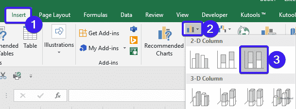
To insert a 100% stacked column chart in the worksheet, do as follows.
- Open the workbook where you want to create the chart.
- Then, select the data range that you want to chart based on.

- On the Insert tab, select the 100% Stacked Column Chart option in the Charts section.
- You will get the chart based on your data as shown in the below screenshot.

Pros and Cons:
Pros:
- Multiple categories are placed in a compact space.
- It can show part-to-whole change over time.
Cons:
- It is difficult to compare all series except the first.
- Visually complex.
A Brief description:
In this post, you can quickly understand the steps to create a 100% Stacked Column Chart in Excel Office 365. Leave your feedback in the comment section. Thanks for visiting Geek Excel. Keep Learning!


Top comments (0)