Welcome to this interesting tutorial on creating a real-time analog clock with HTML, CSS, and JavaScript. Another interesting part of this tutorial is that no library will be used, we are making it with pure JavaScript. Before we move on, you need to have proficient knowledge of HTML, CSS, and JavaScript, this enables you to understand the step-by-step code as we move one.
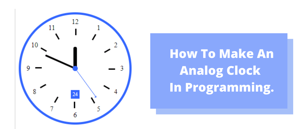
At the end of this tutorial, you will be able to build an awesome working analog clock like this .
Let's get started!
<!-- Html markup -->
<!DOCTYPE html>
<html>
  <head>
    <title>Analog Clock</title>
  </head>
  <body></body>
</html>
Creating the clock number
An analog clock has a 12 digitsso we are going to create a twelve <div>'s with class="clock-number" and each <div> will be given another class according to its nth position. The first <div> will be class="clock-number num1" and the second <div> will be class="clock-number num2" till it reaches class="clock-number num12".
<!DOCTYPE html>
        <html>
          <head>
            <title>Analog Clock</title>
          </head>
          <body>
            <div class="clock-container">
              <div class="clock-number num1"></div>
              <div class="clock-number num2"></div>
              <div class="clock-number num3"></div>
              <div class="clock-number num4"></div>
              <div class="clock-number num5"></div>
              <div class="clock-number num6"></div>
              <div class="clock-number num7"></div>
              <div class="clock-number num8"></div>
              <div class="clock-number num9"></div>
              <div class="clock-number num10"></div>
              <div class="clock-number num11"></div>
              <div class="clock-number num12"></div>
            </div>
          </body>
        </html>
Inserting the clock number
<!DOCTYPE html>
        <html>
          <head>
            <title>Analog Clock</title>
          </head>
          <body>
            <div class="clock-container">
              <div class="clock-number num1"><div class="">1</div></div>
              <div class="clock-number num2"><div class="">2</div></div>
              <div class="clock-number num3"><div class="">3</div></div>
              <div class="clock-number num4"><div class="">4</div></div>
              <div class="clock-number num5"><div class="">5</div></div>
              <div class="clock-number num6"><div class="">6</div></div>
              <div class="clock-number num7"><div class="">7</div></div>
              <div class="clock-number num8"><div class="">8</div></div>
              <div class="clock-number num9"><div class="">9</div></div>
              <div class="clock-number num10"><div class="">10</div></div>
              <div class="clock-number num11"><div class="">11</div></div>
              <div class="clock-number num12"><div class="">12</div></div>
            </div>
          </body>
        </html>
Inserting Other Important Elements
Now, we will be inserting elements like the second reading and the date:
<!DOCTYPE html>
        <html>
          <head>
            <title>Analog Clock</title>
          </head>
          <body>
            <div class="clock-container">
              <!-- Current day-->
              <div class="days"></div>
              <!-- Second reading-->
              <div class="reading"></div>
              <!-- Clock number-->
              <div class="clock-number num1"><div class="">1</div></div>
              <div class="clock-number num2"><div class="">2</div></div>
              <div class="clock-number num3"><div class="">3</div></div>
              <div class="clock-number num4"><div class="">4</div></div>
              <div class="clock-number num5"><div class="">5</div></div>
              <div class="clock-number num6"><div class="">6</div></div>
              <div class="clock-number num7"><div class="">7</div></div>
              <div class="clock-number num8"><div class="">8</div></div>
              <div class="clock-number num9"><div class="">9</div></div>
              <div class="clock-number num10"><div class="">10</div></div>
              <div class="clock-number num11"><div class="">11</div></div>
              <div class="clock-number num12"><div class="">12</div></div>
            </div>
          </body>
        </html>
Styling the clock
The CSS is inserted in the <style> in the head section.
body{
            animation-name: clock-animation;
            animation-iteration-count: infinite;
            animation-duration: 6s;
            width: 100vw;
            height: 100vh;
            display: flex;
            justify-content: center;
            align-items: center;
            font-size: 20px;
            overflow-x: hidden;
            font-family: cursive;

        }

        @keyframes clock-animation{
        0%{
        background:#3e5afb;


        }
        50%{
            background:#3e5;

        }

            100%{
                background: yellow;
            }
        }
        .clock-container{
            width:350px;
            height: 350px;
            border: 6px solid purple;
            border-radius: 50%;
            position: relative;
            background:#fff;

        }
        .clock-container::after{
            content: "";
            position: absolute;
            width: 15px;
            height: 15px;
            background: purple;
            left: 50%;
            top: 50%;
            transform: translate(-50%,-50%)  ;border-radius: 50%;
        }
        .clock-number{
            position: absolute;
            width: 100%;
            height: 100%;
            text-align: center;
        }
        .clock-number:after{
            content:"";
            position:absolute;
            height:13px;
            width:3px;
            top:13%;
            background:#000;

        }

        .clock-number> div{
            padding: 12px;
        }
        .num1{
            transform: rotate(30deg)
        }

        .num1 > div{
            transform: rotate(-30deg)
        }
        .num2{
            transform: rotate(60deg)
        }

        .num2 > div{
            transform: rotate(-60deg)
        }
        .num3{
            transform: rotate(90deg)
        }

        .num3 > div{
            transform: rotate(-90deg)
        }
        .num4{
            transform: rotate(120deg)
        }

        .num4 > div{
            transform: rotate(-120deg)
        }
        .num5{
            transform: rotate(150deg)
        }

        .num5 > div{
            transform: rotate(-150deg)
        }
        .num6{
            transform: rotate(180deg)
        }

        .num6 > div{
            transform: rotate(-180deg)
        }
        .num7{
            transform: rotate(210deg)
        }

        .num7 > div{
            transform: rotate(-210deg)
        }
        .num8{
            transform: rotate(240deg)
        }

        .num8 > div{
            transform: rotate(-240deg)
        }
        .num9{
            transform: rotate(270deg)
        }

        .num9 > div{
            transform: rotate(-270deg)
        }
        .num10{
            transform: rotate(300deg)
        }

        .num10 > div{
            transform: rotate(-300deg)
        }
        .num11{
            transform: rotate(330deg)
        }

        .num11 > div{
            transform: rotate(-330deg)
        }

        .num12{
            transform: rotate(360deg)
        }

        .num12 > div{
            transform: rotate(-360deg)
        }

        .clock-hand{
            width: 100%;
            height: 100%;
            position: absolute;
        }
        .clock-hand > div{
            left: 50%;
            bottom: 50%;
            transform: translateX(-50%);
            position: absolute;
            border-radius:12px;
        }
        .second-hand{
            height: 32%;
            width: 1px;
            background: purple;
        }
        .minute-hand{
            height:30%;
            width: 4px;
            background: #000;
        }

        .hour-hand{
            height: 20%;
            width:8px;
            background: #000;
        }
        .second-hand::after{
            position: absolute;
            content: "";
            border-style: solid;
            border-width: 4px;
            border-color: transparent transparent purple transparent;
            left: 50%;
            transform: translateX(-50%);
            top:-6%;
        }

        .current-day{
            position:absolute;
            font-size:12px;
            font-weight:bold;
            left:50%;
            transform:translateX(-50%);
            top:25%;
        }
        .current-seconds{
            position:absolute;
            font-size:12px;
            font-weight:bold;
            left:50%;
            transform:translateX(-50%);
            bottom:25%;
            background:purple;
            color:#fff;
            padding:4px;
        }
Now we are done with the HTML part and also done styling the HTML
document, let's move into building the analog clock engine.
The JavaScript Code
It is advisable you place your script tag precisely before the closing tag of the <body>.
Furthermore, the JavaScript var and let will be used to define a variable in this lesson, there we go:
let secondHand=document.querySelector("#sec");
        let minHand=document.querySelector("#min")
        let hourHand=document.querySelector("#hr")


        setInterval(clockRotating,1000)

        function clockRotating(){
            var date=new Date();
            var getSeconds=date.getSeconds()/60;
            var getMinutes=date.getMinutes()/60;
            var getHours=date.getHours()/12

            secondHand.style.transform="rotate("+getSeconds*360 + "deg)"
            minHand.style.transform="rotate("+getMinutes*360 + "deg)"
            hourHand.style.transform="rotate("+getHours*360 + "deg)"

            document.querySelector(".current-day").innerHTML=date.toDateString()
            document.querySelector(".current-seconds").innerHTML=date.getSeconds()

        }
Boom, you should have a working Analog clock made with JavaScript.
The Full Code
If you are lost the full code is written below
<!DOCTYPE html>
        <html lang="en">
        <head>
           <style>

        body{
            animation-name: clock-animation;
            animation-iteration-count: infinite;
            animation-duration: 6s;
            width: 100vw;
            height: 100vh;
            display: flex;
            justify-content: center;
            align-items: center;
            font-size: 20px;
            overflow-x: hidden;
            font-family: cursive;

        }

        @keyframes clock-animation{
        0%{
        background:#3e5afb;


        }
        50%{
            background:#3e5;

        }

            100%{
                background: yellow;
            }
        }
        .clock-container{
            width:350px;
            height: 350px;
            border: 6px solid purple;
            border-radius: 50%;
            position: relative;
            background:#fff;

        }
        .clock-container::after{
            content: "";
            position: absolute;
            width: 15px;
            height: 15px;
            background: purple;
            left: 50%;
            top: 50%;
            transform: translate(-50%,-50%)  ;border-radius: 50%;
        }
        .clock-number{
            position: absolute;
            width: 100%;
            height: 100%;
            text-align: center;
        }
        .clock-number:after{
            content:"";
            position:absolute;
            height:13px;
            width:3px;
            top:13%;
            background:#000;

        }

        .clock-number> div{
            padding: 12px;
        }
        .num1{
            transform: rotate(30deg)
        }

        .num1 > div{
            transform: rotate(-30deg)
        }
        .num2{
            transform: rotate(60deg)
        }

        .num2 > div{
            transform: rotate(-60deg)
        }
        .num3{
            transform: rotate(90deg)
        }

        .num3 > div{
            transform: rotate(-90deg)
        }
        .num4{
            transform: rotate(120deg)
        }

        .num4 > div{
            transform: rotate(-120deg)
        }
        .num5{
            transform: rotate(150deg)
        }

        .num5 > div{
            transform: rotate(-150deg)
        }
        .num6{
            transform: rotate(180deg)
        }

        .num6 > div{
            transform: rotate(-180deg)
        }
        .num7{
            transform: rotate(210deg)
        }

        .num7 > div{
            transform: rotate(-210deg)
        }
        .num8{
            transform: rotate(240deg)
        }

        .num8 > div{
            transform: rotate(-240deg)
        }
        .num9{
            transform: rotate(270deg)
        }

        .num9 > div{
            transform: rotate(-270deg)
        }
        .num10{
            transform: rotate(300deg)
        }

        .num10 > div{
            transform: rotate(-300deg)
        }
        .num11{
            transform: rotate(330deg)
        }

        .num11 > div{
            transform: rotate(-330deg)
        }

        .num12{
            transform: rotate(360deg)
        }

        .num12 > div{
            transform: rotate(-360deg)
        }

        .clock-hand{
            width: 100%;
            height: 100%;
            position: absolute;
        }
        .clock-hand > div{
            left: 50%;
            bottom: 50%;
            transform: translateX(-50%);
            position: absolute;
            border-radius:12px;
        }
        .second-hand{
            height: 32%;
            width: 1px;
            background: purple;
        }
        .minute-hand{
            height:30%;
            width: 4px;
            background: #000;
        }

        .hour-hand{
            height: 20%;
            width:8px;
            background: #000;
        }
        .second-hand::after{
            position: absolute;
            content: "";
            border-style: solid;
            border-width: 4px;
            border-color: transparent transparent purple transparent;
            left: 50%;
            transform: translateX(-50%);
            top:-6%;
        }

        .current-day{
            position:absolute;
            font-size:12px;
            font-weight:bold;
            left:50%;
            transform:translateX(-50%);
            top:25%;
        }
        .current-seconds{
            position:absolute;
            font-size:12px;
            font-weight:bold;
            left:50%;
            transform:translateX(-50%);
            bottom:25%;
            background:purple;
            color:#fff;
            padding:4px;}
           </style>
        </head>
        <body>
            <div class="clock-container">
                <div class="current-day">

                </div>
                 <div class="current-seconds">

                </div>
                <div class="current-seconds"></div>
                <div class="clock-number num1">
                    <div>1</div>
                </div>
                <div class="clock-number num2">
                        <div>2</div>
                    </div>
                <div class="clock-number num3">
                    <div>3</div>
                 </div>
                 <div class="clock-number num4">
                     <div>4</div>
                    </div>
                 <div class="clock-number num5">
                    <div>5</div>
                     </div>
                     <div class="clock-number num6">
                       <div>6</div>
                    </div>
                    <div class="clock-number num7">
                  <div>7</div>
                    </div>
                  <div class="clock-number num8">
                     <div>8</div>
                    </div>
                    <div class="clock-number num9">
                      <div>9</div>
                      </div>
                     <div class="clock-number num10">
                       <div>10</div>
                         </div>
                      <div class="clock-number num11">
                     <div>11</div>
                      </div>
                      <div class="clock-number num12">
                   <div>12</div>
                    </div>
                     <div class="clock-hand" id="sec">
                  <div class="second-hand"></div>
                 </div>
                <div class="clock-hand" id="min">
                 <div class="minute-hand"></div>
                 </div>
               <div class="clock-hand" id="hr">
                 <div class="hour-hand"></div>
                </div>
            </div>

            <script>

            let secondHand=document.querySelector("#sec");
        let minHand=document.querySelector("#min")
        let hourHand=document.querySelector("#hr")


        setInterval(clockRotating,1000)

        function clockRotating(){
            var date=new Date();
            var getSeconds=date.getSeconds()/60;
            var getMinutes=date.getMinutes()/60;
            var getHours=date.getHours()/12

            secondHand.style.transform="rotate("+getSeconds*360 + "deg)"
            minHand.style.transform="rotate("+getMinutes*360 + "deg)"
            hourHand.style.transform="rotate("+getHours*360 + "deg)"

            document.querySelector(".current-day").innerHTML=date.toDateString()
            document.querySelector(".current-seconds").innerHTML=date.getSeconds()

        }
            </script>
        </body>
        </html>
Hope you gain from this lesson? Let me know by commenting below


Top comments (3)
I have made css only analog watches. I used JavaScript only to set the initial time. Take a look codepen.io/istavros/pen/wRRNOx codepen.io/istavros/pen/MZzxaa
Wow - it's cool - Good looking clock
I bet you could do this without javascript, so long as you opened the page at a known time :D