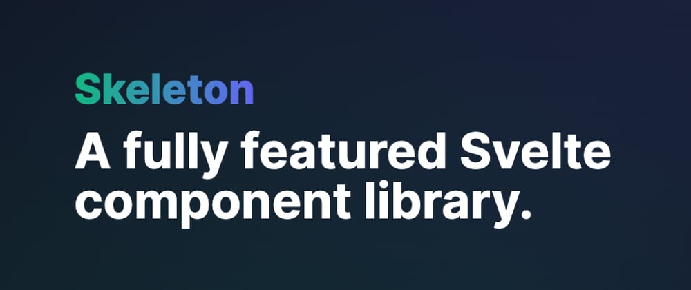
I recently had the privilege of writing an article for Smashing Magazine introducing Skeleton, a new open-source UI component library for Svelte and Tailwind. If you're looking for a quick introduction, I'd recommend starting here:
Smashing Magazine: Meet Skeleton: Svelte + Tailwind For Reactive UIs

However I wanted to go a bit further, as it's not every day you get to hear the origins of the tools we use as frontend developers. I want to share details on how my team and I started the library, explain the challenges faced during development, and of course review the progress made since the public debut. My hope is that this can help inspire others seeking to build and share their own web-based libraries as well.
The Origin of Skeleton
Over the last two years I've worked for a tech startup called Brain & Bones, made up a small team of five individuals. As with most startups you tend to wear a lot of hats, so my job covered everything from tech to design - deciding the tech stack, product design, implementing the frontend applications, guiding development efforts for our platform API, as well as managing two very talented developers.
Day to day, we managed number of web-based applications, which meant our choice in frontend framework had a major impact on our ability to build and maintain the platform for the company. Angular was an obvious choice for me, given I've used it professionally for around 10 years. I've watched it grow from the early v1.x days, through the v2.x launch, and eventually evolving into the mature framework we know today. I'm still a fan of Angular's opinionated design philosophy, as well as Angular Material, their official offshoot of Material Design. The Material aesthetic provides a simple but clean interface, and their component system allows for rapid develop of large scale web-based apps.
Last year we welcome a budding young developer to our team, named Thomas Jespersen. Thomas joined with the mission of improving our QA (quality assurance) and testing efforts, but immediately had interest in expanding into frontend development. So I set aside time and began teaching him everything I could, drawing from my 20 years of experience in the field.
We explored the basics of HTML/CSS/JS, various frontend frameworks like React/Vue/Svelte, with our final goal being an introduction to Angular. However, an interesting thing happened along the way. We had a bit of a revelation after covering Svelte. Like many in the frontend space, we were captivated by Svelte's superb DX (developer experience). We knew our platform relied on Angular, but craved the chance to introduce and use Svelte and SvelteKit (Svelte's app framework) in our production environment. Unfortunately we were unsure how to introduce it at the time.
Fast forward to February of this year and we began the planning phases for our next generation and evolution of our platform. We immediately began brainstorming a means to transition from Angular to Svelte/Kit. However, as we searched for UI libraries to replace Angular Material we came up short. Sure options like Svelte Material UI were available. However, we had growing concerns about the trajectory of Material Design. Material Design v3 hasn't really been a resounding success, having only a small handful of components (even today), and is currently limited exclusively to Android. Even Angular Material, a Google-owned project, has been slow to adopt v3. Progress has been moving at a snail's pace. This left us with a dilemma.
It was at this point we started started toying with the idea of building our own component library. Looking deeper into SvelteKit, we realized it provided a turnkey solution for building and maintaining home grown component libraries using built-in packaging options.
This would make it trivial for us to generate components that could meet the requirements of each of our products, while retaining full control over how they looked and operated. Unfortunately this would require more development effort upfront, but after some internal debate, we decided this was fair trade off in the long term. Thus Skeleton was born!
Seeking Inspiration
While planning our vision for the new library, we began auditing and reviewing every competitor we could find. Searching for inspiration, deciding what components to add, and helping define the conventions we would follow.
Here's a small sample of the libraries we reviewed:
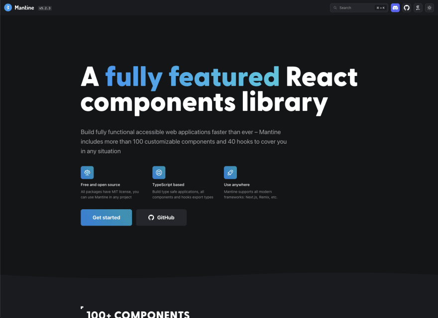
After some time and effort, this process led us to a library called Mantine, a React-focused component library offering a huge set of components, deep customization, all housed within top-notch interactive documentation. This quickly became our go-to source for inspiration and has influenced many of the design decisions for our library, most notably in presentation.
Using Tailwind
We knew right from the start that we wanted take advantage of Tailwind CSS. It's powerful utility-based class system aligned with conventions used in our own project for years, but could help standardize the process. This would allow us to develop a turnkey design system and managed styling both inside our components and throughout each app. The first challenge was how to properly utilize Tailwind within Svelte components. There wasn't a lot of precedence available to draw from other libraries. Many libraries we reviewed opted for either vanilla CSS or preprocessors like SASS.
Plus, we needed a way to handle all styles and customization for components using Tailwind classes. Originally we tried writing all classes inline in the HTML, as is standard practice. However this posed issues with CSS inheritance. Providing a default class in a template, then overwriting with another doesn't always cascade over the original style one might expect.
Through experimentation we came up with a creative approach - we would define all CSS classes in the component script tag, then use a layered or conditional statements to control the classes defined on each element.
In the component script tag we would define our base (read: default) styles for an element as shown:
const let cBase: string = `p-4 space-y-4`;
We would also allow for customizable Tailwind classes to be passed as Svelte component props:
export let background: string = `bg-slate-900`;
export let color: string = `text-white`;
We then created Svelte reactive properties to merge these into a "flat" class string:
$: classesBase = `${cBase} ${background} ${color}`;
By doing this, we concatenate the base and custom prop values and, define the order in in which classes are defined, and also open the door to conditional classes, like so:
export let hover: boolean = true;

$: classesHover = hover ? 'bg-emerald-500' : '';
$: classesBase = `${cBase} ${classesHover}`;
This prevented cramming a ton of conditional logic into the component's HTML template markup. Abstracting this provides a simple and well-define paradigm to follow.
Using JavaScript logic we can intercept and modify our classes, allowing for a deep level of control over presentation. We can even accept single prop values that expand to a set of Tailwind classes:
export let size: string = 'sm'; // small

let cSize: string = '';

switch (size) {
    case ('sm'): cSize = 'p-2 text-sm'; break;
    case ('md'): cSize = 'p-4 text-base'; break;
    case ('lg'): cSize = 'p-5 text-lg'; break;
}

$: classesBase: `... ${cSize}`;
Finally, we append the reactive class value to the element. This keeps our templates clean and reduces the Tailwind class "bloat" that turns many folks away:
<div class={classesBase}>...</div>
One thing to note with this approach, however, is that Tailwind's compiler does NOT allow for dynamically constructed classes. If you try to pass a partial value like color name (ex: emerald) and generate bg-${colorName}-500, this will fail. The Tailwind compiler is looking for the exact string match in each file, but Tailwind reads the value literally and will not recognize this. This was a source of many headaches for us early on, so beware!
Themes
The next challenge we faced was how to properly handle themes. Having to overwrite the same prop value over and over for each component would not scale well. Thankfully Tailwind provides a perfect solution via custom color definitions. These work best with RGBA color values, allowing alpha transparency to be adjusted for each color. In other words bg-emerald-500/40 would mean the color is set to 40% opacity.
To handle theme colors, we generate four uniquely named values:
- Primary - the primary brand color
- Accent - a secondary color for offsets or neutral actions
- Warning - for alerts and critical items
- Surface - a foundation, such as background colors
We hand craft our default theme using Tailwind's default color palette (emerald, indigo, rose, and gray), but converted each color shade from hex to RGBA. These were defined using CSS custom properties (read: CSS variables), and injected into the Tailwind config file via a custom Tailwind plugin. We have since made this process much easier by offering a set of preset themes and theme generator.
This means no colors are hardcoded into components. We draw from each of these sets and apply color styling in logical fashion.
Need to define a Card component background? Use this as your default:
export let background: string = 'bg-surface-800';
Need to style a Button component using your primary branding color? Use this:
export let background: string = 'bg-primary-500';
Dark Mode
Finally, we needed a solution to intelligently adapt each component theme for Tailwind's dark modes. The solution was to balance colors like a weighted scale. We paired colors from either side of the spectrum.
Here's what that looks like visualized:

In execution, the means if you set your body element's light theme background to bg-surface-50, then the dark theme equivalent should be bg-surface-900 to balance. Here's what the CSS looks like in practice:
body { @apply bg-surface-50 dark:bg-surface-900; }
If you want to style a Card component that's slightly elevated (visually) from the background, you use:
export let background: string = 'bg-surface-100 dark:bg-surface-800';
Regardless of what color surface represents, regardless of light or dark mode, the card element always gives the desired effect. Even though this a delicate balancing act, it's still easy to test during development. Just be mindful to review your components in different different themes and with light/dark mode toggled regularly as you progress.
The First Four Months
From February through May, Thomas and I defined these conventions and began building each component. Internally we had a shared list of component needed to satisfy the requirements of our projects. This included Buttons, Cards, Tabs, etc.
By using Svelte, Tailwind, and our design patterns we had produced a majority of the library within the first four months. Unfortunately, as is often the case with startups, we received news that the company would be shutting down and the team would be let go by the end of the month. Obviously this was devastating to hear. We had a wonderful and supportive culture, we were fully invested in the products were were creating, and of course we were excited to get Skeleton off the ground. In some ways this felt like the things were over before they even really began.
However, since the beginning, we had discussed the possibly of making the library open source. We knew we had something that could be beneficial to many Svelte community. However, the library didn't legally belong to us. Luckily Thomas and I have a wonderful working relationship and friendship with the founder of the company. After a bit of a summer break, we came together and agreed to release the library as open source. It was at that point I resumed work on the project, joined soon after by Thomas, we set about opening it to the public.
Launching the Public Beta
At the end of June we added our final polish to the documentation, added the MIT license, and finally set the GitHub repo and NPM package public. We then began promoting and announcing the project within various Svelte-focused communities.
Since launch we've received a slew of useful feedback and positive comments on Reddit and the Svelte Discord. People were asking hard questions, making great suggestions, and generally pretty excited for what we've created. This of course has fueled our ambition to push forward with the project, especially after the delay in May. In some ways it felt like the Phoenix rising from the ashes!
Since the public launch we've put a lot of effort into building up the Skeleton community on Github, Twitter, and Discord. On a whim, I reached to new sources like Smashing Magazine. To our surprise, we received a very pleasant response from Vitaly Friedman. He offered us a chance to write the articled which is now linked at the top of this page. Smashing Magazine has been a huge influence in my career. I've learned a lot about web development from them over the years. Honestly, I'm still kind of shell shocked that this happened at all!
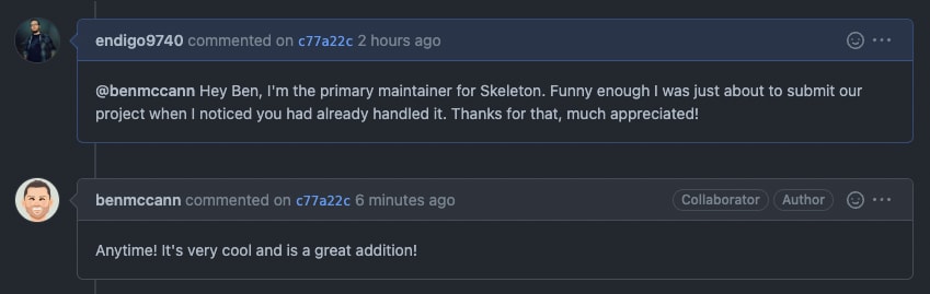
Likewise we've been thrilled with the Svelte community's reaction - being treated to congrats from folks like Ben McCann, the second highest contributor to SvelteKit after Rich Harris (creator of Svelte).
As well as compliments from members of the Astro core team and even a member of the Svelte Sirens. Both are made up of good people and worth a look!
A Bright Future
We continue to push forward with progress on Skeleton, including a large release this week adding a11y improvements and support for Vite and Astro. We're not stopping there though, we have so much more planned and see a bright future for the library.
It's my hope we can continue to to work on Skeleton for as long as possible and build the best UI component library available for Svelte. If you're interested in giving it a try checkout the official documentation here:
https://skeleton.brainandbonesllc.com/
Join us on Github
https://github.com/Brain-Bones/skeleton
Or drop by and say hello on Discord:
https://discord.gg/EXqV7W8MtY
We would be glad to have you and welcome contributions from anyone willing and able! Seriously, thanks to everyone that continues to help make this possible! 🙏


Top comments (0)