Intended Audience
This tutorial is intended for people who have knowledge of HTML and CSS, and who are looking to learn more at an abstract level on how to improve their UI.
Supposing one wanted to display information summarising the details of an upcoming car racing event. One might want it to look like this: (let's call this visual style "notebook")
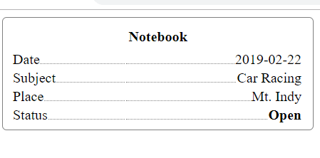
This style of displaying information allows for the readability of information and does not clutter, while at the same time make every row seem connected together.
To explain what I mean, I will compare it with a table.
If one were to create a table to display this information, it might look like this:

In the table, the alternation between grey and white delineates differences in space between the odd row and the even row. This helps the viewer follow a row without ending up in another row. I can look at row Date and end up at the date instead of the subject. However, this same strength is a weakness of this style. It requires separating spaces between each row, which suggests that each row's information is separate from each other. Perhaps you do not want this.
The same problem exists in each row. In each of the rows, the row's subject is demarcated from its object by a line drawn in between. This helps with readability but also creates the feeling of a strict separation between the subject and the object. Perhaps you do not want this.
The boxing up of spaces in a table can also create a feeling of clutter, as boxes take up space.
To address these weaknesses, one can make a design like the first visual I presented. Every row exists in the same space, as there are no differences in shading between each row. To address the problem of reading each row, trailing "....." is placed at the end of the subject leading up to the object. The "..." leads the eyes so that it knows where to end up. Thus, we have a picture where all the rows seem connected together, and the readability issue is solved by trailing "...".
The trailing "..." also resolves the issue of strict demarcation. If you want to create each row so that the subject and object seem connected, "..." gives this more than a straight line separating the two cells. It is kind of like when you're writing a sentence: "I would like ... chocolate ice cream!".
Without any boxing, there is less clutter, hence giving your overall design a sense of more space and openness.
Now that we have explained our understanding of the design, let's start coding!
Before we get to the smart, but harder, solution, let's discuss the easy and not smart solution. Because this "notebook" style is not premade in CSS, it is tempting to simply just take the easy solution of creating a table and for each table row, write, for example, <td> <div>Birthdate..........1966-05-07</div></td>
This solution has a few problems: a) it is much harder to line up every row so that the beginning and end of each row is the same. b) By putting the subject and the object in the same <td>, it fails to capture the intuition that the object and the subject are different. (Remember the purpose of a <td>). c) Manually putting "..." as the text does not capture the intuition that the "..." serves as a way to organise information, not text the way "Birthdate" is text.
Here is the better solution:

Here is the CSS for it:
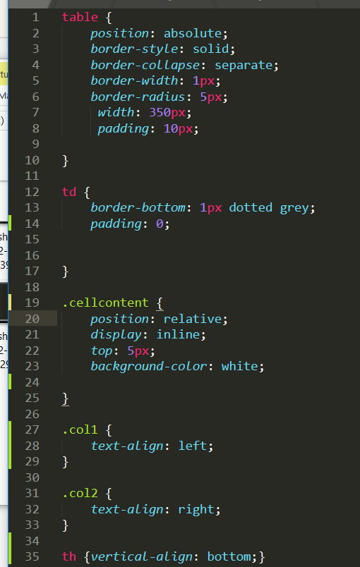
A) By putting the subject in td col1 and object in td col2, it captures the intuition that subject and object are different.
B) By using the <td> bottom border to create the "...", it captures the intuition that the "..." is a design pattern intended to organise information.
As a natural consequence of capturing A) and B), it is now much easier to make the beginning and end of every row positionally the same.
Proof
Every row is of equal width=>The bottom border width is equal on every row => The "..." is of equal width on every row. We set col2 text-align to right, and because it is in its own td, it does not disrupt the subject (remember we want subject to be aligned to the left).
Hence, by setting the text-align separately for subject and object, the text on the left begins the same positionally and the text on the right ends the same positionally.
And since the "...." can never be longer than the width of the row, it implies that every row must begin and end the same positionally.
With only A) and B) though, we only have this:

But we obviously want the texts to be right on the line with the "...".
To make this happen, we use a dirty solution. We simply manually change the position of the texts relative to its original position, "eye-balling" until the text looks right on the line with the "...". It would be better if there was a way to do it through the table designs features (ie through CSS that belongs to <table>). However, this cheating I think is okay because we can interpret the property of being right on the line as part of the information itself instead of as part of the way information is being organised.
Thus we make this css code:

This method only works if one were to put another element inside of the td element to contain the text. Otherwise, we would be moving the whole row! Also, we do not want the "..." underneath the text, but beside it. The div element within the td goes "on top" of the td border and hides it, making it seem like the "..." starts after the end of the text instead of underneath it.
Voila! We are done. I hope you enjoyed this read. It is quite a lot to digest so feel free to reread it.


Top comments (0)