In part one we took a look at the foundations of Design Systems. If you haven't read that yet, I suggest you check it out!
In this post we'll delve into the foundation of a design system: design language.
"A Design Language is a shared vocabulary for design."
- IBM
What Is A Design Language?
A design language is the set of standards which guide the creation of a suite of products underneath a brand. I like to think of a design language as the personality of a brand or product and its corresponding visual design assets.
A design language is comprised of three facets:
- Guidelines
- Elements
- Components
You may see no distinction between elements and components within a design language or UI kit. I've made the distinction here to illustrate that some components are comprised of other components (elements). I like to call these composite components.
Guidelines
Guidelines are principles which describe how your design language should be leveraged to build products. It includes things such as:
- Accessibility
- Brand
- Typography
- Color
- Grid
- Motion
- Icons
Elements
Elements are basic elements that can be used to build more complex components. Some examples of elements include:
- Buttons
- Drop downs
- Input fields
- Radio buttons
Components
Components are more complex than elements, and can actually be built as a composition of many elements. Some examples of components include:
- Modals
- Tooltips
- Navigation
- Pagination
How Do I Build A Design Language?
If you're building a design language from scratch, you're in luck; it's much easier to start with a blank canvas! But the reality is that most companies are trying to build a design language in tandem with a preexisting product.
The general flow for building a design language whilst maintaining a suite of products is as follows:
- Conduct a UI audit
- Establish component priority
- Solidify your brand identity
- Establish guidelines
- Build a UI Kit
Let's delve into each of these a bit more in-depth.
UI Audit
A UI audit is a visual inventory of all elements in all areas of your application, in every state. For example, how many different variations of buttons are there? Do their hover states differ throughout the product?
You can simply take screenshots of each component and add it to an art board in Sketch. It might look something like this if we did a UI audit for Airbnb:

Establishing Priority
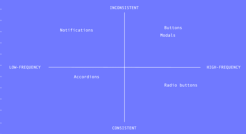
Once you've conducted a UI audit, you can start to prioritize components. We can do this by plotting each component on the consistency/frequency and feasibility/impact charts.
The consistency/frequency chart plots components based on how consistent a component is throughout a UI vs how often it's used throughout your product.
Buttons, as we can see in the Airbnb UI audit above, are pretty inconsistent, but they're used a lot throughout the product. In contrast, accordions aren't used much (maybe in one or two places) and as a result are generally consistent.
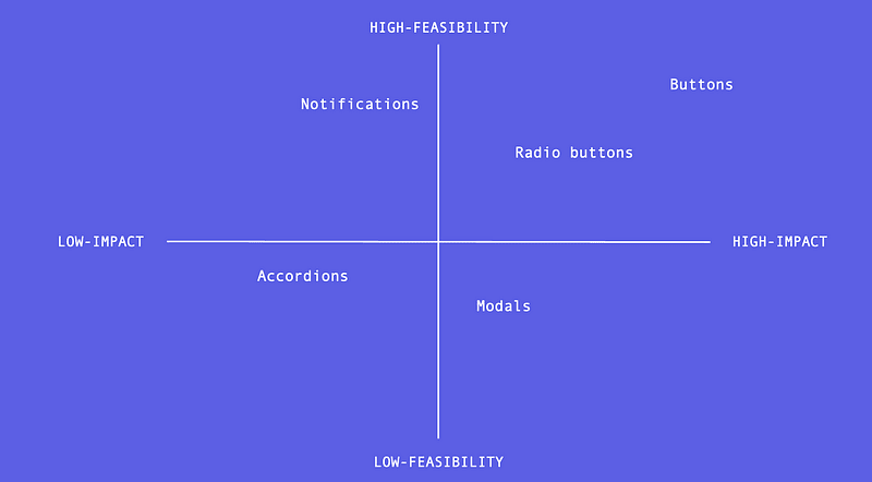
The feasibility/impact chart plots components based on how feasible a component is to design/develop and how much impact it will have on the overall product cohesiveness.
Going back to the Airbnb buttons, they're pretty easy to design and develop in contrast to an accordion (which has a lot of moving pieces), and the impact will have a much higher impact on the product consistency.
Once all components in the product have been plotted on these two charts, we can begin to create a prioritized backlog.
We want to focus on components which fall in the upper right quadrants of both charts: components which are inconsistent and used frequently, but are quite feasible to design/develop and would have high impact. These will yield the biggest return on investment.
Based on our Airbnb results, starting with the button components would be a good idea.
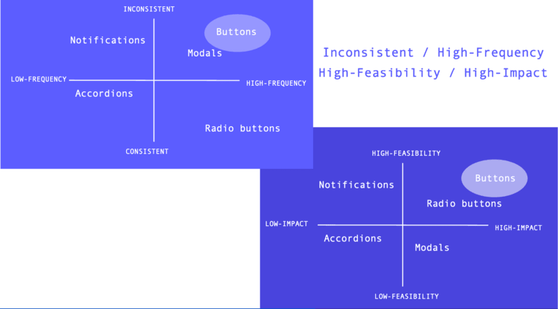
Once the components which land in both upper right quadrants have been tackled, your team can decide on the best way to proceed.
You might want to move on to components which are feasible, have high impact, and are used often throughout the UI, but might be more consistent than other components.
Solidify Your Brand Identity
Before you build a design language, you need to have a strong sense of your brand. How do you want your users to feel when using your products? These emotions need to be packed into your system.
Here are a few questions you might want to ask yourself in order to establish a strong brand identity:
- What emotions do we want our users to experience when using our product(s) (i.e. trust, adventure)?
- What is our mission?
- Why do we do what we do?
Establish Guidelines
Once you've established your brand identity, you can begin to define your design language guidelines. Here are examples of guidelines you'll want to define:
- Accessibility: What level of W3C compliance must your system account for? How can we build this compliance into our system (i.e. color contrast, type scale)?
- Brand: What is your brand identity? You defined this in the previous step.
- Typography: What type scale and font family should we use to reinforce our brand identity?
- Color: What colors best evoke the emotions we want our users to feel? For example, blue indicates trustworthiness.
- Motion: How can we leverage animation and motion within our product to convey our brand?
- Illustrations: Where can we use illustrations within our product to convey our brand? What illustration style fits with our identity?
- Content: What tone of voice/persona will best encompass our brand identity?
- Iconography: What styles of icons will best fit with our brand?
- Spacing: What spacing paradigm do we want to adopt in order to create a consistent UI (i.e. padding, margin)?
Build A UI Kit
Finally, we're ready to start building a UI kit. This is simply a kit of visual design/prototyping assets which embody your design language.
This kit will allow designers to leverage your system within their high-fidelity designs. Sketch is a popular tool for creating UI kits.
It's important to create a strong, and organized, hierarchy for your kit. You may want to separate different component types (i.e. notifications, form elements, etc.) into different pages. Or, you may want to leverage symbols to ensure consistency.
Before designing your kit, be sure to create a "working contract" with your team to ensure you're all on the same page when it comes to kit organization and workflow.
I hope part one served as good primer to design languages. Part three will cover Component Libraries. Feel free to let me know what you think about design systems down below.
All graphics are courtesy of unDraw.


Top comments (18)
Hi Emma,
Great post once again. Learning a lot about design systems due to your talks! I had a couple questions related to design system.
For example, there is a lib called,
styled-system, which makes it possible to expose marginRight, marginLeft, ..., paddingLeft, paddingRight, ... to the "consumer" of the design system, but I'm not sure if that's such a good idea. It feels wrong, but I can't really express why and I might be wrong about it.Thank you for everything you do!
Kind regards,
Kevin
Hey Kevin!
You can absolutely maintain consistency with flexibility; it's all about providing boundaries for said flexibility. For example, allow teams to customize the theme/color palette for different products. So they won't be able to go rogue and add random colors, but they have flexibility to choose options within our bounds.
Too much flexibility is letting developers add custom/rogue values for things :).
What about how a component acts on it's surroundings. Like the padding or margin of an icon. Would you expose marginRight, etc or preferably a prop called "dense", which either makes the spacing tight or "normal" rather than giving straight access to modify the internal margin's.
You can create a spacing mixin/partial if using Sass to allow developers to add specific values for padding/margin. We use a multiple of 4 and have defined variables to help with this :)
That helps! Thank you! :)
Instead of thinking about elements and components, I like Atomic Design methodology and thinking in terms of atoms, molecules and organisms.
I think atomic design can't be properly used on a real project, at least 100%, as you will need different styling for same elements on different parts of a view.
Moreover you'll need those atoms to convert into usable components after all, it simply adds a step, just for adding coherence on a team (i mean avoid everyone to design components as they like instead on keeping same definitions).
Even those facts, Atomic Design is needed nowadays and its useful for many reasons, coherence (as i already said), easy-to-port as front-end framework and easy to generate a theme over it with few overrides (if well implemented).
This is a really awesome article I really learnt a lot from it. My question is how do get people onboard to refine or upgrade when you don't have a dedicated designer in your company especially when it's a small startup that does not have any designers?
Thanks for share this great series, Emma. I have a question respect to the order of the steps. If I don't have an existing application it implies that I can't do a UI audit and without it we can't prioritize accurately. So, what factors do I need to be aware for?
Thanks.
Ah Your talking about so-called style guides right? bitovi.com/blog/style-guide-driven...
Next time you should maybe apply and use the terms that are known by the industry
This is great, thanks for writing this up!
This is a huge area for certain.
Thank you for the post! This series is a good summary of the gigantic field.
Do you recommend creating your own Design System, or use existing ones ?
As a Entry level engineer in software industry, do I need to start with design or should I start with database first?
In-depth information.
This was a great read! I've almost always been on the maintaining end of a design system, so it's really insightful to read about getting one set up. Thanks, Emma! Can't wait for the next one!
Great article @emmabostian . Did you take this investigation any further?
Do you have any advice for how to share your design system with your team (what tools to use, etc) - and how to get and gather feedback from stakeholders?
Thanks for the post!