If I wrote this post entirely in a
monospaced font, you'd probably
stop reading very quickly and
wonder what possessed me to
spend actual effort trying
to make my post less
pleasant to
read.
And we won't even begin to ask why the line length was so much narrower than the space available. I mean... Why?
But the truth of it is that, as programmers, we spend much of our working life painfully reading vast amounts of text that have been formatted and presented in the same way.
Well, you do. I, on the other hand, do not.
For I have a secret.
Every time I setup a code editor, I change the font to a proportional one - usually Deja Vu Sans.
And every time a colleague sees me do that, they stare.
"You can't write code in a proportional font!" they cry.
I ask them why not.
"Because it won't line up!" is the answer.
But you know what? It really does line up very well indeed - because unless you're using some really esoteric languages, you're only ever aligning the beginning of the line, and that means counting space characters. Even in a proportional font, leading space characters have a consistent fixed width.
"It won't look right!"
Oh, but it does. I admit that it takes a little getting used to - looking at code in something like Courier is so ingrained into our psyche that code rendered anything like normal text does look a little weird at first. But after spending a bit of time with it, you realise a few things.
Firstly, it's easier to read. And as a programmer, we read code far more than we write it. The reason why books, magazines, and almost everything else is laid out in proportional fonts is because they're easier to read like that - and we surely want our code to be pleasant to read?
Typographical errors are easier to spot too, because the odd letter combinations actually jar a bit on the eyes.
Secondly, proportional fonts fit a lot more on the page. Horizontally, it's very obvious - you'll overflow you mandated maximal line lengths (don't get me started) with ease, and your primary difficulty will be guessing whereabouts the line ought to end.
Even vertically, a proportional font can fit a bit more in, because the font designs can be considerably clearer at smaller sizes.
But enough of this - you're all convinced it'll look terrible.
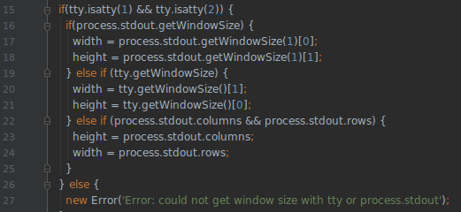
Javascript (actually the window-size library), looking pretty.

C++ (this time Metre) - did you even know it could look this beautiful?
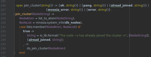
Erlang, looking... OK, it still looks ugly. But less ugly. And I'll bet you spot the spelling error.

Even Python, where the strict layout actually matters to the code, looks great in proportional font.
So do give it a go. You never know, you might like it.
The only irony is that this post, of course, was carefully crafted in monospace...


Top comments (5)
extremely arguable
Everything's arguable, of course. But would you want to read everything in monospace all the time?I would not want for sure. But in the context of programming where every symbol counts I believe monospace fonts work better.
That is not a good looking code :D
You’ll have to pry Operator Mono out of my cold, dead hands.