
A very common component to use in forms or to receive numeric input with a non-arbitrary range is to use a slider component. However, this can easily be done with some basic HTML and CSS whilst adding some react-y props.
The basic usage can be implemented with a simple HTML Input. Something that is not readily apparent is that an input can be of various types. One of these is of type range.
This is how it looks:
Code:
<input type="range" />
However, while this may fulfill the slider component necessity there are a few things that limit it. We should add some styling and make it so the values of the min and max.
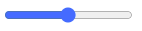
Styling
Let’s dig into the CSS
input[type='range'] {
 -webkit-appearance: none;
height: 7px;
background: grey;
border-radius: 5px;
background-image: linear-gradient(#D46A6A, #D46A6A);
background-repeat: no-repeat;
}

This first bit of styling is to target the bar targeting the color and shape:
However it still looks a bit awkward with the circle being of a different color, we can target this portion with a selector: -webkit-slider-thumb
input[type='range']::-webkit-slider-thumb {
-webkit-appearance: none;
height: 20px;
width: 20px;
border-radius: 50%;
background: #D46A6A;
cursor: pointer;
box-shadow: 0 0 2px 0 #555;
}

Simple enough we just make the circle a bit bigger and change the color to match the rest of the component.
However its not very clear what part of the bar is being filled, so let’s change that by changing the track of the slider:
input[type="range"]::-webkit-slider-runnable-track {
-webkit-appearance: none;
box-shadow: none;
border: none;
background: transparent;
}
But, we also need a way to calculator the current background size of the bar:
const [value, setValue] = useState(0);
const MAX = 10;
const getBackgroundSize = () => {
return { backgroundSize: `${(value * 100) / MAX}% 100%` }; };

<input type="range"
min="0"
max={MAX}
onChange={(e) => setValue(e.target.value)}
style={getBackgroundSize()} value={value}
/>
Let’s break down a few holes here. When an input is of type you have access to several different properties, two of which are min and max which set the two different ends of the slider.
Essentially we’re just calculating the percentage size of the background color based on the value and possible max value.
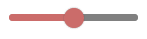
Active Styling
With the bar styled let’s focus on some UX enhancement, with some pseudo-classes we can make the thumb look a bit prettier to the user:
input[type="range"]::-webkit-slider-thumb:hover {
box-shadow: #d46a6a50 0px 0px 0px 8px;
}

input[type="range"]::-webkit-slider-thumb:active {
box-shadow: #d46a6a50 0px 0px 0px 11px;
transition: box-shadow 350ms cubic-bezier(0.4, 0, 0.2, 1) 0ms, left 350ms cubic-bezier(0.4, 0, 0.2, 1) 0ms, bottom 350ms cubic-bezier(0.4, 0, 0.2, 1) 0ms;
}
As well as adding some transition styling to the thumb itself:
input[type="range"]::-webkit-slider-thumb {
// ...other styles;
transition: background 0.3s ease-in-out;
}

And that’s it! Here is a fully working example:
Do you have a preferred slider component? Let me know in the comments below.
Find more articles at Relatable Code
Originally published at https://relatablecode.com on October 17, 2021.


Oldest comments (0)