HTML
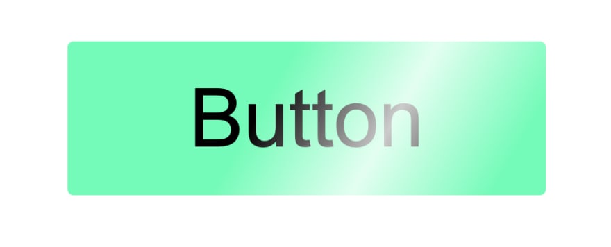
For HTML we have only one button element.
<button>Button</button>
CSS
For CSS, first we'll style the button.
We'll remove border and round it by 1 pixel.
Then we'll set background to green, add some paddings, hide everything that overflows and set position to relative.
button {
    border: none;
    border-radius: 1px;
    padding: 5px 20px;
    background: #00ffb3;
    position: relative;
    overflow: hidden;
}
Now we'll style the before pseudo element. This element will create shine effect.
We'll set content and position to absolute with full height and 100 pixels width.
Background will be linear gradient, rotated by 120 degrees, with white color between two transparent ones.
We'll set top to 0 and left to -100 pixes (element's width).
button:before {
    content: '';
    position: absolute;
    width: 100px;
    height: 100%;
    background-image: linear-gradient(
        120deg,
        rgba(255,255,255, 0) 30%,
        rgba(255,255,255, .8),
        rgba(255,255,255, 0) 70%
    );
    top: 0;
    left: -100px;
}
Now we'll create animation.
We'll simply set left property to -100 pixels on zero percents, and to 100 percents on 20 percents of the animation.
Also, we'll set 100% to 100 percent of the animation, so that the element doesn't move back to it's original position.
@keyframes shine {
    0% {left: -100px}
    20% {left: 100%}
    100% {left: 100%}
}
Now we'll add the animation to before pseudo element, with 3 seconds duration, infinite, linear.
button:before {
    content: '';
    position: absolute;
    width: 100px;
    height: 100%;
    background-image: linear-gradient(
        120deg,
        rgba(255,255,255, 0) 30%,
        rgba(255,255,255, .8),
        rgba(255,255,255, 0) 70%
    );
    top: 0;
    left: -100px;
    animation: shine 3s infinite linear; /* Animation */
}
And that's it.
You can find full code with video tutorial here.
Thank you for reading. ❤️


Oldest comments (0)