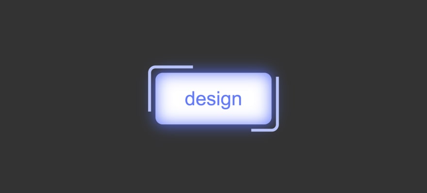
HTML
For HTML we gave only one button element with 'rotation' class.
<button class="rotation">design</button>
CSS
For CSS, first we'll set some styling to a 'rotation' class.
We'll set a blue neon shadow, inside as well as outside.
Then we'll set text color to blue, remove the button's default border and round it to 5 pixels.
We'll position to relative, add some paddings and set background color to white.
.rotation {
    background-color: #fff;
    box-shadow: 0 0 10px #5271ff,
            inset 0 0 10px #5271ff;
    color: #5e7cff;
    border: none;
    border-radius: 5px;
    padding: 10px 20px;
    position: relative;
}
Now we'll style the before and after pseudo elements.
These elements will rotate around the button as border.
First, we'll set the content, and position to absolute with -5px on all sides so it is 5px bigger than the button.
We'll round the borders for 5px and set it to solid two pixels wide light blue.
.rotation::before, .rotation::after {
    content: '';
    border: 2px solid #b5c3ff;
    border-radius: 5px;
    position: absolute;
    top: -5px;
    bottom: -5px;
    left: -5px;
    right: -5px;
}
Now we'll create the animation for pseudo elements.
Using clip-path property, we'll create a linear rotation effect.
@keyframes rotating {
    0% {clip-path: inset(96% 0 0 0);}
    20% {clip-path: inset(0 96% 0 0);}
    50% {clip-path: inset(0 0 96% 0);}
    75% {clip-path: inset(0 0 0 96%);}
    100% {clip-path: inset(96% 0 0 0);}
}
Now we'll add that animation to our pseudo elements.
We'll set the duration of 3 seconds, infinite and linear.
.rotation::before, .rotation::after {
    content: '';
    border: 2px solid #b5c3ff;
    border-radius: 5px;
    position: absolute;
    top: -5px;
    bottom: -5px;
    left: -5px;
    right: -5px;
    animation: rotating 3s infinite linear; /*  Animation  */
}
Now we'll simply add animation delay of half the time (1.5 s) to after pseudo element.
.rotation::after {
    animation-delay: 1.5s;
}
And that is it.
You can find the full code here with video tutorial.
Thank you for reading. ❤️


Oldest comments (2)
That was a good read, thank you, followed and bookmarked!
very beautiful indeed.