Modal popups are very popular on the web. Some common usages may include newsletter sign-ups, alerts, login forms, and others.
In this short article, we would discuss how to build a basic modal popup box.
What is a Modal Popup box?
A modal popup box is a popup window that appears while a user is browsing a web page and it is usually meant to display a piece of critical information or to prompt visitors to take certain actions.
One unique feature of a modal box is that it disables the main content of a web page while keeping it visible.
Build a Modal Popup Box using HTML, CSS and JavaScript
The folder structure for our modal popup box is pretty simple. We would start by creating a folder called modal-box. We would create three files inside this folder: index.html, styles.css, and app.js. We would then link all other files into our index.html as illustrated below:
<!DOCTYPE html>
<html lang="en">
<head>
  <meta charset="UTF-8">
  <meta name="viewport" content="width=device-width, initial-scale=1.0">
  <meta http-equiv="X-UA-Compatible" content="ie=edge">
  <title>Modal Box</title>
  <link rel="stylesheet" href="styles.css">
</head>
<body>

  <script src="app.js" type="text/javascript"></script>
</body>
</html>
HTML Markup for Modal Popup Box
Let's now establish the HTML markup for our modal. You can copy the following code into your index.html file, or get all the code for this project from codepen.
<div class="modal" id="modal">
    <div class='modal__container'>
        <img class="modal__img" src="https://drive.google.com/uc?export=view&id=1hsqRgrdpr5T673KZLyUmHVoLWcv159MC">
        <div class="modal__content">
            <h1 class="modal__title">SPONSOR MY EDUCATION <span>START-UP CONTEST</span>
                <h1>
                    <p class="modal__paragraph">This contest is geared towards discovering and funding innovative ideas.</p>
                    <button class="modal__button">Click here to participate</button>
        </div>
        <i id="close" class="fas fa-times"></i>
    </div>
</div>
<h1 class="main__title">This is a heading</h1>
<p class="main__paragraph">This is a paragraph</p>
Because we're utilizing a Font Awesome icon in our code, you'll need to provide a link to it when copying the code above.
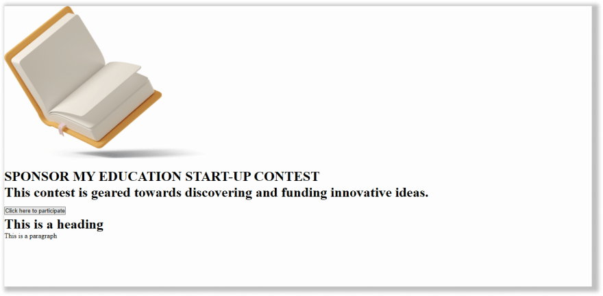
Without CSS, our page will look all bare, like this:
Styling Modal Popup Box with CSS
We want our modal box to look very nice so let's now bring in some CSS code.
* {
    margin: 0;
    padding: 0;
    box-sizing: border-box;
}

html {
    font-size: 62.5%;
}

body {
    font-family: montserrat;
    background-color: #0a9396;
    display: flex;
    justify-content: center;
    height: 100vh;
    align-items: center;
}

.main__title {
    font-size: 4rem
}

.main__paragraph {
    font-size: 1.8rem
}

.modal__img {
    max-width: 60%;
    height: auto;
    display: block;
}

.modal {
    max-width: 700px;
    width: 85%;
    position: fixed;
    top: 50%;
    background-color: rgba(0, 0, 0, 0.3);
    left: 50%;
    transform: translate(-50%, -50%);
    border-radius: 5px;
    background: #EE9B00;
}


/****show modal class****/

.modal.show {
    display: block
}

#close {
    cursor: pointer;
    color: white;
    position: absolute;
    top: 0;
    font-size: 25px;
    right: 0;
    padding: 1rem;
    margin-right: 10px;
}

.modal__title {
    font-size: 2.5rem;
}

.modal__title span {
    display: block;
    font-weight: 400;
}

.modal__paragraph {
    font-size: 16px;
    font-weight: 400;
}

.modal__button {
    background-color: #0a9396;
    border: none;
    color: white;
    padding: 1rem 2rem;
    border-radius: 5px;
    box-shadow: 2px 2px 12px rgba(0, 0, 0, 0.2);
    transition: 0.3s background-color ease-in-out;
}

.modal__button:hover {
    background-color: #0a9372;
}

main {
    text-align: center;
}

.modal__container {
    padding: 1rem 2rem;
    display: flex;
    flex-direction: column;
    justify-content: center;
    align-items: center;
    position: relative;
}


/****styling modal on smaller screen******/

@media only screen and (min-width: 768px) {
    .modal__container {
        flex-direction: row;
        padding: 2rem;
        text-align: left;
    }
    .modal__img {
        max-width: 50%
    }
}

@media only screen and (max-width: 500px) {
    .modal__title {
        font-size: 2rem;
    }
    .modal__img {
        max-width: 80%
    }
}
With all of these above styles applied, here is what our modal box will look like now:

We'll now hide the modal pop window and display it a few seconds after visitors arrive at our site. We would implement this functionality by adding some JavaScript code in the app.js file.
Before adding the JavaScript code, let's hide the modal box by setting display property to none. This should be added to the styles already defined for the .modal class in our CSS code.
.modal {
  display: none;
}
Now, this is what our website page looks like without the modal box:

Adding JavaScript
Let's now add our JavaScript code:
const closeBtn = document.getElementById('close');
const modalMenu = document.getElementById('modal');
const modalBtn = document.querySelector('.modal__button');

setTimeout(() => {
    modalMenu.classList.add('show');
}, 3000);

closeBtn.addEventListener('click', () => { modalMenu.classList.remove('show') })
modalBtn.addEventListener('click', () => { modalMenu.classList.remove('show') })
Using JavaScript
- We accessed the modal box, close button and the button on the modal.
- Next, we used the setTimeout() method to display the modal box 3 seconds after visitors land on the site.
- Lastly, we added an event listener to hide the modal box from view when visitors click on the close button or the modal button.
Now, this is how our project looks and behaves in the end:
Wrapping Up
In this tutorial, we learned how to build a modal popup box using HTML, CSS, and JavaScript.
Thanks for following along. I hope you learned something useful from this short tutorial. Please leave a comment and feel free to follow me on Twitter if you enjoyed this article.


Top comments (2)
Thanks for the post Boateng! I would warn to be very careful on the a11y for a modal -- it's extremely tricky to get right. I'd recomend starting with reading these resources. Full disclosure, I've been involved in creating adapters for a11y-dialog for Svelte and Angular, and did the Vue 3 upgrade for the Vue port (so I'm certainly biased). But have a look at all that needs to be done to make a modal dialog accessible and inclusive:
scottohara.me/blog/2019/03/05/open...
a11y-dialog.netlify.app/
You don't need JavaScript for a modal. Just HTML and CSS. Use id and target