
(Photo by Aaron Huber on Unsplash)
EDIT: edited for the new Yew version (>0.16)
In this sixth part we are going to see how to write and use custom components (and more... as usual...).
Code to follow this tutorial
The code has been tagged with the relative tutorial and part.
git clone https://github.com/davidedelpapa/yew-tutorial.git
cd yew-tutorial
git checkout tags/v6p1
Part 1: Simple but custom
Modularity is the key concept of all current web technologies. In this section we will see how to crate custom components, that is components to embed in the view of our app, that will provide both modularity and customization. As usual, we will start with simple examples in order to gain understanding and proficiency in this technique. Those who are used to write JS using React (or Vue or another modern framework) will not have many problems in understanding Yew's custom components; in JS frameworks custom components are the bread and butter of web development.
We will start with a simple wrapper for the <button> element.
Cargo.toml
We will bump up to Yew 0.14 for this part, because there are many more helps to write custom components:
[dependencies]
wasm-bindgen = "^0.2"
yew = { version = "0.14", features = ["web_sys"] }
With yew 0.14 you really need to specify with the feature which backend you are using; in this case we are using so far web-sys, and we will continue with it (really there are few differences with std-web, the other backend, and pros and cons for both, so I made an opinionated choice and now we will stick with it. feel free to check out std-web as well. For example, std-web has got an interesting js! macro that simplifies writing small JS snippets).
src/lib.rs
We will need to add a components mod so this is our entire src/lib.rs:
#![recursion_limit = "256"]
mod app;
mod components;
use wasm_bindgen::prelude::{wasm_bindgen, JsValue};

#[wasm_bindgen]
pub fn run_app() -> Result<(), JsValue> {
    yew::start_app::<app::App>();

    Ok(())
}
src/components/mod.rs
As you can recall from Rust's basics, mods can be done as separate subdirectories with a mod.rs file in it that exports the other file's elements.
Thus we will create a directory components inside our src directory and add to it the following file mod.rs
pub mod button;
Easy enough: we will add each component in its own file inside the src/components, and then we will export them inside the src/components/mod.rs with pub mod <filename>;
Many modern languages can behave this way, so for example JS and Python (in Python the file inside the folder is called __init__.py for example)
src/components/button.rs
Our first component. For this part we'll use the one present in Yew's good examples.
First a quick overview of the functions we need to implement. In our src/app.rs so far we have implemented really a custom component, with the impl Component for App {}. We did not give too much weight to it, but as is, our src/app.rs is a custom component in reality.
So we already know what components need to do: implement 2 types: type Message and type Properties; and implement 3 functions: fn create, fn update, and fn view
So far this is what we saw in action, and we did not need much more than that. We did not even use the Properties type, while we made extensive use of the Message. Well, so far our custom componets was the root of our virtual DOM, that is the WASM DOM injected in the <body> of our index.html. However, for all other custom components, that is, components that will be injected inside our app, we will use the Properties type, and a new function as well, fn change.
Let's go forth with order. We have all we need in Yew's prelude:
use yew::prelude::*;
We start with the definition of our Button struct.
pub struct Button {
    link: ComponentLink<Self>,
    title: String,
    onsignal: Callback<()>,
}
We use the usual link, but we have also an iteresting Callback (explanations later); moreover, we attach to our Button also a title String that we will use as text for our button.
For a simple example, we will use only a message, to fire a click event. We could map a hover or other event as well, if needed.
pub enum Msg {
    Clicked,
}
We will introduce now a Props struct, to use as type Properties.
The name Props is a classic React term, and in fact it represents the same thing. The parent component, in this case our App, will use it to communicate the state to the child component we are writing.
#[derive(Clone, PartialEq, Properties)]
pub struct Props {
    #[prop_or_default]
    pub title: String,
    pub onsignal: Callback<()>,
}
We make it derive the standard Clone and PartialEq, but also the Properties which is defined in Yew's prelude as of the 0.13 release. It is one of the feature that is making working with custom componets really easy now.
The #[prop_or_default] means that it will be assigned as a prop, otherwise to use the default (empty string in this case). There is also a #[prop_or()] which lets us define the default value if not given as prop.
Of course, the callback will be passed as prop if we want to assign it from our parent to the child (we will see the props in action in our src/app.rs very soon).
Let's tackle the impl of our Button now:
impl Component for Button {
    type Message = Msg;
    type Properties = Props;
As usual we select our Msg structure as type Message. The novelty is that we will not leave the type Properties empty, as we did so far, but we assign to it the Props struct.
    fn create(props: Self::Properties, link: ComponentLink<Self>) -> Self {
        Button {
            link,
            title: props.title,
            onsignal: props.onsignal,
        }
    }
fn create: for this we will not assign by defauld the values to our Button but we will use the values of Props. In the App we never passed props around, because it is the root of our virtual DOM, so up to now we left the value empy with a _: Self::Properties. Now we need it, so we set it as props: Self::Properties: in this way, we can assign its values to cosnstruct the Button. We pass the second argument, link, as usual, from the one received at creation time, as we have always done with our App.
    fn update(&mut self, msg: Self::Message) -> ShouldRender {
        match msg {
            Msg::Clicked => {
                self.onsignal.emit(());
            }
        }
        false
    }
fn update: the update is really simple: we just emit() the callback set as onsignal in the props when the message is Clicked. In other words when clicked the custom button will call the Callback mimicking the onclick of the regular <Button>.
Notice though that we return false as ShouldRender return type: since we emit a callback there's no need to call again the fn view and render again the element on the DOM. The component that will call this Button will decide if the logic called by the Callback needs a new rendering or not. However this will be left to the fn update of the parent, App in our case.
We finally meet a new function that we will implement for our custom component: fn change:
    fn change(&mut self, props: Self::Properties) -> ShouldRender {
        self.title = props.title;
        self.onsignal = props.onsignal;
        true
    }
The function change is called by the parent of our component every time it asks the child to render again, and is used to implement logic to be done for the changes. Up to now we did not need this, because all logic pre-rendering was done in the fn update, since our App represents the root of the DOM, deciding when to render itself again and how.
However, each custom component is not in charge of all the rendering, while between rendering the parent could change the properties in the Props. So we need a mechanism to handle that. That is, we need a function the parent can call when forcing a child to render again. That is the purpose of change().
For example, if we set up our custom Button with a certain title, and we decide that once clicked it should change its title, how does the chain of the envents unfold?
The App will set the custom button and assign to it a title and a callback to emit the signal when it is clicked. When indeed the user clicks on our custom button the Msg::Clicked will be called: at this point, the update logic will emit the callback (which the button component ignores, because it can be whatever the parent decides it to be). At this point let's suppose the callback set by the parent (the App) calls a message in the App itself (in the update() function) that decides to change the title of the button. Since the parent uses the Props to communicate with the child, our app will change the props of the child, then call for a ShouldRender. At this point the function change will be invocked, signaling to our custom component that it should handle the new rendering, and check the new info it received from the parent.
Most of the time it is sufficient to re-set the state copying the state received in the Props, and then call a new render (by returning true) but this logic depends on the internal working of the custom element. Thus the programmer has to make sure of the logic inside the update() function.
Here then we see the need for the fn change, without which we could not handle new render and changes in the props. Of course, the fn change is very similar to the fn update, but with a difference: change is imposed on the child, while update is a response to the child's own needs, that is, is self-initiated.
In this case, we reasssign both the title String and the onsignal Callback, because we do not know what has changed. And since we do not know what changed (if anything) but we do know that the parent forced a new rendering of the view, we return by default a ShouldRender as true. A strategy that could work, and in JS is done often, is to check if something indeed has changed before making again costly operations. In this case we can update by simply copying the values inside the props to the custom Button own properties, but sometimes the logic involved is more complex: think of mapping external APIs for examples, if the update logic has to send API requests and wait for responses in order to sync the internal state. Sometimes it's easier to compare and modify only upon change.
Enough with the theory, let's move on.
Finally we see the view of our component:
    fn view(&self) -> Html {
        html! {
            <button onclick=self.link.callback(|_| Msg::Clicked)>{ &self.title }</button>
        }
    }
}
Most simply we assign the calling of the Msg::Clicked to the onclicked, which will call the Button's callbck in turn, and we use the title as the inner HTML of the <button></button> couple.
src/app.rs
Now we can see our custom component in action. In order to simplify the example, I propose again here the dust off our first example app, with a counter and the messages AddOne, RemoveOne.
use crate::components::button::Button;
use yew::prelude::*;
We need to summon our custom component here, with the use crate::components::button::Button
pub enum Msg {
    AddOne,
    RemoveOne,
}

pub struct App {
    link: ComponentLink<Self>,
    counter: i32,
}
Msg and App as usual, nothing to explain here, just our old friends AddOne, RemoveOne, and the counter.
impl Component for App {
    type Message = Msg;
    type Properties = ();

    fn create(_: Self::Properties, link: ComponentLink<Self>) -> Self {
        App {
            link: link,
            counter: 0,
        }
    }

    fn update(&mut self, msg: Self::Message) -> ShouldRender {
        match msg {
            Msg::AddOne => {
                self.counter += 1;
            }
            Msg::RemoveOne => {
                self.counter -= if self.counter == 0 { 0 } else { 1 };
            }
        }
        true
    }
No Properties as usual, either as type or as paramenter in fn create.
In Msg::RemoveOne we added a check so that the counter does not reach negative numbers but sits at 0 once reached. So now you can see a possible answer for the little exercise I left you in our second tutorial.
Our custom component will be useful in the view:
    fn view(&self) -> Html {
        html! {
            <div>
                <h1>{ "Welcome to Components" }</h1>
                <p>{ self.counter } </p>
                <Button onsignal=self.link.callback(|_| Msg::AddOne) title="+1" />
                <Button onsignal=self.link.callback(|_| Msg::RemoveOne) title="-1" />
            </div>
        }
    }
}
First thing to notice is that the custom component does not have a closing tag, that is why we have to use the final slash form, otherwise the html! macro will not recognize it (this is one little restriction that Yew has, we already saw it).
We assign to the onsignal of the first button the calling of the Msg::AddOne, and the title "+1". Similarly, we assign to the onsignal of the second button the calling of the Msg::RemoveOne, and the title "-1".
The examle is failry simple and contrieved, but it shows the bare minimum.

Here we can see our custom buttons in action

Part 1b: Explaining the process
The method we have seen, to implement the two types type Message and type Properties, as well as the four functions fn create, fn update, fn change, and fn view is valid for all the components. Here in the second part we will see how to simplify greatly the custom component generation. However, before doing so, let's briefly take a more in-depth look at custom components. This could be helpful in some situations, and hopefully this little detour will be a little more clear than the simple info I gave while explaining the code. Feel free to skip ahead to part 2 if you are not interested.
We have seen 2 types and 4 functions (or methods since they are part of each component impl). Actualy, there are other two methods besides these four functions in the component lifecycle, which can help handling more complex situations with more nuanced components.
Let's go in temporal order.
1. fn create()
Signature:
fn create(props: Self::Properties, link: ComponentLink<Self>) -> Self
First things first. create() is the "constructor" of our component. As part of the function signature it accepts the props and a link to the component, as already explained. It returns Self (or equivalent), thus it needs to construct the struct that implements the Component.
Init logic goes here.
2. fn view()
Signature:
fn view(&self) -> Html
Even if we save it always for last in writing our code, really after the creation of the elments the page will have to be rendered, otherwise the user cannot push our buttons and try to fire our Messages, etc... The view() method renders the layout of the component in the virtual DOM. It accepts a reference to self (through which all fields of the component's structure are available), and returns the virtual Html, that is usually rendered from the html! macro.
Layout goes here.
3. fn mounted() // fn rendered()
EDIT: edited for the new Yew version (>0.16).
Now it is called redered() and has got different signature
Signature:
fn mounted(&mut self) -> ShouldRender
(Yew>0.16) fn rendered(&mut self, , first_render: bool)
This new method is called after mounting the component on the DOM, that is, after the view has been rendered, but before the browser refreshes the page. This method is useful for implementing actions to be done after rendering the components, for example if you want to get the focus on a button or form field...
(Yew < 0.16) The method accepts a mutable reference to self and returns a ShouldRender, that is, true if you need to refresh the component after the logic is executed, and render it again on the DOM, or false if not.
(Yew >= 0.16) The method gets a parameter, true the first time it is rendered, false all other times, so we can do post-initiation logic pnly once (with if first_render {...}) , such for example, fetch a service when the page is first loaded instead of asking the user to push a button to do so.
It is an optional method, and will do nothing if not implemented.
Post-render logic goes here.
4. fn update()
Signature:
fn update(&mut self, msg: Self::Message) -> ShouldRender
Whenever a Message is fired the update method is called. A message can be triggered by user actions on the UI (callback on buttons or form inputs, for example), but also child components, Services, Agents (we did not see them yet), or Futures (we saw a form in the Fetch handling). The function accepts a reference to self, and the message that triggered the call for update. It returns a ShouldRender estabishing if a new rendering is due as consequence of the message's handling, or not. Notice that with update is the component that updates itself as a reponse of a message event.
Messages handling goes here.
5. fn change()
Signature:
fn change(&mut self, props: Self::Properties) -> ShouldRender
Whenever a parent component needs to re-render its children, or just to change the props of a child, and so to re-render that component, the change method of the child is called. This method is akin to the update, but instead of accepting a message, it accepts the props. It will have to return a ShouldRender too, in case the change in props warrants for the component's' refresh (say the change of a text value or other). Change is an optional method, and will do nothing if not implemented. In fact, for the root element it is usually not needed.
Props change handling goes here.
6. fn destroy()
Signature:
fn destroy(&mut self)
This method is called to finalize the lifecycle of the component, when it has to be deleted. It accepts a mutable reference to self, and it is useful for gracefully finalize, clenup or sanitize the removal of the component from the DOM. It does not have a return. This method is totally optional, in fact usually a component does not need to do anything before being removed; in fact, many times in webapps no component is ever removed at all.
Component cleanup logic goes here.
Part 2 Simplify (I)
Caveat
When I started to write the code for this tutorial, and then the text, Yew had just bumped up a version (0.15), but I waited to update to it, I updated only to the 0.14; as I show next, the crate we had to use, yewtil, was not compatible with several recent versions (stuck to 0.10!!!). So, as I explain next, I forked it and bumped it up myself. Then Yew bumped up version again, and this time yewtil has beeen moved into Yew's own workspace. However, the versions in crates.io have not been synced so far, while to use the new version of Yew there is quite a change to be done to the codebase, so at this point it is useless for me to try and correct all the following, expecially since I have tagged all versions for reference. So, be patient please: I will show in the following tutorial how to use the latest version of Yew, and how to properly use the official yewtil and not my own fork. But for now, for the sake of understanding the concepts, I will leave the following unchanged.
The next tutorial is scheduled to come up next week, so you will not need to wait too much, and you will be able to use the new Yew, and Yewtil then. Be patient: Yew is still a maturing ecosystem; as I am trying to show, it is already quite usable, but with some caveats, as it is evolving still up to version 1.0
Intro to part 2
There are some ways to simplify our code for components: here we will show one of them. We will make use of a crate named yewtil. Beware, this crate is experimental, and so far there is not the support for Yew 0.14. While waiting for it I made a temporary fork on my github to bump this crate to Yew 0.14. This is all not too orthodox, but while we wait for the new releases, let me show you how simplifying can be done. If you want to stick to the known path keep working with vanilla Yew, as shown in part 1.
For this part I will show you the power of yewtil's pure components
Code to follow this part
git checkout tags/v6p2
Cargo.toml
We would usually add a reference to Yewtil here, and when the version will be updated I will correct this part of the tutorial. For the time being we will refer to my updated fork.
[dependencies]
wasm-bindgen = "^0.2"
yew = { version = "0.14", features = ["web_sys"] }
yewtil = { git = "https://github.com/davidedelpapa/yewtil", branch="master" }
src/components/button.rs
We will make a change only in the component, while mantaining full compatibility with the previous interface: how cool is that? It is important to have the possibility of simplifying things while still mantaining the old interfaces. Well, it's not so evident in contrived exampes, of course, but while working with real projects it is important not too break things too much while improving, if it is possible.
use yew::prelude::*;
use yew::{html, Callback, MouseEvent, Properties};
use yewtil::{Pure, PureComponent};
Two things to notice: the use of the MouseEvent and the use of yewtil. The MouseEvent will handle the click for us.
pub type Button = Pure<PureButton>;
Button has been declared as a type that represents an implementation of yewtil's Pure by a struct PureButton that we will define next.
#[derive(Clone, PartialEq, Properties)]
pub struct PureButton {
    pub onsignal: Callback<MouseEvent>,
    pub title: String,
}
The struct PureButton is very similar to the old Props, not the old Button. In fact, the pure component is a mixture of props + component, however, with these differences:
- the Callback is specified for the MouseEvent, while before it was empty
- since pure components do not hold a state, there is no reference to any
ComponentLink - the imp will focus only on the render
impl PureComponent for PureButton {
    fn render(&self) -> Html {
        html! {
            <button onclick="&self.onsignal">{ &self.title }</button>
        }
    }
}
That's it: we just use it in a render method. Yewtil will take charge of init logic internally with the helper funcion neq_assign(). This function is a "blanket trait to provide a convenience method for assigning props in changed or updating values in update" what it does is that "if self and new aren't equal, assigns new to self and returns true, otherwise returns false." This method is very useful to keep the boilerplate code to a minimum.
If you run this code, apart from downloading the new crate and building it, you will see no change in the UI. However, we simplified much more the code!
Two considerations:
- Pure components are useful only for components that do not need to handle internal state, say, custom implementation of standard components that only present a different render grafphics. For example, if we wanted to implement with Yew all the components available in Picnic CSS that we used earlier in a "Yew Picnic" framework.
- All this shows that most of the times the
Changemethod has only to update the internal state according to props if the two have changed, by copying one to the other. This is what is done for the most art in JS frameworks under the hood. If it is so widely used, then it must be of grat use. One thing then: theneq_assign()function is available in Yewtil also for custom components that are not pure components: we should use more of it.
Now, off with these rumblings, back to work again!
Part 3: Simplify (II) the devops
Up till now we are using the two scripts we did at the beginning, run.sh and stop.sh for our (limited) "devops".
They are fine for our purposes, but if we want to scale our project to a realworld situation we need to do something serious about the devops. This part is optional, but some quick experimenting will be of much use later on.
Code to follow this part
git checkout tags/v6p3
Let's start with a simple addition: a live reload plugin for rollup.
This plugin is needed to reload the content of main.js inside the document if it changes, that is, if we change the wasm build.
However, to use it, we need a package.json that is, we need to initialize our project as a regular npm project.
Easy enough,
npm init
...and answer the questions (or press enter many times, and go with the defaults).
At this point we need to save the dependency of rollup-plugin-livereload as development dependency (not to be brought to the production project):
npm install --save-dev rollup-plugin-livereload
rollup.config.js
Now we need to add a JS file that configures rollup, rollup.config.js
import livereload from "rollup-plugin-livereload";

export default {
  input: "main.js",
  output: {
    file: "pkg/bundle.js",
    format: "iife",
  },
  plugins: [livereload("pkg")],
};
We set in this files the options that we were first passing with the command line (or in the run.sh):
rollup ./main.js --format iife --file ./pkg/bundle.js
We added to it the plugin liverelod, and told it to watch only the directory pkg since for now we need to reload the browser only should changes happen there.
We could as easily watch more than one folder, a JS folder for example:
livereload({
  watch: ["pkg", "js"],
});
At this point it would be sufficient a:
rollup -c
in order to watch for the changes inside the pkg/ folder, and reload the page content. But we need to rebuild the wasm too in order to make the pkg/ folder change. We shall see next how to do it
Cargo Watch
So, we need a way to monitor the changes in the source files and issue a command to compile again the wasm from Rust. We will use cargo watch to handle this job.
cargo install cargo-watch
Now we need to put together a better flow inside our run.sh
run.sh
We need to change the pack() function to use the rollup -c and also create a file similar to .serverpid that we will name .serverpid.rollup
pack(){
    cmd="rollup -c"
    $cmd &
    PID=$!
    echo $PID > .serverpid.rollup
}
That was easy. Next step, which is optional, inside the run function we swap the python server with a Rust server, thttp; it can be installed with cargo install thttp
run(){
    thttp -p 8080 &
    PID=$!
    echo $PID > .serverpid
}
The advantage is that it could be easily containerized later on if needs be, since it supports systemfd
Next step is very important: we create a new watch() and stop() functions.
watch() invokes the cargo watch command with some options: namely when it detects a change it does call again the same run.sh script with an option, --reload, which we will set up in a little while.
watch() {
    cargo watch -w ./src --postpone -s "run.sh --reload"
}
As you can see, cargo watch watches for changes only inside the src/ folder (option -w <path>).
The stop() function is a copy of the content of stop.sh so that we can stop the server, before rebuilding everything.
stop() {
    kill $(cat .serverpid)
    rm .serverpid
}
Finally after all the functions, we need a way to handle the --reload option for the script, that is invoked by cargo watch -s <shell-command> (see above the full command)
while [ "$1" != "" ]; do
    case $1 in
        -r | --reload )         stop
                                build
                                run
                                exit
                                ;;
    esac
    shift
done
Quite easily: it checks for the option -r or --reload, and if present, it execues the following functions in a row:
-
stopto stop thethttpserver (or python if you still got that) -
buildto re-build the Rust again -
runto restart the server - then it
exitwithout continuing the script.
You may think that we are missing the pack function, but think about it: we call the --reload option from within cargo watch when some source file changes in the Rust part. After this, the build will create again a wasm file inside the pkg/ folder.
At this point though, rollup will take care of it, because it is still watching the pkg/ folder through the rollup-plugin-livereload: it will re-run the packaging and swap it with the original one inside the index.html
Talking about options in a bash script, we could add easily other options, for example a --help:
while [ "$1" != "" ]; do
    case $1 in
        -r | --reload )         stop
                                build
                                run
                                exit
                                ;;
        -h | --help )           help
                                exit
                                ;;
    esac
    shift
done
Of course, we need now a help() function, but I leave that up to you.
The final row is very important, it's the default set of commands called up by the script when there are no options:
build && pack && run && watch
We just build, then pack, then run, and watch over the run.
Easy peasy.
For your reference I leave here the whole run.sh, since we change a lot of things. Besides, you could go and check it in the repo (there are additional changes there):
#!/bin/bash

build(){
    wasm-pack build --target web
}

pack(){
    cmd="rollup -c"
    $cmd &
    PID=$!
    echo $PID > .serverpid.rollup
}

run(){
    thttp -p 8080 &
    PID=$!
    echo $PID > .serverpid
}

watch() {
    cargo watch -w ./src --postpone -s "run.sh --reload"
}

stop() {
    kill $(cat .serverpid)
    rm .serverpid
}

while [ "$1" != "" ]; do
    case $1 in
        -r | --reload )         stop
                                build
                                run
                                exit
                                ;;
    esac
    shift
done


if [ -f .serverpid ]; then
    echo "Server already running, or in an inconsistent state"
    exit 1
fi

build && pack && run && watch
stop.sh
Just to be sure, we modify also the stop.sh to be a cleanup, if things go wrong, and also to remove the .serverpid 's
#!/bin/sh

stop(){
    if [ -f .serverpid ]; then
        kill $(cat .serverpid)
        rm .serverpid
        echo Server stopped.
    else
        echo Could not find the server PID. Is it running?
    fi
    if [ -f .serverpid.rollup ]; then
        kill $(cat .serverpid.rollup)
        rm .serverpid.rollup
        echo Hot-Reload server stopped.
    else
        echo Could not find the rot-reload server PID. Is it running?
    fi
}

stop
I think it's quite self-explanatory at this point.
Test the live reload environment
To test it, let's run the script:
./run.sh
Then we modify something in the src/ folder, for example src/app.rs, so that the -1 is on the left, and +1 on the right:
fn view(&self) -> Html {
        html! {
            <div>
                <h1>{ "Welcome to Components" }</h1>
                <p>{ self.counter } </p>
                <Button onsignal=self.link.callback(|_| Msg::RemoveOne) title="-1" />
                <Button onsignal=self.link.callback(|_| Msg::AddOne) title="+1" />
            </div>
        }
    }
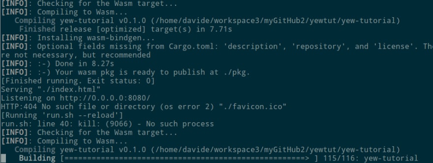
Now it will recompile and restar the server:
Then, rollup will hot reaload it all! (you do not have to move a finger!)

[Optional] Set the version of the build
Very Optional
With all this compiling, many times we do not know if and when the WASM module has been reloaded.
We could make an addition to the main.js, to know which version we are running by outputting the compilation date and time:
import init, { run_app } from "./pkg/yew_tutorial.js";
import { __compiled } from "./src/js/version.js";

// Add compilation time
console.log("WASM program compiled: " + __compiled());

async function main() {
  await init("/pkg/yew_tutorial_bg.wasm");
  run_app();
}
main();
And, of course we have to create a version.js in src/js/ ... programmatically! (Inside the runs.sh, that is)
First we need to create the folder
mkdir ./src/js/
Then we modify accordingly the build() function in run.sh
create_version() {
    datetime=`date +"%D %T"`
    cat > ./src/js/version.js << EOL
// Do not modify; created programmatically
export function __compiled() {
    return "${datetime}"
}
EOL
}

build(){
    create_version
    wasm-pack build --target web
}
To avoid incurring in a costant loop, we need to ignore JavaScript files from the cargo watch command
watch() {
    cargo watch -w ./src --ignore "*.js" --postpone -s "run.sh --reload"
}
Finally we can see in the web console the build date and time of the WASM:

We could easily change the JS to add a real version, followed by the timestamp, and so on (you got the knack of it).
Conclusions
It's all for today.
I'm tired, but I hope these little modifications will help you to build real world apps.
Stay tuned!


Top comments (0)