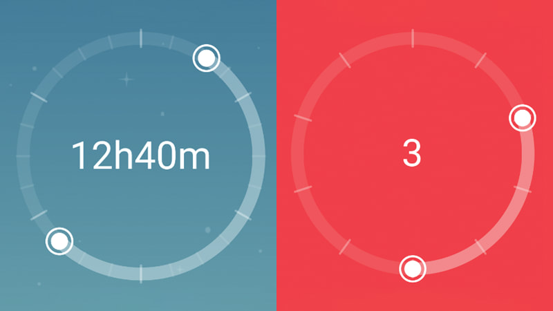
Have you ever wanted to spice up the usual boring sliders by providing a double handler or playing around with the layout?
In this article I'll explain how to integrate the GestureDetector and the Canvas to build a circular slider in Flutter.
If you are not that interested in how to build it but just want to get the widget and use it, you can use the package I published in https://pub.dartlang.org/packages/flutter_circular_slider.
Why do I need a circular slider?
In most cases you don't, but imagine you want the user to select a time interval, or you just want a regular slider but want something a bit more interesting than a straight line.
What do we need in order to build it?
The first thing we need to do is create the actual slider. For this, we will draw a complete circle as the base and, on top of that, another one which will be dynamic depending on the user interaction. In order to do this we will use a special widget called CustomPaint, which provides a canvas on which we can draw what we need.
Once the slider is rendered, we need the user to be able to interact with it, so we will wrap it with a GestureDetector to capture tap and drag events.
The process will be:
- Draw the slider
- Recognize when the user interacts with the slider by tapping down on one of the handlers and dragging.
- Pass the information attached to the event down to the canvas, where we will repaint the top circle.
- Send the new values for the handlers all the way up so that the user can react to changes (i.e., updating the text in the center of the slider).

Let's draw some circles
First thing we need to do is draw both circles. As one of them is static (doesn't change) and the other one dynamic (changes with user interaction), I separated them in two different painters.
Both our painters need to extend CustomPainter, a class provided by Flutter, and implement two methods: paint() and shouldRepaint(), the first one being the one to actually draw what we want and the later a way to know if we need to repaint when there is a change. For the BasePainter we never need to repaint, so it will always be false. For SliderPainter it will always be true, because every change means that the user moved the slider and the selection has to be updated.
import 'package:flutter/material.dart';

class BasePainter extends CustomPainter {
  Color baseColor;

  Offset center;
  double radius;

  BasePainter({@required this.baseColor});

  @override
  void paint(Canvas canvas, Size size) {
    Paint paint = Paint()
        ..color = baseColor
        ..strokeCap = StrokeCap.round
        ..style = PaintingStyle.stroke
        ..strokeWidth = 12.0;

    center = Offset(size.width / 2, size.height / 2);
    radius = min(size.width / 2, size.height / 2);

    canvas.drawCircle(center, radius, paint);
  }

  @override
  bool shouldRepaint(CustomPainter oldDelegate) {
    return false;
  }
}
As you see, paint() gets a Canvas and a Size parameters. Canvas provides a set of methods that we can use to draw anything: circles, lines, arcs, rectangles, etc. Size is, well, the size of the canvas, and will be determined by the size of the widget where the canvas fits. We also need a Paint, which allows us to specify the style, color and many other things.
Now, the BasePainter is pretty self-explanatory, but the SliderPainter is a bit more tricky. Now not only need to draw an arc instead of a circle, we also need to draw the handlers.
import 'dart:math';

import 'package:flutter/material.dart';
import 'package:flutter_circular_slider/src/utils.dart';

class SliderPainter extends CustomPainter {
  double startAngle;
  double endAngle;
  double sweepAngle;
  Color selectionColor;

  Offset initHandler;
  Offset endHandler;
  Offset center;
  double radius;

  SliderPainter(
      {@required this.startAngle,
      @required this.endAngle,
      @required this.sweepAngle,
      @required this.selectionColor});

  @override
  void paint(Canvas canvas, Size size) {
    if (startAngle == 0.0 && endAngle == 0.0) return;

    Paint progress = _getPaint(color: selectionColor);

    center = Offset(size.width / 2, size.height / 2);
    radius = min(size.width / 2, size.height / 2);

    canvas.drawArc(Rect.fromCircle(center: center, radius: radius),
        -pi / 2 + startAngle, sweepAngle, false, progress);

    Paint handler = _getPaint(color: selectionColor, style: PaintingStyle.fill);
    Paint handlerOutter = _getPaint(color: selectionColor, width: 2.0);

    // draw handlers
    initHandler = radiansToCoordinates(center, -pi / 2 + startAngle, radius);
    canvas.drawCircle(initHandler, 8.0, handler);
    canvas.drawCircle(initHandler, 12.0, handlerOutter);

    endHandler = radiansToCoordinates(center, -pi / 2 + endAngle, radius);
    canvas.drawCircle(endHandler, 8.0, handler);
    canvas.drawCircle(endHandler, 12.0, handlerOutter);
  }

  Paint _getPaint({@required Color color, double width, PaintingStyle style}) =>
      Paint()
        ..color = color
        ..strokeCap = StrokeCap.round
        ..style = style ?? PaintingStyle.stroke
        ..strokeWidth = width ?? 12.0;

  @override
  bool shouldRepaint(CustomPainter oldDelegate) {
    return true;
  }
}
Again, we get the center and radius, but now we draw an arc. Our SliderPainter will get as parameters the start, end and sweep angle to use based on the user interactions, so we can use those to draw the arc. The only thing worth mention here is that we need to subtract -pi/2 radians from the initial angle because our slider origin is on the top of the circle and the drawArc() function uses the positive x axis instead.
Once we have the arc we need to draw the handlers. For that we will draw two circles for each, an internal filled one and an external around it. I'm using some utility functions to translate from radians to coordinates in the circle. You can check these functions in the repo in github.
How do we make it interactive?
What we have right now would be enough to draw what we want, we just need to use CustomPaint and both our painters, but it's still not interactive. We need to wrap it with a GestureDetector. That way we will be able to react to user events in the canvas.
We will define initial values for our handlers and then, as we know the coordinates for those handlers, our strategy will be as follows:
- listen for a pan (tap) down on any of the handlers and update the status for that handler (_xHandlerSelected = true).
- listen for a pan (drag) update event while any handler is selected, and then update the coordinates for that handler and pass them down to the SliderPainter and up in our callback method.
- listen for a pan (tap) up event and reset the status of the handlers to not selected.
As we need to calculate the coordinates for the handlers and the new angles to pass down to the painter, our CircularSliderPaint has to be a StatefulWidget.
import 'package:flutter/material.dart';
import 'package:flutter_circular_slider/src/base_painter.dart';
import 'package:flutter_circular_slider/src/slider_painter.dart';
import 'package:flutter_circular_slider/src/utils.dart';

class CircularSliderPaint extends StatefulWidget {
  final int init;
  final int end;
  final int intervals;
  final Function onSelectionChange;
  final Color baseColor;
  final Color selectionColor;
  final Widget child;

  CircularSliderPaint(
      {@required this.intervals,
      @required this.init,
      @required this.end,
      this.child,
      @required this.onSelectionChange,
      @required this.baseColor,
      @required this.selectionColor});

  @override
  _CircularSliderState createState() => _CircularSliderState();
}

class _CircularSliderState extends State<CircularSliderPaint> {
  bool _isInitHandlerSelected = false;
  bool _isEndHandlerSelected = false;

  SliderPainter _painter;

  /// start angle in radians where we need to locate the init handler
  double _startAngle;

  /// end angle in radians where we need to locate the end handler
  double _endAngle;

  /// the absolute angle in radians representing the selection
  double _sweepAngle;

  @override
  void initState() {
    super.initState();
    _calculatePaintData();
  }

  // we need to update this widget both with gesture detector but
  // also when the parent widget rebuilds itself
  @override
  void didUpdateWidget(CircularSliderPaint oldWidget) {
    super.didUpdateWidget(oldWidget);
    if (oldWidget.init != widget.init || oldWidget.end != widget.end) {
      _calculatePaintData();
    }
  }

  @override
  Widget build(BuildContext context) {
    return GestureDetector(
      onPanDown: _onPanDown,
      onPanUpdate: _onPanUpdate,
      onPanEnd: _onPanEnd,
      child: CustomPaint(
        painter: BasePainter(
            baseColor: widget.baseColor,
            selectionColor: widget.selectionColor),
        foregroundPainter: _painter,
        child: Padding(
          padding: const EdgeInsets.all(12.0),
          child: widget.child,
        ),
      ),
    );
  }

  void _calculatePaintData() {
    double initPercent = valueToPercentage(widget.init, widget.intervals);
    double endPercent = valueToPercentage(widget.end, widget.intervals);
    double sweep = getSweepAngle(initPercent, endPercent);

    _startAngle = percentageToRadians(initPercent);
    _endAngle = percentageToRadians(endPercent);
    _sweepAngle = percentageToRadians(sweep.abs());

    _painter = SliderPainter(
      startAngle: _startAngle,
      endAngle: _endAngle,
      sweepAngle: _sweepAngle,
      selectionColor: widget.selectionColor,
    );
  }

  _onPanUpdate(DragUpdateDetails details) {
    if (!_isInitHandlerSelected && !_isEndHandlerSelected) {
      return;
    }
    if (_painter.center == null) {
      return;
    }
    RenderBox renderBox = context.findRenderObject();
    var position = renderBox.globalToLocal(details.globalPosition);

    var angle = coordinatesToRadians(_painter.center, position);
    var percentage = radiansToPercentage(angle);
    var newValue = percentageToValue(percentage, widget.intervals);

    if (_isInitHandlerSelected) {
      widget.onSelectionChange(newValue, widget.end);
    } else {
      widget.onSelectionChange(widget.init, newValue);
    }
  }

  _onPanEnd(_) {
    _isInitHandlerSelected = false;
    _isEndHandlerSelected = false;
  }

  _onPanDown(DragDownDetails details) {
    if (_painter == null) {
      return;
    }
    RenderBox renderBox = context.findRenderObject();
    var position = renderBox.globalToLocal(details.globalPosition);
    if (position != null) {
      _isInitHandlerSelected = isPointInsideCircle(
          position, _painter.initHandler, 12.0);
      if (!_isInitHandlerSelected) {
        _isEndHandlerSelected = isPointInsideCircle(
            position, _painter.endHandler, 12.0);
      }
    }
  }
}
A few things to notice here:
- We want to notify the parent widget when the position of the handlers (and hence, the selection) is updated, that's why the widget exposes a callback function onSelectionChange().
- The widget needs to be re-rendered when the user interacts with the slider, but also if the initial parameters change, that's why we use didUpdateWidget().
- CustomPaint also allows a child parameter, so we can use that to render something inside our circle. We will just expose the same parameter in our final widget so that the user can pass whatever she wants.
- We use intervals to set the number of possible values in the slider. With that we can conveniently express the selection as a percentage.
- Again, I use different utility functions to translate between percentages, radians and coordinates. The coordinates system in a canvas is a bit different to a regular one, as it starts in the top left corner and so both x and y are always positive values. Also, radians start in the positive x axis and go clockwise (always positive) from 0 to 2*pi radians.
- Finally, the coordinates for our handlers are related to the canvas origin, but the coordinates in GestureDetector are global to the device, so we need to transform those using RenderBox.globalToLocal() which uses the context in a widget as a reference.
With this we have all we need for our circular slider.
A few extra features
There's quite a few ground to cover here so I didn't go full into details, but you can check the repo for the project and I'll be glad to answer any question in the comments.
In the final version I added some extra features, like custom colors for the selection and the handlers or the option to draw primary and secondary selectors to get that great look for the watch (hours, minutes) if we need it. I also wrapped everything in a final widget for clarity.
Remember you can also use this widget if you want by importing the library from https://pub.dartlang.org/packages/flutter_circular_slider.
That's all. Thanks for reading!


Top comments (0)