
📌 Introduction
As a result of the increased access to internet and the impacts of Covid-19 pandemic, the number of people who prefer shopping online rose gradually over the last year. This situation lead to an upward trend in the demand for the development of e-commerce websites as shown in the graph below from Google Trends.

Thus, I've decided to write this post about two popular components used together in e-commerce applications; the announcement bar and the sticky(or fixed) navigation bar. Furthermore, I've planned to use a navigation bar with a transparent background, which is popular especially in these days.
💻 Hands On
Before starting, I want to emphasize that this article is mainly focusing on how to create a sticky navigation bar with an announcement bar. My source code I based this article on can be found in the Github link below. I will explain all steps in detail and at the end, our react application is going to look like this. For the further questions, I will try to respond in the comments section.
 damla
/
announcement-navbar-react
damla
/
announcement-navbar-react
Announcement bar and sticky navigation bar done with Sass and ReactJS.
Step 1: create-react-app
Let's create a new react application by using create-react-app.
⚠️ Before starting, Node.js has to be installed on your computer.
# create a folder named "tutorial"
mkdir tutorial

# change current directory to the folder "tutorial"
cd tutorial

# create a react app named "announcementbar-and-navbar"
npx create-react-app announcementbar-and-navbar
ℹ️ Are you new to create-react-app? You can get start from here.
📦 Step 2: Node Packages
The packages used in the project are completely optional, but I explained all of the steps assuming you have them. Therefore, it will be better to use them.
Sass is used as css extension language. I preferred to use LibSass with version 4.13.1. To add the node package of it, both yarn and npm commands written below:
# add in yarn
yarn add node-sass@4.13.1

# add in npm
npm install node-sass@4.13.1 --save
Second package we are going to add is classnames, which is a JS utility to join classNames together conditionally.
# add in yarn
yarn add classnames

# add in npm
npm install classnames --save
⚠️ After adding the packages, run the project to check if everything is okay.
# run in yarn
yarn start

# run in npm
npm start
You should see a page like this:

📝 Step 3: Creating the Folder Structure
In order to simplify things for the purposes of this project, we will use the folder structure as shown below:
src
   |-- components
   |   |-- announcement
   |   |   |-- announcement.component.jsx
   |   |   |-- announcement.styles.scss
   |   |
   |   |-- navbar
   |   |   |-- navbar.component.jsx
   |   |   |-- navbar.styles.scss
   |
   |-- App.jsx
   |-- App.scss
   |-- App.test.js
   |-- index.css
   |-- index.js
   |-- logo.svg
   |-- reportWebVitals.js
   |-- setupTests.js
To obtain this folder structure;
Change App.css to App.scss and App.js to App.jsx. Fix the import in App.jsx as
import './App.scss'Add a folder named components to put our components in it.
Create announcement and navbar folders under the components folder.
Add announcement.component.jsx and announcement.styles.scss under announcement folder.
Add navbar.component.jsx and navbar.styles.scss under navbar folder.
💄 Step 4: Make Up
After these steps, open index.css file and change the css with the lines below. Don't forget that index.css has a global scope therefore, it will be reachable from all components.
/* Line 1 */
html {
  box-sizing: border-box;
}

*, *:before, *:after {
  box-sizing: inherit;
  margin: 0;
  padding: 0;
}
/* Line 11 */

a {
  color: black;
  text-decoration: none;
}

a:hover {
  opacity: 0.7;
}

body {
  font-family: -apple-system, BlinkMacSystemFont, "Segoe UI", "Roboto", "Oxygen",
    "Ubuntu", "Cantarell", "Fira Sans", "Droid Sans", "Helvetica Neue",
    sans-serif;
}
ℹ️ To understand the lines between 1 to 11 please take a look at universal box sizing with inheritance.
ℹ️ If we add an elements to the DOM, links' color will be black and on hover event, their opacity will be changed by the help of the css we wrote. Also, they won't have underline.
🛠 Step 5: Getting Started to Components
Let's start with App.jsx and get deeper into other components on the way. Firstly, I will create a container which fills the entire page.
// import the style file
import "./App.scss";

export default function App() {
  // add a div with a container class
  return (
      <div className="container"></div>
  );
}
.container {
  min-height: 100vh;
  background-color: bisque;
}
And the result will be like this:
To add an announcement bar at the top of the page, an Announcement component needs to be created.
// import the style file
import "./announcement.styles.scss";

// create a Announcement component with a children prop parameter
export default function Announcement({ children }) {
  return <div className="announcement-bar-container">{children}</div>;
}
.announcement-bar-container {
  background-color: #2c2e2f;
  display: flex;
  align-items: center;
  justify-content: space-between;
  padding: 0.2rem 1.5rem;

  /* because of the dark background, the color changed to white */
  a {
    color: white;
    line-height: 30px;
  }
}
ℹ️ Flexbox is used to set the layout of announcement bar.
ℹ️ Parent of the announcement, which is App component in this case, will pass the children of it as a prop. Take a 👀
Now, let's implement Announcement component into App component.
// import Announcement component
import Announcement from "./components/announcement/announcement.component";
import "./App.scss";

export default function App() {
  // add Announcement component with children
  return (
    <div className="container">
      <Announcement>
        <a href="mailto:me@damlakoksal.com">me@damlakoksal.com</a>
        <a href="tel:+902122222222">+90 (212) 222 22 22</a>
      </Announcement>
    </div>
  );
}
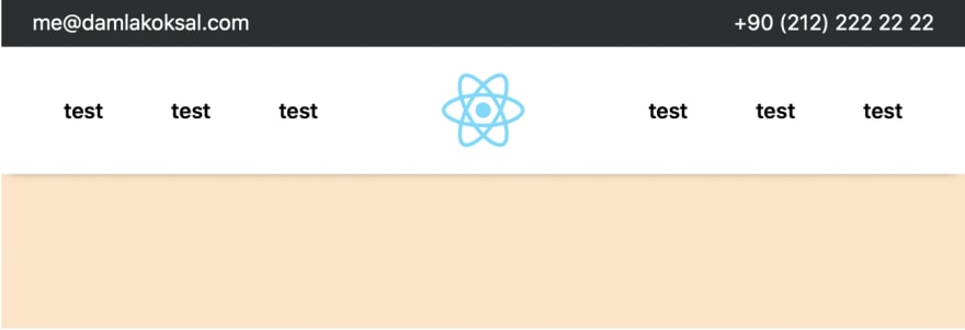
And, our app will look like this:

🧗🏼♀️ Step 6: Smooth Start to Navbar Component
At the beginning, our Navbar will neither be fixed nor have a transparent background. We will add them step by step to understand it better. At the end of Step 6, Navbar component is going to look like below:
So, I planned our elements as shown below:

Now, we have to implement the elements planned above into Navbar component.
import "./navbar.styles.scss";

import logo from "./logo.svg";

export default function Navbar() {
  return (
    <nav className="navbar-container">
      <div className="link-container link-container__left">
        <a href="/">test</a>
        <a href="/">test</a>
        <a href="/">test</a>
      </div>
      <img src={logo} className="logo" alt="logo" width={150} height={75} />
      <div className="link-container link-container__right">
        <a href="/">test</a>
        <a href="/">test</a>
        <a href="/">test</a>
      </div>
    </nav>
  );
}
/* simple mixin to add white background to class  */
@mixin white-bg {
  background-color: white;
  -webkit-box-shadow: 0 4px 8px -8px black;
  -moz-box-shadow: 0 4px 8px -8px black;
  box-shadow: 0 4px 8px -8px black;
}

/* Flexbox is used for the layout.
 * top is calculated as ( (# of announcement component) * ( height of announcement component) )
 */
.navbar-container {
  @include white-bg;
  display: flex;
  justify-content: center;
  align-items: center;
  padding: 10px 1.5rem 10px 1.5rem;
  align-items: center;
  z-index: 9;
  top: calc(1 * (0.4rem + 30px));
  width: 100%;

  .logo {
    &:hover {
      opacity: 0.7;
    }
  }

  .link-container {
    width: 33vw;
    display: flex;
    justify-content: space-between;
    align-items: center;

    a {
      font-weight: 600;

      &:hover {
        opacity: 0.7;
      }
    }

    &__left {
      padding-right: 3rem;
    }

    &__right {
      padding-left: 3rem;
    }
  }
}
Next, when the Navbar component is added to App component as shown in the code below, our result will be same with the picture at the beginning of this step. In addition, I've added another container to be able to scroll down in the page.
import Announcement from "./components/announcement/announcement.component";
import "./App.scss";
import Navbar from "./components/navbar/navbar.component";

export default function App() {
  return (
    <>
      <div className="container">
        <Announcement>
          <a href="mailto:me@damlakoksal.com">me@damlakoksal.com</a>
          <a href="tel:+902122222222">+90 (212) 222 22 22</a>
        </Announcement>
        <Navbar />
      </div>
      <div className="container"></div>
    </>
  );
}
ℹ️ If you are thinking what the heck is <>, Take a 👀 at here
💃🏼🕺🏼 Step 7: Last Dance with Navbar Component
As I mentioned at the beginning, the Navbar component has to be transparent and its background color has to be white on hover. For that reason, let's modify our navbar.styles.scss.
@mixin white-bg {
  background-color: white;
  -webkit-box-shadow: 0 4px 8px -8px black;
  -moz-box-shadow: 0 4px 8px -8px black;
  box-shadow: 0 4px 8px -8px black;
}

.navbar-container {
  // @include white-bg deleted
  display: flex;
  justify-content: center;
  align-items: center;
  padding: 10px 1.5rem 10px 1.5rem;
  align-items: center;
  z-index: 9;
  top: calc(1 * (0.4rem + 30px));
  width: 100%;

 // hover added with white-bg mixin
  &:hover {
    @include white-bg;
  }

  .logo {
    &:hover {
      opacity: 0.7;
    }
  }

  .link-container {
    width: 33vw;
    display: flex;
    justify-content: space-between;
    align-items: center;

    a {
      font-weight: 600;

      &:hover {
        opacity: 0.7;
      }
    }

    &__left {
      padding-right: 3rem;
    }

    &__right {
      padding-left: 3rem;
    }
  }
}
Next, we will set the position of .navbar-container to fixed and add a transition. Afterwards, we will create .scrolled class.
/* other codes */
.navbar-container {
  display: flex;
  justify-content: center;
  align-items: center;
  padding: 10px 1.5rem 10px 1.5rem;
  align-items: center;
  z-index: 9;
  position: fixed;
  // position fixed
  top: calc(1 * (0.4rem + 30px));
  width: 100%;
  transition: all 0.1s ease-in;
  // transition added

  &:hover {
    @include white-bg;
  }

  &.scrolled {
    // css class to activate during scroll event
    @include white-bg;
    padding: 5px 25px 5px 25px;
    top: 0;
  }
/* other codes */
ℹ️ .scrolled class will give Navbar component a white background with a shadow, smaller padding and fix it to top.
It's okay to see your components as shown in below because we didn't add the .scrolled class yet.

⚠️ Don't know what Hooks is? Take a 👀
import React, { useLayoutEffect } from "react";

import "./navbar.styles.scss";
import logo from "../../logo.svg";
const classNames = require("classnames");
// import hooks and classNames

export default function Navbar() {
  const [scrolled, setScrolled] = React.useState(false);
  // set the state


  useLayoutEffect(() => {
    const handleScroll = () =>
      window.scrollY > 0 ? setScrolled(true) : setScrolled(false);
    // if the window is scrolled, set state of scrolled to true

    window.addEventListener("scroll", handleScroll);
    // add event listener for scroll with the function above

    return () => window.removeEventListener("scroll", handleScroll);
    // clear the event
  }, []);
  // used useLayoutEffect to mutate the DOM


  return (
    // used classNames to append the className
    <nav className={classNames("navbar-container", { scrolled: scrolled })}>
      <div className="link-container link-container__left">
        <a href="/">test</a>
        <a href="/">test</a>
        <a href="/">test</a>
      </div>
      <img src={logo} className="logo" alt="logo" width={150} height={75} />
      <div className="link-container link-container__right">
        <a href="/">test</a>
        <a href="/">test</a>
        <a href="/">test</a>
      </div>
    </nav>
  );
}
What we did here is:
- Initialize state of scrolled to false as default.
- Implement useLayoutEffect. Curious about why useLayoutEffect instead of useEffect? Here is a nice comparison.
- Add handleScroll function. Set state to true or false according to the condition.
- Add event listener for scroll event.
- Remove event listener.
- Implement classNames with scrolled state. Thus, .scrolled class will added or removed according to state value.
🎉 Congrats
You made it! Hope you enjoyed while learning it. If you have any questions please let me know.


Top comments (6)
Good job!
Thank you Akif 🙃
Congratz, good job!
Thank you!
Deductive and a neat article.
Have a good work!
Thanks for reading 🙃