
Well-documented resources can help make your résumé stand out even if you aren't artistic. Today, I'll walk you through how I used existing resources to build an exciting résumé without design knowledge.
Latex is essential, IMHO. Other tools simplify résumé creation by degrees, but Latex will help you avoid the cookie-cutter stereotype. I pay for Overleaf, but anyone willing to learn Latex can do this for free.
An additional benefit to Latex is using it to generate PDFs. It's the primary publication format on Overleaf.
DISCLAIMER
Although this post is mostly about résumé presentation, a small portion is about content.
I am not an expert recruiter and am not sharing advice to help you pass ATS software. I am sharing approaches I have learned to promote myself to people, and I am still learning!
Please be nice in the comments.
TL;DR
Scan for the 💡 to pick out helpful suggestions, like the suggestion below.
💡 A benefit PDFs have over some alternate formats is that it's more difficult for a recruiter to change your perfectly-crafted résumé.
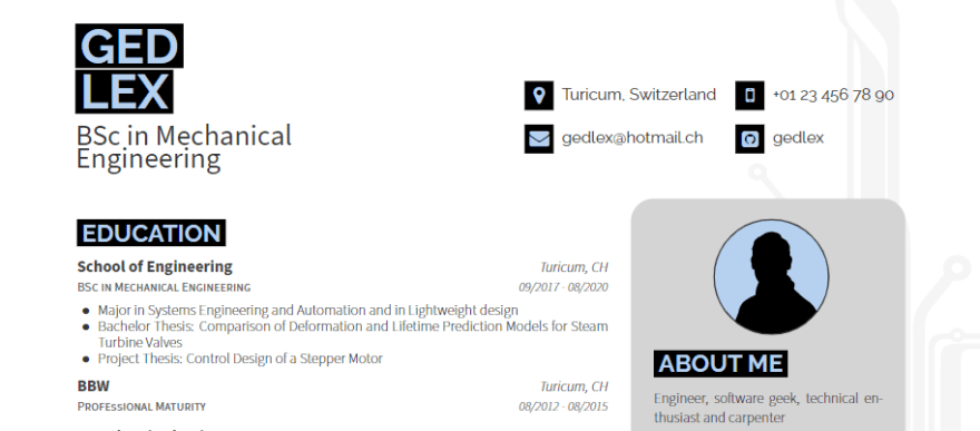
Choosing a template
It starts with a good template. I chose this one because
- It claims to be easy to alter
- It places the sidebar on the right
💡 A lot of résumés place their sidebar on the left, but that is sub-optimal for content placement. A left sidebar will cause more lines to overflow in your primary content area, which means you can shove more content onto a page with the sidebar on the right.
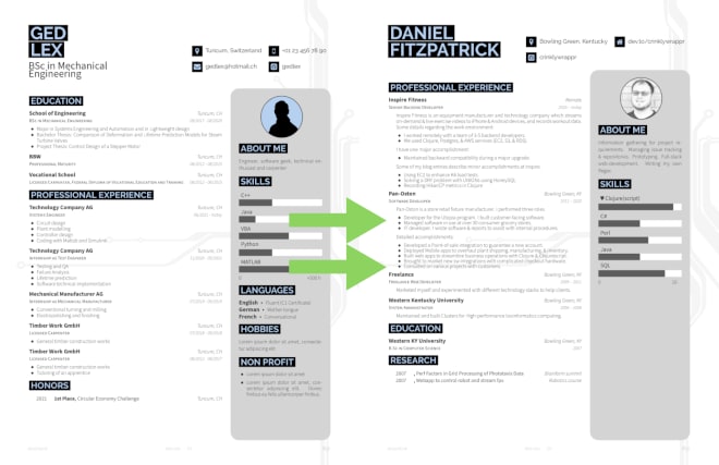
Transferring content
I have a lot of content from my old résumé, so I'm going to transfer that first, minus some contact information. I won't go into all the details, but it's probably worth pointing out how I changed the header, images, and bar graph.
The header is full of clickable contact info.
\name{Daniel}{Fitzpatrick}
\address{Bowling Green, Kentucky}
\github{crinklywrappr}
\homepage{dev.to/crinklywrappr}
I uploaded a personal photo, edited it with Gimp, and exported it to PDF.1
\photo[circle,edge,fill,left]{2.5cm}{pics/headshot.pdf}
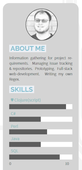
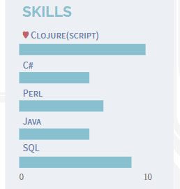
The template measures experience with various tools in hours, but I want to instead express a vague competency with each tool using values 1-10. Also, in my old résumé, I used a heart to express an affinity for a particular tool. 😉
\skillset[label/0\hfill 10]{SQL/.8,Java/.5,Perl/.6,C\#/.5,♥ Clojure(script)/.9}
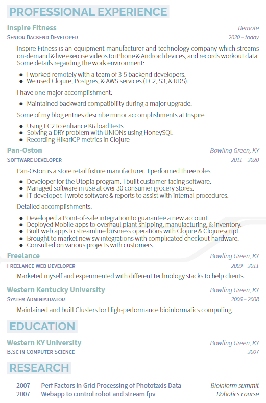
💡 The major categories should be placed on the page from most relevant to least relevant, top to bottom. In my case, this means Professional Experience should go at the top.
Cleaning up
What's that unsightly comma doing there?
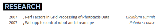
The honors section I re-purposed for Research has some incorrect assumptions. You can see the problem here, in ReCeiVe.cls.

You can also see an alignment issue near the top. That is because I omitted the position field.

We can fix that by adjusting the experience section position. After figuring out a rough measurement, I added this line to the top of cvSections/professionalExperience.tex.
\vspace{-7.5mm}

Nice.
Theme it!
💡 You don't have to be an artist to pick a good color palette. Many tasteful palettes exist already because we've been theming our desktops and editors for ages. I encourage you to visit r/unixporn for inspiration.
I have chosen the Nord theme for my résumé. The docs are essential.
💡 A dark style can be tempting. However, some people will print your résumé, which makes light styles a better choice in most cases.
I begin by copying the palette into ReCeiVe.cls in the Color configurations section.
\definecolor{nord0}{HTML}{2E3440}
\definecolor{nord1}{HTML}{3B4252}
\definecolor{nord2}{HTML}{434C5E}
\definecolor{nord3}{HTML}{4C566A}
\definecolor{nord4}{HTML}{D8DEE9}
\definecolor{nord5}{HTML}{E5E9F0}
\definecolor{nord6}{HTML}{ECEFF4}
\definecolor{nord7}{HTML}{8FBCBB}
\definecolor{nord8}{HTML}{88C0D0}
\definecolor{nord9}{HTML}{81A1C1}
\definecolor{nord10}{HTML}{5E81AC}
\definecolor{nord11}{HTML}{BF616A}
\definecolor{nord12}{HTML}{D08770}
\definecolor{nord13}{HTML}{EBCB8B}
\definecolor{nord14}{HTML}{A3BE8C}
\definecolor{nord15}{HTML}{B48EAD}
You can tweak the color of some elements immediately.
Nord0 is intended to be used for text.

Nord7 is perfect for subheadings.
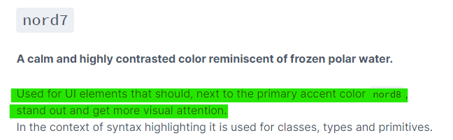
Nord9 and Nord10 are suitable for the job title beneath the Business subheading. After playing around, I decided on Nord10.

Finally, Nord1 is perfect for the lighttext class of elements. Just look at the tagline.

In Latex, it all looks like this bit of templating.
\colorlet{darktext}{nord7}
\colorlet{text}{nord0}
\colorlet{graytext}{nord10}
\colorlet{lighttext}{nord1}
Here, you can see how this breaks down.

That styling looks good, but I have a nagging feeling that the location should be Nord10 to match the date range. That's easy to change in ReCeiVe.cls under "Section styles".
\newcommand*{\entrylocationstyle}[1]{{\fontsize{9pt}{1em}\bodyfontlight\slshape\color{graytext} #1}}
Now it looks better.
Next up, we have another minor issue with our template. We can set the header color, but the background color is hardcoded to black. So, we need to change that in a couple of places in ReCeiVe.cls.
First, we define a new color, highlightbox, so named because our title color is highlight. I default it to black to preserve the original style.
\colorlet{highlightbox}{black}
Then, we replace \colorbox{black} with \colorbox{highlightbox} everywhere it occurs. Finally, we can set the colors for our new header.
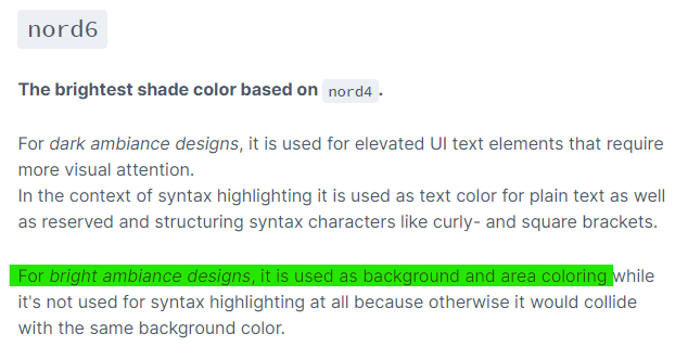
Nord8 must be our header color.
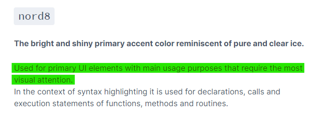
And Nord doesn't leave us any questions about the new background color either. It's obviously Nord6.
Here's the template code.
\colorlet{highlightbox}{nord6}
\colorlet{highlight}{nord8}
And here is the result.

The main body looks promising. But, unfortunately, our sidebar looks like trash. So, let's examine that next.
Fixing the sidebar
Here is where I think the major problems lie.
- The sidebar color does not belong to the Nord color scheme.
- The bar graph colors do not belong to the Nord color scheme.
- The bar graph labels appear to be styled with the same color as the main headers. They would look better if they matched the font and color of the job title from the previous section.
- The sidebar corner radius is too large.
Let's take this one by one.
I will take the same approach as highlightbox to fix the sidebar color. Start by defining a new color in ReCeiVe.cls.
\colorlet{sidebarcolor}{lightgray}
You want to set the fill to that color.
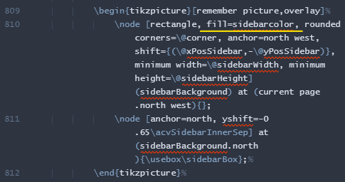
Last, I set the sidebarcolor near the top of my résumé.
\colorlet{sidebarcolor}{nord6}

That is a significant improvement to our sidebar, but fixing the background color has caused the graph labels to stick out even more. So let's fix them next.
That is pretty easy to do. Just find the For elements of sidebar section of ReCeiVe.cls and
- Set the color to
graytext. - Set the font to
scshape.


Nice! However, like with the last change, the improved labels make the bar graph stick out worse than before. So let's tackle the bar graph next.
Once again, I will take the same approach as highlightbox and sidebarcolor. Start by defining some colors in ReCeiVe.cls.
\colorlet{skillsetfillbg}{white}
\colorlet{skillsetfillfg}{gray}
Then use them in the skills definition.

Finally, set the colors at the top of your résumé. But what colors should we use?
I feel like the goal of expressing "a vague competency with each tool" is better served by matching the background color with the sidebar color. The Nord8 description suits the bar graph color, perhaps surprisingly.
# near the top of the resume
\colorlet{skillsetfillbg}{nord6}
\colorlet{skillsetfillfg}{nord8}
Finally, I want to ensure that the ♥ symbol has a suitable color, so I chose a reddish hue from Nord, Nord11.
\skillset[label/0\hfill 10]{SQL/.8,Java/.5,Perl/.6,C\#/.5,{\color{nord11} ♥} Clojure(script)/.9}
Our histogram looks fantastic!
Last, let's tackle these feathery corners. I will use the same approach as before. First, define a value sidebarRadius in ReCeiVe.cls.
\newlength{\sidebarRadius}
\setlength{\sidebarRadius}{0.5cm}
Then, apply that to the sidebar definition.

Finally, please give it a new definition near the top of your résumé.
\setlength{\sidebarRadius}{0.15cm}
Last, I am going to remove the ring around my portrait. Find the \photo definition near the top of your résumé, and change edge to noedge.
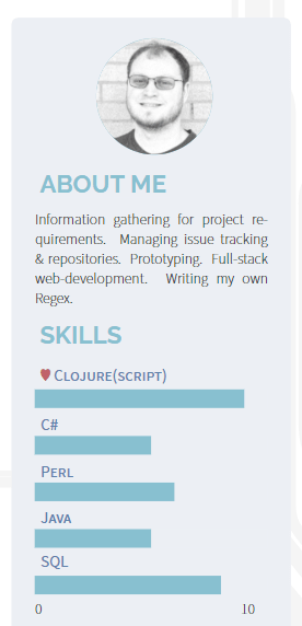
That sidebar is looking good now!
Improve "skimmability."
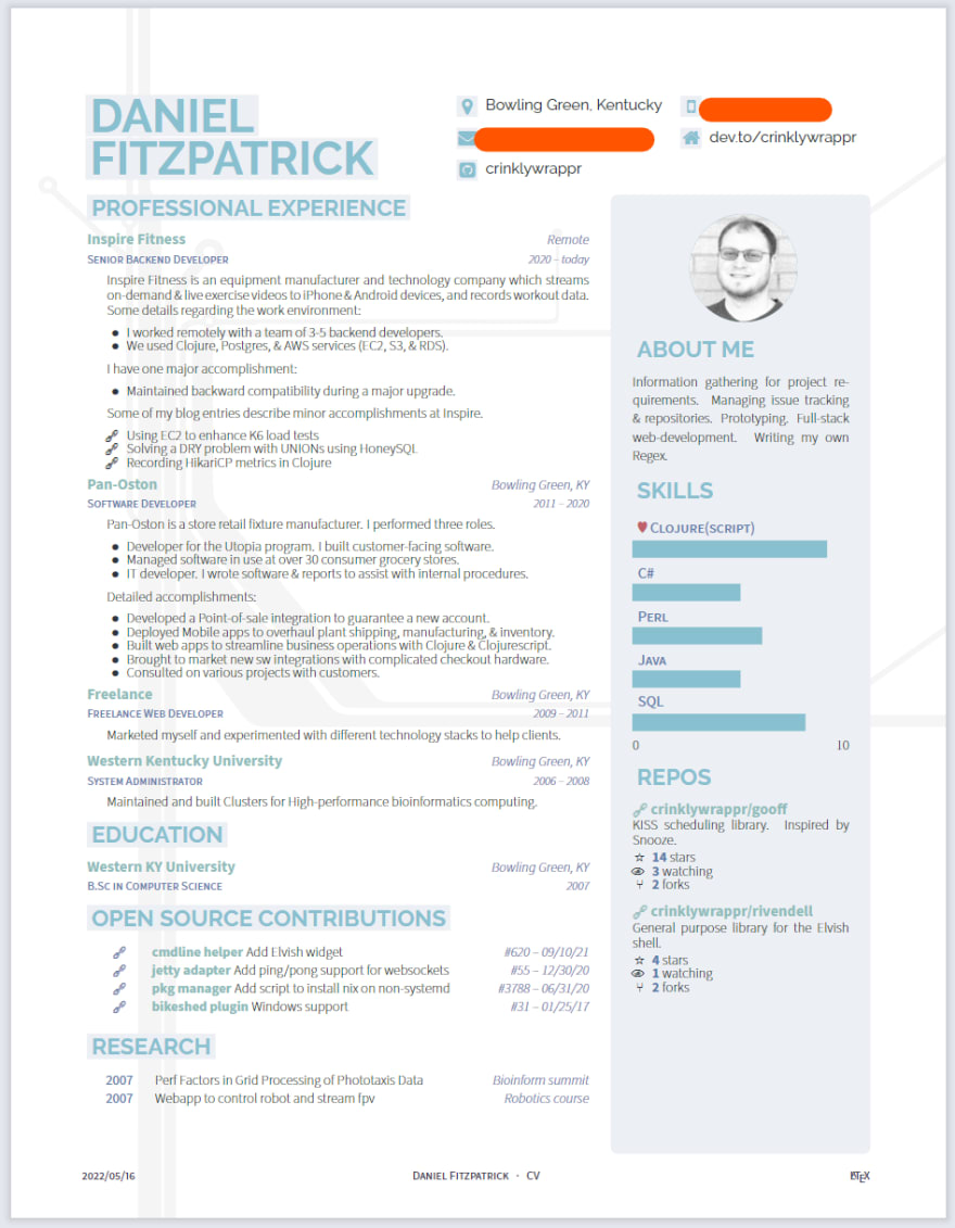
I have links in the main body of my résumé. In the future, they may be in the sidebar, too. Can you find them in this image?
Congratulations if you picked this yellow highlighted area.

💡 Quickly identifiable links will encourage hiring managers to explore beyond your résumé. It gives you depth.
We can do better. Latex allows you to customize bullet points, so let's use the "chain link" Unicode character. Other characters could work, too. You can also remove the bullet point and move the symbol to the right - dealer's choice.
I'm going to edit these three bullets in cvSections/professionalExperience.tex.
\begin{cvitems}
\item[{\fontspec{Symbola}\symbol{"1F517}}] \href{https://dev.to/crinklywrappr/using-ec2-to-enhance-k6-load-tests-57nj}{Using EC2 to enhance K6 load tests}
\item[{\fontspec{Symbola}\symbol{"1F517}}] \href{https://dev.to/crinklywrappr/saving-the-union-with-honeysql-4apm}{Solving a DRY problem with UNIONs using HoneySQL}
\item[{\fontspec{Symbola}\symbol{"1F517}}] \href{https://dev.to/crinklywrappr/recording-hikaricp-metrics-in-clojure-1baf}{Recording HikariCP metrics in Clojure}
\end{cvitems}

💡 It's good to maintain this practice in new sections, even if they're stylistically different.

What to emphasize?
💡 You probably already know that it's best to emphasize significant contributions and accomplishments at prior institutions.
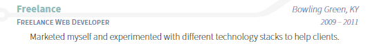
That approach can be more difficult for developers than it sounds. Take this line from my résumé, for example.
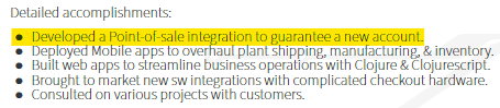
When I think about that accomplishment, the customer is of little interest to me. Instead, I recall the niche technology and strange development environments: coding on a 5-gallon plastic bucket in the middle of a grocery store self-checkout area.
💡 An interview is largely about determining the boundaries of your comfort zone.
I think some developers have a blind spot about that. Your comfort zone includes technology but also people. Think about the social aspect. Are you comfortable talking with a customer, for instance?
Identifying comfort zone boundaries can be framed as a contribution. Again, from my résumé.

💡 You should absolutely tout and link to significant open-source contributions. PRs, reviews, projects, blogs. Whatever you think highlights the qualities you want to promote.
I think some developers view their open-source contributions as orthogonal, irrelevant, and perhaps even detrimental to their image during a review. That view couldn't be further from the truth. I have met more than one hiring manager who elected to do a codebase walkthrough instead of a technical assessment.
My final résumé has these sections.
Final result
Here it is. Does it look compelling? Please give me your thoughts!
-
💡 Self-portraits add polish, but recruiters may suggest they harm résumés because hiring managers can subconsciously accept or reject you based on your appearance. Choose wisely. ↩


Top comments (0)