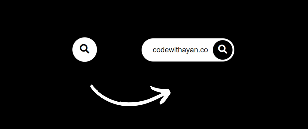
Hello Devs, Today we’ll create an Awesome animated search bar with icon using HTML and CSS . To create it you will need a Font awesome kit. Hope you enjoy this post.
A search bar is a very important component of our website. They allow users to easily search for articles available on your blog and help them find out what they are looking for easily, which increases the friendliness of the website to users.
Extending the search box to Hover is an idea that modern websites use nowadays, with placing it in the top navbar of the website to see it easily. Even if it is a small feature to be implemented; you can be creative with it and make the Search bar interactive in a way that adds a good experience for the users.
Demo
Now, as we have seen the demo so let’s head to create this with CSS & HTML. To create animated search bar we have used Font Awesome. Hence, you will need a Font Awesome link in your
Awesome Animated search bar with icon HTML CSS (source code)
<!DOCTYPE html>
<html lang="en">
    <head>
        <title>Animated Search Bar</title>
        <link rel="icon" href="animated.jpg">
        <link rel="stylesheet" href="SearchBar.css">
        <link rel="stylesheet" href="https://cdnjs.cloudflare.com/ajax/libs/font-awesome/5.15.3/css/all.min.css" integrity="sha512-iBBXm8fW90+nuLcSKlbmrPcLa0OT92xO1BIsZ+ywDWZCvqsWgccV3gFoRBv0z+8dLJgyAHIhR35VZc2oM/gI1w==" crossorigin="anonymous"/>
    </head>

    <body>
        <br>
        <form action="" id="s">
            <input type="search">
            <i class="fa fa-search"></i>
        </form>

    </body>

</html>
CSS Code
body{
    padding: 0;
    margin: 0;
    height: 100vh;
    width: 100%;
    background: #07051a;
}

form{
    position: relative;
    top: 50%;
    left: 50%;
    transform: translate(-50%,-50%);
    transition: all 1s;a
    width: 50px;
    height: 50px;
    background: white;
    box-sizing: border-box;
    border-radius: 25px;
    border: 4px solid white;
    padding: 5px;
}
input{
    position: absolute;
    width: 100%;
    height: 42.5px;
    line-height: 30px;
    display: none;
    font-size: 1em;
    border-radius: 20px;
    padding: 0 20px;
    top: 0;
    left: 0;
    outline: 0;
    border: 0;
}
.fa{
    box-sizing: border-box;
    padding: 10px;
    width: 42.5px;
    height: 42.5px;
    position: absolute;
    border-radius: 50%;
    color: #07051a;
    text-align: center;
    font-size: 1.2em;
    transition: all 1s;
    top: 0;
    right: 0;
}
form:hover {
    width: 200px;
    cursor: pointer;
}
form:hover input {
    display: block;
}

form:hover .fa {
    background: #07051a;
    color: white;
}
Congratulations! You have now successfully created our Animated search bar with icon.
Make sure to check out my other amazing CSS and Javascript tutorials:
- Responsive footer design in HTML and CSS
- Random Password Generator app in Javascript Source code
- Glassmorphism Login Form using HTML and CSS
My Website: codewithayan, see this to checkout all of my amazing Tutorials.


Top comments (0)