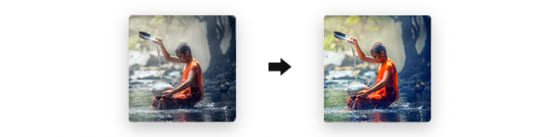
“Frosted glass” effect kicked around the Internet more than 10 years ago and it’s still popular. You can create a faded background effect and other complex design effects with just a single line of CSS!
The backdrop-filter is an animatable CSS property which allows applying various graphical effects to the area behind an element. Thanks to this property you can achieve different effects such as blurring, colour shifting or frosted glass. The “backdrop” basically describes everything of the drawn content that lies behind the specified item. While using it in SVG it applies an effect to a container but excludes the defs tags. Element or its background needs to be at least partially transparent to see them because they are applied to everything that is behind.
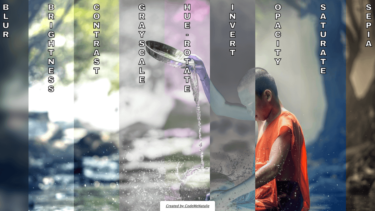
While using the backdrop-filter property you can choose from many filter values:
-
blur()– applies a distance measurement within which pixels are scattered. It makes the element less clear. Strength is indicated by the number you use. The higher the value, the less distinct item will be.

brightness()– adjusts the brightness of the element’s colour. If you set the value below 1 the result will be darkened and numbers above 1 will lighten it. The filter accepts percentage or any number from 0 to infinity.contrast()– defines the element’s contrast by increasing the already light areas and decreasing the darker ones. It takes every pixel of the item and adjusts the difference between the light and dark values.grayscale()– changes the amount of light of the element while intensifying its colours between black and white. When you set the value to 1 or 100% the element will be completely grayscaled.

invert()– generates the opposite colour of the element.hue-rotate()– specifies an angle around the colour circle that the element will be adjusted by. You can provide value from 0 to 360 in either degrees or radians. Each degree has its own colour – 0 is red, 120 is green and 240 is blue. That means if you have green pixel in your element and set the value to 240 your red pixel will be blue.none– doesn’t apply any filter to the backdrop.opacity()– applies transparency to the element’s colour.saturate()– changes the intensity of the element’s colour making it appear more or less vivid. Setting the value to 2 (or 200%) will double the saturation. Decreasing the value will make the item look more greyish and blend.
-
sepia()– applies a sepia tinge to the element what gives a warmer and more antique feeling.
Check out an example of all of them below:
Please note that this property is not compatible with Edge and Internet Explorer. For more information, you should check the official documentation.


Top comments (3)
Love this stuff. CSS is super powerful. Your codepen is beautiful.
Thank you! 😍
Oh, neat! I always assumed you could do stuff like that with CSS, but didn't know it was that easy (and definitely didn't know it was animatable). Thanks!