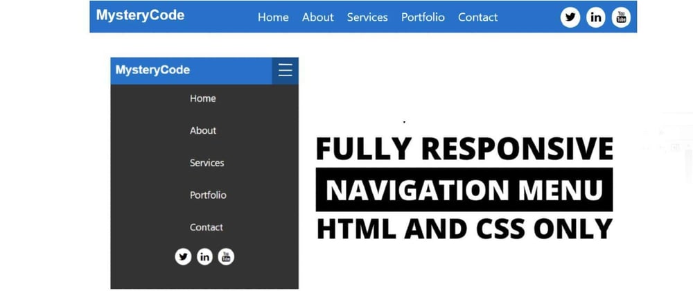
The responsive navigation bar is a UI element in the website which contains links to other sections of the website. Hello friends, in this blog article I am going to show you how to create a navigation menu bar on Responsive using only simple HTML and CSS programming code. I have designed many more types of menubars before, such as side menubars, overlay menubars, and so on.
The navigation menu I created in this article is very simple and generally designed.
Although in most cases the navigation bar is placed horizontally at the starting of the webpage(on top), in some cases, a horizontal navigation bar may not fit the website design. Each menu has a hover effect, meaning that when you hover or click on the menus, the color of the background will change.
Responsive Navigation Bar (Source Code)
You can download the required source code by clicking on the download link above. In addition, I have given below the necessary source codes, you can copy them from there.
 <div class="nav">
        <input type="checkbox" id="nav-check">
        <div class="nav-header">
          <div class="nav-title">
            MysteryCode
          </div>
        </div>
        <div class="nav-btn">
          <label for="nav-check">
            <span></span>
            <span></span>
            <span></span>
          </label>
        </div>

        <div class="nav-links">
            <ul>
          <li><a href="#" target="_blank">Home</a></li>
          <li><a href="#" target="_blank">About</a></li>
          <li><a href="#" target="_blank">Services</a></li>
          <li><a href="#" target="_blank">Portfolio</a></li>
          <li><a href="#" target="_blank">Contact</a></li>
          <a class="icon">
            <i class="fa fa-twitter"></i>
            <i class="fa fa-linkedin"></i>
            <i class="fa fa-youtube"></i>

          </a>
            </ul>
        </div>
      </div>
* {
    box-sizing: border-box;
  }

  body {
    margin: 0px;
    font-family: 'segoe ui';
  }

  .nav {
    height: 50px;
    width: 100%;
    background-color: #1177ca;
    position: relative;
  }

  .nav > .nav-header {
    display: inline;
  }

  .nav > .nav-header > .nav-title {
    display: inline-block;
    font-size: 22px;
    color: #fff;
    font-weight: 550;
    font-family: Arial, Helvetica, sans-serif;
    padding: 10px 10px 10px 10px;
  }

  .nav > .nav-btn {
    display: none;
  }

  .nav > .nav-links {
    display: inline;
    float: right;
    font-size: 18px;
  }
  .nav > .nav-links > ul li a{
    display: block;
    padding: 0 8px;
    color: #fff;
    line-height: 40px;
    font-size: 18px;
    text-decoration: none;

  }
  .nav > .nav-links > ul{
    padding: 0;
    margin-top: 5px;
    list-style: none;
    position: relative;

  }
  .nav > .nav-links > ul li{
    display: inline-block;
    background-color: #1177ca;


  }
  .nav > .nav-links > ul li:hover{
      background-color: #0b65af;
      border-radius: 5px;
  }

  .nav > #nav-check {
    display: none;
  }

 .nav .nav-links ul a.icon{
 margin-left: 80px;
 margin-right: 10px;
 }

 .nav .nav-links ul a i{
    background-color: #fff;
    border-radius: 50px;
    padding: 7px;
    margin-left: 5px;
 }


  @media (max-width:750px) {
    .nav > .nav-btn {
      display: inline-block;
      position: absolute;
      right: 0px;
      top: 0px;
    }
    .nav > .nav-btn > label {
      display: inline-block;
      width: 50px;
      height: 50px;
      padding: 13px;
    }
    .nav > .nav-btn > label:hover,.nav  #nav-check:checked ~ .nav-btn > label {
      background-color: rgba(0, 0, 0, 0.3);
    }
    .nav > .nav-btn > label > span {
      display: block;
      width: 25px;
      height: 10px;
      border-top: 2px solid #eee;
    }
    .nav > .nav-links {
      position: absolute;
      display: block;
      width: 100%;
      background-color: #333;
      height: 0px;
      transition: all 0.3s ease-in;
      overflow-y: hidden;
      top: 50px;
      left: 0px;
    }
    .nav > .nav-links > ul li a {
      display: block;
      width: 100%;
    }

    /*   */


      .nav > .nav-links > ul li{
        display: block;
        margin-bottom: 20px;
        padding: 0;
        background-color: #333;

      }
      .nav > .nav-links > ul li a{
          margin-left: 40%;
      }
      .nav .nav-links ul a.icon{
        margin-left: 33%;
      }

    /*   */
    .nav > #nav-check:not(:checked) ~ .nav-links {
      height: 0px;
    }
    .nav > #nav-check:checked ~ .nav-links {
      height: calc(100vh - 50px);
      overflow-y: auto;
    }
  }
You can visit my blog for more tutorials like this.
https://www.foolishdeveloper.com/


Top comments (3)
Thanks for this! In the future, could I ask for more definition of the code and a code pen so we can see it in action? Thanks!
wow!
Can I use image in the Navigation Bar instead of title