In this article I have shared with you how to create a simple Responsive Navigation menu bar.
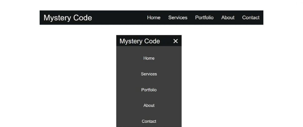
We all know the menu bar is a significant part of a website. The navigation menu plays a big role in determining the beauty and quality of the website. Many websites now use sidebar menus, but most websites now use the navigation menu bar.
I have designed many more navigation menus using HTML and CSS code. However, in this case I have used a small amount of JavaScript to execute the menu button. This is a very simple and simple design. If you know the basic HTML and CSS then you can understand the design.
Below is a YouTube video that lets you watch a demo and get an idea of how it's made.
Hopefully the video above has helped you to know how this design is made. Now I am sharing with you how to make it in full step by step below.
Step 1: Create the basic structure of navigation
First I designed the basic background of this navigation bar. Originally in the background here I used black color. You can use any other color if you want.
 <nav class="navbar">

 </nav>
    * {
        margin: 0;
        padding: 0;
        box-sizing: border-box;
    }

    html {
        font-family: sans-serif;
    }

    li {
        list-style: none;
    }

    a {
        text-decoration: none;
    }

    .navbar {
        display: flex;
        justify-content: space-between;
        align-items: center;
        background-color: #151617;
        padding: 1rem 1.5rem;
    }

Step 2: Add logo to navbar
Now I have used a logo. I have used font-size: 30px and color white of this logo.
<a href="#" class="nav-logo">Mystery Code</a>
    .nav-logo {
        font-size: 30px;
        font-weight: 500;
        color: white;
    }

Step 3: Add menu links
Now I have added the necessary menu items here. Here I have basically added five menu items you can increase the amount if you want. Margin-left: 3rem has been used to keep each menu a bit away from each other.
Here I have used the front size of the menu links 19 px and the color white. If you want to increase the size of these links a little, you can increase the size of the front here.
<ul class="nav-menu">
 <li class="nav-item">
   <a href="#" class="nav-link">Home</a>
 </li>

 <li class="nav-item">
   <a href="#" class="nav-link">Services</a>
 </li>

 <li class="nav-item">
   <a href="#" class="nav-link">Portfolio</a>
 </li>

 <li class="nav-item">
   <a href="#" class="nav-link">About</a>
 </li>

 <li class="nav-item">
   <a href="#" class="nav-link">Contact</a>
 </li>
</ul>
    .nav-menu {
        display: flex;
        justify-content: space-between;
        align-items: center;
    }

    .nav-item {
        margin-left: 3rem;
    }

    .nav-link{
        font-size: 19px;

        color: white;
    }

    .nav-link:hover{
        color: #1ae5f7;
    }

Step 4: Create menu button
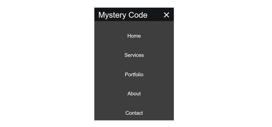
Above we have designed the Basic menu bar, now I will make it for Responsive Devices. First of all here I will create a menu button. Basically, in the case of responsive devices, menu items are completely hidden, instead we see a menu button.
When we click on that menu button, we can see the complete menu items. I made this button by three lines. Which is built using the following HTML and CSS codes. I used width: 25px, height: 3px and background-color: white of each line. The lines are 5 pixels apart.
<div class="hamburger">
    <span class="bar"></span>
    <span class="bar"></span>
    <span class="bar"></span>
</div>
    .hamburger {
        display: none;
    }

    .bar {
        display: block;
        width: 25px;
        height: 3px;
        margin: 5px auto;
        -webkit-transition: all 0.3s ease-in-out;
        transition: all 0.3s ease-in-out;
        background-color: white;
    }
Step 5: Make the menu bar responsive with css
Now I will make it for Responsive Devices. In this case, I did not use any bootstrap or CSS library. I made it responsive using only css.
@media only screen and (max-width: 668px) {
        .nav-menu {
            position: fixed;
            left: -100%;
            top: 5rem;
            flex-direction: column;
            background-color: #3d3d3d;
            width: 100%;
            padding-top: 20px;
            padding-bottom: 20px;
            text-align: center;
            transition: 0.3s;

        }

        .nav-menu.active {
            left: 0;
        }

        .nav-item {
            margin: 2.5rem 0;

        }

Step 6: Determine what happens when you click on the menu button
The following CSS codes have been used to add animation effects to the menu button. When you click on that menu button, those three lines will join together to form a cross symbol.
In this case, the lines number one and number three move at an angle of 45 degrees to each other and the line number two is not visible. This results in the number one and three lines being joined together to form a cross mark.
       .hamburger {
            display: block;
            cursor: pointer;
        }

        .hamburger.active .bar:nth-child(2) {
            opacity: 0;
        }

        .hamburger.active .bar:nth-child(1) {
            -webkit-transform: translateY(8px) rotate(45deg);
            transform: translateY(8px) rotate(45deg);
        }

        .hamburger.active .bar:nth-child(3) {
            -webkit-transform: translateY(-8px) rotate(-45deg);
            transform: translateY(-8px) rotate(-45deg);
        }
Step 7: Activate the menu button using JavaScript
Now I have activated these buttons using JavaScript code. First I set the constants to one of three class functions. Here '.hamburger', '.nav-menu', '.nav-link' have hamburger, navMenu, navLink constants respectively.
const hamburger = document.querySelector(".hamburger");
const navMenu = document.querySelector(".nav-menu");
const navLink = document.querySelectorAll(".nav-link");
Then using the JavaScript below I activated those two menu buttons.
hamburger.addEventListener("click", mobileMenu);
navLink.forEach(n => n.addEventListener("click", closeMenu));

function mobileMenu() {
    hamburger.classList.toggle("active");
    navMenu.classList.toggle("active");
}

function closeMenu() {
    hamburger.classList.remove("active");
    navMenu.classList.remove("active");
}
Hope you know the basic JavaScript and understand the JavaScript structure above. If you have trouble understanding, you can watch the video tutorial above.
Hopefully in this article I have explained how to extend the menu bar on a simple navigation using HTML CSS and JavaScript code. You can download the required source code.


Top comments (0)