You read that right, it's time to bring out your Blue Eyes White Dragon and d-d-d-d-deliver some nice animations to your side projects. Bear with me while I revisit my childhood please, and in the meantime, let's have some fun with CSS 🥰
If you wish to jump right into the solution, here's the Codesandbox link, enjoy !
Step 1: Create the wrapper 🎁
 <div class="card-wrapper">

 </div>
// Our card flip animation, simply rotates the element on the Y
// axis and then goes back to its original state
@keyframes cardFlip {
  0% {
    transform: rotateY(0deg);
  }
  50% {
    transform: rotateY(180deg);
  }
  100% {
    transform: rotateY(0deg);
  }
}

.card-wrapper {
  position: relative;
  transform-style: preserve-3d;
  animation: cardFlip 3s ease-in-out infinite;
  width: 100px;
  height: 150px;
}
Here transform-style defines each children element as 3D. When used in conjunction with backface-visibility and transform, it will allow us to use the back and front as tangible 3D objects that can be rotated.
Step 2: Create each card face 🎴
<div class="card-wrapper">
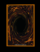
<img class="card" src="front.jpg" alt="" />
<img class="card card-back" src="back.jpg" alt="" />
</div>
.card {
  position: absolute;
  backface-visibility: hidden;
  width: 100px;
  height: 150px;
}

// By default, we rotate the back of the card out of view
// This way, when the animation triggers, the front and back
// swap places back and forth
.card-back {
  transform: rotateY(180deg);
}
backface-visibility defines the back of the card as hidden by default, this way, when it turns, we won't simply see the same face twice.
And that's it, short and sweet.
I struggled a bit to implement it at first and figured it would be worth documenting !
Whether you play Magic: the Gathering, Yu-Gi-Oh!, Flesh and Blood, Vanguard or any other TCG, I'm sure you'll find that animation a bit nostalgic.
Feel free to follow me on Twitter (if it's still around by the time you read this article) - it's always fun chatting with some of you and sharing tips & tricks together 😄


Top comments (0)