
What are breakpoints?
Have you ever been styling a webpage, just to notice that your text cuts off the screen when the browser window shrinks? Or that the webpage is a mess and hard to use from a phone's browser? Well, many other developers noticed the same thing and came up with the concept of breakpoints.
Breakpoints are pixel values for a specific webpage. Used in software development, they help us create more responsive webpages. So how exactly do they work? Well, they're generally used to provide CSS conditions for elements. We can say to a css element: "Style my element this way, but once the webpage pixels pass a certain threshold, change to styling this way." By doing this, we can make our webpages more responsive, meaning they respond and update according to the size of our browser.
As an example, we can set up some conditional CSS to shrink the font of some given text and apply word wrap once the window shrinks to a certain level. Now, the text wont cut off the screen, but will instead wrap and be more easily readable.
Breakpoints in Material UI
So we now know what breakpoints are, but how are they used in Material UI? Well, Material UI actually does a lot of the hard stuff for us. Firstly, they set up default breakpoint values as part of their default theme. These values, being extra small (xs), small (sm), medium (md), large (lg), and extra large (xl), all hold a unique pixel value that corresponds to a specific window size like so:
| Size | Variable Name | Value |
|---|---|---|
| extra small | xs | 0px |
| small | sm | 600px |
| medium | md | 960px |
| large | lg | 1280px |
| extra large | xl | 1920px |
Material UI uses breakpoints a lot, specifically with components like Grids. If you've used a grid before, you know that the items take in props that correspond to a given breakpoints variable name and a number out of 12, like xs={12} sm={6}. These props are telling the grid component that when the window is above breakpoint small, or 600px, the grid item takes up half of a row (since rows are 12 columns in MUI). Once the window shrinks to above the extra small breakpoint but below the small one, or 0px-599px, the grid item will take up an entire row.
Material UI's default breakpoint values are also changeable when creating a custom Material UI theme. Look at the default theme documentation here to see exactly where you need to override.
Material UI Media Queries
Now we know how Material UI characterizes breakpoints and uses them in their components, but what about that conditional CSS that we were talking about earlier? Well, Material UI also have some custom media queries that can be used to render conditional css. Generally used inside of a makeStyles function, it can responsively render different CSS based on breakpoint values.
Lets start by setting up a basic makeStyles function for some text:
import { makeStyles, useTheme, Typography } from '@material-ui/core'

const useStyles = makeStyles(theme ({
  textExample: {
    fontSize: '4rem',
    texAlign: 'center'
  }
})

function StartingPage() {
  const theme = useTheme();
  const classes = useStyles(theme);

  return (
    <Typography
      className={classes.textExample}
    >
      This is an Example
    </Typography>
  );

}
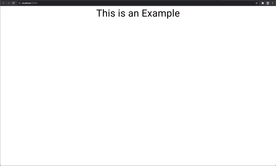
This code will render a line of text in the center of our page and give it a font size of 4rem. Here's how it looks:
Now, let's start adding some conditional CSS!
Theme.breakpoints.up
theme.breakpoints.up('variable') is a Material UI helper that targets a screen size greater than and equal to a given variable. So theme.breakpoints.up('md') targets the screen size from when it is 960px or more.
We can use it in our makeStyles function to conditionally render css like shown:
import { makeStyles, useTheme, Typography } from '@material-ui/core'

const useStyles = makeStyles(theme ({
  textExample: {
    fontSize: '4rem',
    texAlign: 'center',
    [theme.breakpoints.up('md')]: {
       color: 'red'
    }
  }
})

function StartingPage() {
  const theme = useTheme();
  const classes = useStyles(theme);

  return (
    <Typography
      className={classes.textExample}
    >
      This is an Example
    </Typography>
  );

}
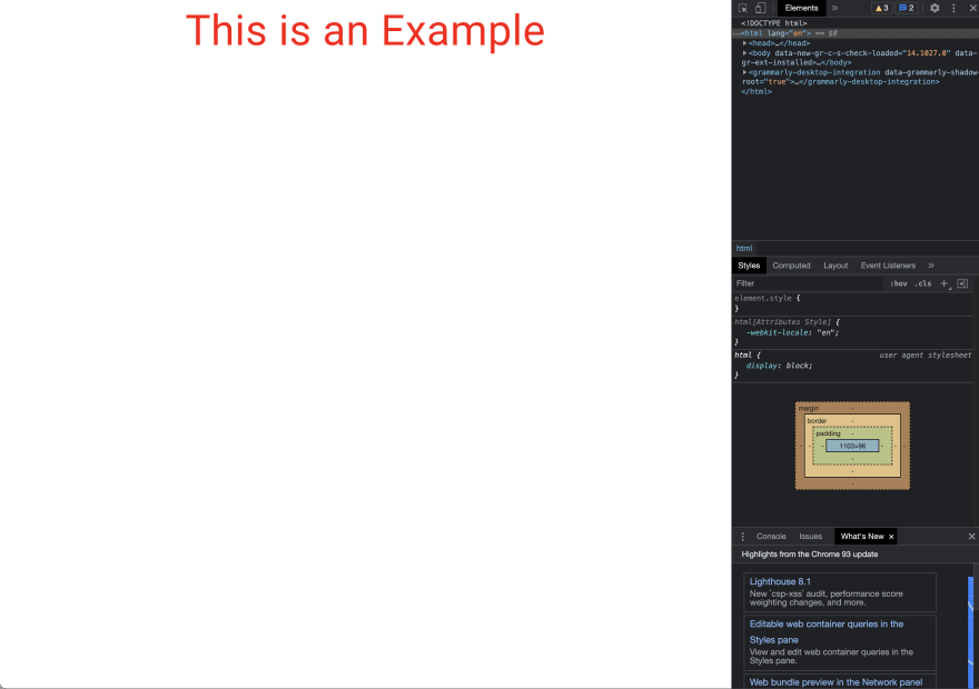
This piece of conditional css will change the color of our text to red if the window size is medium or larger. Lets test it out:
Small Window

Medium Window
Theme.breakpoints.down
As you could probably guess by the name, this helper does the exact opposite of theme.breakpoints.up. It targets a screen size less than and equal to a given variable. So using theme.breakpoints.down('sm') targets a screen size that is less than and including 600px.
Lets add it to our styling:
import { makeStyles, useTheme, Typography } from '@material-ui/core'

const useStyles = makeStyles(theme ({
  textExample: {
    fontSize: '4rem',
    texAlign: 'center',
    [theme.breakpoints.up('md')]: {
       color: 'red'
    },
    [theme.breakpoints.down('sm')]: {
      fontSize: '1rem'
    }
  }
})

function StartingPage() {
  const theme = useTheme();
  const classes = useStyles(theme);

  return (
    <Typography
      className={classes.textExample}
    >
      This is an Example
    </Typography>
  );

}
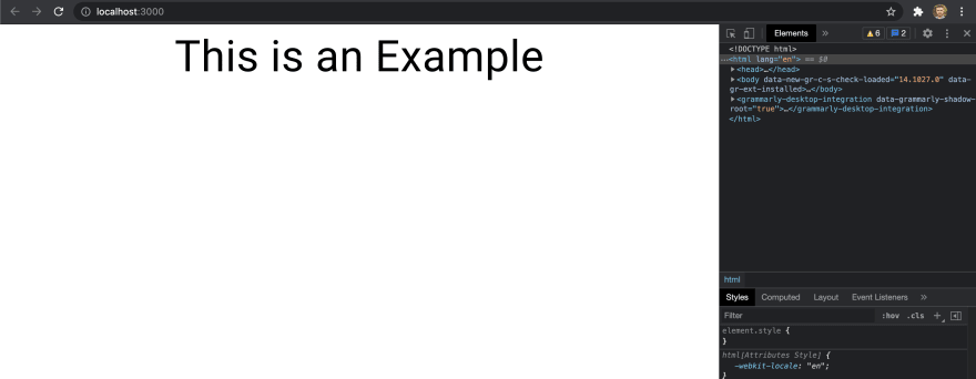
This code is going to change our font size from 4rem to 1rem if the window is smaller than or equal to 600px. Lets test it out!
Small Window

Medium Window

Theme.breakpoints.between
Again, this helper is a lot like the previous two. It takes in two variables and targets the screen starting at the first variable and up to, and including, the second variable. So theme.breakpoints.between('sm', 'md') is going to target the screen from 600px to 960px.
Lets remove our previous breakpoints and add this one to our code:
import { makeStyles, useTheme, Typography } from '@material-ui/core'

const useStyles = makeStyles(theme ({
  textExample: {
    fontSize: '4rem',
    [theme.breakpoints.between('sm', 'md')]: {
       color: 'blue'
    }
  }
})

function StartingPage() {
  const theme = useTheme();
  const classes = useStyles(theme);

  return (
    <Typography
      className={classes.textExample}
    >
      This is an Example
    </Typography>
  );

}
Now, our text will change from black to blue when our window is between 600px and 960px. Lets test it out:
Extra Small Window

Small Window

Medium Window

Large Window

Theme.breakpoints.only
And once again, this helper has a pretty self explanatory name. The theme.breakpoints.only helper only targets the screen when it is within the boundaries of a given variable. So theme.breakpoints.only('sm') only targets the screen when it is greater than 600px and less than 960px (which is the threshold for 'md').
Let's change our code around to incorporate it!
import { makeStyles, useTheme, Typography } from '@material-ui/core'

const useStyles = makeStyles(theme ({
  textExample: {
    fontSize: '4rem',
    [theme.breakpoints.only('sm')]: {
       color: 'blue'
    }
  }
})

function StartingPage() {
  const theme = useTheme();
  const classes = useStyles(theme);

  return (
    <Typography
      className={classes.textExample}
    >
      This is an Example
    </Typography>
  );

}
This code is now going to change our text color to blue only when it is greater than 600px and less than 960px. Let's test it out!
Extra Small Window

Small Window

Medium Window
useMediaQuery Hook
Finally, we have the useMediaQuery hook. This hook takes in one of our previously defined helpers and returns a boolean value. If the window is currently targeting the screen, the hook returns true, and if it isn't the hook returns false. An example of this hook goes like this: useMediaQuery(theme.breakpoints.only('sm'). If the window size is between 600px and 959px, the hook returns true, otherwise it returns false.
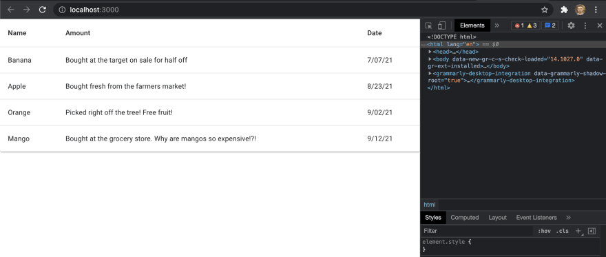
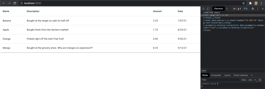
So why is this useful? Well, using this hook, we now have a way to responsively render entire components. Say you wanted to display a table with a bunch of transaction information. The table has columns for name, description, date, and amount. Now, when you have a large screen thats all fine, but when the screen size shrinks, the information on the table will start to get messed up. Either it will cut off the screen or it will wrap poorly and be ugly to look at and hard to read. Thats where our useMediaQuery hook comes in. We don't really need to see the description of the transaction when the table starts to shrink, so why don't we responsively render that so it disappears when our screen shrinks below 960px. By using the theme.breakpoints.up('sm') helper with useMediaQuery, we can have it return true when the window is larger than or equal to 960px and false when it's smaller. We can then use this to conditionally render our descriptions, like so:
import {
    useTheme,
    useMediaQuery,
    Paper,
    Table,
    TableContainer,
    TableHead,
    TableBody,
    TableRow,
    TableCell
} from '@material-ui/core'

function StartingPage() {
  const theme = useTheme();
  const isSmallOrLess =
  useMediaQuery(theme.breakpoints.up('md'));

    const rows = [
        { name: 'Banana', description: 'Bought at the target
          on sale for half off', amount: '2.25', date:
          '7/07/21' },
        { name: 'Apple', description: 'Bought fresh from the
          farmers market!', amount: '1.75', date: '8/23/21'
          },
        { name: 'Orange', description: 'Picked right off the
          tree! Free fruit!', amount: '0.00', date:
          '9/02/21' },
        { name: 'Mango', description: 'Bought at the grocery
          store. Why are mangos so expensive!?!', amount:
          '8.25', date: '9/12/21' }
    ];

    return (
        <TableContainer component={Paper}>
            <Table>
                <TableHead>
                    <TableRow>
                        <TableCell>Name</TableCell>
                        {   isSmallOrLess ?
                            <TableCell>Description</TableCell>
                            :
                            null
                        }
                        <TableCell>Amount</TableCell>
                        <TableCell>Date</TableCell>
                    </TableRow>
                </TableHead>
                <TableBody>
                    {rows.map(row => (
                        <TableRow>
                            <TableCell>{row.name}</TableCell>
                            {isSmallOrLess ?
                                <TableCell>{row.description}</TableCell>
                                :
                                null
                            }
                            <TableCell>{row.amount}</TableCell>
                            <TableCell>{row.date}</TableCell>
                        </TableRow>
                    ))}
                </TableBody>
            </Table>
        </TableContainer>
    );
}
This code is building out a basic table and loading it with four rows of data. Although it may look overwhelming, the important places to pay attention to are where we are conditionally rendering our component. Up near the top we are using our useMediaQuery hook and storing that value in a constant called isSmallOrLess. That constant is then being used in a ternary expression when rendering the description parts of our header and body. What this will do is render the component if isSmallOrLess is true, otherwise it will return null and not render anything.
Let's try it out!
Small Window
Medium Window
Conclusion
Breakpoints are a great way to make our webpages more responsive and user-friendly, but like any css, it can be a hassle to set up. Material UI, once again, makes everyone's lives a little easier by providing a bunch of custom breakpoints, helpers for conditionally rendering css, and a hook for conditionally rendering components.
If you would like to learn more about using breakpoints in Material UI, the documentation page here is a great source of information. There is also a useful stack overflow page here that gives a clear and concise overview on the subject.
Good luck and happy coding!


Top comments (4)
Great article, im wondering how to use Breakpoints inside
createTheme().Great article
makeStyles is deprecated in MUI v5.
please how can we use breakpoints in mui v5