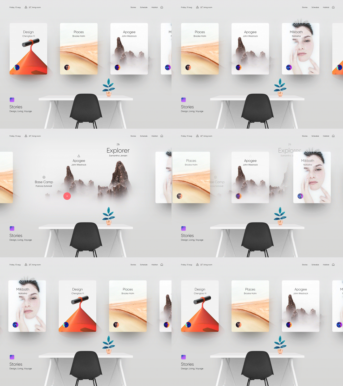
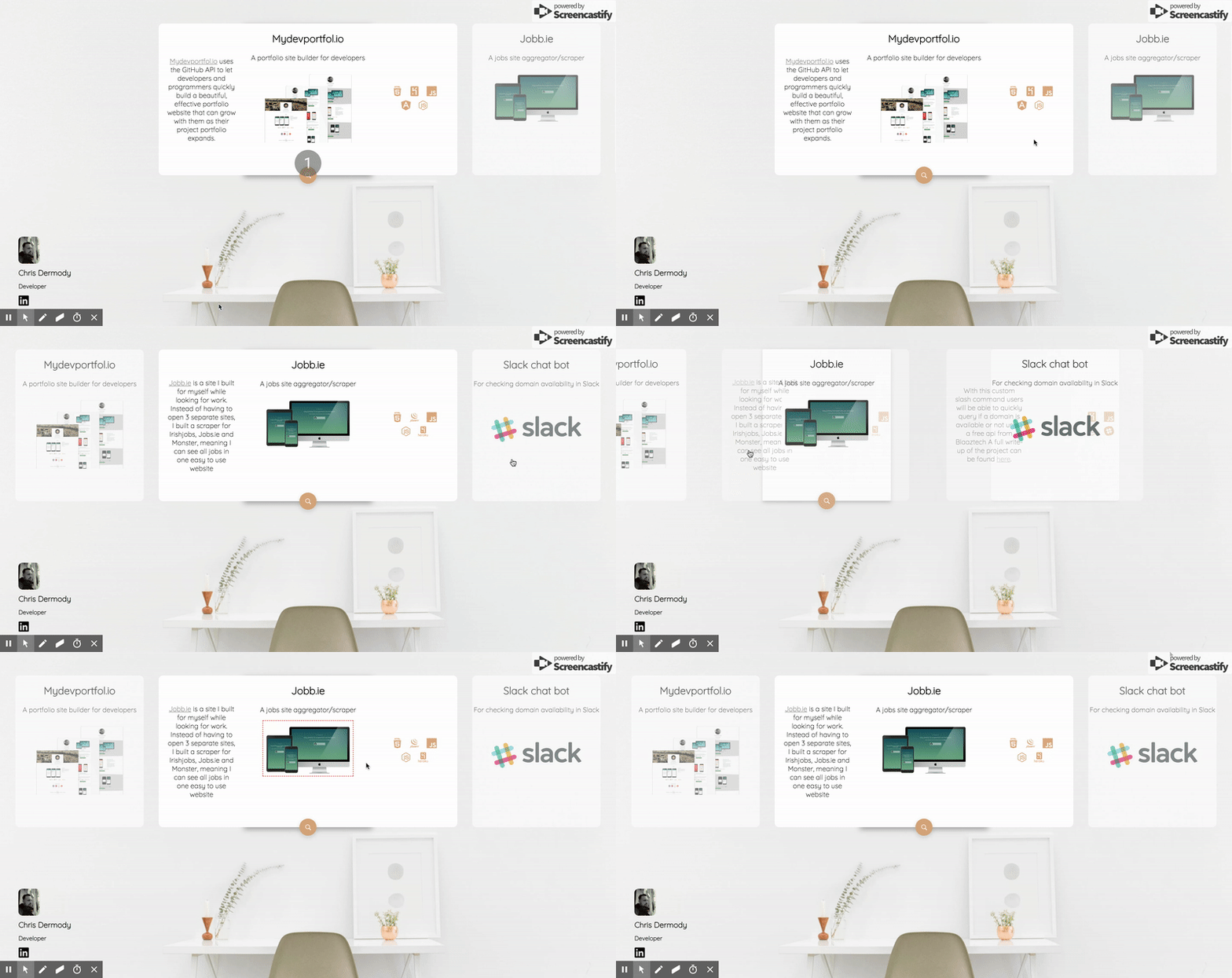
So, I have my side project mydevportfol.io, which means I keep an eye out for interesting portfolio designs that I could build. While perusing Dribbble, I came across this awesome shot (above), and thought it'd be perfect to turn into a portfolio, so I tried to build it.
There's the result above, and here's the live site. I took some creative license and didn't follow the design to the tee, but I'm happy with the result so far.
I posted it on Reddit and got some really good feedback, but I'm curious what you guys think.
I quite like it. It still needs some work to work 100% on browsers other than Chrome, but I'm reasonably satisfied with it.
As I said though, totally open to critical feedback! Here's the code on Github
Cheers!


Top comments (29)
Really slick.
A couple thoughts:
I think the general look here is nice. Giving some attention to the spacing, padding, and general small details will really make it polished.
Yep I think they should. Had a bit of trouble getting that to work though so left it for the moment. But yep, I agree
Yep good call! it needs some padding to give some content room to breath!
Cheers for the feedback!
Do you have any tutorials?
I have some, but they're a bit random in their content. Is there anything in particular you're curious about?
chrisdermody.com
When I see the things you have worked on I am impressed. What was your journey like to become the developer you are now? I am 1 year and 7 months in my Web Developer career and I want to a better Front-End Developer. Do have anything that shows all the skills needed to become a developer like yourself?
Hey Sam.
I don't really have anything that shows the skills I have no. One thing I would say that has stood to me is that I never just built stuff for the sake of it, it was usually to solve a problem I personally had. For instance I built jobb.ie because I was looking for a job and got sick of opening three separate sites to find a job. I didn't know everything I needed to know but the pain of the problem gave me the motivation to Google my way to figuring it out. The code is by no means perfect (the app is a little broken at the mo I think since I haven't updated it in years..), but I learned web scraping, node server tech, Heroku deployment etc.
The main "skill" you need is curiousity and creativity. Feel the pain of something in your life and think of technical solutions to them that you might be able to build, then go find out if it's possible, and if it is, get coding.
;)
+1 for the "just go for it" mentality. I've worked in both the front and back end and that is the best piece of advice any aspiring Dev can receive. In my case, I had no money for University so I didn't really have a choice, but an insatiable curiosity and near-complete disregard for common sense points like "I've never done this before, I don't know this language/framework, don't even know where to start, etc" will make you happy in your life as a developer. In my opinion, credentials can get you a good job right out of the gate. But unconditional love for your craft and dedication to "building a better mouse trap" will keep it fun and enjoyable regardless of if you feel your not at the prestige level you want to be. That prestige will come if you want it later on. If your a mad scientist who adores his craft, and loves to work with and share it with others, people will find out no matter how many basement levels down your company stashes you 😁😁👍
This!
That is an amazing site, but isn’t “only works on Chrome” kind of a turnoff for anyone looking to hire you? Just asking because I don’t know, but if it doesn’t work on web browsers... It does show you’re more capable than I will ever be, but that’s a low bar. 😎
Haha it only doesn't work on Firefox, as far as I can tell. But yes, it should and I have some ideas to try later to get around it.
But, if I waited till it was perfect before I got some feedback on it, I'd have waited too long and possibly lost the motivation to even finish it.
It's important us devs don't dilly daddle too long with our work and ship something, even if it's not perfect on 100% browsers.
But yep I should fix it. As an experiment in whether I could build something like the Dribbble shot though, it's served its purpose.
And as I've said to others, this site might look pretty but it's really very simple. I wouldn't put yourself down at all, this is well within the capability of even a novice webdev to achieve.
Just tried in Safari and it looks amazing. :)
That is really cool. Nice find and well done on the execution. Thanks for sharing. I look forward to dropping in and checking out the iterations.
Cheers! 😊
I played with the layout check it out on my Codepen
Here are a few things I want to improve.
TODO
I want to make another one and try and get the sudo image bleed effect that the original dribble has. I think that would be solid.
Anyway, thanks for the inspiration. By the way, I like the MyDevPortfol.io project. 👍
nice work!
it needs a background image though right? Otherwise it's just a lot of white.
If you pull off that image bleed effect I'll be very impressed, no idea how I'd go about doing that!
Thanks! You're totally right. It definitely needs a background image! 😇
No promises but it sure looks cool in the Dribble and I have a few ideas. Though I have a sneaking suspicion it's might be more of a photoshop hack rather then slick development if you know what I mean.
Best!
The portofolio site gives that "comfy" vibe and it's really easy on the eye; good job. :)
One suggestion tho - the magnifier button at the bottom of a card, can be clicked on the card that's not currently in the center. While clicking on that card point, I expected the card to fly to the center and reveal itself but was kind of surprised with a new tab opened.
ah good call! I'm gonna fix that later. Thanks for the kind words! :)
Well… round about every blog posts online don’t have much originality as I found on yours
noldp.com
Awesome work there man! reading some of the feedback makes me agree with them, if you add the keyboard integration in the navigation and the dark theme slider/changer it would be the bomb.
Amazing portfolio 🔥
Awesome!
Some minor suggestions:
First: the horizontal slider should be scrollable.
Second: The picture in the second block should be centered. Because this feels like something incomplete. I want to scroll the page and see the picture but I can't.
The dribble concept is really magnificent (sans the sterile stock desk maybe) but unfortunately your site really gives away you're no designer. The typography looks clueless and aimless, there are spacing issues and the colours do not as organically together as in the dribble picture and this all contributes to a wooden put-on look. But hey, at least your version of the desk looks much nicer :)
I mention all this mostly out of fascination with how good design is really invisible but less capable design quickly becomes jarring. It's not easy to be a good designer, of course.
Loving the look and feel of it. Great work!
Cheers! Much appreciated!
Looks great! Love it :)
Thanks! :)
Needs arrow keys and mousewheel tied in imo
Hey, glad to find your post. Let me clear out some of my doubts.
How did you manage to reduce the initial pageload for angular?.I seem to notice you used angular there on your site.