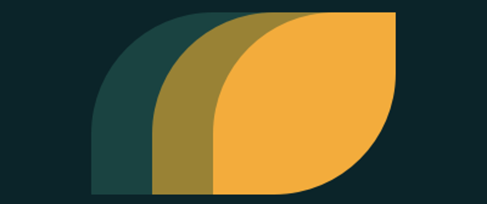
So this challenge requires you to be comfortable with absolute positioning, building shapes with border-radius.
Goal

Observation of Goal
A 3 rectangular shape with border-radius at 1 edge on top and bottom.
Nearly centered image (Meaning we can absolutely position and bring it to the center using the top and left)
Shapes overlap after some distance
It is prudent to guess the size of shapes say width and height rather than manually plugging in value. SO first we guess the size and the Code of the solution
Solution
Combining the above observations we can figure out the code looks similar to the below code
<div> </div>
<div> </div>
<div> </div>
<style>
body {
    background: #0B2429;
}

div {
    left: 50%;
    top: 50% ;
    height: 150;
    width: 150;
    border-radius: 100px 0 100px 0;
    position: absolute;
  }

div:nth-child(1) {
    background: #1A4341;
    transform: translate(-125px, -75px);
}

div:nth-child(2) {
    transform: translate(-75px, -75px);
    background: #998235;
}

div:nth-child(3) {
    transform: translate(-25px, -75px);
    background: #F3AC3C;
  }
</style>
Do let us know how much time you took to achieve the target by yourself in the comments.


Top comments (0)