
Ever since facebook announced a game-changing JavaScript framework during the summer of 2015, called React Native. It has made it easy for developer to design IOS and Android apps since it can handle about 85% of your code for you. With this framework, you could write pretty much all of your application which makes it very a valuable framework to learn.
React Native is a JavaScript framework for writing natively rendering mobile applications. A lot of companies like React-Native since it really increases the productivity and it reaches the market in no time. To name some companies: facebook, Instagram, Pinterest, Skype, UberEats, Bloomberg, discord, and of-course many more.
In this blog, I plan on going over the main twenty-four core components and explain the functionality of each one. Of course there are many more components but the most used ones are displayed below.
24 Native Core Components:
View: maps directly to the native view on whichever platform you are using. It can be displayed directly or you can build a custom views on top of it. View is a container that supports layout with flex-box, style, some touch handling, and accessibility controls.
Text : a foundation component, anytime you want to display any type of text in your component. You can use this directly or create your own wrapper component.
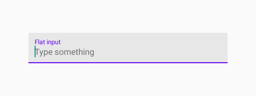
TextInput: how users input text into your app. It comes with some awesome properties like autocorrect, placeholder text, autoCapitalize, and autoComplete(Android). The TextInput values is always a string.
import * as React from 'react';
import { TextInput } from 'react-native-paper';

const MyComponent = () => {
  const [text, setText] = React.useState("");

  return (
    <TextInput
      label="Email"
      value={text}
      onChangeText={text => setText(text)}
    />
  );
};

export default MyComponent;
ScrollView : If you are building for a web, you would not need to use this component since it is automatically always rendered but when doing mobile apps, you should definitely consider this.
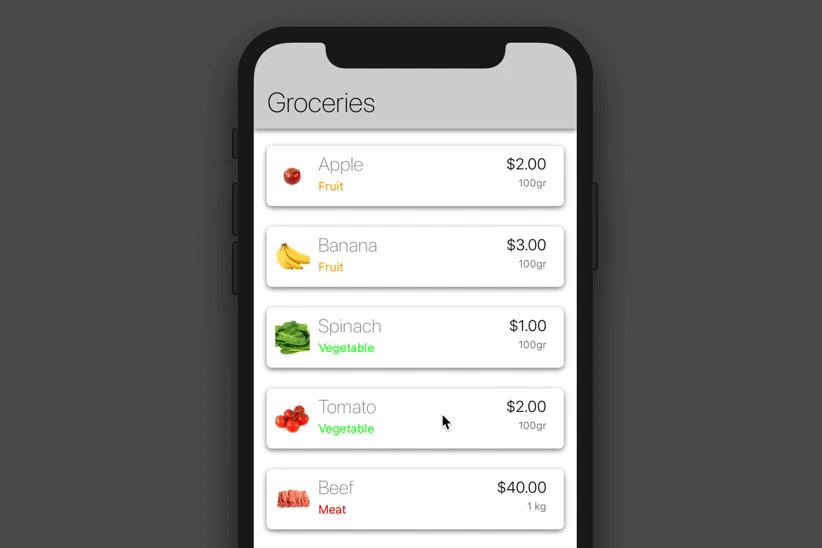
FlatList: is a component that renders items in a scrollable view, like a list of countries, states, or provinces.
<FlatList
data={Groceries}
renderItem={yourRenderItem}
keyExtractor={item=>item.id} />
SectionList: very similar to FlatList, but the list of data is organized to a section and each section would of course have a Header. 
ActivityIndicator: displays a loading indicator animation, it is very limited, the only thing you could customize is the size of the loading and the color.
import * as React from 'react';
import { ActivityIndicator, Colors } from 'react-native-paper';

const MyComponent = () => (
  <ActivityIndicator animating={true} color={Colors.red800} /> //animating: determines whether to show it or hide it
);

export default MyComponent;

ImageBackground: basic way of showing a background view.
KeyboardAvoidingView: a component to solve the common problem of views that need to move out of the way of the virtual keyboard. It can automatically adjust either its height, position, or bottom padding based on the keyboard height.
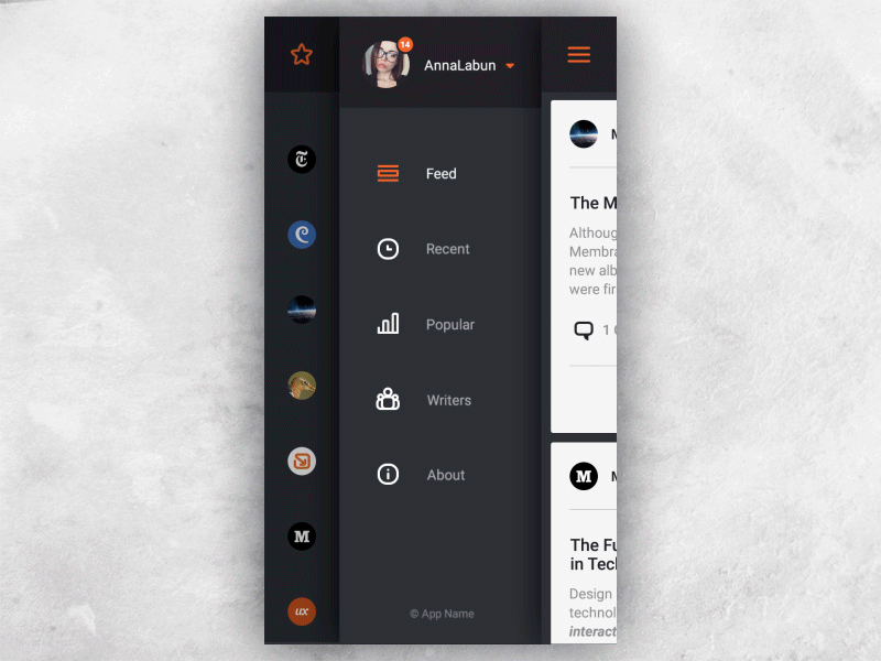
DrawerLayout: is android specific, pop a little menu from the right side to the left side.
TouchableNativeFeedback: responds to touches on android.
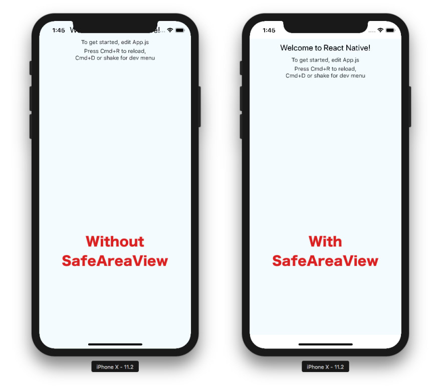
SafeAreaView: makes sure the content is well within the safe area boundaries of a device. Sadly, it is only applicable to iOS device with version 11.0 and after. It automatically puts padding to the page so that the navigation bar, tabs, toolbars, etc are not covered.
StatusBar: The status bar is the area, typically at the top of the screen, that displays the current time, Wi-Fi and cellular network information, battery level and/or other status icons.
Button: is a basic button component that renders nicely on your app. If you feel like it does not look right, start applying TouchableOpacity or TouchableWithoutFeedback components. You can make the button an icon or even the loading spinner.
import React, { Component } from 'react'
import { Button } from 'react-native'

const App = () => {
   const handlePress = () => false
   return (
      <Button
         onPress = {handlePress}
         title = "Red button!"
         color = "red"
      />
   )
}
export default App
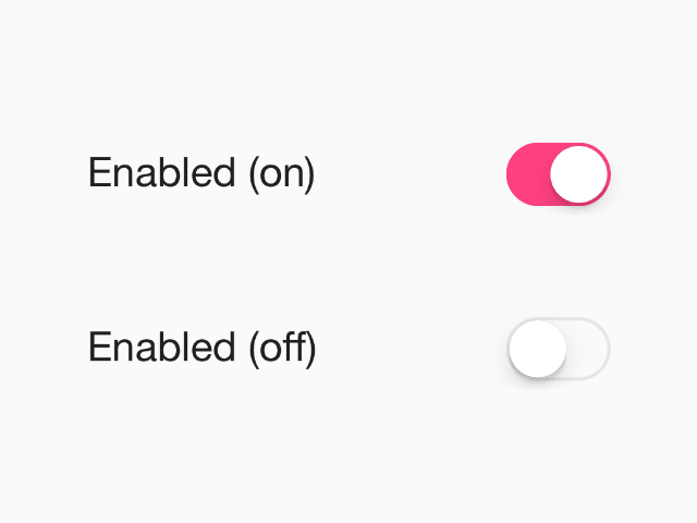
Switch: a visual toggle between two states, like on or off.
import * as React from 'react';
import { Switch } from 'react-native-paper';

const MyComponent = () => {
  const [isSwitchOn, setIsSwitchOn] = React.useState(false);

  const onToggleSwitch = () => setIsSwitchOn(!isSwitchOn);

  return <Switch value={isSwitchOn} onValueChange={onToggleSwitch} />;
};

export default MyComponent;
TouchableHighlight: allows you to handle the users touches and when pressed the under-light color will be shown.
TouchableOpacity: Also used for user touches but, also has builtin opacity when pressed button. A lot of people seem to use this over highlight.
TouchableWithoutFeedBack: No built in feedback, all elements that respond to press should have a visual feedback when touched
Modal: is a basic way to present content above an enclosing view. (tip: To render the Modal above other components, you'll need to wrap it with the Portal component)
RefreshControl: is very much like the Pull-to-Refresh functionality.

Pressable: is a newer and well-defined component compared to the touchable component such as the TouchableOpacity,Button, etc. This component is very easy to implement you can just:

VirtualizedList: a base implementation of the FlatList and SectionList component. It should only really be used when you might need more flexibility.
InputAccessoryView: iOS only component, it enables customization of the keyboard input accessory view on iOS. The input accessory view is displayed above the keyboard whenever a TextInput has focus. This component allows you to create a custom toolbar.
Conclusion
To conclude, react-native is an amazing JavaScript hybrid framework that allows a developers job to be easier when developing an app for iOS and Android. This framework is still growing and maturing. Of course, there is competition to React-Native, a big one would be flutter. Flutter was developed by Google in 2018 but is still an infant language compared to React Native.
Sources:
https://callstack.github.io/react-native-paper/4.0/index.html


Top comments (0)