Introduction
Working on a product comes with lot of perks and stress. There is a lot of evaluation that needs to be done to get a good product. One of the most important evaluations carried out on a product is User Experience(UX).
User Experience(UX) is the overall experience of a person using a product, especially in terms of how pleasing the visuals of the application are or how easy it is to navigate through the application.
Radio Buttons are a common way to allow users to make a single selection from a list of mutually exclusive options. The basic function of a radio button in UX is that no matter the choice of users, the interface design doesn't change.
You'll learn how to create a basic radio button interface in Flutter in this article, cool, huh? Without having to repeat a lot of codes, you would learn how to create a unique radio button that can be modified to fit variety of situations in your app.
Technologies to be used
As this tutorial is hands-on, there are a few technologies that you must have and be familiar with. They are:
- Android Studio/Visual Studio Code
- The Dart Programming Language
- Flutter Basics
Implementing the custom radio button
You might be wondering, why you should implement a custom radio button in your flutter application. The answer is that it is very important to make some of your logic and classes custom so that they can be reusable for you in other cases. For instance, you have an application where different radio button selections exist. Given that the shapes of these radio buttons vary, why not create a custom class and import it wherever you need it instead of writing numerous lines of code throughout the app?

Project Setup
You will start by creating a project in Visual Studio Code or Android Studio, depending on your choice of editor for development. However, you will use the command prompt to create your project file and will use the following command:
flutter create custom_radio_button
By running this command, all the base files needed for the app to run will be generated. Two files will be present in the application: one file containing the unique class for the radio button and another class displaying an illustration of what a radio button looks like.
Let's take the process step by step
Step 1: Create two new files in your lib folder, custom_radio.dart and days_of_the_week.dart.
Step 2: In custom_radio.dart, create a stateless widget class named CustomRadio. The class holds the custom class for the radio button.
import 'package:flutter/material.dart';
class CustomRadio extends StatelessWidget {
  const CustomRadio({ Key? key }) : super(key: key);
  @override
  Widget build(BuildContext context) {
    return Container();
  }
}
Step 3: In the second file, days_of_the_week.dart.Create a stateful widget class called DaysOfWeek(you'll be working on a list of the days of the week). This file contains the implementation that displays a list of the days in a week.
import 'package:flutter/material.dart';
class DaysOfWeek extends StatefulWidget {
  const DaysOfWeek({Key? key}) : super(key: key);
  @override
  State<DaysOfWeek> createState() => _DaysOfWeekState();
}
class _DaysOfWeekState extends State<DaysOfWeek> {
  @override
  Widget build(BuildContext context) {
    return Scaffold(
      appBar: AppBar(
        backgroundColor: Colors.purpleAccent,
        title: const Text(
          "Days of the Week",
          style: TextStyle(
            color: Colors.white,
            fontSize: 16,
          ),
        ),
        centerTitle: true,
        elevation: 0,
      ),
      body: SafeArea(
        child: Column(
          children: const [],
        ),
      ),
    );
  }
}
Step 4: I'm dropping the pubspec.yaml file here for reference, and it can be found in the code block below.
name: custom_radio_button
description: A new Flutter project.
publish_to: 'none'
version: 1.0.0+1
environment:
  sdk: ">=2.16.2 <3.0.0"
dependencies:
  flutter:
    sdk: flutter
  cupertino_icons: ^1.0.2
dev_dependencies:
  flutter_test:
    sdk: flutter
  flutter_lints: ^1.0.0
flutter:
  uses-material-design: true
Step 5: Now, let’s go to the custom_radio.dart file you created. To begin with, you'll pass a few variables to the constructor; these variables represent the labels that will give each radio button its own identity.
class CustomRadio<T> extends StatelessWidget {
  final String text;
  final T value;
  final T? groupValue;
  final ValueChanged<T>? onChanged;
  const CustomRadio(
      {Key? key,
      required this.text,
      required this.value,
      this.groupValue,
      this.onChanged})
      : super(key: key);
The lines of code above show the CustomRadio class with some variables passed into the constructor. These variables consist of required and optional parameters. The required parameters are the labels that identify a unique radio button.
Let's break down these parameters into smaller bits for more understanding:
- final String text: This variable designates a String type and holds the text that will be supplied to the class constructor wherever it is used.
- final T value: The T data type is a generic datatype because it lacks a predetermined data type. The value represents the radio button.
- final T groupValue: It is the currently selected value for a group of radio buttons.
- final ValueChanged? OnChanged: The function that will be called when a user clicks a radio button.
Step 6: Now that you have your class constructor, let’s look at this expression below before creating your layout for the button.
bool get_selected => value == groupValue;
This expression is basically doing a check to know if the radio button has been selected or not, the value in this expression represents the radio button, while groupValue represents the selected radio button. If value equals groupValue, then the radio button is selected.
Step 7: This Container represents a rectangular shape that holds the radio button and the text for each radio.
Container(
        decoration: BoxDecoration(
          borderRadius: BorderRadius.circular(8),
          border: Border.all(
            color: Colors.grey.withOpacity(0.4),
          ),
        ),
        padding: const EdgeInsets.symmetric(horizontal: 20, vertical: 12),
You will be using a circular radio shape, that is where Container and its properties come in. Depending on the shape you want to use, you can tweak this code to your preference.
Step 8: Now let’s look at the other part of the UI in the code below.
Under the color property inside BoxDecoration widget. The property is making use of bool expression you declared from the beginning. The code there is doing a check using the ternary operator. It is checking if the radio button is selected or not. If it is selected, it returns the color for the selected state, otherwise, it returns the color for !selected state
The other code there represent the widget that holds the TEXT that would be representing each radio button in your view.
In the last code, there is a function, that checks if a user has chosen any value (radio buttons), anytime a radio button is clicked, the value will be updated in the view.
Row(
              children: [
                Container(
                  height: 30,
                  width: 30,
                  decoration: BoxDecoration(
                    shape: BoxShape.circle,
                    color: _selected ? Colors.blue : Colors.grey.withOpacity(0.4),
                  ),
                  alignment: Alignment.center,
                  child: const Icon(Icons.check, color: Colors.white),
                ),
                const SizedBox(width: 8),
                Text(
                  text,
                  style: const TextStyle(fontSize: 20, color: Colors.blue),
                ),
              ],
            ),
          ),
        );
      }
       void updateValue(T value) {
        onChanged!(value);
      }
    }
Step 9: Now that you have created your custom class, let’s build your main view to test what you have written. Open your days_of_the_week.dart file and paste the code below under the body.
 SafeArea(
            child: Column(
              crossAxisAlignment: CrossAxisAlignment.start,
              children: [
                CustomRadio<String>(
                  text: 'Monday',
                  value: 'Monday',
                  groupValue: groupValue,
                  onChanged: (value) {
                    groupValue = value;
                    setState(() {});
                  },
                ),
                const SizedBox(height: 10),
                CustomRadio<String>(
                  text: 'Tuesday',
                  value: 'Tuesday',
                  groupValue: groupValue,
                  onChanged: (value) {
                    groupValue = value;
                    setState(() {});
                  },
                ),
                const SizedBox(height: 10),
                CustomRadio<String>(
                  text: 'Wednesday',
                  value: 'Wednesday',
                  groupValue: groupValue,
                  onChanged: (value) {
                    groupValue = value;
                    setState(() {});
                  },
                ),
                const SizedBox(height: 10),
                CustomRadio<String>(
                  text: 'Thursday',
                  value: 'Thursday',
                  groupValue: groupValue,
                  onChanged: (value) {
                    groupValue = value;
                    setState(() {});
                  },
                ),
                const SizedBox(height: 10),
                CustomRadio<String>(
                  text: 'Friday',
                  value: 'Friday',
                  groupValue: groupValue,
                  onChanged: (value) {
                    groupValue = value;
                    setState(() {});
                  },
                ),
                const SizedBox(height: 10),
                CustomRadio<String>(
                  text: 'Saturday',
                  value: 'Saturday',
                  groupValue: groupValue,
                  onChanged: (value) {
                    groupValue = value;
                    setState(() {});
                  },
                ),
                const SizedBox(height: 10),
                CustomRadio<String>(
                  text: 'Sunday',
                  value: 'Sunday',
                  groupValue: groupValue,
                  onChanged: (value) {
                    groupValue = value;
                    setState(() {});
                  },
                ),
              ],
            ),
          ),
Now let’s talk about the code above, it might start getting confusing from the point where you have the CustomRadio class with type inference. If you recall that, in the custom class you used Type T, T is a dynamic type that represents any data type. So, in the CustomRadio class, you are parsing the necessary data for each parameter.
Note: For further information on the dart type system, check this out.
With all these done, you can go ahead and save your work and run your application. Run the command below to run the sample application.
flutter pub run
Check out the visual of how the application looks here with this
link
Conclusion
Hoorayyyy! You have finally come to the end of the article, I hope you enjoyed it. It is a very simple approach to implement and will help you construct different shapes of radio buttons in Flutter. While this is an approach to shapes, I have added in the source code another approach which will be displayed in the picture below
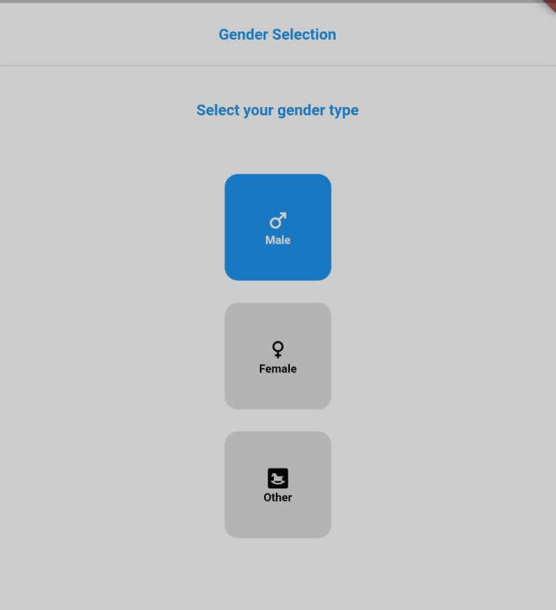
To access the full source code, check it out here. If you have any questions, you can reach out to me by dropping your comments in the comments box. Thank youuu!!!


Oldest comments (0)