If you have ever needed to add a chart to your Android app, you certainly have heard about MPAndroidChart by PhilJay. If not, consider using this powerful library. Let me show you how easy it is to start!

Goal
The goal is to build a simple app written in Kotlin which displays a linear chart with static data. To make it a little bit more interesting we're going to provide data with .csv file. It is very simple format for storing table-based data in the form of text files where values are separated with commas (Comma Separated Values). We'll use an OpenCSV library to parse it.
Dependencies
First add dependencies to gradle files.
allprojects {
    repositories {
        ...
        maven { url "https://jitpack.io" }
dependencies {
    ...
    implementation "com.github.PhilJay:MPAndroidChart:v3.0.3"
    implementation "com.opencsv:opencsv:4.1"
Raw Data Set
Find some data, for example from here. I've chosen food searches on Google set and cut it a little to display comparison of two searches: banana bread and frozen yogurt. The file looks like this:
id,googleTopic,week_id,value
banana-bread,/m/04cym9,2004-01,30
banana-bread,/m/04cym9,2004-02,31
banana-bread,/m/04cym9,2004-03,24
banana-bread,/m/04cym9,2004-04,27
...
There are 676 records in both datasets. Values are normalised, so value is between 0 and 100, where 0 is the lowest number of searches, 100 is the largest, and the rest are calculated proportionally.
Put banana_bread.csv & frozen_yogurt.csv under /app/res/raw directory in your project.
Now let's make a data class with corresponding field, the simplest as it can be:
FoodSearch.kt
package com.bi.chartapp

data class FoodSearch(
        val id: String,
        val googleTopic: String,
        val week_id: String,
        val value: Int
)
How to parse it?
Take a look at the parser below:
Parser.kt
package com.bi.chartapp

import com.opencsv.CSVReaderBuilder
import java.io.Reader

class Parser {

    companion object {

        fun toDataSet(reader: Reader): List<FoodSearch> {

            val csvReader = CSVReaderBuilder(reader)
                    .withSkipLines(1)
                    .build()

            val foodSearches = mutableListOf<FoodSearch>()
            var record = csvReader.readNext()

            while (record != null) {
                foodSearches.add(FoodSearch(record[0], record[1], record[2], record[3].toInt()))
                record = csvReader.readNext()
            }

            return foodSearches
        }
    }
}
The static method builds a list of FoodSearch records based on the provided Reader. You can get a reader from fileStream, which is provided with activity resources. It looks like this:
val streamBananas = resources.openRawResource(R.raw.banana_bread)
val bananaData = Parser.toDataSet(streamBananas.reader())
Finally our data looks a little bit more friendly. Time to make a chart!
Apply data
Add LineChart view to your layout, for example:
<com.github.mikephil.charting.charts.LineChart
        android:id="@+id/lineChart"
        android:layout_width="match_parent"
        android:layout_height="match_parent"
        android:layout_centerInParent="true" />
How to manage data now?
LineChart accepts data as an instance of LineData class. LineData is created from at least one instance of LineDataSet. LineDataSet is created from MutableList of Entry objects and String label. Huh. And Entry is an object representing single point on our Chart (basically is an (x,y) representation). It sounds a little bit overwhelming at first, but it is pretty simple. Here are the steps to follow:
- Parse your data from a csv file to a list of any data objects representing a single point on the chart - DONE!
- Map the list of data objects to the list of
Entryobjects - Create
LineDataSetfrom the list of entries and label, like "Banana Bread" - Use each of the sets as an argument to create
LineDataobject. Voila.
private fun getEntriesFromCSV(rawResId: Int, label: String): LineDataSet {

    var data: List<FoodSearch>? = null
    resources.openRawResource(rawResId).use { stream ->
        data = Parser.toDataSet(stream.reader())
    }
    val entries: MutableList<Entry> = ArrayList()

    data?.mapIndexed { index, foodSearch ->
        entries.add(
                Entry(index.toFloat(), foodSearch.value.toFloat(), foodSearch)
        )
    }

    return LineDataSet(entries, label)
}
This function and Parser from the previous paragraph creates LineDataSet from csv resource. Now simply call it for each csv file and create LineData:
val bananaDataSet = getEntriesFromCSV(R.raw.banana_bread, "Banana Bread")
val yogurtDataSet = getEntriesFromCSV(R.raw.frozen_yogurt, "Frozen Yogurt")

lineChart.data = LineData(
        bananaDataSet,
        yogurtDataSet
)
That's it, the chart is set up with data!

Make me beautiful - LineChart properties
Time to add some colors and spices. The chart layout configuration is very flexible. I'll show you some basic properties, the rest you may find in the documentation. Props are separated between dataset-specific and chart-specific.
Tune up data sets
First add some colors to the resource colors.xml file in order to make banana look a little bit more like banana and yogurt like yogurt.
<color name="banana">#ffe100</color>
<color name="yogurt">#0085c7</color>
We'll configure each of the LineDataSet object the same way, but with a different color. Check out the method below with the comments:
private fun configureSetLayout(set: LineDataSet, color: Int) {

    set.color = color                         // color of the line
    set.setDrawFilled(true)                   // fill the space between line and chart bottom
    set.fillColor = color                     // color of the fill
    set.setDrawCircles(false)                 // disable drawing circles over each Entry point
    set.mode = LineDataSet.Mode.CUBIC_BEZIER  // round the line
    set.fillAlpha = 50                        // make fill transparent with alpha (0-255)

}
Now apply configuration to each dataset:
val bananaColor = resources.getColor(R.color.banana, null)
val yogurtColor = resources.getColor(R.color.yogurt, null)

configureSetLayout(bananaDataSet, bananaColor)
configureSetLayout(yogurtDataSet, yogurtColor)
Tune up a chart
You may configure the chart behaviour in many ways. Default setting allows the user to scale the chart with pinching and scroll it. Since our dataset contains ~700 records let's leave the ability to scale the chart along the axis X and only block the ability to scale it along axis Y. Also remove a description from the right bottom corner and highlighting values by tapping. Like that:
lineChart.description.isEnabled = false

lineChart.isHighlightPerTapEnabled = false
lineChart.isHighlightPerDragEnabled = false
lineChart.isScaleYEnabled = false
It works more intuitively already. Now notice that the description above the top X axis are float values. They don't say much unfortunately. It would be better if they marked a year's change every 52 weeks! To achieve this use IAxisValueFormatter. It looks like this:
inner class MyAxisFormatter : IAxisValueFormatter {
    override fun getFormattedValue(value: Float, axis: AxisBase?): String {
        return if (value.toInt() % 52 == 0) "${startingYear + value.toInt() / 52}"
        else ""
    }
}
It means that it will display a value only if it is divisible by 52. And then maps the value to a corresponding year (with starting year set to 2004). We need also a proper granularity so there won't be any grid between years.
lineChart.xAxis.valueFormatter = MyAxisFormatter()
lineChart.xAxis.granularity = 52f
Also who needs an Y axis on both sides? Disable one of them:
lineChart.axisRight.isEnabled = false
Boom! That's it! Looks nice and presents the data clearly. Pinch to zoom, swipe right and left to get through all these years and finally check when a frozen yogurt beats a banana bread in Google searches!
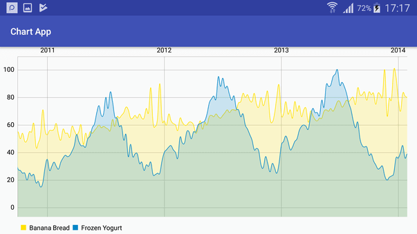
Oh, it looks like every year around summer! Who would know.
Originally published at brightinventions.pl
By Radek Pieczątkiewicz, Software Engineer @ Bright Inventions
Email


Top comments (0)