
Written by Facundo Corradini✏️
Firefox 71 has just been released, with support for the CSS subgrid. This is huge news for anyone working with web layouts, as it allows us to easily align items to their parent’s grid container.
Up until now, when we declared a grid container, only its direct descendants could be aligned to the specified columns/rows. We can always nest grids inside grids, but their tracks are independent from each other, which can cause some issues when we need the grandchildren (the elements inside the nested grid) to align.
The new subgrid value for grid-template-columns and grid-template-rows allows us to declare a nested grid that inherits its parent’s tracks and, in turn, can affect its dimensions when using any sort of autosizing (auto, min-content, max-content).
Let’s check out how this work in some common UI components.

Aligning rows
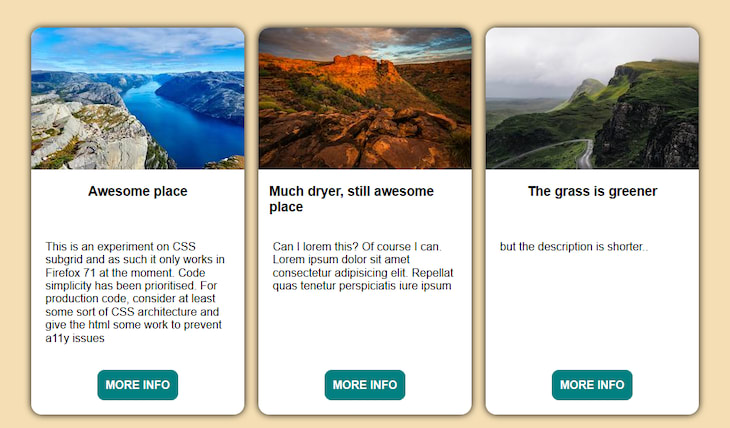
Consider a typical grid of cards. When designing the UI, we might get a mockup with perfectly aligned, repeating placeholders:

But when we turn this into our real web/app code, we might get different text lengths, which usually results either in a rough layout going out of our way to put them together with badly shaped HTML and some CSS hacks.

Using CSS subgrid in the cards to inherit the row declarations from the main container guarantees the elements will occupy the same space as their counterparts in other cards. We just have to define the rows in the container, then instruct the card to span all rows and their elements auto-adjust to one row each.
I would suggest doing this kind of things inside a @supports query, so we can have a sensible fallback that gets progressively enhanced to the subgrid version:
@supports (grid-template-rows: subgrid){
  .container{
    /* declare the rows for the container*/
    grid-template-rows: repeat(4, auto);
  }

  .card{
    /* gets the element to span all rows, to prevent overlapping */
    grid-row: span 4;
    /* sets the card row tracks to depend on the parent*/
    grid-template-rows: subgrid;
  }
}
Here’s a live demo on CodePen, in case you’re running Firefox and want to check it out:
Aligning through column tracks
The same concept can be used for the columns. Let’s say we got this simple form UI that we need to turn into code:

Some developers prefer to nest <input> inside <label> elements for a cleaner markup, as it can be easier to read and will implicitly declare their relation. Others choose to let the label be a sibling of the input, explicitly declaring their relation with the for attribute, sometimes adding a container for each pair.
While there are many accessibility, usability, and compatibility considerations for choosing either approach, one of the greater limitations of inputs nested inside labels has been the difficulty to get them properly aligned with CSS when the label length is dynamic (i.e., when we don’t know exactly how wide the labels will be). This is a very common case, especially when dealing with internationalization.
If we just tried to use nested grids, the different label text nodes will result in uneven inputs.

Subgrid provides us a better solution by using the form’s grid to align the labels’ children. This way, the spacing for the labels will correspond to the longest one, and the inputs will align automatically.
The question then is what to do as a fallback. We could set a fixed width for the label’s text node tracks or change the grid-template-columns declaration in order to set the inputs as the ones with fixed width.
Alternatively, we could simply let the form fall back to a labels-over-inputs layout in browsers that don’t support subgrid, since that’s also most likely what we’ll be doing for smaller screens anyway. Remember that we can nest @supports and @media queries, so this should make maintenance simpler.
@media screen and (min-width:500px){
  @supports (grid-template-columns: subgrid){
    .form{
      grid-template-columns: auto 1fr;
      grid-gap: 20px;
    }
    .field{
      grid-column: 1 / -1;
      grid-template-columns: subgrid;
    }
    input,textarea{
      /* lets the grid-gap take care of spacing instead */
      margin: 0;
    }
  }
}


As you can see, subgrid is a very welcome addition to our CSS toolbox that’s debuting in Firefox and will soon be ready for other browsers as well. We can start using it with progressive enhancement, so it’s the right time to learn how to do so.
Here I covered two very common applications, but subgrid is much more than just that: we can set both axes as subgrids, use named tracks, and position elements into specific tracks, just like with CSS grid.
For a comprehensive look, I recommend reading the CSS Grid Level 2 specification and Rachel Andrew’s article on it.
Much more than just subgrid!
While I focused on this key aspect, Firefox 71 includes many improvements for users as well as developers.
column-span
The implementation of the column-span property finally allows us to use multicol layouts in a powerful way. For instance, we can set a container to multicol and have an element span through all columns, which is very common for headings. Firefox is eight years late to this one, but I still celebrate the implementation — better late than never.
Aspect ratio mapping and support for the path value
Firefox now computes the internal aspect ratio of images from the HTML attributes, so it will display the correct placeholder size even if we set the image dimensions through CSS. This will prevent layout jank. Chrome announced this feature for its upcoming release next week, so we can start using this awesome feature right now.
The clip-path property now accepts the path() value, which allows us to use any SVG-like path for clipping elements.
Support for Promise.allSettled()
On the JS side of things, the Promise.allSettled() method is now supported. This will fulfill when all the given promises have been resolved, whether they are fulfilled or rejected, providing an array with the outcome of each promise.
The previously available Promise.all() is quite similar, but that one only resolves when all promises are fulfilled.
For a deeper dive on those and a complete list of changes, check Mozilla Hacks’ post on this new release.
Editor's note: Seeing something wrong with this post? You can find the correct version here.
Plug: LogRocket, a DVR for web apps

LogRocket is a frontend logging tool that lets you replay problems as if they happened in your own browser. Instead of guessing why errors happen, or asking users for screenshots and log dumps, LogRocket lets you replay the session to quickly understand what went wrong. It works perfectly with any app, regardless of framework, and has plugins to log additional context from Redux, Vuex, and @ngrx/store.
In addition to logging Redux actions and state, LogRocket records console logs, JavaScript errors, stacktraces, network requests/responses with headers + bodies, browser metadata, and custom logs. It also instruments the DOM to record the HTML and CSS on the page, recreating pixel-perfect videos of even the most complex single-page apps.
Try it for free.
The post What’s new in Firefox 71: CSS subgrid and more appeared first on LogRocket Blog.


Top comments (0)