
Mozilla keeps pushing forward, and the release of Firefox 67 ships a great new feature for accessibility and customization: the prefers-color-scheme query, which allows us to know if the user has requested a light or dark theme and adapt our designs accordingly.
There are also lots of other new features for both users and developers, so let’s check those out before taking a deep dive into that awesome media query.
Improvements for users
Side-by-side profiles
Users are now able to run multiple versions of Firefox simultaneously, each with different profiles. Previously, all installed versions shared a single profile, so this makes it much more fail-safe.

WebRender’s enhanced performance
After years in the works, Firefox is gradually starting to ship their WebRender engine for Windows 10 users, with other platforms to come. This is a huge improvement on performance that will allow much faster animations and scrolling when they are implemented in ways that affect the rendering step of the pipeline.
Enhanced privacy controls
Now we will be able to block cryptominers and fingerprinters.

Better account and password management
Firefox 67 includes a lot of new features aimed at improving password and account management, such as easier access to saved logins, ability to save passwords on private windows, and support for autocomplete=”new-password”, which will no longer be autofilled with saved logins.

Improvements for developers
JavaScript String.prototype.matchAll()
Firefox now joins Chrome in supporting the matchAll() method, which returns an iterator of all results matching a string against a regular expression, including capturing groups. This makes it simpler to get the results by avoiding the need for loops.
CSS revert keyword
The CSS revert keyword allows us to get any property for a selector back to the value specified in the user agent stylesheet (i.e., the browser’s default). There was a similar keyword called initial, but that one acts on a per-property basis, not per-selector.
This means, for instance, that if we had our
tags set to display:flex for whatever reason, revert will set it back to display:block, which is the browser’s default value for the display property on elements. Likewise, initial will set it to display:inline, the initial value for the display property.Seems like a weird corner case, it can be extremely useful when we need to add an exception to some rule.
Prefers-color-scheme
Modern operating systems allow users to choose their preference for light or dark themes.
The prefers-color-scheme media query is part of the CSS Media Queries level 5 specification, which intends to provide this feature on the web by allowing browsers to query the user preference and adjust the page accordingly.
This is outstanding news for people with photophobia (sensitivity to light), vestibular disorders, and anyone who simply prefers the dark schemes that are so rare on the web yet, oddly enough, extremely popular in our text editors and IDEs.
The valid values are light (dark text on light background), dark (light text on dark background), and no-preference (when the user has made no known preference).
In its more basic form, we can use it as follows:
.element { background: white; color: black; }

[@media](http://twitter.com/media) (prefers-color-scheme: dark) {
  .element { background: black; color: white; }
}
This will have a default black text on white background, but reverse them when the user has specified a preference for dark themes.
If the example above seems like an extreme simplification, that’s because it is. Defining a media query every time we set a color in the CSS would be pretty much insane.
CSS variables to the rescue!
We can define the colors for all the documents in CSS variables at the root level, and simply switch their values in media queries to instantly adapt everything to the user’s preference:
:root{
  --foreground: #001144;
  --background: #CCFFEE;
  color: var(--foreground);
  background: var(--background);
}

@media (prefers-color-scheme: dark) {
  :root{
    --foreground: white;
    --background: black;
  }
}

@media (prefers-color-scheme: light) {
  :root{
    --foreground: black;
    --background: white;
  }
}
This will provide a dark-blue text on light-blue background by default, which will turn into white text on black background when the user has specified a preference for dark themes, and black text on white background when they’ve chosen light theming.
The above approach can be easily adapted to multiple colors, whatever the theming convention.
A note on browser support
Until now, only Safari had supported this query. But Firefox has now joined in, and Chrome is planning it for version 76 (scheduled for July 30), so it’s a great opportunity to start implementing it in our projects.
That being said, IE, old Edge, and older versions of evergreen browsers are still in use, so we should take them into consideration if the project allows us to. The right way to use this feature, then, is as progressive enhancement.
Using the example above, browsers that don’t support the prefers-color-scheme media query will just ignore the rule and, therefore, simply not provide the feature. This isn’t so bad, but if possible, we should allow other means for users to adjust theming when needed, such as an option in our apps’ or websites’ configuration.
The bigger issue would be with browsers that don’t support CSS variables, such as IE. But we can deal with that the same way we would any other CSS var: set a default value that’s later overridden by the variable on compatible browsers only:
:root{
  /* initial values for the color variables */
  --foreground: #001144;
  --background: #CCFFEE;

  /* fallbacks for browsers that don't support variables */
  color: black;
  background: white;

  /* Set colors for browsers that support CSS Variables */
  color: var(--foreground);
  background: var(--background);
}

/* change the theming on browsers that support both variables and prefers-color-scheme*/
@media (prefers-color-scheme: dark) {
  :root{
    --foreground: white;
    --background: black;
  }
}
Remember the different media
It’s easy to forget, but printing pages is still a thing, and more often than not, it’s likely that a user that selected a dark theme for the screen still prefers the light one when printing. So I would suggest using the color schemes media queries together with screen type as well.
@media screen and (prefers-color-scheme: dark) {
  :root{
    --foreground: white;
    --background: black;
  }
}
It’s not only about colors
Any CSS property for any selector can be changed inside these media queries, so you could adjust anything from opacity(semitransparent stuff usually looks bad when switching backgrounds) to advanced properties such as mix-blend=mode.
Plug: LogRocket, a DVR for web apps
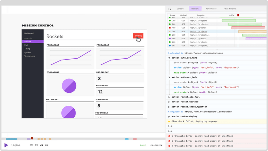
LogRocket is a frontend logging tool that lets you replay problems as if they happened in your own browser. Instead of guessing why errors happen, or asking users for screenshots and log dumps, LogRocket lets you replay the session to quickly understand what went wrong. It works perfectly with any app, regardless of framework, and has plugins to log additional context from Redux, Vuex, and @ngrx/store.
In addition to logging Redux actions and state, LogRocket records console logs, JavaScript errors, stacktraces, network requests/responses with headers + bodies, browser metadata, and custom logs. It also instruments the DOM to record the HTML and CSS on the page, recreating pixel-perfect videos of even the most complex single-page apps.
The post What's new in Firefox 67: Prefers-color-scheme and more appeared first on LogRocket Blog.


Top comments (0)