
Written by Facundo Corradini✏️
If you ever get the feeling that designers and developers are from different worlds, you should have seen what it was like 10 or 20 years ago. In the early days of the internet, we were building websites while trying to figure out what a website was and how it should work.
Coming from a print background, designers were used to the features (and limitations) of a known-dimension canvas and tried to replicate them in a medium that’s essentially designed as exactly not that. Developers were struggling mightily with the extremely limited features of early CSS, trying to implement those designs in browsers that were radically different from one another.
In the middle of all that, the users were getting a web experience that was quite inaccessible, hard to use, and simply unaesthetic.
Over time, we agreed on a core rule set for how a website should look and feel based on the concept of symmetrical columns such as 960.gs, which later on was implemented in many popular frameworks, including Bootstrap. This streamlined the process, providing a common language that designers, developers, and users felt comfortable with.
But I’m sure I’m not alone when I get the feeling that web layouts have stagnated since. We all have seen those “all websites look the same” parodies, to the point that all those parodies are starting to look the same.

CSS has come a long way since those early days, with the development cycle greatly accelerating in the last couple years. Finally, web layouts are not a hack anymore (floats were originally meant to simply float text around an image).
We got multicol, flex, and grid to allow us a degree of freedom we’ve never seen before. We can finally break out of that symmetric columns paradigm and use all sorts of effects and features that we would’ve never dreamed of. We are not in the early 2000s anymore.
The newer specs allow us to build layouts that we would have discarded for being unusable or for lack of responsiveness just a couple of years ago. So I believe it’s time to start revisiting those concepts. Maybe we can bring back some of those print-like layouts in a way that adapts to the unknown canvas of the web.

Early this year, Jenn Simmons posted these magazine layouts as inspiration, wondering how they could work for the web. I went ahead and turned them to code, so we can explore the core concepts of building a web layout that’s different from what everyone seems to be doing. Here’s how to build web layouts like it’s 2020.
 Don’t work. Don’t work. It’s Sunday. Chill at a coffee shop. Read random magazines. Ah…
Oh wait, can we do that in CSS? How far could I get with a demo inspired by this? Gosh, we need the Exclusions spec implemented / improved. And Regi—
Stop working!!
But let’s make demos!16:58 PM - 13 Jan 2019


Thinking responsive, progressive layouts
Designing for the web is, by definition, designing for an unknown canvas. The web can be accessed from all sorts of devices with radically different dimensions and through all kinds of browsers — from a tiny mobile device or even a watch to a ginormous 4K smart TV, not to mention all sorts of alternate approaches that are not even based on graphic display.
So the first challenge in converting a magazine layout for web use is considering how it should adapt to whatever device is accessing it. Where are the boundaries where this approach doesn’t work anymore? How should the alternative look? What are some technical limitations that a browser can have trouble implementing?
Considering this layout, I identify the parts that can be challenging.

- The multicolumn layout can work on the wider devices, but it’s certainly a no-go for smaller screen sizes.
- The title itself with a “center float” is something most browsers won’t know how to deal with.
- The intro paragraph between the columns can be somewhat tricky.
Luckily, the solution pretty much works itself out if we consider a progressive enhancement approach from the start. We can think of all the different layers as progressive enhancement: from the layout for different viewport sizes via the use of media queries, adding newer features in a safe way with feature queries, or even adding accessibility goodies such as prefers-reduced-motion or dark mode with prefers-color-scheme. Every layer can work over the previous to create the best user experience for a given device.
Personally, I like to start from how the website should look if no CSS is loaded at all. This means using nothing but semantic markup in a reasonable order. This will ensure that the web is usable even if we strip it all the way down to the browser’s default styling.
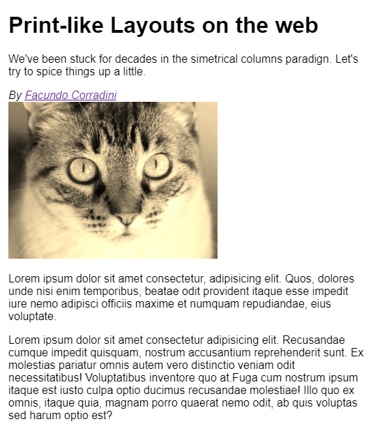
<article class="print-like">
  <header class="intro">
    <h1 class="title">Print-like Layouts on the web</h1>
    <p class="summary">We've been stuck for decades in the simetrical columns paradign. Let's try to spice things up a little.</p>
    <address class="author">By <a rel="author" href="https://twitter.com/fcorradini">Facundo Corradini</a><br/>
    </address>
  </header>
  <img class= "main-image" src="https://placeimg.com/640/480/animals/sepia" alt="random image"/>
  <section class="main-text">
    <p>...</p>
    <p>...</p>
    <p>...</p>
  </section>
</article>
The semantic markup in a logical order means that we can get away with title on top, intro, paragraphs, then progressively enhance the layout for the wider screens and the different features.
Best thing about it is that mobile layouts are usually not that different from the browser defaults. Sure, we put a great deal of effort into our typography, spacing, and such, but the mobile content is rarely seen in any format other than the traditional blocky layout were elements flow one below the other.

We can then think of a slightly bigger screen size. What if the viewport is wide enough to fit two columns, but not quite wide enough for the full layout?
It’d make sense to keep the title and intro above everything else, but have the paragraphs as two columns with a variable width, growing as needed.
Simply turning the text container to multicolumn layout in a media query does the trick.
@media screen and (min-width: 600px){
  .print-like{
    display: grid;
  }
  .main-image{
    grid-row: 3/4;
  }
  .main-text{
    column-count: 2;
  }
  .main-text :first-child{
    margin-top:0;
  }
  .main-text :last-child{
    margin-bottom: 0;
  }
}

When the viewport becomes big enough to fit all columns (including the container in the middle), we can use the column-gap property to clear the space in the middle for the title and intro, then position the elements with a simple grid declaration in the container. Although the original design was based on thirds, I chose to keep the central column in fixed width and let the side ones adjust to the container, just as an experiment to see what happens when we break the symmetric columns paradigm.
@media screen and (min-width: 900px){
  .print-like{
    grid-template-columns: 1fr 300px 1fr;
    align-items: center;
  }
  .intro{
    grid-row:1;
    grid-column: 2/3;
    max-width: 0px;
  }
  .main-text{
    column-gap: 310px;
    grid-row: 1;
    grid-column: 1/4;
  }
  .main-image{
    grid-column: 1 / -1;
    margin: 0 auto;
  }
}

The final touch — and the one that makes the layout — is the text wrapping around the title. Unfortunately, we need to use CSS exclusions to create that effect, as there’s no such thing as float: center. This means that only IE11 and Edge will provide that experience, which is quite ironic. But other browsers still provide a perfectly usable layout, and the code will most likely work when they finally decide to implement that feature (perhaps with minor tweaking if the spec changes).
@media screen and (min-width: 900px){
  @supports (-ms-wrap-flow: both){
    .title{
      -ms-wrap-flow: both; /* CSS exclusions! */
      position: absolute;
      right: 25%;
      padding: 10px 20px;
    }
  }
}

With all those layers, the final layout will work like this:
Conclusion
Let’s be clear: I’m not saying the current paradigm is wrong, and definitely not trying to say that websites should look like magazines — or even defending the use of multicol. I just think a little innovation might make our layouts stand out from the rest. We finally have the right tools, let’s make web layouts more diverse!
Editor's note: Seeing something wrong with this post? You can find the correct version here.
Plug: LogRocket, a DVR for web apps

LogRocket is a frontend logging tool that lets you replay problems as if they happened in your own browser. Instead of guessing why errors happen, or asking users for screenshots and log dumps, LogRocket lets you replay the session to quickly understand what went wrong. It works perfectly with any app, regardless of framework, and has plugins to log additional context from Redux, Vuex, and @ngrx/store.
In addition to logging Redux actions and state, LogRocket records console logs, JavaScript errors, stacktraces, network requests/responses with headers + bodies, browser metadata, and custom logs. It also instruments the DOM to record the HTML and CSS on the page, recreating pixel-perfect videos of even the most complex single-page apps.
Try it for free.
The post Web layouts like it’s 2020 appeared first on LogRocket Blog.


Latest comments (0)