
Written by Dylan Tientcheu✏️
Growing up, I enjoyed playing with Legos because they enable you to endlessly put together different combinations of creative toys using the same pieces.
You can think of components in UI development as Lego bricks.
In the same way, they allow you to assemble different interfaces from a pool of pieces.
Imagine there exists a tool that helps you organize all these components — or bricks — in an isolated manner to enable you to build, share, and test them efficiently.
This is the role of Storybook, and it’s defined on their website as follows:
Storybook is an open source tool for developing UI components in isolation for React, Vue, and Angular.
It makes building stunning UIs organized and efficient.
What are Storybook addons?
Addons are plugins that help supercharge your Storybook with new custom advanced functionalities and workflows.
These addons are contributed by the core maintainers (official addons) and by the developer community (community addons).
If you have been using Storybook, you’ve probably seen some official addons like Knobs and Actions.
Addons are still a growing feature of Storybook.
Below are some major addons that greatly enhance your workflow:

Knobs

Knobs allow you to dynamically edit props through the Storybook interface.
It’s a great development, testing, and debugging tool.
With Knobs, you are able to change a button’s state or text from enabled to disabled simply by checking a box or changing a field.
Actions

The Actions addon is used to display data received by event handlers.
It’s basically your event console.log().
With this addon, you can monitor multiple actions on your component.
You can even process the data before sending it to the logger incase you need to do some cleanup before.
Tip:
The Events addon can also enable you to add (emit) custom events for your stories.
You can mimic an event and customize the payload.
Viewport

The Viewport addon allows you to display your stories in different sizes and layouts.
This addon basically functions as your browser developer tools.
You are able to set popular (iPhone 6, iPhone X, Pixel XL etc..), edit them, or add custom viewports on your components to help visualize them in different environments.
import { addParameters } from '@storybook/react';

const customViewports = {
  kindleFire2: {
    name: 'Kindle Fire 2',
    styles: {
      width: '600px',
      height: '963px',
    },
  },
  kindleFireHD: {
    name: 'Kindle Fire HD',
    styles: {
      width: '533px',
      height: '801px',
    },
  },
};

addParameters({
  viewport: { viewports: customViewports },
});
Tip:
You can improve your component’s responsiveness tests with taffy and responsive views.
Taffy enables a dynamic draggable re-sizer and responsive views is able to set media queries to help test your components.
Storysource

This addon simply adds the stories code sources in the addon panel.
This enables the reader to see the component’s implementation.
You are even able to add a prettier configuration (or formatting rules) to the code.
Moreover, you can add dark and light syntax themes to the code.
Tip:
In case you are a React user, there’s a React live edit plugin.
As its name says, it helps you to live edit a story’s code.
Accessibility

The a11y addon checks your components against common accessibility rules.
This helps developers understand which of these rules their components respect and which ones they violate.
It even provides hints for how to fix it, as well as links to get more information.
Docs
Storybook Docs transform your Storybook stories into world-class component documentation.
DocsPage
Out of the box, all your stories get a DocsPage.
DocsPage is a zero-config aggregation of your component stories, text descriptions, docgen comments, props tables, and code examples into clean, readable pages.
MDX If you want more control, MDX allows you to write long-form markdown documentation and stories into one file.
You can also use it to write pure documentation pages and embed them inside your Storybook alongside your stories.
Tip:
You can use notes and chapters addons to organize and supercharge even more of your components’ documentation.

Versions is basically your git for the components in your storybook.
This addon allows you to navigate through different versions of your components via a versions panel, in case you have a setup that produces a different static Storybook build for each of your versions.
Data and State Management
GraphQL and Apollo
If you work with the Apollo client to help query and mutate your GraphQL API, the Apollo storybook addon has you covered.
You are able to provide a mock object which will be consumed by your component.
Furthermore, if your graphQL API relies on GraphCMS, the Graph kit addon helps you visualize all your data directly in appropriate components.
You’re also able to browse the database in a friendly, visible form.
Formik addon
Now, just in case you happen to use the well known Formik to build your forms without tears in React, this Storybook addon wraps your Formik fields and tracks their state in a panel to provide you with a nice experience.
i18n
i18n is a tool that simply helps to change a component’s locale.
The addon is made completely library-agnostic (it doesn’t depend on any particular internationalization tool).
Styles
With the different style addons in Storybook, you are able to present your components in various ways.
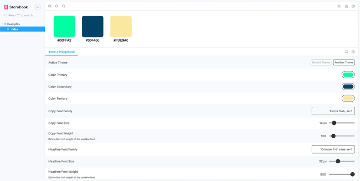
Theme playground
Theme playground provides a panel where the theme values predefined in the components can be tweaked easily.
Flavored styles
If you have any flavored stylesheets, you may use the following:
Playroom

Playroom is probably one of the greatest community Storybook addons.
The playroom enables you to play along with all of your components while testing them against popular screen breakpoints.
Using this addon, you can start designing combinations of components using each story source as a starting point.
Design addons
If you wish to have your Adobe XD or Figma UI designs embedded in your Storybook page for any reason, you can use the XD addon and Figma addon, respectively.
You can also use the vertical rhythm addon each time your high-fidelity designs have very sensitive specs.
They will help you deal with your component’s sizes, depths, and line heights.
Tip:
There also exists a Design token addon that enables you to automatically generate design token documentation from your stylesheets.

Extra tips
- Each time you want to try a new addon, you should always take a look at the framework support table. It is basically the caniuse.com for Storybook addons.
- If you are a big fan of Storybook and its ecosystem, remember to stay at the cutting edge by watching the Storybook’s awesome-list repository.
- React carbon design system has included in their Storybook a good collection of addons. You can use it to check out most of the aforementioned addons.
Conclusion
Storybook already offers a great approach to frontend development, and addons only increase its power.
Addons are a great addition to Storybook and its vision of giving developers a better experience.
Plug: LogRocket, a DVR for web apps

LogRocket is a frontend logging tool that lets you replay problems as if they happened in your own browser. Instead of guessing why errors happen, or asking users for screenshots and log dumps, LogRocket lets you replay the session to quickly understand what went wrong. It works perfectly with any app, regardless of framework, and has plugins to log additional context from Redux, Vuex, and @ngrx/store.
In addition to logging Redux actions and state, LogRocket records console logs, JavaScript errors, stacktraces, network requests/responses with headers + bodies, browser metadata, and custom logs. It also instruments the DOM to record the HTML and CSS on the page, recreating pixel-perfect videos of even the most complex single-page apps.
Try it for free.
The post Top Storybook addons to take your code to the next level appeared first on LogRocket Blog.


Top comments (0)