
Everybody loves charts. They convey information in a simple way that can be quickly interpreted at a glance. And everybody loves doughnuts. They are tasty, tasty doughnuts.
Pie charts and doughnut charts are one of those elements that we love but rarely see on the web, mostly because of the technical complexity involved in creating them. We have been relying on canvas with JavaScript libraries, or some quite hacky (and awesome) approaches with CSS and SVGs, but they are still complex and lacking on semantics.
Luckily, with the recent release of Chrome 69, we finally have support for the key ingredient — conical gradients. Now we can create both pie charts and doughnut charts in a extremely simple and semantic way.
Conical what?
Conical gradients are fill gradients that have their color stops around the circumference of a circle. They are part of the CSS Image Values and Replaced Content level 4 module and has been in the works for years, yet no browser had implemented them until recently.
In their most basic application, conical gradients can look like a directional light effect, and with multiple stops allow us to easily create color wheels.
.cone{
  background: conic-gradient(orange .1turn, red, orange 326deg);
}

.color-wheel{
  background: conic-gradient(red, yellow, lime, aqua, blue, magenta, red);
}

Similarly to what we do to linear and radial gradients to create alternating solid color patterns, we can define the color stops of a conical gradient at equal positions (or subsequent stops starting at 0), effectively turning it into a pie chart.
.linear-background{
  background: linear-gradient(to right, red 25%, yellow 25%, yellow 50%, green 50%, green 75%, blue 75%, blue 100%);
}

.pie-chart{
  background: conic-gradient(red 33%, green 33%, green 66%, yellow 66%);
}

Going from there to a doughnut chart is easy as applying a mask on a single stop conical gradient.

The right markup
HTML 5 introduced lots of additional semantic elements, some of which remain little known to most developers. For a doughnut chart, we could easily get away with using a single
, but there are two elements better suited for it: and .Progress is meant to indicate completion progress of a given task, e.g. a file download.
Browsers have some freedom (maybe too much freedom) on how they implement it, but it’s typically shown as a progress bar. Besides the global attributes, they accept max to indicate the number at which the task is considered completed (defaults to 1), and value to indicate how much has already been completed (range from 0 to max)
Meter is intended to represent a scalar value within a known range, e.g. disk usage. It’s rendered similarly to progress but with additional styles for different ranges.
Attributes include the current value, min for the minimum (defaults to 0), max for the maximum (defaults to 1), and low , high and optimum to give different styles according to given thresholds (e.g. show the bar in red color when disk usage is above 90%). It also can be associated to a form element (such as an input) via the form parameter.
With this in mind, here’s what the semantically correct HTML markup for our charts looks like:
/\* 50% filled progress bar \*/
<progress value="50" max="100"></progress>

/\* 50% filled meter bar \*/
<meter value="50" max="100"></meter>
Un-styling the elements
Similar to other complex form elements, browsers rely on vendor specific pseudo-elements to create the different visual components of a or . They also use the appearance property to style the elements according to the operating system’s theme. So, the first step is to get rid of all of those:
/\* gets rid of custom appearance provided by the operating system's theme \*/

progress, meter{
  -webkit-appearance: none;
  appearance: none;
}

/\* hides all <progress> pseudo elements from webkit \*/

::-webkit-progress-inner-element, ::-webkit-progress-bar, ::-webkit-progress-value{
  display:none;
}

/\* hides all <meter> pseudo elements from webkit \*/

::-webkit-meter-bar, ::-webkit-meter-optimum-value, ::-webkit-meter-suboptimum-value,::-webkit-meter-even-less-good-value {
  display: none;
}
This will leave us with an empty container (similar to an empty div) that we can style at will to create the pie / doughnut chart.
We only need to hide all the elements for our task at hand , but here’s a reference of how all of this works, just in case you ever want to style the progress bar:
- appearance: none disables the custom styles from the OS theme, this is mandatory to style any of the internal components.
Progress pseudos:
- ::-webkit-progress-inner-element, despite the confusing name, represents the outermost container for the progress element. We might add borders and shadows here.
- ::-webkit-progress-bar styles the whole progress bar, which is normally visible only as the unfilled part, as the filled portion is rendered above it. We would typically change the background.
- ::-webkit-progress-value is the filled portion of the bar, Again, backgrounds are what we would normally style on it
Meter pseudos:
- ::-webkit-meter-bar styles the whole meter bar, visible as the unfilled part. The filled part is controlled by the other three pseudo-elements. Notice that only one of them will be active at a given time, depending on the given value and it’s relation to the low, high and optimum parameters.
- ::-webkit-meter-optimum-value styles it when the value is in the low to high range.
- ::-webkit-meter-suboptimum-value is applied when the value is outside low to high range.
- ::-webkit-meter-even-less-good-value is applied when the value is outside the low to high range and on the opposite side of the optimum value
Creating the chart
With all custom styling out of the way, we can define our chart sizes and simply use border-radius to turn it into a circle, filling it with a single-step conical gradient.
To define the value of that step, we can use a CSS custom property (aka CSS variable):
progress, meter{
  position: relative;
  width: 100px; height: 100px;
  border-radius: 50%;
  --fill: calc(var(--progress) \* 1%);
  background: conic-gradient(CornflowerBlue var(--fill), LightGrey 0);
}
This should give us a pie chart filled up to the variable percentage with the first color (CornflowerBlue), and the second color (LightGrey) filling the rest.
In an ideal world, we would use the attr() function as defined in CSS Values and Units Module Level 3 to assign the variable from the actual value attribute.
--progress: attr(value);
Unfortunately, using the attr() function in any other property than a pseudo-element’s content is currently not supported by any browser, so we need to either assign it from a little JavaScript parsing, or repeat the value on the element’s inline styling.
I went with the latter just to keep it CSS-only on this demo, but the JS approach to assign the CSS variable would be better for maintainability, re-usability and to keep it DRY.
<progress class="doughnut" value="50" max="100" style="--progress:50"></progress>

<meter class="doughnut" value="50" max="100" style="--progress:50"></meter>
Next step is turning the pie chart into a doughnut. This can be easily achieved by overlaying a pseudo element on top of the pie chart, with a solid background as a sort of mask and the value attribute as the content
/\* "masks" the pie chart, overlays text \*/
progress::after, meter::after{
  content: attr(value) "%";
  position: absolute;
  top:8px; right:8px; bottom:8px; left:8px; /\* bar thickness \*/
  background: white; /\* "mask" color \*/
  border-radius: 50%;

  /\* centers text \*/
  display: flex;
  align-items: center;
  justify-content: center;
}
And there we have it, a single-element, semantic, easy to code doughnut chart for Chrome 69+
https://medium.com/media/0c7905342dd71e87fb7d1929cd423458/href
Using actual masking
Real-world implementations will probably require the inner circle to be an actual mask and not a hard-coded background color, to use it in different colored containers. Browser support for the mask property is much better than for the conical gradients, so that should be easy.
mask:radial-gradient(closest-side, transparent calc(100% - 10px), black calc(100% - 8px));
The preceding code creates a mask consisting of a transparent fill all the way until the last 9px, and a solid black (could be declared as any color, the important part is that the alpha channel is 1) taking the last 8px, effectively “cutting” out everything from the element but the outer 8px, i.e. the progress bar thickness. 1px difference between the steps is to prevent sharp edges.
The issue here is that applying the mask on the element also gets rid of the text displayed on the pseudo element. So, we need to separate the gradient and mask into their own pseudo, with the other displaying the text.
/\* element styles only define sizing \*/
.progress, meter{
  position: relative;
  width: 100px;
  height: 100px;
}

/\* using a conical gradient + masking on a pseudo to create the doughnut chart. \*/
progress::before, meter::before{
  content: "";
  position: absolute;
  top: 0; left: 0; right: 0; bottom: 0;
  border-radius: 50%;
  --fill: calc(var(--progress) \* 1%);
  background: conic-gradient(CornflowerBlue var(--fill), lightgrey 0);
  mask:radial-gradient(closest-side, transparent calc(100% - 9px), black calc(100% - 8px));
}

/\* overlays text using the other pseudo \*/
progress::after, meter::after{
  content: attr(value) "%";
  position: absolute;
  top: 0; right: 0; bottom: 0; left: 0;
  display: flex;
  align-items: center;
  justify-content: center;
}
That provides a better looking, more reusable doughnut chart.
https://medium.com/media/2a9773b1934787cb036532b83f8b9693/href
What about other browsers?
Chrome 69 is officially the first one to ship support for conical gradients, while Webkit has just implemented it, so we can expect it in the next versions of Webkit-based browsers as well.
No signs of planned support from Edge or Firefox so far.
So the first thing to do is consider using this as progressive enhancement, with the humble progress bar as a fallback. This can be easily achieved by wrapping our doughnut chart declaration inside a @supports query
[@supports](http://twitter.com/supports)(background: conic-gradient(#000 50%, #FFF 0)){
  /\* (...) \*/
}
That being said, we can make conical gradients work in other modern browsers thanks to Lea Verou’s polyfill.
To use it we just need to include the conic gradient polyfill.js file, as well as it’s dependency -prefix-free.
<script src="[https://cdnjs.cloudflare.com/ajax/libs/prefixfree/1.0.7/prefixfree.min.js](https://cdnjs.cloudflare.com/ajax/libs/prefixfree/1.0.7/prefixfree.min.js)"></script>
<script src="conic-gradient.js"></script>
There are some limitations though, most notably lack of support for calc() and var(). So keep that in mind, as using the polyfill will prevent us from getting the fill set as a CSS variable. We can use some JS to read the value for each and set the background directly from JS instead of setting the CSS custom property.
As we did with Chrome, we should hide the pseudo elements for Firefox and Edge. Luckily it’s a single element for each of them.
/\* hides Firefox progress fill bar \*/
::-moz-progress-bar {
  visibility: hidden;
}
/\* hides Edge progress fill bar \*/
::-ms-fill {
  display: none;
}
Notice we’re using visibility:hidden instead of display:none to hide the progress fill bar from Firefox, as the latter has no effect, even when flagged as !important. Neither can we change the width of the pseudo-element or shape it in any other way. It seems Firefox is styling it as inline, !important, so we can only change some properties there.
But why would we want to style that pseudo in the first place? well, turns out Firefox doesn’t support ::before or ::after pseudo elements inside a either, so styling the ::moz-progress-bar seemed a viable approach to apply the mask or the text content. But it’s not.
Unfortunately, we are left with no choice but to change our markup to make this work on Firefox.
Wrapping in a semantic-neutral element (such as div or span) to display the value as text was the simplest approach I could find
HTML
<span class="doughnut" data-value="40"><progress value="40" max="100"></progress></span>
CSS
.doughnut{
  position:relative;
}

.doughnut progress{
  -moz-appearance: none;
  appearance: none;
  width: 100px;
  height: 100px;
  display: block;
  border:0;
  border-radius:50%;
  background: conic-gradient(CornflowerBlue 40%, lightgrey 0);
  mask:radial-gradient(closest-side, transparent calc(100% - 9px), black calc(100% - 8px));
}

/\* overlays text on the span's pseudo \*/
.doughnut: after{
  content: attr(data-value) "%";
  position: absolute;
  top: 0; right: 0; bottom: 0; left: 0;
  display: flex;
  align-items: center;
  justify-content: center;
  font-weight: 700;
}
Not the best thing in the world, especially since this requires to repeat the value in a data attribute on the span. But at least it works.
https://medium.com/media/89ae293fc364cb801b0bd5c814282d5b/href
Going into Edge territory, the major limitation there is lack of support for the mask property on Edge 17, which is the current version at this time. It can be enabled with the “Enable CSS Masking” flag, but that’s obviously something we can’t ask users to do. Therefore, the solid color overlay might be the right approach there.
The good news it that Edge 18 is scheduled to ship support for masks.
Wrapping up
Conical gradients makes it quite easy to turn our boring progress bars into awesome doughnut charts. Furthermore, they can be used for all sorts of applications: pie charts, color wheels, 3D simulation, lightning effects, starburst. Even optical illusions can be easily done.
It’s not a feature that has been in high demand by developers and that might be why browsers took so long to start implementing them. But with Chrome 69 and WebKit leading the way, there’s no reason for others not to follow.
If you’d like to see them implementing conical gradients as well, make sure to make some noise at Gecko bug report and Edge uservoice thread. We can make the web a little bit prettier. And tastier.
Plug: LogRocket, a DVR for web apps
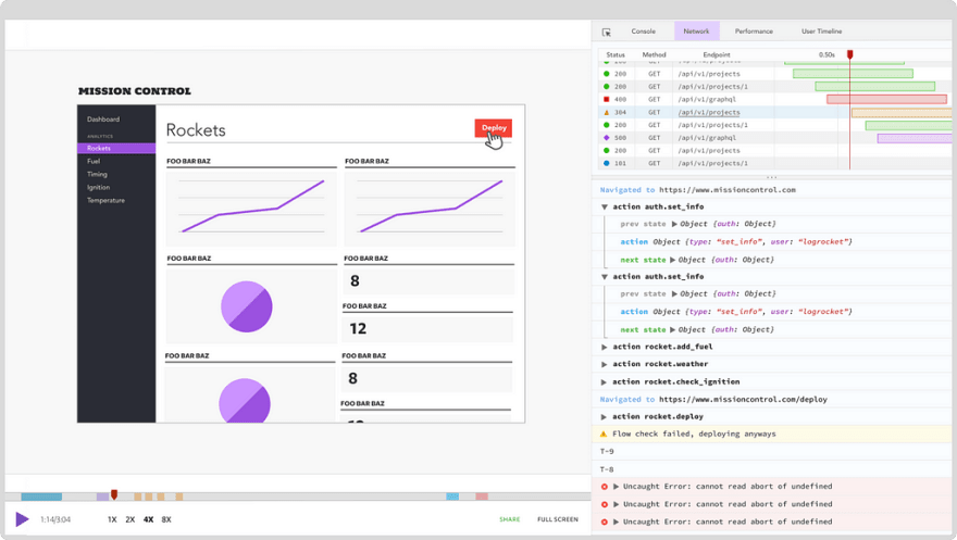
LogRocket is a frontend logging tool that lets you replay problems as if they happened in your own browser. Instead of guessing why errors happen, or asking users for screenshots and log dumps, LogRocket lets you replay the session to quickly understand what went wrong. It works perfectly with any app, regardless of framework, and has plugins to log additional context from Redux, Vuex, and @ngrx/store.
In addition to logging Redux actions and state, LogRocket records console logs, JavaScript errors, stacktraces, network requests/responses with headers + bodies, browser metadata, and custom logs. It also instruments the DOM to record the HTML and CSS on the page, recreating pixel-perfect videos of even the most complex single page apps.


Top comments (0)