
TL;DR: In this post, you will be introduced to a few new Angular features you might not know about. We will look at the thought process behind them and even some examples on how to get started using them.
Angular
Angular, a JavaScript framework (with almost 44,000 stars on GitHub), is a platform that makes it easy to build applications with the web. Angular combines declarative templates, dependency injection, end to end tooling, and integrated best practices to solve development challenges. Angular empowers developers to build applications that live on the web, mobile, or the desktop. It also has the most useful CLI tool for beginners to easily get started.
In this article, you will be introduced to a few Angular features that every Angular developer should know about. Angular is currently in the seventh version, and the next version is expected to be released anytime in May 2019. With this post, you will have a look back at exciting features and also a preview of what is to come in version 8.

Angular Elements
In the sixth version released around this time last year, Angular Elements was released to developers for use. Angular Elements is a new Angular package which you can use to bootstrap Angular components within an existing Angular application by registering them as custom elements. Angular does this by taking your Angular component and compiling it to a web component.
As web components are getting massive acceptance in the JavaScript community, this is a sure great time to start using them in your Angular projects. Angular elements are re-usable as you can use them in other frameworks like React and Vue and also use them in the server-side of your project.
In version 7, the Angular team added support for content projection using web standards for custom HTML element like in Angular Elements:
@Component({
  selector: 'bla-bla',
  template: `
    <header>
      <slot name="bla-header"></slot>
    </header>
    <slot></slot>`,
  encapsulation: ViewEncapsulation.ShadowDom,
  styles: []
})
export class BlaComponent {
}
With this declared, using slot like this is now possible:
<bla-bla>
  <span slot="bla-header">Angular rocks!</span>
<bla-bla>
Library support
Due to popular demand, the Angular team added schematics support so you can now create and publish new libraries to extend Angular functionality. If you find that you need to solve the same problem in more than one application or you want to share your solution with other developers in a reusable manner, you should be excited about this:
ng generate library <name>

This command will create a library project within your CLI workspace, with options of configuring it for testing and for building. You can learn more about creating libraries with the Angular CLI here.
CLI upgrade: ng add and ng update
In the effort to radically make the CLI tool easier to use and more intuitive, more CLI commands were introduced to Angular CLI in version 6. These commands are very helpful and you should start using them if your Angular version is at version 6 or above.
- ng add : This CLI command was built to help add new capabilities through packages and features to your project easily with one command. The syntax is:
ng add <package>
It uses your default package manager (yarn or npm) to download new dependencies and also activate the installation scripts to install them so you can use them on the go.
- Other JavaScript frameworks like Vue have implemented similar CLI add command capabilities inspired by the ng add in the Vue CLI 3.0
2. ng update : This CLI command goes into your package.json file, analyzes it and uses its inbuilt Angular version recommendation system to update the particular package you specify. The syntax looks like this:
ng update <package>
Where the package is the name of your preferred package. The update command does more than update your packages, it also keeps your dependencies in sync and applies needed transforms to your project using yarn or npm.
Data saver updates
In version 7, an efficiency feature was introduced and you now get warnings when your bundle is over 2MB in size when you run the build command. It goes a step further to show error messages when your bundle gets to 5MB in size. You can however personally adjust these error and warnings settings to your own personal bundle size limit by modifying the Angular.json file:
"budgets": [
  {
    "type": "initial",
    "maximumWarning": "2mb",
    "maximumError": "5mb"
  }
]
These budgets settings are similar to them with that can be shown to google chrome users and so get Chrome’s Data Saver features. This is a very great way to keep you both disciplined and accountable to your set bundle size targets.
Angular CDK
Google’s Material.io platform for building web experiences with material design was updated at the time when the sixth version of Angular was released. It now contains a component development kit. The Component Development Kit (CDK) is a set of tools that implement common interaction patterns whilst being un-opinionated about their presentation. It represents an abstraction of the core functionalities found in the Angular Material library, without any styling specific to Material Design. Think of the CDK as a blank state of well-tested functionality upon which you can develop your own bespoke components. Adding the Material setup to your Angular project can be done with a line of command:
ng add @angular/material
The features below were born from the CDK.
Starter components
A couple of out-of-the-box starter components were added to the CDK, as in the sixth Angular version. These components were:
-
Material sidenav : Here we see a starter Angular application which consists of a toolbar and a side navigation. All of the components are fully responsive and are of course built in accordance with material design:
ng generate @angular/material:material-nav — name=my-nav
2. Material dashboard : Here you can generate a starter dashboard template with a command. This dashboard contains dynamic grid list of cards, all design according to material design principles. They are all responsive:ng generate @angular/material:material-dashboard --name=my-dashboard
3. Material data table : Here you can generate a data table component that is already configured with a data source for both sorting and pagination:ng generate @angular/material:material-table --name=my-table
You can learn more about the available Angular Material Schematics here.
Virtual scroll
Angular version 7 was released with even more shiny additions to the CDK. The virtual scrolling feature was added to help structure your user interface in such a way that you might not necessarily have to use pagination options anytime you have to display component with a long list of items. The virtual scrolling module achieves exactly that by loading elements unto the DOM and also unloading elements from the DOM by the visible parts of a list as you scroll, this, in turn, provides a great platform for building cooler and faster user experience with large scrollable lists:
import {ChangeDetectionStrategy, Component} from '@angular/core';

/** @title Basic virtual scroll */
@Component({
  selector: 'cdk-virtual-scroll-overview-example',
  styleUrls: ['cdk-virtual-scroll-overview-example.css'],
  templateUrl: 'cdk-virtual-scroll-overview-example.html',
  changeDetection: ChangeDetectionStrategy.OnPush,
})
export class CdkVirtualScrollOverviewExample {
  items = Array.from({length: 100000}).map((_, i) => `Item #${i}`);
}
TypeScript
.example-viewport {
  height: 200px;
  width: 200px;
  border: 1px solid black;
}

.example-item {
  height: 50px;
}
CSS
You can read more about Virtual Scrolling here.
Drag and drop

Added to the virtual scrolling module is another user interface game-changer called drag and drop. This module brings exciting interactivity in user interface design to life. With the drag and drop, you can have list items get very practically interactive, giving the user the power to drag and drop list items within a single list and even between two lists. It is such a creative feature you should totally check out. The rendering, re-ordering and re-shuffling of list items are all done automatically and dynamically and you can also animate the process:
<div class="example-box" cdkDrag>
  Drag me around
</div>
HTML
import {Component} from '@angular/core';

/**
 * @title Basic Drag&Drop
 */
@Component({
  selector: 'cdk-drag-drop-overview-example',
  templateUrl: 'cdk-drag-drop-overview-example.html',
  styleUrls: ['cdk-drag-drop-overview-example.css'],
})
export class CdkDragDropOverviewExample {}
Typescript
.example-box {
  width: 200px;
  height: 200px;
  border: solid 1px #ccc;
  color: rgba(0, 0, 0, 0.87);
  cursor: move;
  display: flex;
  justify-content: center;
  align-items: center;
  text-align: center;
  background: #fff;
  border-radius: 4px;
  position: relative;
  z-index: 1;
  transition: box-shadow 200ms cubic-bezier(0, 0, 0.2, 1);
  box-shadow: 0 3px 1px -2px rgba(0, 0, 0, 0.2),
              0 2px 2px 0 rgba(0, 0, 0, 0.14),
              0 1px 5px 0 rgba(0, 0, 0, 0.12);
}

.example-box:active {
  box-shadow: 0 5px 5px -3px rgba(0, 0, 0, 0.2),
              0 8px 10px 1px rgba(0, 0, 0, 0.14),
              0 3px 14px 2px rgba(0, 0, 0, 0.12);
}
CSS
Personally, common use cases that come to mind are: games and project boards.
Conclusion: Angular 8 is coming!
We have seen the newest and shiniest Angular features out as we wait for the next version. According to the speculative Angular release timeline, the opt-in preview of Angular version 8 will be released in May this year and this is going to be a very symbolic release because the Angular renderer is going to be changed to a new one called Ivy. Ivy promises to bring faster re-build time, improvements with type checking, an easier platform for debugging and most importantly drastically reduced bundle size. Which of these Angular features are you meeting for the first time?
Plug: LogRocket, a DVR for web apps
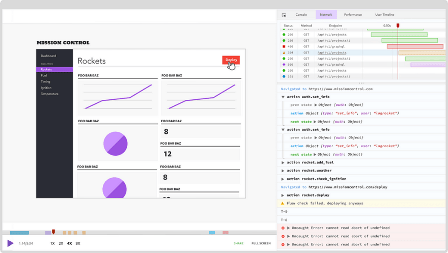
LogRocket is a frontend logging tool that lets you replay problems as if they happened in your own browser. Instead of guessing why errors happen, or asking users for screenshots and log dumps, LogRocket lets you replay the session to quickly understand what went wrong. It works perfectly with any app, regardless of framework, and has plugins to log additional context from Redux, Vuex, and @ngrx/store.
In addition to logging Redux actions and state, LogRocket records console logs, JavaScript errors, stacktraces, network requests/responses with headers + bodies, browser metadata, and custom logs. It also instruments the DOM to record the HTML and CSS on the page, recreating pixel-perfect videos of even the most complex single-page apps.
The post New Angular features you didn't know existed appeared first on LogRocket Blog.


Top comments (0)