
Written by Jeremy Kithome✏️
Introduction
A progress bar (sometimes referred to as a progress indicator) is a visual indicator or representation of the progress of a particular task. This can be an operation such as download, file transfer/upload, installation, program execution or even completed steps in profile setup.

Software with good UX lets a user know if there is a process running, expected running time and completed portion of work.
Progress bars can be determinate or indeterminate. Determinate progress bars are used when you can tell what has been done and what is left to complete. Indeterminate progress bars, on the other hand, are used when these metrics can’t be immediately determined.

In this article, we will be looking at how to build a progress bar for React Native. You might ask why you would want to build one, after all, there are a few React Native packages for progress bars such as react-native-progress-bar-animated and react-native-progress. Ultimately, it will probably come down to personal preferences and creating something that you can tweak to meet your requirements.
React Native has a progress bar component ProgressBarAndroid which is only available for Android. If you want your iOS app to have a progress bar, you will have to use an existing npm package or build one yourself.

Getting started
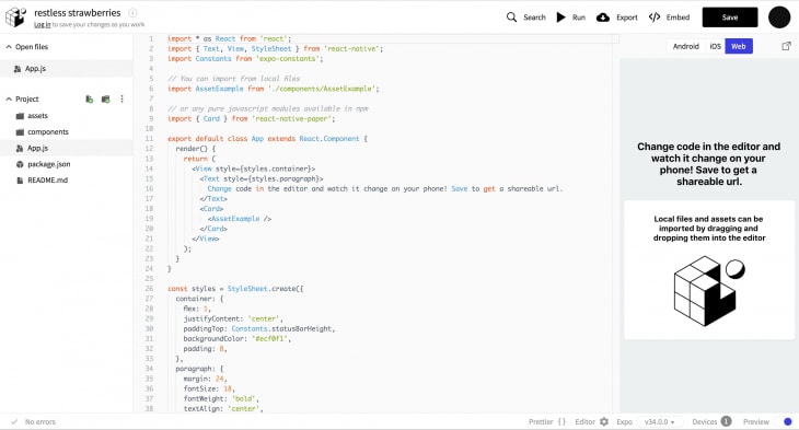
This article assumes that you are familiar with React Native or, at the very least, React. An understanding of React Hooks will also be required. To get started, we will first have to start a project. You can use Expo CLI or React Native CLI to bootstrap your project. For the purposes of this article, I will be using Snack which allows you to try React Native out directly in your web browser. If you go to Snack you will see a view similar to this:
We will be making our changes in the App.js file. Let’s clear out what we already have there so we can get started. Add the following code to App.js:
import React, { useEffect, useState, useRef } from 'react';
import { Text, View, StyleSheet } from 'react-native';
import Constants from 'expo-constants';


const App = () => {
 return (
   <View style={styles.container}>
     <Text>
       We Will Start Here
     </Text>
   </View>
 );
}

export default App;

const styles = StyleSheet.create({
 container: {
   flex: 1,
   justifyContent: 'center',
   alignItems: 'center',
   paddingTop: Constants.statusBarHeight,
   backgroundColor: '#ecf0f1',
   padding: 8,
 },
});
We are rendering a View with some text in it. The device simulator should update automatically.
Building the progress bar
Before we start building our progress bar, we need to determine what it will look like and what we need to show. A simple progress bar will have some descriptive text e.g loading, and the actual bar representing the progress of the operation. We will also add some text that shows what percentage of the operation is complete. Let’s create the skeleton of our progress bar. In our App.js, we will change the text in our Text Component to Loading.....:
<Text>
  Loading.....
</Text>
We want the Loading..... text to be above the progress bar and the percentage completion below the bar. We will need to change the container styling to align the child components in a column. Let’s add a flexDirection: 'Column' property to our container styles. Below this, we’ll have an empty view with a height of 20 pixels, 100% width, a white background, and a black border 2 pixels thick. You can add these styled to a new styles object called progressBar.
<View style={styles.container}>
  <Text>
    Loading.....
  </Text>
  <View style={styles.progressBar}></View>
</View>

const styles = StyleSheet.create({
  container: {....},
  progressBar: {
   height: 20,
   width: '100%',
   backgroundColor: 'white',
   borderColor: '#000',
   borderWidth: 2,
   borderRadius: 5
 }
});
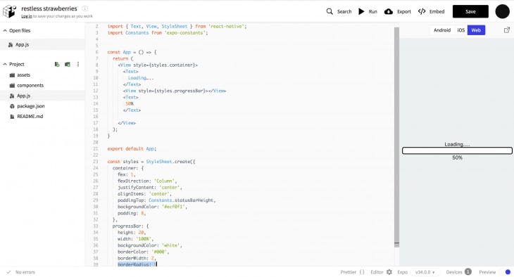
To display the current progress of task execution, we’ll add a text field with the percentage completion below the progress bar. We can hardcode it at 50% for now.
<View style={styles.container}>
  <Text>
    Loading.....
  </Text>
  <View style={styles.progressBar}></View>
  <Text>50%</Text>
</View>
Here is what our progress bar should look like so far:
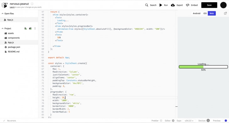
We can now start working on the actual progress bar. We will need to add a child View to the progress bar container View. The child View will show the percentage of progress. Since the child View will need to be aligned across the horizontal plane, the progress bar container will need styling property flexDirection:"Row". Add this property to the progressBar styles. We’ll eventually want to animate the bar, so we’ll use an animated View.
Our animated View will use StyleSheet.absoluteFill to create an overlay with position absolute and zero positioning.
{
  position: 'absolute',
  left: 0,
  right: 0,
  top: 0,
  bottom: 0
}
We will also need to give the view a fill color. You can pick the color of your choice. I’ve chosen to use a shade of green. Let’s also give the View a width of 50%.
<View style={styles.progressBar}>
  <Animated.View style={[StyleSheet.absoluteFill], {backgroundColor: "#8BED4F", width: “50%”}}/>
</View>
Our app should now look like this:
Adding the progress counter
In order for our progress bar to show changing completion, we will need a counter. The easiest way to do this is by using setInterval. However, I am using Hooks and setInterval doesn’t behave as expected. To get over this hurdle, we’ll use a fantastic custom Hook created by Dan Abramov. You can find in his blog here. Let’s go ahead and copy this custom Hook and add it to our App.js file:
function useInterval(callback, delay) {
  const savedCallback = useRef();
  // Remember the latest callback.
  useEffect(() => {
    savedCallback.current = callback;
  }, [callback]);
  // Set up the interval.
  useEffect(() => {
    function tick() {
      savedCallback.current();
    }
    if (delay !== null) {
      let id = setInterval(tick, delay);
      return () => clearInterval(id);
    }
  }, [delay]);
}
Now that we have this Hook, we can go ahead and use it. We will need to have a progress state value and update it using the custom Hook. Add the following code to your component:
const [progress, setProgress] = useState(0);
 useInterval(() => {
   if(progress < 100) {
     setProgress(progress + 5);
   }
 }, 1000);
We are using the custom setInterval Hook to update the value of progress from 0 to 100 in increments of 5 every 1 second.
Animating the progress bar
The first thing we will need to do is create our animated value. To accomplish this, we will use useRef Hook. Let’s add our animated value to the component:
const App = () => {
  let animation = useRef(new Animated.Value(0));
  .....
}
When our progress value changes, we will need to drive updates via animations using Animated.timing(). This will take the current value of the animation ref as well as a configuration object that will contain the new value to animate to and the animation duration. The animation will then be triggered by calling start. We will use useEffect with progress value as a dependency to update animations. In code, this will look something like this:
useEffect(() => {
   Animated.timing(animation.current, {
     toValue: progress,
     duration: 100
   }).start();
 },[progress])
Next, we will need to set a width for the progress bar. We will do this by creating an interpolated value from the animation.
const width = animation.current.interpolate({
  inputRange: [0, 100],
  outputRange: ["0%", "100%"],
  extrapolate: "clamp"
})
The value inputRange represents the range of values that we will be receiving from progress. The outputRange defines the range of values that will be output. An interpolation maps input ranges to output ranges typically using a linear interpolation. By default, it will extrapolate the curve beyond the ranges given. To ensure that the output values do not extend beyond the provided range, we pass a property extrapolate: "clamp" to the configuration object. We now pass out interpolated width to the animated progress bar.
<View style={styles.progressBar}>
  <Animated.View style={[StyleSheet.absoluteFill], {backgroundColor: "#8BED4F", width }}/>
</View>
The percentage progress value that we hardcoded earlier will now need to match the updating progress bar. Since our values range from 0 to 100, we’ll construct the text using a template string.
<View style={styles.container}>
  ...
  <View style={styles.progressBar}>
    ...
  </View>
  <Text>{`${progress}%`}</Text>
</View>
And there we have it. Our progress bar is complete. The final product can be found here.
Conclusion
You can find the Snack for this project here. You can also find the code for this project on GitHub. This is by no means a perfect progress bar. There are many improvements that can be made to it especially with regards to animation. To challenge yourself further, you can try uploading a file and displaying the progress. If you have any questions, comments or feedback please let me know. You can find me on Twitter.
Editor's note: Seeing something wrong with this post? You can find the correct version here.
Plug: LogRocket, a DVR for web apps

LogRocket is a frontend logging tool that lets you replay problems as if they happened in your own browser. Instead of guessing why errors happen, or asking users for screenshots and log dumps, LogRocket lets you replay the session to quickly understand what went wrong. It works perfectly with any app, regardless of framework, and has plugins to log additional context from Redux, Vuex, and @ngrx/store.
In addition to logging Redux actions and state, LogRocket records console logs, JavaScript errors, stacktraces, network requests/responses with headers + bodies, browser metadata, and custom logs. It also instruments the DOM to record the HTML and CSS on the page, recreating pixel-perfect videos of even the most complex single-page apps.
Try it for free.
The post How to build a progress bar with React Native appeared first on LogRocket Blog.


Top comments (0)