Quick guide to React compound components

Compound components is an advanced pattern so it might be overwhelming to use. This guide aims to help you understand the pattern so that you can use it effectively with confidence and clarity.
Note — In this article we’ll use the new context API introduced in React v16.3. Other articles implement the pattern using React.cloneElement but that involves cloning each component which increases the memory footprint. It also limits the components to be immediate children of parent. So using context API is much better.

What are compound components?
Compound components is a pattern in which components are used together such that they share an implicit state that let’s them communicate with each other in the background.
Think of compound components like the and elements in HTML. Apart they don't do too much, but together they allow you to create the complete experience. — Kent C. Dodds
When you click on an option, select knows which option you clicked. Like select and option, the components share the state on their own, you don’t have to explicitly configure them.
Example of compound component
<TabSwitcher>
  <header>
    <ul className="tablist">
      <li>
        <Tab id="a">
          <button>Tab A</button>
        </Tab>
      </li>
      <li>
        <Tab id="b">
          <button>Tab B</button>
        </Tab>
      </li>
    </ul>
  </header>
  <main>
    <TabPanel whenActive="a">
      <div>
        a panel
      </div>
    </TabPanel>

    <TabPanel whenActive="b">
      <div>
        b panel
      </div>
    </TabPanel>
  </main>
</TabSwitcher>
When you click on the buttons inside Tab component the corresponding tab panels’ content is rendered.
Why do I need it when I have render props?
Render props is a great pattern. It is very versatile and easy to understand. However this doesn’t mean that we have to use it everywhere. If used carelessly it can lead to obfuscated code.
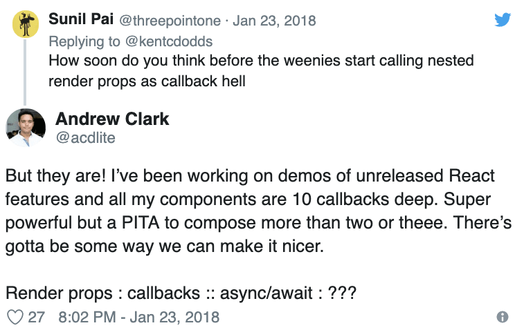
Having too many nested functions inside the markup lead to difficulty in reading. Remember nothing is a silver bullet , not even render props.
Advantages of compound component pattern
By looking at the example some advantages are pretty clear.
- The developer owns the markup. The implementation of Tab Switcher doesn’t need a fixed markup structure. You can do whatever you like, nest a Tab 10 levels deep (I’m not judging) and it will still work.
- The developer can rearrange the components in any order. Suppose you want the Tabs to come below the Tab Panels. No changes are required in the component implementation, we just have to rearrange the components in the markup.
- The components don’t have to be jammed together explicitly, they can be written independently but they are still able to communicate. In the example Tab and TabPanel components are not connected directly but they are able to communicate via their parent TabSwitcher component.
How it works
- The parent component (TabSwitcher) has some state.
- Using the context-api, TabSwitcher shares it’s state and methods with child components.
- The child component Tab uses the shared methods to communicate with TabSwitcher .
- The child component TabPanel uses the shared state to decide if it should render its content.
Implementing the TabSwitcher compound component
To implement a component component, I usually follow these steps.
- List down the components required.
- Write the boilerplate.
- Implement the individual components.
List down the components required
For the TabSwitcher we need to have two things. One is to know which tab content to show and second is to switch tab panels when user click.
This means we need to control the rendering of tab panel content and have a click event listener on the tabs, so when tab is clicked the corresponding tab panel content is shown.
To accomplish this we need three components.
- TabSwitcher — parent component to hold the state
- Tab — component which tell its parent if its clicked
- TabPanel — component which renders when parent tells it to
Write the boilerplate
The compound component pattern has some boilerplate code. This is great because in most cases we can write it without much thinking.
import React, { Component, createContext } from 'react';

const context = createContext({});

const { Provider, Consumer } = context;

const Tab = ({ id, children }) => (
  <Consumer>
    {({ changeTab }) => <div onClick={() => changeTab(id)}>{children}</div>}
  </Consumer>
);

const TabPanel = ({ whenActive, children }) => (
  <Consumer>
    {({ activeTabId }) => (activeTabId === whenActive ? children : null)}
  </Consumer>
);

class TabSwitcher extends Component {
  state = {
    activeTabId: 'a'
  };

  changeTab = newTabId => {
    console.log(newTabId);
    this.setState({
      activeTabId: newTabId
    });
  };

  render() {
    return (
      <Provider
        value={{
          activeTabId: this.state.activeTabId,
          changeTab: this.changeTab
        }}
      >
        {this.props.children}
      </Provider>
    );
  }
}

export default TabSwitcher;
export { Tab, TabPanel };
Here we are making a context. The child components will take data and methods from the context. The data will be the state shared by the parent and the methods will be for communicating changes to the state back to the parent.
Implement the individual components
The Tab component needs to listen to click events and tell parent which tab was clicked. It can be implemented like this —
const Tab = ({ id, children }) => (
  <Consumer>
    {({ changeTab }) => changeTab(id)}>{children}}
  </Consumer>
);
Tab component takes id prop and on click event call changeTab method passing its id. This way the parent gets to know which Tab was clicked.
TabPanel component needs to render its children only when it is the active panel. It can be implemented like this —
const TabPanel = ({ whenActive, children }) => (
  <Consumer>
    {({ activeTabId }) => (activeTabId === whenActive ? children : null)}
  </Consumer>
);
TabPanel component takes whenActive prop which tells it when to render the children. The context provides the activeTabId through which TabPanel decides if it should render its children or not.
TabSwitcher component needs to maintain active tab state and pass the state and methods to the child components.
class TabSwitcher extends Component {
  state = {
    activeTabId: 'a'
  };

  changeTab = newTabId => {
    this.setState({
      activeTabId: newTabId
    });
  };

  render() {
    return (
      <Provider
        value={{
          activeTabId: this.state.activeTabId,
          changeTab: this.changeTab
        }}
      >
        {this.props.children}
      </Provider>
    );
  }
}
TabSwitcher component stores activeTabId , by default it is ‘a’. So the first panel will be visible initially. It has a changeTab method which is used to update the activeTabId state. TabSwitcher shares the state and the methods to the consumers.
Let’s see how they all fit together.
import React, { Component, createContext } from 'react';

const context = createContext({
  activeTabId: '',
  changeTab: () => {}
});

const { Provider, Consumer } = context;

const Tab = ({ id, children }) => (
  <Consumer>
    {({ changeTab }) =>  changeTab(id)}>{children}}
  </Consumer>
);

const TabPanel = ({ whenActive, children }) => (
  <Consumer>
    {({ activeTabId }) => (activeTabId === whenActive ? children : null)}
  </Consumer>
);

class TabSwitcher extends Component {
  state = {
    activeTabId: 'a'
  };

  changeTab = newTabId => {
    this.setState({
      activeTabId: newTabId
    });
  };

  render() {
    return (
      <Provider
        value={{
          activeTabId: this.state.activeTabId,
          changeTab: this.changeTab
        }}
      >
        {this.props.children}
      </Provider>
    );
  }
}

export default TabSwitcher;
export { Tab, TabPanel };
The compound component can be used like this:
import React from "react";
import ReactDOM from "react-dom";

import TabSwitcher, { Tab, TabPanel } from './TabSwitcher';

function App() {
  return (
    <div className="App">
      <h1>TabSwitcher with Compound Components</h1>
      <TabSwitcher>
        <Tab id="a">
          <button>a</button>
        </Tab>
        <Tab id="b">
          <button>b</button>
        </Tab>

        <TabPanel whenActive="a">
          <div>
            a panel
          </div>
        </TabPanel>

        <TabPanel whenActive="b">
          <div>
            b panel
          </div>
        </TabPanel>
      </TabSwitcher>
    </div>
  );
}

const rootElement = document.getElementById("root");
ReactDOM.render(<App />, rootElement);
Demo (beware it's no CSS land)
If you found the article helpful, please clap for it. Follow me on Twitterand Medium to get notified when I post more articles like this.
Plug: LogRocket, a DVR for web apps
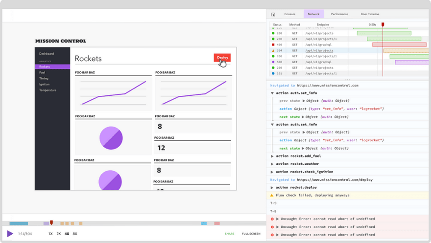
LogRocket is a frontend logging tool that lets you replay problems as if they happened in your own browser. Instead of guessing why errors happen, or asking users for screenshots and log dumps, LogRocket lets you replay the session to quickly understand what went wrong. It works perfectly with any app, regardless of framework, and has plugins to log additional context from Redux, Vuex, and @ngrx/store.
In addition to logging Redux actions and state, LogRocket records console logs, JavaScript errors, stacktraces, network requests/responses with headers + bodies, browser metadata, and custom logs. It also instruments the DOM to record the HTML and CSS on the page, recreating pixel-perfect videos of even the most complex single page apps.
The post Quick guide to React compound components appeared first on LogRocket Blog.


Top comments (0)