
Introduction
Building select elements used to be one of the easiest things to build when working on a web project three or four years ago. Now, there is so much that goes into building select elements especially when UI/UX is a high priority.
One has to consider features such as on-focus, styling select elements, fetching data from a remote source and the list goes on. You may have had this thought when working on that React project and wished a reusable component existed somewhere in the multiverse. Well, lucky for us, Jed Watson started an open source project, funded by Thinkmill (his company) and Atlassian, called react-select.
There were several limitations with version one of react-select, which gave birth to v2. In this article, we’ll be going over the awesome features embodied in react-select v2 as well as getting on a launchpad to introduce us to react-select v2 and how to get started.
Installation and basic usage
Prerequisites
- Yarn/npm installed
- create react app CLI tool installed
- A basic understanding of HTML, JavaScript (ES6) and CSS
- A basic understanding of React JS and using create react app
- A basic understanding of the command line terminal

Installation
With all of those requirements out of the way, it’s time for us add the react-select package to our existing React application. For the sake of this tutorial, we’ll be using the create react-app CLI tool. If you don’t already have an existing project you can provision one like this:
$ yarn create react-app react
After that is done, we’ll install the react-select package from npm:
$ yarn add react-select
Now, we’ll take a look at how we can import and use the react-select package in a react application.
Basic usage
In theApp.js file, we import two items at the top of the file, the react and react-select package respectively like this:
//App.js

import React from 'react';
import Select from 'react-select';

...
With those two packages imported, we will be able to have access to the react-select ( ) and also extend the React.Component class. In traditional HTML, the tag houses multiple options and values. Our react-select component follows the same convention but the options and values are passed in as props.
//App.js

//Import React and Select

const options = [
  { value: 'blues', label: 'Blues' },
  { value: 'rock', label: 'Rock' },
  { value: 'jazz', label: 'Jazz' },
  { value: 'orchestra' label: 'Orchestra' }
];

class App extends React.Component {
  render(){
    return (
      <Select options = {options} />
    );
  }
}

export default App;
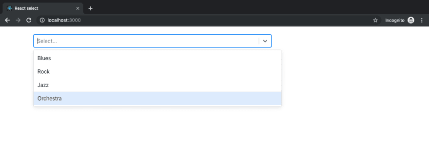
In the code snippet above, we have our select options as music genres which is passed into the select component as props. The class App is exported so that it could be rendered to our App component in the DOM. When we run this application we should see a select element that spans across the screen from one end to the other.
 If you got that output when you ran your react application, kudos. In the coming sections, we’ll look at how we can style the select component to extend its functionalities and make it visually pleasing.
Custom styling your select components
In this section, we’ll be discussing how we can add beauty and aesthetics to our select component. First things first, we will leverage bootstrap CSS to resize our select component so it doesn’t take up the whole width of the web page. We’ll install bootstrap in our project like so:
$ yarn add boostrap@4.31
With bootstrap installed, we’ll add our styling to our select component.
//App.js

import 'bootstrap/dist/css/bootstrap.css';
//Import react and select

return(
  <Select className="mt-4 col-md-8 col-offset-4"
    options = { options }
  />
);

...
For better results, we’ll enclose our root DOM element in index.html in a bootstrap container.
<!-- index.html -->
...

<div class="container">
    <div id="root"></div>
</div>

...
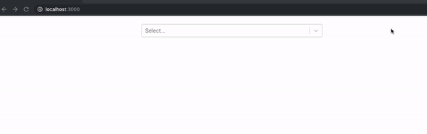
This will give us a select element that looks exactly like the image below:
Styles and states
In this section, we will look at how we can extend the out-of-the-box default styling, and also look at how we can style the entire component. The code block above where we added some bootstrap styling is a good demonstration of extending the default styling which comes with the select component. To elaborate further we will tweak the look and feel of the select component:
//App.js
//Import react and select

const customStyles = {
  option: (provided, state) => ({
    ...provided,
    borderBottom: '2px dotted green',
    color: state.isSelected ? 'yellow' : 'black',
    backgroundColor: state.isSelected ? 'green' : 'white'
  }),
  control: (provided) => ({
    ...provided,
    marginTop: "5%",
  })
}

...

return(
  <Select className="col-md-8 col-offset-4"
    styles = { customStyles }
    options = { options }
  />
);

...
There are two component properties (option and control) we tweaked to extend and customize the look and feel of the select component. There are many properties provided by react-select which gives us, the consumers, a lot of room to build to our needs and taste. We will discuss custom components in detail in a later section of this article. For the sake of this section, we will briefly discuss the two custom components stated above.
Option: This is the component responsible for displaying the options. By targeting this component we were able to get the select element below:
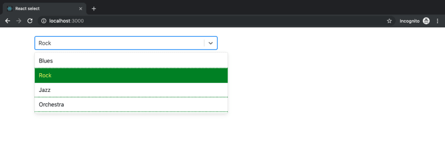
In the image above we were able to set the background of a selected option to green and change the text color to yellow. This was made possible by extending its default styling by spreading it into the provided variable …provided
Control: This is the component responsible for the ValueContainer and IndicatorsContainer . With this, we were able to add a margin-top property of 5% which moved the whole select component away from the top of the page as shown in the image above as opposed to the very first image of the select component in the basic usage section.
Props
In this section, we will take a look at some of the major props we use to customize the functionalities of our select component. Below is an example of how some of these props come in handy.
//App.js

//Import react and select

state = {
  selectedOption: null,
}
handleChange = (selectedOption) => {
  this.setState({ selectedOption });
  console.log(`Option selected:`, selectedOption);
}
render(){
  const { selectedOption } = this.state;
}

return (
  <Select className="mt-4 col-md-6 col-offset-4"
  onChange={this.handleChange}
  options={options}
  autoFocus={true}
  />
)
Above is the state manager prop onChange which we use to get the information about the currently select item. Supposing we select rock as an option in our console we’ll get something along the lines of Option selected: {value:"rock", label: "Rock"} this will come in handy when we want to manipulate the data gotten from our select component. Other props seen are the options and autoFocus props. The options prop is used to pass in select options to the select component. The options used in the code block above are:
const options = [
  { value: 'blues', label: 'Blues' },
  { value: 'rock', label: 'Rock' },
  { value: 'jazz', label: 'Jazz' },
  { value: 'orchestra' label: 'Orchestra' }
];
The autoFocus prop which has a data type of boolean is used to add autoFocus to the select component on page load. To know about props which are available for use you can check out the props documentation for react-select.
Custom components
Under styles and states , we discussed two custom components (option and control) which we used to extend the select styling. In this section, we’ll take a look at another custom component called the Custom SingleValue . This custom component does what our regular select component does but we’re going to add a little bit of finesse. In our App.js file, we’ll import the React and Select packages from react and react-select respectively like so:
//App.js

import React, { type ElementConfig } from 'react';
import Select, { components } from 'react-select';
...
By the time we are done, we have a finished product that looks something like this:

In the code block below, we define our custom component SingleValue as a method which extends the base component in the react-select package. In our App class, we have a couple of props and functions which contribute to the functionality (as shown in the image above) such as:
handleChange: This method is triggered by a state manager prop called the onChange . This method is responsible for storing the value of the selected option in our state object called selectedOption
styles: In this prop, we extend the style modifier method singleValue where we modify the styling already accessible to us by default by spreading default styles into the base object. The line responsible for adding a background color to each selected option is the background: this.state.selectedOption.value where we get the current option selected from the state and use it to update the background
components: In the component prop we pass in the SingleValue component, the primary function of the component is to display in the input for a single select.
options: The options prop that we all know by now is how we pass in our array object of select items which in this case are colors like so.
className: In this prop is where we add our bootstrap styling to position our select component away from the top margin as well as centralize our select component nicely.
//App.js

 const SingleValue = ({ children, ...props }) => (
   <components.SingleValue {...props}>
     {children}
   </components.SingleValue>
 );

 class App extends React.Component {
   state = {};
   state = {
     selectedOption: null,
   }
   handleChange = (selectedOption) => {
     this.setState({ selectedOption });
   }
   render() {
     return (
       <Select
           className="mt-4 col-md-6 col-offset-4"
           onChange={this.handleChange}
           styles={{ singleValue: (base) => ({ ...base, padding: 5, borderRadius: 5, background: this.state.selectedOption.value, color: 'white', display: 'flex' }) }}
           components={{ SingleValue }}
           options={colourOptions}
         />
     );
   }
 }
 export default App;
Using built-in animated components
In this section, we will take a look at how we can add a little animation to our react select component. All we need to add animation to our select component is to import the animated component which in this case is named makeAnimated and then reference makeAnimated in our component’s props like so:
//App.js

import React from 'react';
import Select, { components } from 'react-select';
import makeAnimated from 'react-select/lib/animated';
import 'bootstrap/dist/css/bootstrap.css';

const colourOptions = [] //our array of colours

class App extends React.Component {
  render(){
    return (
      <Select
        className="mt-4 col-md-6 col-offset-4"
        components={makeAnimated()}
        isMulti
        options={colourOptions}
        />
    );
  }
}

export default App;
TheisMulti prop is used to make us select more than one option at once as we can see in the gif below:
Other concepts
There are other concepts which are important to know in regards to working with the react-select component. One of which is theAsync component which is imported like this:
import Async from 'react-select/lib/Async';
This component comes in handy when we want to request our select values or options from an API or a database query. This component helps to add Async property to our select component which comes bootstrapped with helper props such as
cacheOptions for caching options and also an event listener props onInputChange.This component can be implemented through the use of callbacks or promises.
Another component which may come in handy is the fixed options component. This component makes it possible to have fixed options as already selected values which can’t be removed.
Conclusion
In the course of this article, we have learned some common use cases of the react-select component, how to get started and also how to extend some of the predefined components to suit our needs. There are a plethora of functionalities built into the react-select package, some of which will fit your needs, some of which you’ll need to customize to fit your use case. Here’s a link to the official documentation to get your hands dirty. Feel free to leave a comment if you have questions or get stuck I’ll lend a helping hand. 
Plug: LogRocket, a DVR for web apps
LogRocket is a frontend logging tool that lets you replay problems as if they happened in your own browser. Instead of guessing why errors happen, or asking users for screenshots and log dumps, LogRocket lets you replay the session to quickly understand what went wrong. It works perfectly with any app, regardless of framework, and has plugins to log additional context from Redux, Vuex, and @ngrx/store.
In addition to logging Redux actions and state, LogRocket records console logs, JavaScript errors, stacktraces, network requests/responses with headers + bodies, browser metadata, and custom logs. It also instruments the DOM to record the HTML and CSS on the page, recreating pixel-perfect videos of even the most complex single-page apps.
Try it for free.
The post Getting started with react-select appeared first on LogRocket Blog.


Top comments (3)
Thank you for the recent posts, Brian.
I've noticed that formatting/syntax highlights seem to be off for many posts.
Would you be able to update them?
I've noticed that too. I'm going to look into it. I think what's happening is porting stuff over from WordPress to here is messing with the formatting. The formatting on blog.logrocket.com should be correct - but viewing the post there is totally up to you. Thanks!
Ah, LogRocket blog is using Mediumish theme for WordPress.
I've had some trouble with code snippets and emojis when importing from my WordPress site.
So ended up using Gists & fixing emojis manually 😓