
One of the highlights in the world of web design for 2018 was when Jen Simmons came up with the term Intrinsic Web Design and shared it with the world. Intrinsic Web Design is not a framework. It isn’t a set of rules to follow either. Rather, it is a collection of concepts that highlight what is now possible with modern CSS. How we choose to utilize these concepts for better art direction on the web and to build better layouts, that’s up to us.
Jen covered the following six major concepts when she talked about Intrinsic Web Design:
- combining both fluid and fixed
- stages of squishiness
- truly two-dimensional layouts
- nested contexts
- expanding and contracting content
- media queries, as needed
You’ll notice that none of those concepts pinpoint a specific CSS property or module. That is because CSS works best when various complementary properties are used together. In this post, I want to talk about the concept of stages of squishiness, and how it is going to greatly enhance art direction of editorial content on the web.

Sizing items with CSS
Let’s start off with some basics. Browsers perform a lot of computations to ensure that every element gets rendered correctly on a web page. Each element has to have every possible CSS property value resolved and computed before it can be laid out on the page.
According to the visual formatting model, each element in the document tree generates zero or more boxes. And there are numerous factors that influence the dimensions of these boxes.
The CSS specification that covers this in detail is the CSS Intrinsic & Extrinsic Sizing Module Level 3. Extrinsic sizing is based on the context of the element, without taking into account its contents, while intrinsic sizing is based on the contents of the element, without taking into account its context.
Most of us would be familiar with extrinsic sizing because that’s usually what we use to size items in our web pages. Almost every web developer I’ve met started off by doing things like setting width and height with fixed CSS units like px, or relative CSS units like percentages.
Then we’d learn about rem and em units, and gravitate towards those. Some of us start using viewport units as well, which were another type of relative unit. Sizing in this manner ignores the content in the element altogether, as illustrated in the following Codepens:
https://medium.com/media/6a40774a352eb0b2c4a5dd35c27d6915/href
It’s not that intrinsic sizing is a new thing, I think it’s more that the usage of intrinsic sizing simply meant leaving things alone. The browser is doing the sizing for us based on the amount of content within the element.
There is a long rule set to determining an element’s width and height, depending on its type (block or inline, replaced or not, positioning scheme etc.), which can be found from the CSS2.1 specification if you’re interested. And the CSS Intrinsic & Extrinsic Sizing Module Level 3 extends the specification further.
One thing I want to remind everyone when it comes to the width and height properties is that these two sizing properties do not apply to inline elements. The width of an inline element is determined by the width its rendered content, while the height of an inline element is determined by font size.
The Level 3 specification adds new content-based keywords to the width and height properties, namely: min-content, max-content and fit-content(), which allows non-inline elements to have more content-based sizing options.
All of these values are supported when used in a Grid formatting context. However, your mileage may vary if you want to use them in sizing properties at the moment.
https://medium.com/media/2bcb4e217cc6f7e191f4b0fda0854782/href
Relative sizing of elements
A common design pattern for responsive design on the web is having columns of content adjust to fit the viewport. Developers would code such layouts with numerous media queries, as the width of each column had to be specified at specific breakpoints. This approach would be achieved with either floats or inline-block, but the mechanism of using numerous media queries is the same.
https://medium.com/media/a1973c1d09ce7d73a6dfc8e747a64df7/href
As you resize the window and observe the columns growing and shrinking, notice that all of the columns grow and shrink at the same rate. This is to be expected because each column is sized as a percentage of the viewport width.
A consequence of this behaviour is that it becomes harder to build layouts that present different types of content at an optimum size across a broad spectrum of viewport sizes. Content with intrinsic aspect ratios, like images, would require more consideration as opposed to textual content, which can flow and adapt more easily.
Sizing with variable rates of change
Let’s take a look at situations where the size of columns grow and shrink at different rates. Such situations may arise when we are operating in a flex formatting context, a grid formatting context when certain track-sizes are applied, or when content-based sizing is used.
For this Flexbox example, I highly recommend reading Rachel Andrew’s step-by-step explanation of how the sizing algorithm works. Here you can see when there is more content in the last column Flexbox gives it more space and shrinks the second column “earlier” for the bottom example versus the top one.
https://medium.com/media/e4b09d41c56d56ee28ae28bba3315ac3/href
Grid introduces the fr unit, which is defined as the fraction of the leftover space in the grid container. It behaves similarly to how flex items fill up space within a flex container.
Once all non-flexible tracks have reached their maximum size, the total size of such rows or columns is subtracted from the available space, yielding the leftover space, which is then divided among the flex-sized rows and columns in proportion to their flex factor.
For this Grid-based example, columns are sized with a variety of values, and this affects their resultant behaviour when the viewport size changes. For the first example, the first column is sized with 1fr, which means it takes up the amount of space required for the content plus any available free space. So it will keep growing if the viewport gets wider.
As the viewport shrinks, however, its behaviour is determined by how the other columns are sized. The other two columns are auto and fit-content(400px), which, as space is taken away, behave similarly because fit-content resolves to minmax(auto, max-content), except that it’s clamped at the provided argument value.
https://medium.com/media/cb4433f956a4ef37e4d302dbce6dd03b/href
For the second example, the last column is sized with minmax(200px, 400px). Notice that this column holds its maximum size for as long as possible, while other columns shrink. The fr column shrinks first, followed by the auto column. But both the auto column and minmax() column reach their minimum size at the same time.
Better responsive art-direction
Now let’s apply this to an actual design. This example could be for a featured article on an editorial publication, with a large hero image, header and some opening text. Again, I highly recommend opening this demo in a separate window so behaviour across the full width of the viewport can be observed.
The first example is done with percentage sizing, and the limitation here is two-fold. Overlap of the header over the image is a little clunky because it’s done with negative margins. Secondly, the image and text all shrink at the same rate so at the narrowest size, the image is a bit too small and the text is also a bit too squished.
https://medium.com/media/22996cc79d550f953480506252ffbf00/href
With Grid, the overlap is much easier to manage, as placing items within the grid is a matter of assigning them to the required rows and columns, and there is no limit against having multiple items taking up the same space on the grid.
If you have Firefox installed, open up DevTools and toggle on the Grid inspector, which will show you how the tracks are adjusting as the viewport size changes. In addition, use of minmax() for track sizing allows the content in the middle column to “hold“ its size as long as possible, while the tracks sized to auto shrink first.

Conclusion
Such behaviour gives web designers and developers better options and greater flexibility in terms of art direction and ensures that the focus of the content is never lost regardless of the context in which it is viewed in.
I highly encourage developers to try out these newer properties and techniques themselves, as it was through experimentation that I figured a lot of this stuff out. With more developers and designers using these new tools, we’ll have a greater pool of ideas and inspiration for building designs that truly suit the nature of the web.
Plug: LogRocket, a DVR for web apps
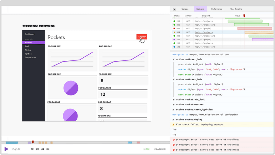
LogRocket is a frontend logging tool that lets you replay problems as if they happened in your own browser. Instead of guessing why errors happen, or asking users for screenshots and log dumps, LogRocket lets you replay the session to quickly understand what went wrong. It works perfectly with any app, regardless of framework, and has plugins to log additional context from Redux, Vuex, and @ngrx/store.
In addition to logging Redux actions and state, LogRocket records console logs, JavaScript errors, stacktraces, network requests/responses with headers + bodies, browser metadata, and custom logs. It also instruments the DOM to record the HTML and CSS on the page, recreating pixel-perfect videos of even the most complex single page apps.


Top comments (0)