
Data visualization refers to the technique used to communicate data in a more clear and efficient way using visual objects such as charts, graphs and many more.
On the web, there are many libraries that can be used to visualize data but one that stands out is the D3js library. It has become the de facto for data visualization and has won the confidence of many developers.
React is a library that is used by many developers. In this article, we will see how we can use React and D3 to create components that are both reusable and beautiful.
First, let’s examine each of these libraries briefly.

React
React is a JavaScript library for building user interfaces. It makes it easy to create reusable components that can be put together to form more complex components.
These components are capable of maintaining their state by themselves.
D3
D3.js is a JavaScript library for manipulating documents based on data. It uses HTML, CSS and SVG to bring data to life.
D3 seeks to provide a means for efficient data manipulation based on data rather than, providing frameworks to do every possible feature.
It is fast, supports large datasets and dynamic behaviors for animation and interaction.
Let’s see how we can use these two libraries together to create dynamic data visualization components.
Setting up React
The easiest way to set up react is by using the create-react-app boilerplate by React’s team.
To install it globally on your local machine so that it can be reused, run this in your terminal:
npm install -g create-react-app
Next, we create a new app using the create-react-app template:
create-react-app react-d3
Next, we change directory into the newly created project:
cd react-d3
Setting up D3
You can add the D3 library to your app either using the CDN or by installing via NPM.
In this case, we will be installing using NPM:
npm install d3
Now, we are all set to start using D3 to make data visualization in React.
To preview the app just created on your default browser, run the code below:
npm start
Building a bar chart with D3
Open the created project with your favorite text editor and navigate to src/App.js.
This is the component that is currently rendered in the browser. We would need to remove the content of the render() method so we can replace that with our own content.
In the src folder, create a new js file named BarChart.js. This is where we will build the bar chart that will be rendered.
To start, add the following code to the file:
import React, {Component} from 'react';
import * as d3 from "d3";

class BarChart extends Component {

}

export default BarChart;
We will use the ComponentDidMount lifecycle method to display the bar chart when the BarChart component has been mounted in the DOM.
Add the following to the BarChart component:
class BarChart extends Component {

  componentDidMount() {
    this.drawChart();
  }
}
The drawChart is the method where we will do all of our D3 magic.
Normally, when using D3 without React, you do not have to put your D3 code in a method, but this is important in React to ensure that the chart displays only when the component has been mounted on the DOM.
Next, we create the drawChart method:
drawChart() {
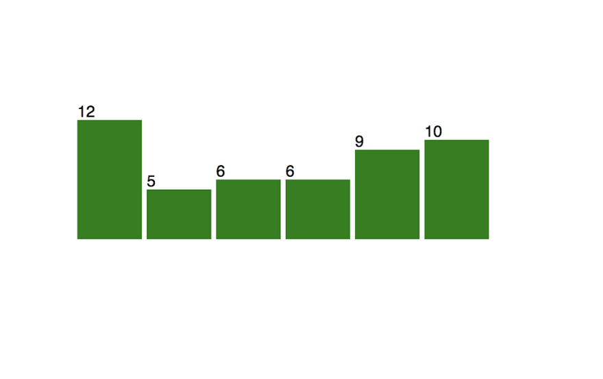
const data = [12, 5, 6, 6, 9, 10];
const svg = d3.select("body").append("svg").attr("width", 700).attr("height", 300);
}
What’s going on here?
First, we defined a variable data which contains the data we want to visualize.
Next, we defined an SVG using D3 methods. We are using SVG because it’s scalable that is, no matter how large the screen is or how much you zoom in to view the data, it will never appear pixelated.
The d3.select() is used to select an HTML element from the document. It selects the first element that matches the argument passed and creates a node for it.
In this case, we passed the body element, which we will change later to make the component more reusable.
The append() method appends an HTML node to the selected item and returns a handle to that node.
The attr method is used to add attributes to the element. This can be any attribute that you will normally add to the HTML element like class, height, width or fill .
We then appended an SVG element to the body element with a width: 700 and height: 300.
Under the SVG variable we created, add the following code:
svg.selectAll("rect").data(data).enter().append("rect")
Just like the select method, selectAll() selects the element that matches the argument that is passed to it. So, all elements that match the arguments are selected and not just the first.
Next, the data() method, is used to attach the data passed as an argument to the selected HTML elements.
Most times, these elements are not found because most visualization deal with dynamic data and it is nearly impossible to estimate the amount of data that will be represented.
The enter() method rescues us from that bottleneck as it is used alongside the append method to create the nodes that are missing and still visualize the data.
So far we have created nodes for each data point. All that’s left is to make it visible.
To make it visible we need to create a bar for each of those datasets, set a width and update the height of each bar dynamically.
The attr method allows us to use a callback function to deal with the dynamic data:
selection.attr("property", (d, i) => {})
Where d is the data point value and i is the index of the data point of the array.
First, we need to set each data point at a specific point on the x and y-axis of the bar chart. We use the “x” and “y” attributes to achieve this, where “x” represents the position of the bar along the x-axis(horizontally) and “y” represents the position of the bar along the y-axis.
Also, we need to set the width and height of each data point. The width of each data point is constant since the bars would be of the same width.
The height, on the other hand, depends on the value of each data point. We have to use the callback function to make the bar chart display the value of each data point.
We modify our SVG variable to become:
svg.selectAll("rect")
  .data(data)
  .enter()
  .append("rect")
  .attr("x", (d, i) => i * 70)
  .attr("y", 0)
  .attr("width", 25)
  .attr("height", (d, i) => d)
  .attr("fill", "green");
For the “x”, each index of the data point in the array is multiplied by a constant integer 70, to shift the position of each bar by 70.
“y” has a constant value y, which we will change soon.
The width also has a constant value of 65 which is less than the position of each element on the chart to create a space between each element.
The height of the bar depends on the value of each entry in the data set.
Using this we have created a bar chart. However, we have two issues:
- The bars in the chart are small
- The chart is also inverted
To resolve the above, we would multiply each data by a constant value of say 10, to increase the size of each bar without affecting the data:
.attr("height", (d, i) => d * 10)
Bar chart magnified but still inverted

Next, we solve the issue of the bar being inverted, but before that let’s understand why the chart is inverted in the first place.
The SVG position starts from top to bottom, so using a y attribute of 0 puts each bar at the top edge of the SVG element.
To fix this, we subtract the height of each bar from the height of the SVG element:
.attr("y", (d, i) => h - 10 * d)
Where (10 * d) is the height we got from our previous calculation.
Putting it all together, the BarChart component will be:
class BarChart extends Component {
  componentDidMount() {
    this.drawChart();
  }

  drawChart() {
    const data = [12, 5, 6, 6, 9, 10];

    const svg = d3.select("body")
    .append("svg")
    .attr("width", w)
    .attr("height", h)
    .style("margin-left", 100);

    svg.selectAll("rect")
      .data(data)
      .enter()
      .append("rect")
      .attr("x", (d, i) => i * 70)
      .attr("y", (d, i) => h - 10 * d)
      .attr("width", 65)
      .attr("height", (d, i) => d * 10)
      .attr("fill", "green")
  }

  render(){
    return <div id={"#" + this.props.id}></div>
  }
}

export default BarChart;

We now have a basic bar chart. Let’s do a little extra and add labels.
Adding labels to a bar chart
To add labels we add the following code to the drawChart function:
svg.selectAll("text")
  .data(data)
  .enter()
  .append("text")
  .text((d) => d)
  .attr("x", (d, i) => i * 70)
  .attr("y", (d, i) => h - (10 * d) - 3)
This is similar to what we did for the bars but this time, text is appended instead.
The bar chart should now look like this:
Making the bar chart reusable
One of the important parts of React is to make components that are reusable.
To do this, we need to remove the provided data and then pass it to the component through props.
The width and height of the SVG will also be passed via props:
const data = [12, 5, 6, 6, 9, 10];
becomes
const data = this.props.data;
and the width and height attribute change from:
const svg = d3.select("body").append("svg").attr("width", 700).attr("height", 300);
to
const svg = d3.select("body").append("svg")
  .attr("width", this.props.width)
  .attr("height", this.props.height);
In our App.js file, we can now use the component and pass the data we want from the parent component:
class App extends Component {

  state = {
    data: [12, 5, 6, 6, 9, 10],
    width: 700,
    height: 500,
    id: root
  }

  render() {
    return (
      <div className="App">
        <BarChart data={this.state.data} width={this.state.width} height={this.state.height} />
      </div>
    );
  }
}
This way, we can reuse the bar chart anywhere we want to in our React App.
Cheers!!!
Plug: LogRocket, a DVR for web apps
LogRocket is a frontend logging tool that lets you replay problems as if they happened in your own browser. Instead of guessing why errors happen, or asking users for screenshots and log dumps, LogRocket lets you replay the session to quickly understand what went wrong. It works perfectly with any app, regardless of framework, and has plugins to log additional context from Redux, Vuex, and @ngrx/store.
In addition to logging Redux actions and state, LogRocket records console logs, JavaScript errors, stacktraces, network requests/responses with headers + bodies, browser metadata, and custom logs. It also instruments the DOM to record the HTML and CSS on the page, recreating pixel-perfect videos of even the most complex single page apps.
The post Data visualization in React using React D3 appeared first on LogRocket Blog.


Top comments (0)