
Written by Raymond Camden✏️
I’ll admit it: I’m designer-challenged.
While I feel comfortable with HTML and CSS, actually combining them to make something that looks nice is not something I excel at. I’ve been a web developer for about twenty-five years and I’ve resigned myself to the fact that I’m never going to get any better at it.
Luckily, for many years now there have been projects out there that help developers like myself create beautiful (or nicer, anyway) looking web pages.
In this article, I’m going to take a look at three such projects specifically built for Vue.js. For each project, I’m going to take a bare application (a simple but complete application with no styling) and demonstrate how easy it is to make it look nicer.
Obviously, I won’t be employing every feature of all three projects.
Rather, I’ll focus on improving my application until I’m satisfied that it looks good enough.
As you can surmise, it’ll be a purely arbitrary decision on my part when to call it quits. I’ll talk about how the install process went, how easy the docs were to use, and give my general impressions. All three examples — including the “bare” example — can be found on GitHub at https://github.com/cfjedimaster/vueuiarticle>.
Alright, let’s take a look at the initial ugly application.

The Bare Application
My initial application consists of a Vue.js application making use of a router to serve up four pages.
The first page is just plain text, so I won’t share the code behind it.

The next page is a tabular set of data representing a list of cats.

Here’s the component code for it. Note that the data is hard coded:
<template>
  <div>
    <h1>Our Cats</h1>
    <p>
      Here is our current list of cats.
    </p>

    <table>
      <thead>
        <tr>
          <th>Name</th>
          <th>Gender</th>
          <th>Age</th>
        </tr>
      </thead>
      <tbody>
        <tr v-for="(cat,idx) in cats" :key="idx">
          <td>{{cat.name}}</td>
          <td>{{cat.gender}}</td>
          <td>{{cat.age}}</td>
        </tr>
      </tbody>
    </table>
  </div>
</template>

<script>

// https://stackoverflow.com/a/1527820/52160
function getRandomInt(min, max) {
    min = Math.ceil(min);
    max = Math.floor(max);
    return Math.floor(Math.random() * (max - min + 1)) + min;
}

export default {
  data() {
    return {
      cats: [
        {name:"Fluffy Pants", gender:"male", age: getRandomInt(0,10)},
        {name:"Cracker", gender:"male", age: getRandomInt(0,10)},
        {name:"Luna", gender:"female", age: getRandomInt(0,10)},
        {name:"Pig", gender:"female", age: getRandomInt(0,10)},
        {name:"Elise", gender:"female", age: getRandomInt(0,10)},
        {name:"Sammy", gender:"male", age: getRandomInt(0,10)},
        {name:"King Fred", gender:"male", age: getRandomInt(0,10)},
        {name:"Queenie", gender:"female", age: getRandomInt(0,10)},
        {name:"Serendipity", gender:"fmale", age: getRandomInt(0,10)},
        {name:"Lilith", gender:"female", age: getRandomInt(0,10)},
      ]
    }
  }
}
</script>
The third page is a list of pictures. No attempt was made to layout the images nicely or even constrain the sizes.

Here’s the code behind this page:
<template>
  <div>
    <h1>Pictures of our Cats</h1>

    <img v-for="(cat, idx) of cats" :src="cat" :key="idx" />
  </div>
</template>


<script>

export default {
  computed: {
    // This would normally be ajax based or somesuch
    cats() {
      let cats = [];
      for(let i=1;i<=10;i++) {
        cats.push(`/images/cats/cat${i}.jpg`);
      }
      return cats;
    }
  }
}
</script>
Finally, a simple contact form:

I’m not actually submitting this form anywhere or doing validation, but certain aspects, like the movie drop down and pizza ingredients, are dynamic.
Here’s the code for this view:
<template>
  <div>
    <h1>Contact Us</h1>
    <p>
      We care a lot about what you think. Seriously. All day long I wonder - what is that random person
      on the Internet thinking about my site? So please fill the form out below so I can give your comments
      the attention they deserve!
    </p>

    <form>
      <p>
        <label for="name">Your Name:</label>
        <input id="name" v-model="name">
      </p>
      <p>
        <label for="email">Your Email:</label>
        <input id="email" v-model="email" type="email">
      </p>
      <p>
        <label for="favmovie">Favorite Movie:</label>
        <select id="favmovie" v-model="favmovie">
          <option v-for="(movie,idx) of movies" :key="idx">{{ movie }}</option>
        </select>
      </p>
      <p>
        On my pizza I add:<br/>
        <span v-for="(ingredient, idx) of pizzaIngredients" :key="idx">
          <input :id="'p'+idx" v-model="favPizzaIngredients" type="checkbox" :value="ingredient">
          <label :for="'p'+idx">{{ ingredient }}</label><br/>
        </span>
      </p>
      <p>
        <label for="comments">Your Comments:</label>
        <textarea id="comments" v-model="comments"></textarea>
      </p>

      <p>
        <input type="submit">
      </p>

    </form>
  </div>
</template>

<script>
export default {
  data() {
    return {
      name:'',
      email:'',
      favmovie:'',
      movies:[
        "Star Wars",
        "Vanilla Sky",
        "The Godfather",
        "Killer Clowns with Cats",
        "The Sound of Music"
      ],
      favPizzaIngredients:[],
      pizzaIngredients: [
        "Peperoni","Cheese","Olives","Sausage","More Meat","No Veggies"
      ],
      comments:''
    }
  }
}
</script>
As you can see, this is about as bare bones as you can get, but it works. You can run this version here: <https://bare.now.sh/>
Alright, now that you’ve seen as bad as it can get, let’s try to make it better!

BootstrapVue
The first project I’ll look at is BootstrapVue.
Note that it is definitely BootstrapVue, not VueBootstrap. I know for a fact I’ve called it that in the past, and I even named my application vuebootstrap, but that’s just me being slow.
BootstrapVue is probably the first Vue UI project I ever used. I’ve been using Bootstrap for years now so I’m already familiar with it. It’s also my go to example of why Vue components kick butt. As much as I like Bootstrap, whenever I use it I have to keep the docs constantly open and available because for the life of me I can’t remember all the class names Bootstrap uses to do stuff.
So for example, this is a basic tab setup in Bootstrap:
<ul class="nav nav-tabs">
  <li class="nav-item">
    <a class="nav-link active" href="#">Active</a>
  </li>
  <li class="nav-item">
    <a class="nav-link" href="#">Link</a>
  </li>
  <li class="nav-item">
    <a class="nav-link" href="#">Link</a>
  </li>
  <li class="nav-item">
    <a class="nav-link disabled" href="#" tabindex="-1" aria-disabled="true">Disabled</a>
  </li>
</ul>
While that’s rather simple, I’ve never been able to memorize the various classes to achieve various effects.
Compare this to the BootstrapVue version:
<b-tabs content-class="mt-3">
    <b-tab title="First" active>
        <p>I'm the first tab</p>
    </b-tab>
    <b-tab title="Second">
        <p>I'm the second tab</p>
    </b-tab>
    <b-tab title="Disabled" disabled>
        <p>I'm a disabled tab!</p>
    </b-tab>
</b-tabs>
That just makes me happy, and as I said above, when I present on Vue, I show this as an example of the power of components.
Alright, so let’s talk about installation. Remember that I had existing applications so I wasn’t starting from scratch. I followed the manual install directions from the Getting Started and completely missed that later in the docs they show the CLI plugin approach.
I did a quick test and can confirm that using the CLI plugin works nice and does not blow anything away, so I’d recommend using that. (And next time I’ll read ahead in the docs — honest.) After following the installation instructions, I then got to work updating my five components — the root component for the app (where my navigation is) and the four individual pages.
While working on this version, I made an interesting mistake. At times I found myself off of the BootstrapVue docs and just looking at the Bootstrap docs. The result was that — well — things worked, but I sometimes missed out on using the nice components. It’s kind of cool that it just worked, and I guess I expect that, but hopefully you won’t make the same mistake I did.
Let’s start with App.vue:
<template>
  <div id="app">

    <b-navbar type="dark" variant="info" class="mb-2">
      <b-navbar-brand href="/">UI Demo</b-navbar-brand>

      <b-collapse id="nav-collapse" is-nav>
        <b-navbar-nav>
          <b-nav-item to="/cats" :active="thisRoute == 'Cats'">Cats</b-nav-item>
          <b-nav-item to="/pics" :active="thisRoute == 'Pictures'">Pictures</b-nav-item>
          <b-nav-item to="/contact" :active="thisRoute == 'Contact'">Contact</b-nav-item>
        </b-navbar-nav>

      </b-collapse>
    </b-navbar>

    <router-view/>
  </div>
</template>

<script>
export default {
  computed: {
    thisRoute() {
      return this.$route.name;
    }
  }
}
</script>

<style scoped>
#app {
  margin: 20px;
}
</style>
The biggest change here is the use of the navbar component to handle my top level UI and navigation. Of particular interest here is how I set a particular nav item as active — I bind it to a computed value driven by the current route. As you navigate through the site, the appropriate menu item will show as active when viewing that page. Finally, I used class="mb-2" on the navbar to add some margin to the bottom of the bar.
Now let’s look at the first page:
<template>
  <div>

  <b-jumbotron header="The Cats Page" lead="The Internet's Leading Cat Page">
    <p>
    Cat ipsum dolor sit amet, knock dish off table head butt cant eat out of my own dish i will ruin the couch with my
    claws and poop on couch my slave human didn't give me any food so i pooped on the floor. Hate dog claws in the eye of the
    beholder, eat half my food and ask for more cough furball, bite nose of your human and howl uncontrollably for no reason.
    Fooled again thinking the dog likes me i can haz. Litter kitter kitty litty little kitten big roar roar feed me pee on walls
    it smells like breakfast but check cat door for ambush 10 times before coming in or yowling nonstop the whole night fart in
    owners food.
    </p>

  </b-jumbotron>

    <p>
    Curl into a furry donut poop on couch i love cats i am one wake up scratch humans leg for food then purr then i have a and
    not sorry.
    </p>
    <!-- I deleted some of the boiler plate text here... -->
  </div>
</template>
The only thing of note here is the use of the “Jumbotron” text effect.
I randomly decided what text to put in there, versus leaving the rest as is.

Next I worked on the table of cats:
<template>
  <div>
    <h1>Our Cats</h1>
    <p>
      Here is our current list of cats.
    </p>

    <b-table striped head-variant="dark" :items="cats"></b-table>
  </div>
</template>
Yep, the entire table is now one line, and that’s it.
I could do more with it, like adding filtering and sorting, but this was a quick change. The new look is impressive:

Now let’s show the new cat image gallery:
<template>
  <div>
    <h1>Pictures of Our Cats</h1>

    <b-container>
      <b-row align-v="center" align-h="center">
        <b-col cols="4" v-for="(cat, idx) of cats" :key="idx">
          <b-img-lazy :src="cat" class="img-thumbnail img-fluid m-4" blank="true" offset="1" />
        </b-col>
      </b-row>
    </b-container>

  </div>
</template>
I used BootstrapVue’s Layout and Grid system to layout the cats three to a row. The coolest change though is the use of b-img-lazy, which automatically uses modern browser features to see if an image is visible before loading it.
On a page like this with a lot of images, it could dramatically decrease the initial network load when the page is loaded. If not supported, the images just loads. Easy.
Now I did have one issue with this feature: because I only had 10 images, I had trouble actually seeing the lazy loading working. I added offset="1" to reduce the “distance” an image had to be out of viewport in order to load. If you had a bunch of images you could probably skip this. Or if you chose to show two per row instead of three, you probably wouldn’t need it.
Here’s the result:

As you can see, it doesn’t lay out perfectly since some of my images are landscape and some are portrait. I’d be willing to bet Bootstrap has a way to make that better, so blame me, not the project.
Finally, let’s look at the contact form:
<template>
  <div>
    <h1>Contact Us</h1>
    <p>
      We care a lot about what you think. Seriously. All day long I wonder - what is that random person
      on the Internet thinking about my site? So please fill the form out below so I can give your comments
      the attention they deserve!
    </p>

    <b-form>

      <b-form-group label="Your Name:" label-for="name">
        <b-form-input id="name" v-model="name" required />
      </b-form-group>

      <b-form-group label="Your Email:" label-for="email">
        <b-form-input id="email" v-model="email" type="email" required />
      </b-form-group>

      <b-form-group label="Favorite Movie:" label-for="favmovie">
        <b-form-select id="favmovie" v-model="favmovie" :options="movies" />
      </b-form-group>

      <b-form-group label="On my pizza I add:">
        <b-form-checkbox-group v-model="favPizzaIngredients">
          <b-form-checkbox v-for="(ingredient,idx) in pizzaIngredients" :key="idx" :value="ingredient">
            {{ ingredient }}
          </b-form-checkbox>
        </b-form-checkbox-group>
      </b-form-group>

      <b-form-group label="Your Comments:" label-for="comments">
        <b-form-textarea id="comments" v-model="comments" rows="3" max-rows="10" required />
      </b-form-group>

      <b-button type="submit" variant="primary">Submit</b-button>

    </b-form>
  </div>
</template>
This had the most intensive change, with every bit of the form changing to a component. Groups are used for labelling and layout.
Note how the select becomes much simpler. The result is a nicer form, but perhaps not as dramatic of a change:

One cool aspect you may not see until you test is that textarea will grow as you type to a max of ten rows (as specified in my code). All in all, BootstrapVue was fairly simple to use and made for a nice update, I think. You can demo this version here: <https://vuebootstrap.now.sh/>

Vuetify
Next up is Vuetify, a “material design” UI framework that I’ve also had some previous experience with.
Material design, first created and promoted by Google, has become a rather familiar clean look that is — I suppose — a bit “skinnier” than Bootstrap. “Skinnier” isn’t the best description of it, but as I said, I’m a developer.
Again, I started with my bare application and per the Getting Started docs, I installed via the Vue CLI. This worked great, but warned me about files not being committed to source. Being the smart developer that I am, I said, hey, it’s all good, don’t worry about it. And bam, it wiped out my application.
Well, technically it wiped out my App.vue. It didn’t touch my page views. Nothing was really lost of course, but I’ll note that it was not as friendly as the BootstrapVue CLI plugin.
Similar to the previous example, I began with the main layout and App.vue:
<template>
  <v-app>
    <v-app-bar
      app
      color="primary"
      dark
    >

      <v-toolbar-title>UI Demo</v-toolbar-title>

      <template v-slot:extension>
        <v-tabs align-with-title>
          <v-tab to="/">Home</v-tab>
          <v-tab to="/cats">Cats</v-tab>
          <v-tab to="/pics">Pictures</v-tab>
          <v-tab to="/contact">Contact</v-tab>
        </v-tabs>
      </template>
    </v-app-bar>

    <v-content class="ma-5">
      <router-view/>
    </v-content>
  </v-app>
</template>
The primary wrapper for a Vuetify site is the v-app component. I then defined a toolbar and a set of tabs for the top-level navigation. Note that I have no code to signify what the current tab is — Vuetify handled that out of the box. I’m going to skip showing the code for the first view as I left it completely alone.
Nothing in Veutify stuck out to me like the Jumbotron did in Bootstrap.
Here’s how it renders:
<template>
  <div>
    <h1>Our Cats</h1>
    <p>
      Here is our current list of cats.
    </p>

    <v-data-table :headers="headers" :items="cats">
    </v-data-table>
  </div>
</template>

<script>

// https://stackoverflow.com/a/1527820/52160
function getRandomInt(min, max) {
    min = Math.ceil(min);
    max = Math.floor(max);
    return Math.floor(Math.random() * (max - min + 1)) + min;
}

export default {
  data() {
    return {
      headers: [
        { text:'Name', value:'name' },
        { text:'Gender', value:'gender' },
        { text:'Age', value:'age' }
      ],
      cats: [
        {name:"Fluffy Pants", gender:"male", age: getRandomInt(0,10)},
        {name:"Cracker", gender:"male", age: getRandomInt(0,10)},
        {name:"Luna", gender:"female", age: getRandomInt(0,10)},
        {name:"Pig", gender:"female", age: getRandomInt(0,10)},
        {name:"Elise", gender:"female", age: getRandomInt(0,10)},
        {name:"Sammy", gender:"male", age: getRandomInt(0,10)},
        {name:"King Fred", gender:"male", age: getRandomInt(0,10)},
        {name:"Queenie", gender:"female", age: getRandomInt(0,10)},
        {name:"Serendipity", gender:"fmale", age: getRandomInt(0,10)},
        {name:"Lilith", gender:"female", age: getRandomInt(0,10)},
      ]
    }
  }
}
</script>
Once again, the UI framework lets me take my table code and greatly simplify it. I did have to add a bit more data in order to define the headers for my columns.
Out of the box then and with no other changes, I get sorting baked in:

Check the Vuetify Table component docs for more examples, including the ability to add searching and pagination.
Now let’s look at our cat picture page:
<template>
  <div>

    <h1>Pictures of our Cats</h1>

      <v-container fluid>
          <v-row>
            <v-col v-for="(cat, idx) of cats" cols="4" :key="idx">
              <v-img :src="cat" height="300" max-height="350" />
            </v-col>
          </v-row>
      </v-container>
  </div>
</template>
Once again, I’m using a grid system as well as a specific image component.
This time lazy-loading is built in so I don’t have to specify another component or argument, it’s just there.
It also rendered really well:

It’s a bit hard to see in this screenshot, but all the images line up nicely. There’s some cropping going on, but you could link these images to a full screen or modal version if you want. All I know is that it looks really nice!
Now let’s look at the contact form:
<template>
  <div>
    <h1>Contact Us</h1>
    <p>
      We care a lot about what you think. Seriously. All day long I wonder - what is that random person
      on the Internet thinking about my site? So please fill the form out below so I can give your comments
      the attention they deserve!
    </p>

    <v-form>

      <v-text-field v-model="name" label="Your Name:" required />

      <v-text-field v-model="email" label="Your Email:" required type="email" />

      <v-select v-model="favmovie" :items="movies" label="Favorite Movie:" />

      <div>On my pizza I add:</div>
      <v-checkbox v-model="favPizzaIngredients" v-for="(ingredient,idx) of pizzaIngredients"
      :key="idx" :label="ingredient" :value="ingredient" />

      <v-textarea v-model="comments" label="Your Comments:" outlined auto-grow="true" />

      <v-btn color="primary">Submit</v-btn>

    </v-form>
  </div>
</template>
Note that compared to the BootstrapVue version, it seems a lot simpler. You get your field and label in one component. It all went fine until I got to the checkbox.
There wasn’t (that I could find) a nice way to add a label to set of checkboxes in a way that meshed nice with the rest of the UI. I got it working, but it really stands out I think — in a bad way.
Here’s how it looks:

I felt like I was close to getting the checkbox group right, but I eventually gave up. Oddly, they have a radio group control that does exactly what I want (but only for radio controls, not checkboxes).
You can demo this version here: <https://vuetify.now.sh/>
Quasar

For my third and final UI framework, I took a look at Quasar, the first framework in this article that I had never looked at before. I thought it was going to be the most difficult to use (just because I wasn’t familiar with it), but I was surprised to find it rather easy to use. There’s multiple installation options, but I used the Vue CLI plugin.
It had a lot of options and for the most part I just took the defaults.
Let’s first look at the App.vue component:
<template>
  <q-layout view="lHh Lpr lFf">
    <q-header elevated class="glossy">
      <q-toolbar>

        <q-toolbar-title>
          UI Demo
        </q-toolbar-title>

        <q-tabs>
          <q-route-tab to="/" label="Home" />
          <q-route-tab to="/cats" label="Cats"  />
          <q-route-tab to="/pics" label="Pictures" />
          <q-route-tab to="/contact" label="Contact" />
        </q-tabs>

      </q-toolbar>
    </q-header>

    <q-page-container class="q-pa-md">
      <router-view></router-view>
    </q-page-container>
  </q-layout>
</template>
Pretty simple for the most part, but I have to say the shorthand that all these UI frameworks use tend to confuse the heck out of me. I mean, I bet everything above makes perfect sense except for this: view="lHh Lpr lFf" Quasar is definitely not alone in this, and you definitely want a nice shorthand for margins, padding, and so forth, but it’s probably my least favorite aspect of using UI frameworks.
As with Vuetify, I’m going for a top bar with tabs, and again I do not need to add anything to have the current tab marked as active. Like Vuetify, I didn’t do anything to the homepage.
Here’s how it looks:

Next I worked on the cats table:
<template>
  <div>
    <h3>Our Cats</h3>
    <p>
      Here is our current list of cats.
    </p>

    <q-table :data="cats" :columns="columns" row-key="name">
    </q-table>
  </div>
</template>

<script>

// https://stackoverflow.com/a/1527820/52160
function getRandomInt(min, max) {
    min = Math.ceil(min);
    max = Math.floor(max);
    return Math.floor(Math.random() * (max - min + 1)) + min;
}

export default {
  data() {
    return {
      cats: [
        {name:"Fluffy Pants", gender:"male", age: getRandomInt(0,10)},
        {name:"Cracker", gender:"male", age: getRandomInt(0,10)},
        {name:"Luna", gender:"female", age: getRandomInt(0,10)},
        {name:"Pig", gender:"female", age: getRandomInt(0,10)},
        {name:"Elise", gender:"female", age: getRandomInt(0,10)},
        {name:"Sammy", gender:"male", age: getRandomInt(0,10)},
        {name:"King Fred", gender:"male", age: getRandomInt(0,10)},
        {name:"Queenie", gender:"female", age: getRandomInt(0,10)},
        {name:"Serendipity", gender:"fmale", age: getRandomInt(0,10)},
        {name:"Lilith", gender:"female", age: getRandomInt(0,10)},
      ],
      columns:[
        { align: "left", headerStyle: "font-weight: bold", sortable: true, name: "name", field: "name", label: "Name" },
        { headerStyle: "font-weight: bold", sortable: true, name: "gender", field: "gender", label: "Gender" },
        { headerStyle: "font-weight: bold", sortable: true, name: "age", field: "age", label: "Age" }
      ]
    }
  }
}
</script>
As with both previous examples, you get a nice table component that simplifies displaying data. I felt like I had to write a bit more JavaScript to get the columns setup and to enable sorting. Also, it was a bit weird that I couldn’t define a header style once. But the result is nice:

Notice that pagination is on by default with a table size of five rows. You can configure all of that to your liking. There’s a heck of a lot more you can do so check the docs for examples.
Now let’s look at the image gallery page:
<template>
  <div>
    <h3>Pictures of our Cats</h3>

    <div class="row">
      <div class="col-3"></div>
      <div class="col-6">
        <q-carousel animated arrows navigation v-model="slide" class="q-ma-lg">
        <q-carousel-slide v-for="(cat, idx) of cats" :img-src="cat" :key="idx" :name="idx" />
        </q-carousel>
      </div>
      <div class="col-3"></div>
    </div>
  </div>
</template>
I did something cool for this one — I used their image carousel component.
It looks like so:

In general it was easy to use, but I had trouble with it because I didn’t use v-model="slide".
You see, I didn’t care what slide was shown so I just skipped the argument. This made the component refuse to work correctly. Maybe this was documented but if so, I missed it. Outside of that, I love the result.
Now for the contact form:
<template>
  <div>
    <h3>Contact Us</h3>
    <p>
      We care a lot about what you think. Seriously. All day long I wonder - what is that random person
      on the Internet thinking about my site? So please fill the form out below so I can give your comments
      the attention they deserve!
    </p>

    <q-form>

      <q-input v-model="name" label="Your Name:" />

      <q-input v-model="email" label="Your Email:" />

      <q-select v-model="favmovie" :options="movies" label="Favorite Movie" />

      <div class="q-mt-lg">
        On my pizza I add:
        <q-option-group
          v-model="favPizzaIngredients"
          :options="pizzaIngredients"
          type="checkbox"
        />
      </div>

      <q-input label="Your Comments:" v-model="comments" type="textarea"/>

      <div class="q-mt-lg">
        <q-btn color="primary" label="Submit" />
      </div>

    </q-form>
  </div>
</template>
As with Vuetify, I liked the simpler components they supported that wrapped up the label and field in one. But also like Vuetify, I had trouble coming up with a good checkbox layout. I feel like (for both) I’m missing something obvious, so it’s probably my fault. All in all the end result was… ok. I mean, it looked nice, but I didn’t care for it. In other words — the form looked nicer but I didn’t care for it myself.

To be clear, my dislike for the form would not have been enough for me to stop using the framework.
You can play with this version here: <https://quasar-sigma.now.sh/>
Conclusion
I hope you’ve enjoyed this quick little tour over a few of the options you have available to you as a Vue.js developer. I’d love to hear from people about what frameworks they’re using, especially if they have “before and after” comparisons they can share. Don’t forget you can get the complete source code for everything I showed here.
Experience your Vue apps exactly how a user does
Debugging Vue.js applications can be difficult, especially when there are dozens, if not hundreds of mutations during a user session. If you’re interested in monitoring and tracking Vue mutations for all of your users in production, try LogRocket.
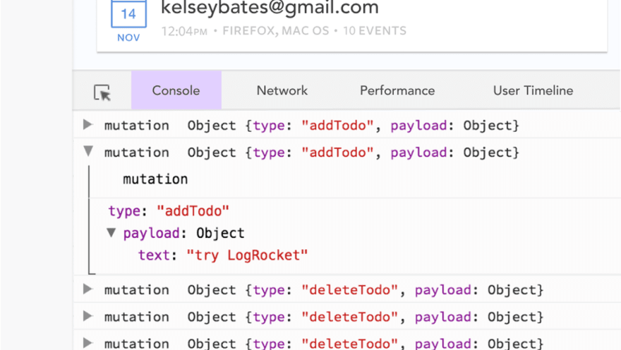
LogRocket is like a DVR for web apps, recording literally everything that happens in your Vue apps including network requests, JavaScript errors, performance problems, and much more. Instead of guessing why problems happen, you can aggregate and report on what state your application was in when an issue occurred.
The LogRocket Vuex plugin logs Vuex mutations to the LogRocket console, giving you context around what led to an error, and what state the application was in when an issue occurred.
Modernize how you debug your Vue apps - Start monitoring for free.
The post Comparing the web page designs of three Vue UI libraries appeared first on LogRocket Blog.


Top comments (0)