Back in the good old days, the limits of CSS were such that even “simple” things like vertical centering posed a challenge, with some of us even relying on JavaScript solutions. It was fragile, it was very constrained, and there was always that one exception that made it fail.
Whether we were trying to align an icon or image beside the text, create one of those popular “hero” banners, or a modal overlay, centering things in the vertical axis was always a struggle.
But CSS has come a long way since, providing lots of methods that made vertical centering easier every time. Here’s a summary of some of them, along with their use cases and limitations.

1. Absolute positioning and margin auto
An element with no intrinsic size can be “centered” by simply using equal values from the top and bottom. When the element has intrinsic dimensions we might use 0 for top and bottom, then apply margin auto. This will automagically center the element:
.container{
  position:relative;
}
.element{
  position:absolute;
  top: 0; bottom: 0; left: 0; right: 0;
  margin: auto;
  height: 20px; /*requires explicit height*/
}
The limitation is, of course, that the element height must be explicitly declared, or it will occupy the entire container.
2. The classic top 50% translate -50%
This is one of the first, and still a go-to, for many developers. A simple trick, relying on absolute positioning the inner element at 50% from the top of their parent, then translating it up 50% of its height:
.container{
  position: relative;
}
.element{
  position: absolute;
  top: 50%;
  transform: translateY(-50%);
}
A fairly solid approach, with the only major limitation being the use of translate that might get in the way of other transforms, e.g. when applying transitions/animations.
3. Tables. Yup, I just said tables.
A really simple approach and one of the first (back in the day, everything was tables), is using the behaviour of table cells and vertical-align to center an element on the container.
This can be done with actual tables (shame, shame, shame), or using semantic HTML, switching the display of the element to table-cell:
.container{
  display: table;
  height: 100%;
}
.element{
  display: table-cell;
  text-align: center;
  vertical-align: middle;
}
This works even when both elements are of unknown height. The major limitation is of course if you need to have a non-centered sibling, and it might get tricky with the background limits.
Also, bear in mind this totally fails on screen readers (even if your markup is based on divs, setting the CSS display to table and table-cell will make screen readers interpret it as an actual table). Far from the best when it comes to accessibility.
4. The ghost element method
Another oldie, that didn’t catch up for whatever reason, is using inline-block with a ghost (pseudo) element that has 100% height of the parent, then setting the vertical-align property to middle:
.container::before {
  content: '';
  display: inline-block;
  height: 100%;
  vertical-align: middle;
  margin-left: -1ch;
}
.element{
  display: inline-block;
  vertical-align: middle;
}
It actually works quite well, with the most noticeable “gotcha” being that it moves the horizontal center just a tiny bit to the right, because of the always cringy behaviour of white space between inline-block elements.
This can be dealt with as we would with the inline-block issue in any other context, simplest approach being the margin-left -1ch that I used above (although this will not be 100% accurate except on monospace fonts, as ch unit means the width of the “0” character), or setting the font size to 0 on the container then resetting it to px or rem on the element. Not optimal to say at least.
5. Margin auto on a flex-item
Finally getting into modern CSS territory , flexbox introduced a pretty awesome behaviour for auto margins. Now, it will not only horizontally center the element as it did in block layouts, but also center it in the vertical axis:
.container{
  display:flex;
}
.element{
  margin:auto;
}
This tactic is one of my favourites because of its simplicity, the only major limitation is that it’ll only work with a single element.
6. Pseudo-elements on a flex-container
Not the most practical approach in the world, but we can also use flexible, empty pseudo elements to push the element to the center:
.container{
  display: flex;
  flex-direction: column;
}
.container::before,
.container::after {
  content: "";
  flex: 1;
}
This may be useful when we want to keep a flexible spacing on a column-oriented flex-container with multiple items.
7 & 8. Align on the flex-container or the flex-item
Flexbox also introduced really great alignment properties (that are now forked into their own box alignment module). This allows us to control how items are placed and how empty space is distributed, in ways that would have required either magic numbers in CSS for a specific number of elements, or a quite clever JS for dynamic amounts.
Depending on the flex-direction, we might use justify-content or align-items to adjust as needed.
On the container:
.container{
  display: flex;
  justify-content: center;
  align-items: center;
}
On a particular flex-item:
.container{
  display: flex;
}
.element{
  align-self: center;
  margin: 0 auto;
}
Not many downsides to this, except if you need to support older browsers. IE 11 should work, but its implementation of flexbox is quite buggy, so it should be always treated with extra care. IE 10 requires additional work as it’s based on an older, early draft of the specification that has different syntax, and requires the -ms vendor prefix.
9 & 10. Align on the grid-container or the grid-item
CSS Grid includes pretty much the same alignment options as flexbox, so we can use it on the grid-container:
.container{
  display: grid;
  align-items: center;
  justify-content: center;
}
Or just on a specific grid-item:
.container{
  display: grid;
}
.element{
  justify-self: center;
  align-self: center
}
Lack of legacy browsers support is the only limitation for this technique.
11. Pseudo-elements on a grid
Similarly to the flexbox alternative, we could use a three-row grid with pseudo-elements:
.container{
  display: grid;
  grid-template-columns: 1fr;
  grid-template-rows: repeat(3, 1fr);
}
.container::before,
.container::after{
  content:"";
}
Remember that 1fr actually means minmax(auto, 1fr), so the empty rows will not necessarily take 1/3 of the container height. They will collapse as needed all the way down to their minimal value of auto, and without content, means 0.
This might look like a silly approach, but it allows us to easily pull off one of my favourite CSS Grid tricks: combining fr rows with minmax ones , which will cause the empty fr ones to collapse first, then the mixmax ones. Jenn Simmons has great exampleson this.
So, having the pseudos take the fully-collapsible rows will allow the auto-placement algorithm to work its magic on our actual elements. Except if we need to support IE, which lacks auto-placement. Which leads us to the next method…
12. Explicit grid row placement
CSS grid allows items to be explicitly placed on a specific row, so the same grid declaration as above and the item placed on the second row will be enough:
.container{
  display:grid;
  grid-template-columns:1fr;
  grid-template-rows: repeat(3, 1fr);
}
.element{
  grid-row: 2 / span 1; /* or grid-row: 2/3 */
}
This one can work down to IE10. Believe it or not, IE was one of the first and stronger supporters for CSS grid , shipping it all the way back in 2011 with IE10. It’s based on a really early draftthat has a completely different syntax, but we can make it work:
.container{
  display: -ms-grid;
  -ms-grid-rows: (1fr)[3];
  -ms-grid-columns: 1fr;
}
.element{
  -ms-grid-column: 1;
  -ms-grid-row: 2;
}
13. Margin auto on a grid-item
Similarly to flexbox, applying margin-auto on a grid-item centers it on both axes.
.container{
  display: grid;
}
.element{
  margin: auto;
}
This comes particularly handy in order to center respectively to a particular column/group, or column/group span
Some (probable) future implementations:
According to the CSS Box Alignment Module level 3 specification, align-content should work on the block axis of block containers and multicol containers, so (if browsers implement it) we should be able to center the content of those containers just like we do in flex or grid containers.
Conclusion
And that’s it. What used to be extremely hard can now be achieved in a dozen+ different ways, and I’m probably missing a couple more. If you know other techniques, please share them in the comments.
Plug: LogRocket, a DVR for web apps
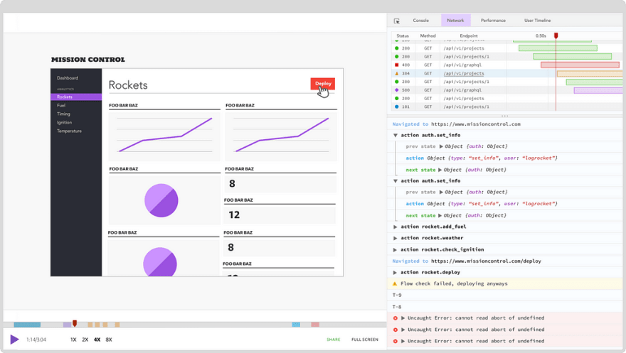
LogRocket is a frontend logging tool that lets you replay problems as if they happened in your own browser. Instead of guessing why errors happen, or asking users for screenshots and log dumps, LogRocket lets you replay the session to quickly understand what went wrong. It works perfectly with any app, regardless of framework, and has plugins to log additional context from Redux, Vuex, and @ngrx/store.
In addition to logging Redux actions and state, LogRocket records console logs, JavaScript errors, stacktraces, network requests/responses with headers + bodies, browser metadata, and custom logs. It also instruments the DOM to record the HTML and CSS on the page, recreating pixel-perfect videos of even the most complex single page apps.
The post 13 ways to vertical center in 2018 appeared first on LogRocket Blog.


Top comments (0)