
Hi everyone.
I have decided to create a post to share my point of view about units of measure in CSS.
All that I am going to put next are things that I have learned in open source and personal projects, that is, by practicing a lot.
I'm just going to talk about the units of measurement that I usually use. And it should be noted that the use cases that I am going to present are to make a responsive design
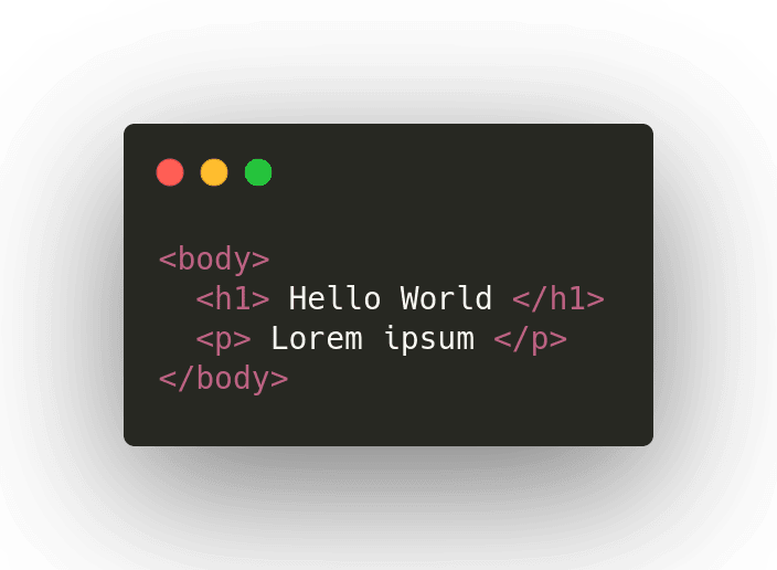
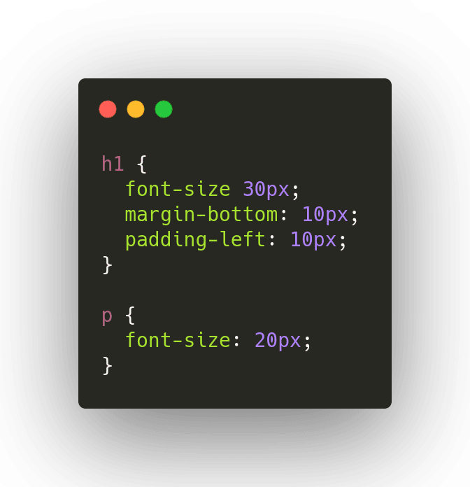
px (pixel) : px I only use it in very isolated and small cases, for example. When I want to give a fixed font size or even for fixed margins and paddings.
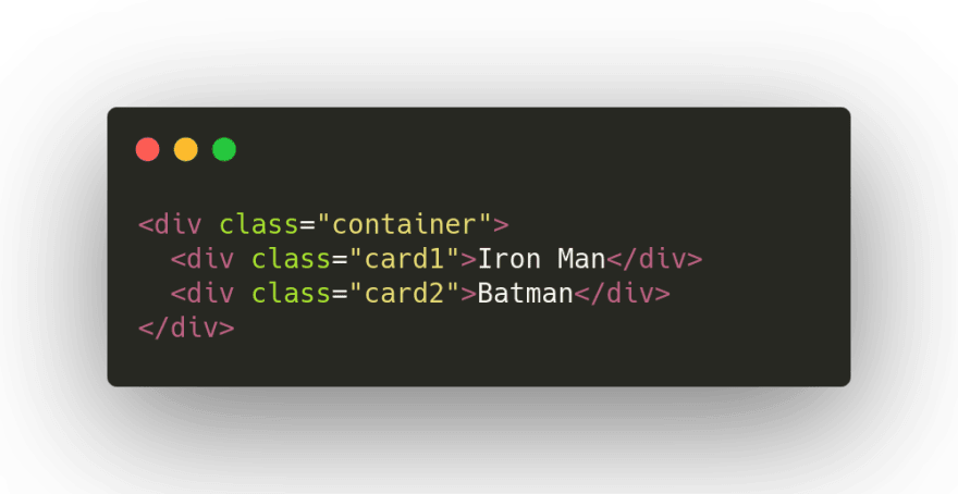
rem (root em) : I use rem for the same elements in px, but with the difference that it is something variable or responsive, for example text fonts and responsive spacing.
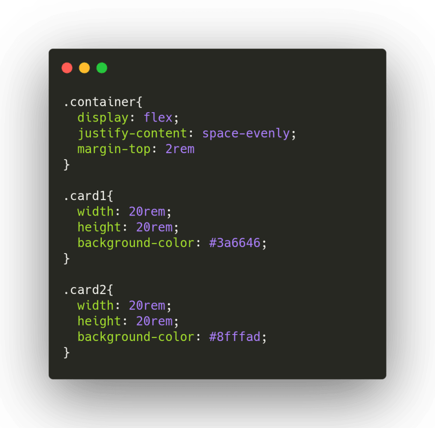
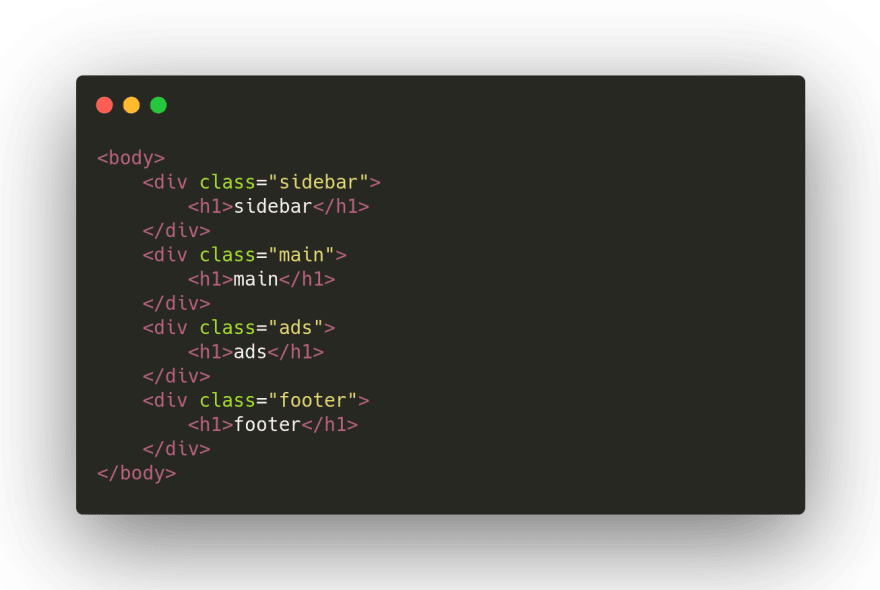
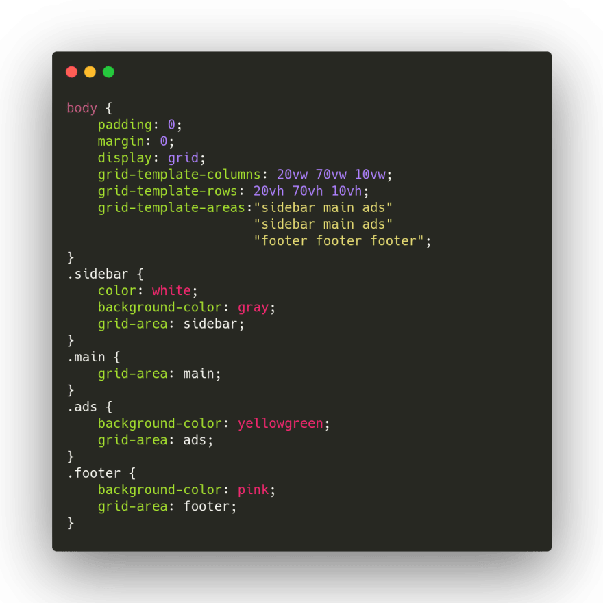
vh (view height) - vw (view width): These two measurements, being a reference to the size of the screen, are used to measure the layouts.
Thanks so much for reading.
If you have any suggestion, let me know it in the comments.


Top comments (1)
Nice post