The frontend landscape changed quite a lot in the last years (hopefully for the better). Now there are tools and technologies that help us achieve great results pretty quickly and efficiently. Among those tools the combination of Vue.js and Tailwind stands out as it let's you build prototypes (and not only prototypes) super quickly and modify them very easily along the way. Moving fast and adapting to changes seems to be something people value quite a lot these days. In this article we're going to explore how we can build animated draggable interfaces with Vue.js and Tailwind. Below is one of the examples were going to build. If you just want to see the code, you can find it here. Let's get started.

Setup
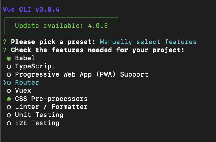
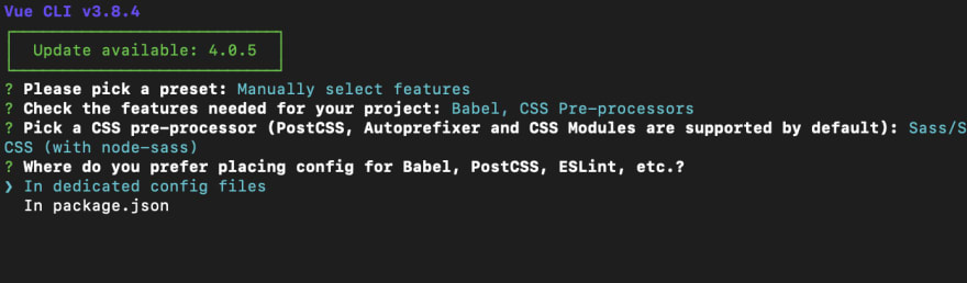
1. We're going to use Vue CLI to scaffold a new project. It will be a basic one with Babel and preprocessors support
2. We're going to install tailwind css and configure it so we can use the @apply, @screen utilities in our css.
You can follow the installation steps here but we'll list them below as well.
npm install tailwindcssCreate a new file inside
src/assets/css/tailwind.csswith the following content
    @tailwind base;

    @tailwind components;

    @tailwind utilities;
-
import this file inside your App.vue or main.js file
import './assets/css/tailwind.css'
Run
<span>npx tailwind init</span>to create a tailwind configuration fileAdd these 2 lines of code inside postcss.config.js or inside postcss object in package.json (in case you have it there). Note that you don't have to install anything. Autoprefixer should be there by default with Vue CLI
    module.exports = {
      plugins: [
        // ...
        require('tailwindcss'),
        require('autoprefixer'),
        // ...
      ]
    }
That's it! We're finished with the setup.
Creating a list of users
We're going to start with a nice list of users. It's very simple to do that with Tailwind and Vue.

For simplicity we're going to have all the code inside App.vue file for now.
1. Layout and background. We're going to add a background to the page first and center everything in the page.
    <div id="app" class="min-h-screen w-screen bg-gray-200 flex items-center justify-center">
    </div>
All the css classes we're going to use are from tailwind's default set of classes. You can find them in the documentation but most of them are pretty self explanatory.
2. Create the list and the cards. We're going to add a small array object to define our list. Our users will be declared inside the data section of our App.vue file
    data() {
      return {
        users: [
          {
            id: 1,
            name: "Adrian Schubert",
            avatar: "https://pickaface.net/gallery/avatar/unr_sample_161118_2054_ynlrg.png"
          },
          {
            id: 2,
            name: "Violet Gates",
            avatar: "https://pickaface.net/gallery/avatar/freud51c8b3f65e7dc.png"
          },
          {
            id: 3,
            name: "Steve Jobs",
            avatar: "https://pickaface.net/gallery/avatar/Opi51c74d0125fd4.png"
          },
          {
            id: 4,
            name: "Yassine Smith",
            avatar: "https://pickaface.net/gallery/avatar/unr_yassine_191124_2012_3gngr.png"
          },
          {
            id: 5,
            name: "Senior Saez",
            avatar: "https://pickaface.net/gallery/avatar/elmedinilla541c03412955c.png"
          }
        ]
      }
    }
Now that we have the users array we can create the list really quickly and iterate over the users to display the cards.
    <ul>
     <li v-for="user in users" :key="user.id">
      {{user.name}}
     </li>
    </ul>
Alright but the list has no styles at all. We can fix that with some tailwind utilities.
    <ul class="w-full max-w-md">
      <li v-for="user in users"
          :key="user.id"
          class="p-4 mb-3 flex justify-between items-center bg-white shadow rounded-lg cursor-move">
        {{user.name}}
      </li>
    </ul>
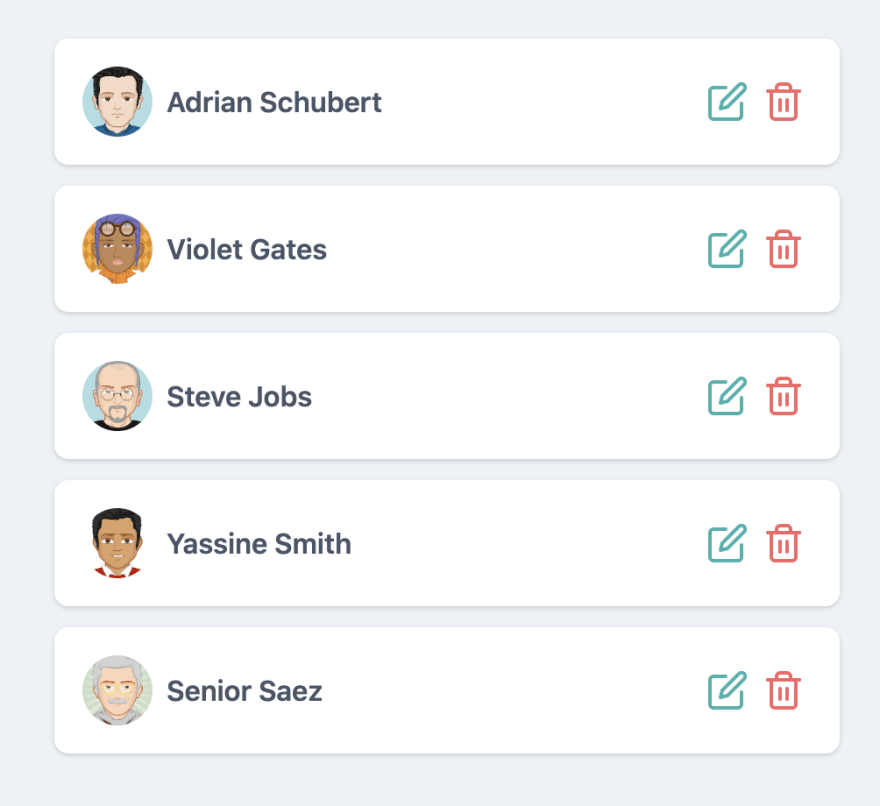
Our list of users should now look more or less like this

We're going to add a few more details to it like the avatar and some action buttons. For the action buttons we're going to use Vue Feather Icons. It's a set of SVG icons that can be imported as svg components.
Make sure to install it npm install vue-feather-icons
Since we already have the avatar urls in our users array, it will be very simple to style the avatars.
    <div class="flex items-center">
        <img class="w-10 h-10 rounded-full" :src="user.avatar" :alt="user.name">
        <p class="ml-2 text-gray-700 font-semibold font-sans tracking-wide">{{user.name}}</p>
    </div>
Our list should look like this now. Much better!

Last step before adding drag and drop support is to add those action buttons (which are optional) but we're going to do it for the completeness of the example.
We'll first add the icon components and some placeholder methods.
    import { EditIcon, Trash2Icon } from "vue-feather-icons";
    export default {
        name: "App",
        components: {
          EditIcon,
          Trash2Icon
        },
        // data
        methods: {
          onEdit(user) {
            alert(`Editing ${user.name}`);
          },
          onDelete(user) {
            alert(`Deleting ${user.name}`);
          }
        }
    }
and then the html part for the action buttons
    <div class="flex">
        <button aria-label="Edit user"
                class="p-1 focus:outline-none focus:shadow-outline text-teal-500 hover:text-teal-600"
                @click="onEdit(user)">
            <EditIcon/>
        </button>
        <button aria-label="Delete user"
                class="p-1 focus:outline-none focus:shadow-outline text-red-500 hover:text-red-600"
                @click="onDelete(user)">
            <Trash2Icon/>
        </button>
    </div>
Our list of users is visually complete. The only missing part is the drag and drop support.
Adding drag and drop support
For drag and drop support we're going to use Vue Draggable which is an awesome library (wrapper over SortableJS) that exposes a component that you can use to make stuff draggable. It's perfect for places where you have full control over the HTML however when it comes to third party components or for example integrating it with a third party data table, it's better to use SortableJS directly.
Alright so let's start with installing it npm install vuedraggable and then importing the draggable component
    import Draggable from 'vuedraggable'
    export default {
     components: {
      // other components
      Draggable
     }
    }
Now in order to make our list draggable we just have to wrap our cards in this draggable component.
    <draggable :list="users">
        <li v-for="user in users"
            :key="user.id">
           <!-- Card code here-->
        </li>
    </draggable>
It is very important to reference the list we want to add drag support to via :list="users" prop so the draggable components knows that this is the list it should work with.
Although this is already a good progress we have a few issues: the UX is not great and there's an extra div placed inside our <ul> tag. That's because draggable creates an extra html element and wraps it around our list. Fortunately that can be fixed easily.

We can convert our draggable component into an <ul> tag and then delete our old ul tag.
<draggable tag="ul" class="w-full max-w-md" :list="users">
Alright, now let's add animation support and some bit of styling. For animations there's an animation prop
<draggable tag="ul" class="w-full max-w-md" :list="users" :animation="200">
Now we have support for smooth animations which is wonderful. We can go one step further and highlight the card that is currently moving. We can do so via a prop called ghost-class. Vue draggable will add this class to the moving element whenever we select an element and want to drag it. Let's name it moving-card. Also in order to improve user experience on mobile especially we will make sure that our cards cannot be dragged by using filter prop and filtering our our buttons. In this case our filter looks like this filter=".action-button" Our buttons should contain this class and vue draggable will ignore these elements so users can freely click on them without accidentally dragging the cards.
<draggable tag="ul" ghost-class="moving-card" filter=".action-button" class="w-full max-w-md" :list="users" :animation="200">
Now if you open devtools and drag one of the cards you'll see this class being applied to the moving card. We can use it to style the dragged card.
The styling in this case will be some reduced opacity and highlighted borders. We can use the tailwind @apply directive to do that inside our css
    <style lang="scss">
        .moving-card {
            @apply opacity-50 bg-gray-100 border border-blue-500;
        }
    </style>
Now we have a complete example of an animated draggable list. The users list will automatically update it's object positions in the array whenever we move items inside it. For example if we move the first user to the last place, it will automatically swap contents of index 0 and index 4 in our array. You can find the full example here and also a separate github repository where you can follow the git history for each of the steps above.
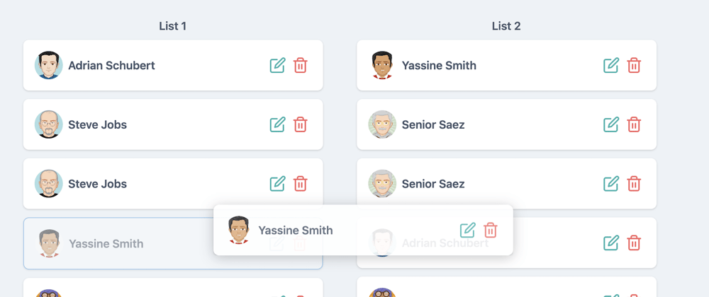
Drag elements between two lists
In some real scenarios we might have to drag elements from one place to another, for example moving a user from a group to another or moving tasks in a kanban board from a column to another.
We can achieve this really simply with the group prop from vue draggable. If you've made it this far then it means you already grasped some of the concepts above and we're going to move a bit faster from here one.
First we're going to extract our user card component
    <template>
        <li class="p-4 mb-3 flex justify-between items-center bg-white shadow rounded-lg cursor-move">
            <div class="flex items-center">
                <img class="w-10 h-10 rounded-full" :src="user.avatar" :alt="user.name">
                <p class="ml-2 text-gray-700 font-semibold font-sans tracking-wide">{{user.name}}</p>
            </div>
            <div class="flex">
                <button aria-label="Edit user"
                        class="p-1 focus:outline-none focus:shadow-outline text-teal-500 hover:text-teal-600"
                        @click="$emit('on-edit', user)">
                    <EditIcon/>
                </button>
                <button aria-label="Delete user"
                        class="p-1 focus:outline-none focus:shadow-outline text-red-500 hover:text-red-600"
                        @click="$emit('on-delete', user)">
                    <Trash2Icon/>
                </button>
            </div>
        </li>
    </template>
    <script>
      import { EditIcon, Trash2Icon } from "vue-feather-icons";
      export default {
        components: {
          EditIcon,
          Trash2Icon
        },
        props: {
          user: {
            type: Object,
            default: () => ({})
          }
        },
      }
    </script>
Now our list should look like this:
    <draggable tag="ul"
               class="w-full max-w-md"
               ghost-class="moving-card"
               :list="users"
               :animation="200">
        <user-card v-for="user in users"
                   :user="user"
                   :key="user.id"
                   @on-edit="onEdit"
                   @on-delete="onDelete">
        </user-card>
    </draggable>
We're going to create another list like this near it with another set of users. Our template should look more or less like this
    <div class="w-full max-w-md text-center">
        <p class="mb-2 text-gray-700 font-semibold font-sans tracking-wide">List 1</p>
        <draggable tag="ul"
                   ghost-class="moving-card"
                   :list="users"
                   :animation="200">
            <user-card v-for="user in users"
                       :user="user"
                       :key="user.id"
                       @on-edit="onEdit"
                       @on-delete="onDelete">
            </user-card>
        </draggable>
    </div>

    <div class="w-full max-w-md ml-12 text-center">
        <p class="mb-2 text-gray-700 font-semibold font-sans tracking-wide">List 2</p>
        <draggable tag="ul"
                   ghost-class="moving-card"
                   :list="newUsers"
                   :animation="200">
            <user-card v-for="user in newUsers"
                       :user="user"
                       :key="user.id"
                       @on-edit="onEdit"
                       @on-delete="onDelete">
            </user-card>
        </draggable>
    </div>
At this point if we want to move a user from a list to another, we won't be able to do that. In order to achieve this we have to specify that draggable components are part of the same "group" via the group property.
    <draggable tag="ul" group="all-users" :list="users">

    <draggable tag="ul" group="all-users" :list="newUsers">
The name of the group doesn't really matter here. It has to be the same so vue draggable knows that it can accept items between the 2 lists.
If you open Vue Dev Tools and move users from a list to another you will see the 2 lists being updated accordingly

You can find the full code here
An interesting note here is that the users are actually moved (deleted from first list and added to the second one). If you happen to need the behavior of cloning the users you can do so via a more explicit group configuration.
For example if you want to "clone" users when dragging them from list and don't allow moving users from list 2 to list 1, you would do it like this:
:group="{ name: 'all-users', pull: 'clone', put: false }"
Also there are many useful events and props that you can find here that can allow you to have further restrictions like not having duplicate items, disable moving of items in certain scenarios via the move callback and so on.
We have another cool example with a kanban board on our website that you can check out here that pretty much uses the techniques described above.
Conclusion
It's relatively simple to build beautiful, animated draggable interfaces with Vue.js and Tailwind. Tailwind is wonderful for styling things very quickly and Vue.js provides the extra flexibility of extracting reusable components and adding interactivity.
Hope you liked the provided examples and steps and feel free to comment with any suggestions or things that you might feel that are missing from this article. Cheers!
If you want to build a cool product or just want to chat, feel free to leave us a message


Top comments (2)
This was a great read! I'll be utilizing this soon. Thanks!
@binar_code good post...thank you! It would be helpful if you could add a backend (I prefer Laravel) to remember state..