Quick note: I am an occasional developer, so if I did something wrong, please be gentle :-). Okay on with the article...
Recently I decided to build my website from scratch and did so to learn Jekyll (a blog-aware web platform) and GitHub Pages. I also wanted to learn SASS/SCSS.
My last real website used div and table tags everywhere for layout, along with some JavaScript code to keep all the elements in check. While the sites generally looked great, changing anything was a courageous act that put fear in my heart and added pain to my typing fingers.
Before building my site, I decided to take a look at what people are using now for HTML and CSS code. That is when I learned stylesheets (CSS) could be fun with the SASS programming language, which is essentially CSS that is easier to read. While I was learning about SASS, I stumbled upon a few videos that extolled the virtues of responsive website design using CSS Grids.
I never heard about CSS grids until very shortly before designing my site, but realizing they are the elegant implementation of my old div-table-javascript mashups of the past, I was sold.
For my new site, I decided to make it 100% based on CSS Grids and require no JavaScript, which is what I accomplished (the only JavaScript comes in the form of integrations with Calendly, Mailchimp, etc., but I have no managed JavaScript code for the site).
But...
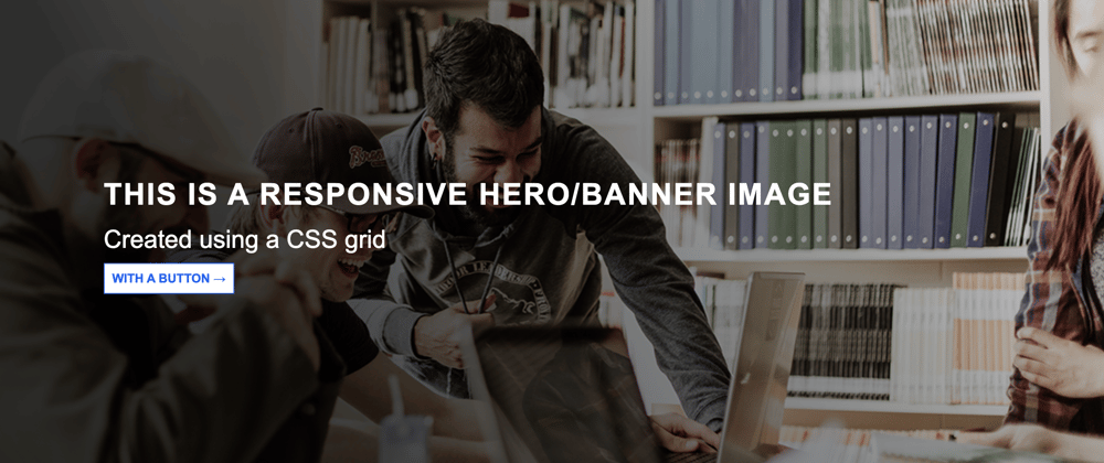
The hero image/banner image death spiral
You have all seen them before. You go to a website, and there is a big image on the page. That image calls attention to a text overlay. That text overlay may have other HTML elements, like buttons or form fields, to sign up for a newsletter, for example. Since the image could change, and the text might be hard to read, you will notice a slight gradient over the image.

I thought it would be super easy to create this. Place a CSS Grid down, add HTML text, and I will be good to go. Not so fast.
If you search for a banner image or hero image on all the places (Google, YouTube, CodePen, etc.), you will see countless ways designers create them.
Some code samples were super complex, requiring JavaScript. Most examples, however, relied on a method where you put your text on the page, sans image. You use CSS to add the image as a background image, add a linear gradient over the background image, and then use absolute positioning to place the HTML overlay text onto the page.
Here is a straightforward example I found from W3Schools, but trust me, they get pretty complicated after that.
W3Schools article on how to create a hero image
Those approaches are all fine and good, but I did not want it to feel like a hack, by putting a background image in CSS, using absolute positioning to place the content, or using JavaScript to ensure responsiveness. I wanted a pure CSS Grid option, which I could not find, so after far too much research, I decided to build it myself.
My hero image requirements
Here are the basic requirements I laid out for my hero image:
- The image must be placed as an
imgtag in HTML. I do not want background images or have the image defined in CSS while the rest of the images are defined in HTML. - I want the option of a gradient overlay for any hero/banner images.
- The HTML components cannot use absolute positioning. They must be responsive and CSS Grid "friendly."
- The banner should work on Firefox, Chrome, Edge, and IE (or at least the version of IE I tested with).
The solution
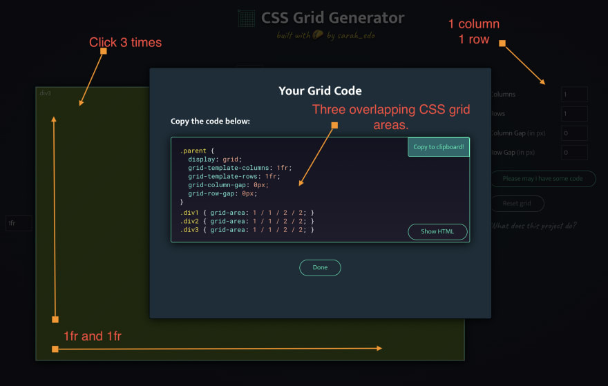
To be honest, I was getting so frustrated with the fact no one had a nice clean and straightforward approach until I came across the CSS Grid Generator by Sarah Edo. I was playing around with creating various grid sizes and noticed that if I click on a grid area more than once, I would get more grid areas. Ahhh! You can overlap grid areas!
NOTE: I later changed the height to a set number of pixels.
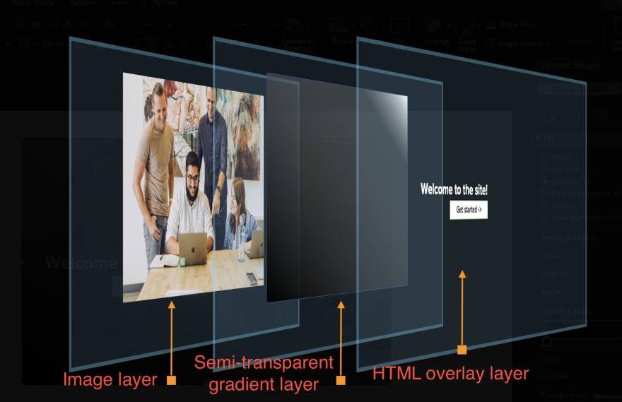
With my new CSS Grid design in place, it is a matter of merely placing each element on top of the other. Here is a 3D view of what the site looks like:
Putting it all together
The following CodePen shows the final solution. In the following sections of this article, I will walk you through the code.
The CodePen uses a randomly selected image from Unsplash. Note how most images display nicely even though they are portrait or landscape... more on that later.
The html
I created an HTML file and placed the following code in the body area. There is a section that represents the grid itself, and then there are three div tags that contain the image, gradient overlay, and the content. In CSS, these divs are defined as grid areas, and they will overlap with each other.
<!-- The CSS grid that makes up the entirety of the hero image/banner image area -->
<section class="top-banner-section">
<!-- The CSS grid area that displays the image (layer 1) -->
<div class="banner-image-div">
<img class="banner-image" src="https://source.unsplash.com/random" alt="Banner Image" />
</div>
<!-- The CSS grid area that displays the semi-transparent gradient overlay (layer 2) -->
<div class="banner-overlay-div"></div>
<!-- The CSS grid area that displays the content (layer 3) -->
<div class="banner-text-div">
<span class="banner-text">
<p class="banner-h1-text">Remain relevant in today's technology-driven economy</p>
<p class="banner-body-text">Learn how agile can give you a competitive edge.</p>
<p class="banner-btn"><a class="banner-btn-item" href="https://www.cambermast.com">Get started →</a></p>
</span>
</div>
</section>
The CSS Grid
Using the CSS Grid code I pulled from the aforementioned CSS Grid generator, I modified the CSS a bit, making the height 350px and aligned and justified the content contained within so it is centered. While I wanted a responsive site, I also put some limits on just how small the image could get.
As you can see in the following code snippet, the CSS Grid 'connects' with the corresponding section in the HTML code.
// Create three grid areas (boxes) that overlap each other, essentially creating three layers.
// Grid box 1 (layer 1): Image
// Grid box 2 (layer 2): Gradient overlay
// Grid box 3 (layer 3): Call to action text/content
.top-banner-section {
  display: grid;
  grid-template-columns: 1fr; // stretch to the full frame
  grid-template-rows: 350px; // 350 pixels tall
  grid-column-gap: 0px;
  grid-row-gap: 0px;
  align-content: center;
  justify-content: center;

  .banner-image-div {
    grid-area: 1 / 1 / 2 / 2;
  } // image
  .banner-overlay-div {
    grid-area: 1 / 1 / 2 / 2;
  } // gradient or other overlay
  .banner-text-div {
    grid-area: 1 / 1 / 2 / 2;
  } // overlay objects like text, buttons, etc.
}
At this point, you have HTML that creates a CSS Grid with three grid areas. One thing that may not be apparent is how the grid-area knows to display the image first, the gradient second, and the content third. That is defined by order of the div tags in the HTML. So if I put the gradient div tag first, then the image would just draw over it.
Layer 1: The banner image
As I mentioned earlier in this article, I want the banner to be responsive. For the image, I would not let it get smaller than 350px because at some point the font would be too small to read. Otherwise, it can stretch the entire width and height of the CSS Grid it lives in.
// Banner image (layer 1)
.banner-image {
  display: grid;
  min-width: 350px; // Do not resize to smaller than this.
  width: 100%;
  height: 100%;
  object-fit: cover; // Using this so the image can be any size and still look halfway decent.
}
Something I wanted but did not articulate in my list of requirements was the ability for my grid to easily handle any image I throw into the img tag in the HTML. Whether I place a large portrait photo or a horizontal one, I wanted the image to look good. It turns out you can use the object-fit: cover; css rule. The basic idea is the browser stretches the image proportionally and crops out parts that cannot display because of height and width restrictions.
Since I want the image to be responsive, I made the width and height 100%. That means as the browser size changes, so will the height and width of the image. Since the image is contained within a grid, it will never be larger than its container.
Note: I am sure throwing up any image of any file size, width and height, is bad for optimization and design, but this generic approach of using object-fit worked great for me.
Layer 2: The semi-transparent gradient overlay
As the following code implies, I found a gradient generator online (there are many, and I forgot to write down the one I used). The basic idea here is to create a linear gradient fill that goes from black to white at a 60-degree angle (why 60 degrees? it looked good to me.).
// Gradient overlay (layer 2)
// gradient overlay going from black to transparent.
// note: search for a gradient overlay generator to make this easier.
.banner-overlay-div {
  display: grid;
  max-width: 100%;
  background: black;
  background: linear-gradient(
    60deg,
    rgba(0, 0, 0, 0.7777485994397759) 30%,
    rgba(255, 255, 255, 0) 100%
  ); // start at black at the bottom left'ish and goes at a 60% angle. This will make the white easy to read with nearly any image.
}
The black (0,0,0) is 30% transparent. The white (255, 255, 255) is 100% transparent. With those transparencies in place, you can see the underlying image while also making it easier to read the white content that displays in layer 3.
Layer 3: The content
At this point, we have an image that displays on the screen. A layer above that is the semi-transparent gradient. Now, we want to display the content. As you can see, I just center the content and put a little margin on the right and left, so the text does not pin directly with the edge of the image.
// Banner html components (layer 3)
// banner text
.banner-text-div {
  display: grid;
  align-items: center;
  margin-left: 15px;
  margin-right: 15px;
}
In the spirit of responsiveness, I could have made the margin-left and margin-right a percentage, em, rem, or something other than a hard-coded number of pixels, but it worked for me.
Styling the content
Since I said one of my requirements was to make this banner responsive, I might as well talk about how I format the content. Of course, this is using SASS, so apologies if you want the CSS code here.
I am not going to go through each element, but you can see I used a little calc trick to say, "I don't want the font to be smaller than this point size, but it is okay to make it larger.". I will be curious to see if anyone has comments about how good or bad this is or if I should have used a different approach, but again, it worked for me.
// Typograhy: *** This is all the stuff you change
.banner-h1-text {
  // font can get larger, but no smaller than 10 points.
  font-size: calc(10pt + 0.15vw);
  letter-spacing: 0.05em;
  font-weight: bolder;
  text-transform: uppercase;
  color: white;
}

.banner-body-text {
  // font can get larger, but no smaller than 10 points.
  font-size: calc(10pt + 0.15vw);
  margin-top: 0.5em;
  color: white;
  text-decoration: none;

  &:hover {
    color: white;
  }
  &:visited {
    color: white;
  }
  &:active {
    color: white;
  }
}

.banner-btn {
  margin-top: 1em;
}

.banner-btn-item {
  font-size: calc(8pt + 0.15vw); // responsive size, but keep a minimum.
  padding-top: calc(0.5em + 0.08vw);
  padding-bottom: calc(0.5em + 0.08vw);
  padding-left: calc(0.5em + 0.08vw);
  padding-right: calc(0.5em + 0.08vw);
  color: blue;
  background-color: white;
  text-align: center;
  text-transform: uppercase;
  font-weight: bold;
  border: 1px solid white;

  &:link {
    text-decoration: none;
  }
  &:visited {
    text-decoration: none;
  }
}
Wrapup
As I mentioned at the top of this article, I am not a full-time programmer, but I do like to learn. I had no idea SASS or CSS Grids even existed until I started this project, but it sure was fun to learn.
I am sure there are things I did wrong and will bite me later, but so far, my minimal browser testing shows the site works pretty well.
If you would like to see the final website design, that only uses CSS Grid, check it out at Cambermast.com.
Any recommended changes to my site are welcome and truly appreciated, so feel free to send a pull request or log an issue if you like. GitHub Pages code.


Oldest comments (6)
Thank you for sharing your experience. For everyone who is interested in the topic of heroes, I recommend the article gapsystudio.com/blog/hero-image-we.... This article explains how to place heroes on home pages and website banners, and outlines methods for hero performance for your brand.
That is a great article, thank you!
Nice touch on the typography! It makes a huge difference in readability. Try using VH instead of pixels for the height of the banner, this way it’s always proportional to the users viewing area. Also, use a child combinator to avoid writing so many class names. You can target the children of your Div like this:
.banner-text-div > h1 {
Styles: here;
}
.banner-text-div > p {
Styles: here;
}
developer.mozilla.org/en-US/docs/W...
Thanks for sure VH idea! I will play with implementing that on the project I start today, so it’s a timely idea. Yes, I have a tendency to do that with CSS so thank you for the reminder :)
Thanks for this write up. I found it really inspiring.
I ended having a go at some grid hero images as well and found that the background image can be just a default display: block element with the image set to backgound-size: cover, the tint/overlay can be the grid container.
I ended doing it two ways, one with a 12x12 grid like the one you've outlined in this article, and one just using justify/align-items, which is a bit simpler but still very versatile. Anyway if you fancied a look here's what I came up with:
michaelodonovan.net/Words/HeroImag...
Grid is awesome and I've gone all in this year, don't even use flex anymore - grid can do everything flex can, and a lot lot lot more : )
Nice article and glad you like this approach. It seems like there’s still great reasons to use flex, but yes I agree Grids are much easier to work with.
The specific reasons I don’t like background images is it is hard to make them dynamic. For example, take a blog post. Most blog posts have a unique image in them. You want to add those images to the markup (HTML), not the CSS. Also, if you are coding dynamic sites, background images contained within the CSS feels clunky.
I’m not against the use of a background image, but it feels like you get a lot more flexibility with a standard image.
Thanks again!