every designer has a case study of their design, here is my first.
!Disclaimer I was not hired by Viusasa nor did I receive any payment for the project
I first published this study at: https://bethanyjep.live/blog/viusasa-case-study/

Background
As I started exploring UI/UX design, I became completely lost at some point. One evening, after creating my first multi-page design from scratch, I decided to send a LinkedIn message to Kelvin Kamau to review my design. Fast-forward a few months later, he pushed me to try and redesign an existing app: Viusasa. The Case Study was conducted between August-early December 2020.

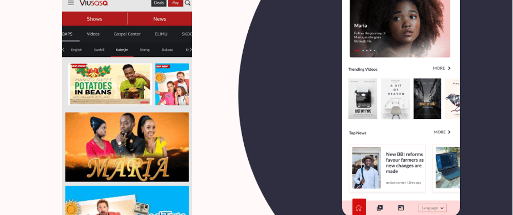
Viusasa is a Kenyan digital platform, like YouTube. It distributes a wide range of content. Some of the content includes TV, Radio, news, music, education and other video content. The application was recently revamped, after this Case Study. The revamp included new services such as bill payments, games, shopping and more have. Its greatest offering is it avails content in Kiswahili, English and vernacular languages. All in all, Viusasa lets you consume content on the go, on any device be it Android, Apple or your personal computer.
Role
In this project, I acted as both the User Experience Researcher as well as the designer. Being my first personal project, I did the research, set my own timelines and ensured all designs were ready.
The project was done during COVID-19 period therefore I could not carry out in-person research rather I used online tools and techniques to carry out research.
Design Goal
- To incentivize more people to use the Viusasa App
- To promote the consumption of local content provided on the Viusasa App
- To ease adoption and use of the Viusasa App
Usability testing
First, I evaluated the app on its ease of use using Heuristic Evaluation. Heuristic evaluation uses 10 core principles to determine interface ease of use. I used six out of the ten rules and here is the outcome of my evaluation:
- One can clearly tell what is going on
- On onboarding, it is unclear what the site is all about: do you watch the shows? Or is it a renting site?
- The home page is very vague, there are no buttons to tell you what next
- Low contrast on most links, buttons and texts which hinder visibility
-
Consistency in design elements
Design is very inconsistent throughout the site:
- Buttons have different shades of red
- Navigation bar varies from page to page
- Video/playlist icon is variant, depending on the page
-
Recognition rather than recall
No clear steps on what to do on the landing page on what next
-
Users are able to get the help they may need
- There is little text on the whole site
- A new user may not understand some terms used for instance data pass, or cannot easily identify the video they may want to view.
- Another issue is while logging in, you are greeted with advertisements but no clear information on what the site is about.
- The help menu item leads you to a blank contact us page
-
Design is minimalistic and appealing
One great (or not so great if you don’t understand what is happening) thing about the site is the absence of a lot of unnecessary text.
However, there are too many unnecessary elements:
- Broken image links on articles
- Unnecessary links on the menu which just refreshes the page when clicked for instance: language links like Embu, Kamba
- Too much empty space
-
Users have control over their actions
Can users navigate out of a place they do not want to be?
- When signing up/registering for an account, there is no clear way out
A more clear presentation on the application heuristic evaluation is found here.
User Research
Having taken Open Classrooms course on conducting user and design research, I embarked in putting into practice what I learnt.
We conduct user research sessions to build empathy for our users and to gain insight that will drive feature development.
On the Apple store, the app has 22 ratings with an average of 2.4 out of 5. There are also 6 reviews, some notable reviews include:


The Android Application has more reviews, with over 20, 970+ ratings, totalling to an average of 3.7 out of 5. Moreover, the application has over one million downloads. The most notable reviews include:


From the research, most of the application users are found on the Android app and the ratings are not very favourable.
User Persona
A persona is a fictional character that best represents your current customer or your target user. Viusasa's audience is not really depicted in their products. However, from their marketing campaigns, I identified two persona groups as below:
Viusasa offers data-pass, a way to use the application without buying data bundles, on two products. One a popular Kenyan Soap, Maria and for students to access its education bundle
Persona-1: Students who use Viusasa as a revision tool
Name: 'Mwakideu'
Age: 13
Occupation: Student
Location: Eldoret
Tagline: As a student, I want to study so that I can pass my exams
Experience Level: Well versed with mobile technology and can easily navigate the app
Frustrations: Schools are closed, Bored as they cannot play out with their friends
Goals: Revise and catch up on their studies
Persona-2: Young ladies, between 18-30 years who use Viusasa to catch up on their latest shows and soaps.
Name: 'Wanjiku'
Age: 26
Occupation: house manager
Location: Nairobi
Frustrations: Once she is done with their chores, she is bored and turns to her phone for entertainment.
Goals: Catch up with her latest shows and find activities she can occupy her time with

Formulated Research Questions
- How much time they spend on their phones/laptops?
- How do they access the internet: WiFi or Data Bundles?
- Do they watch movies? If yes - when, what time and why?
- Which sites do they visit? Do you need to pay to access the sites?
User Journey [Design Architecture]
A user journey is used to map how the user interacts with the product.
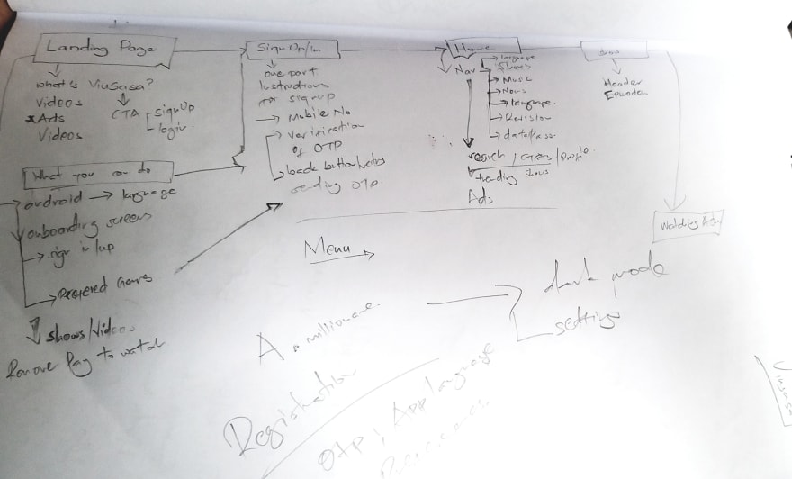
First, the user Logs-in or signs-up to the application → At the home page the user can view top shows and news → from here a user can choose to a) view more shows or news → b)select a specific article and read news there-in → c) select a show where if it is a series can be able to select a single episode but if is a movie will be prompted to pay to watch the movie → d) search for what he/she wants.
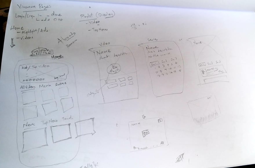
Wireframing
Wireframing consists of sample illustrations on how you would like the application to look. Here are sample low-fidelity wireframes used in the project:
Mood-boarding
A mood board is a collection of designs used to help you gain insights of what your final design may possibly look like. Here is part a mood board I created

existing applications

design inspiration from Dribbble and Behance
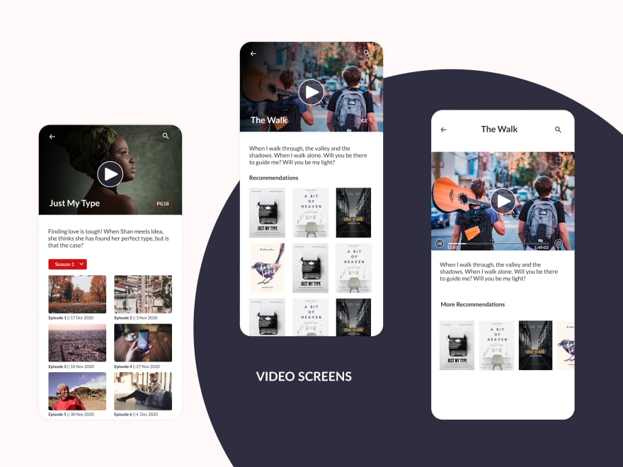
Final Design
Below are final design samples


Prototype
The final prototype can be found at https://www.figma.com/proto/R3MLwwWOd8wR0EWLEQdeuG/Viusasa-Project?node-id=14%3A2&viewport=-349%2C439%2C0.09093504399061203&scaling=scale-down
Outcomes and Learnings
During the redesign was I realized the company had already revamped their application. It was a big blow as the whole application changed and I was almost done with my project. Yet, I decided to complete and my initial designs.
I learnt new skills including User Research, Usability Testing using Heuristic Evaluation, Wireframing and Prototyping.
Do you need your current application revamped? Reach out to me on LinkedIn.


Top comments (0)